hay TIN
works
about
en
kr
/
KIKI Creative House Brand Identity & Positioning
request PRESS FILE
KIKI Creative House is an art film production built to expand artists' worlds through the medium of film.
HAY TIN joined KIKI from the very beginning, designing not just a visual identity, but the entire brand structure that allows this production to define a genre that has never existed before.
Our work went beyond aesthetics. We built the language, positioning, and system that answers the fundamental questions: what KIKI is, why it exists, and how it connects artists, creators, and film.
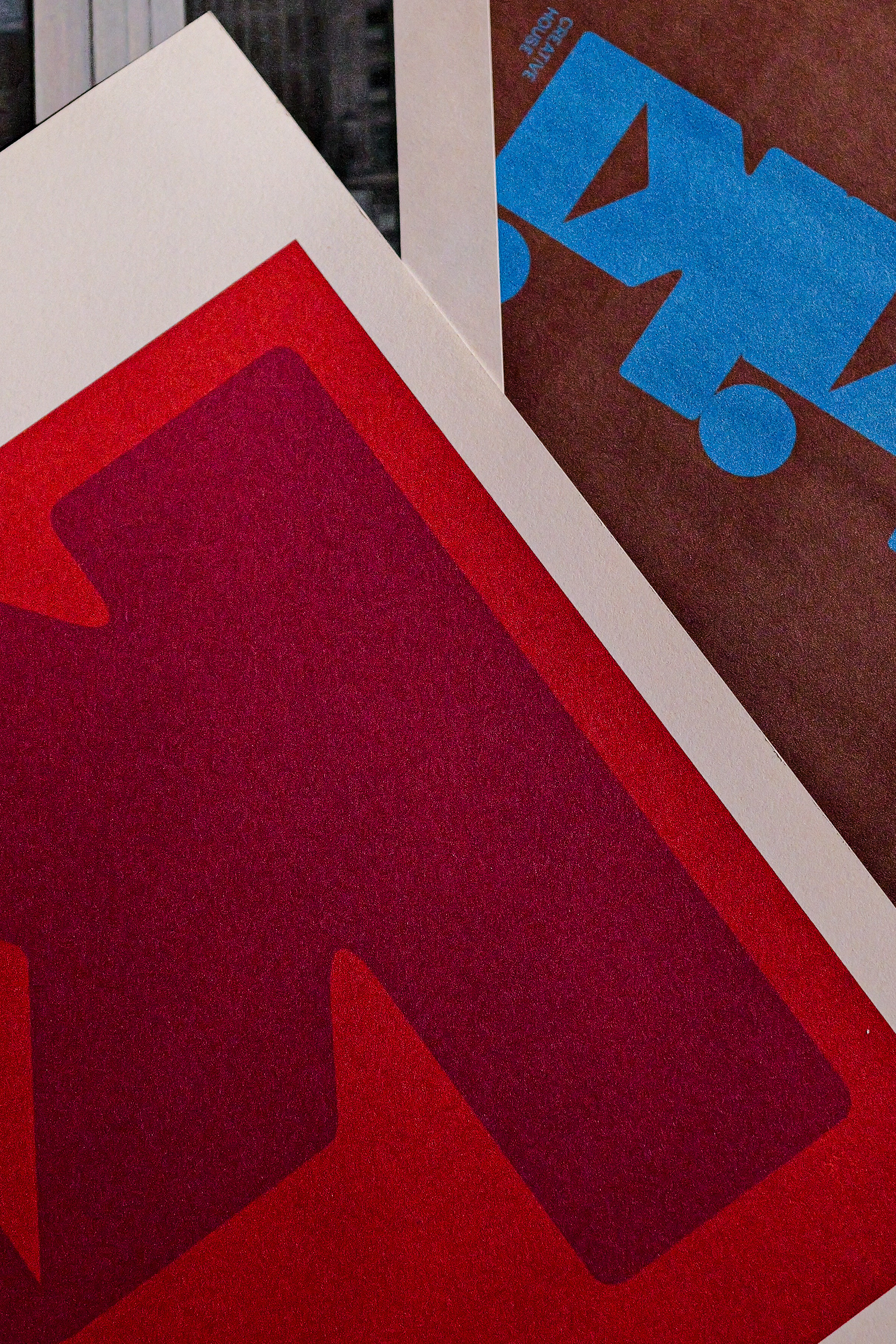
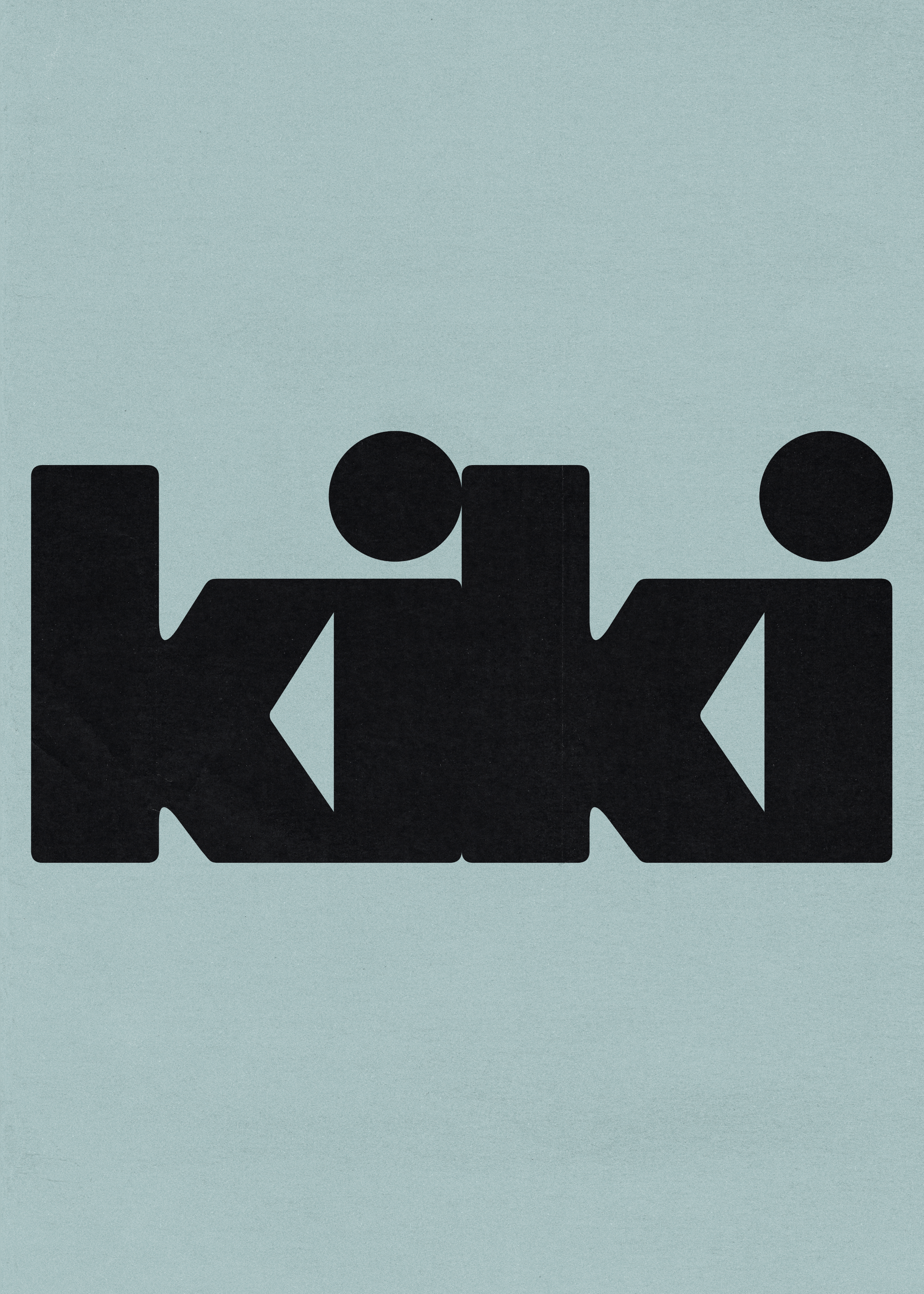
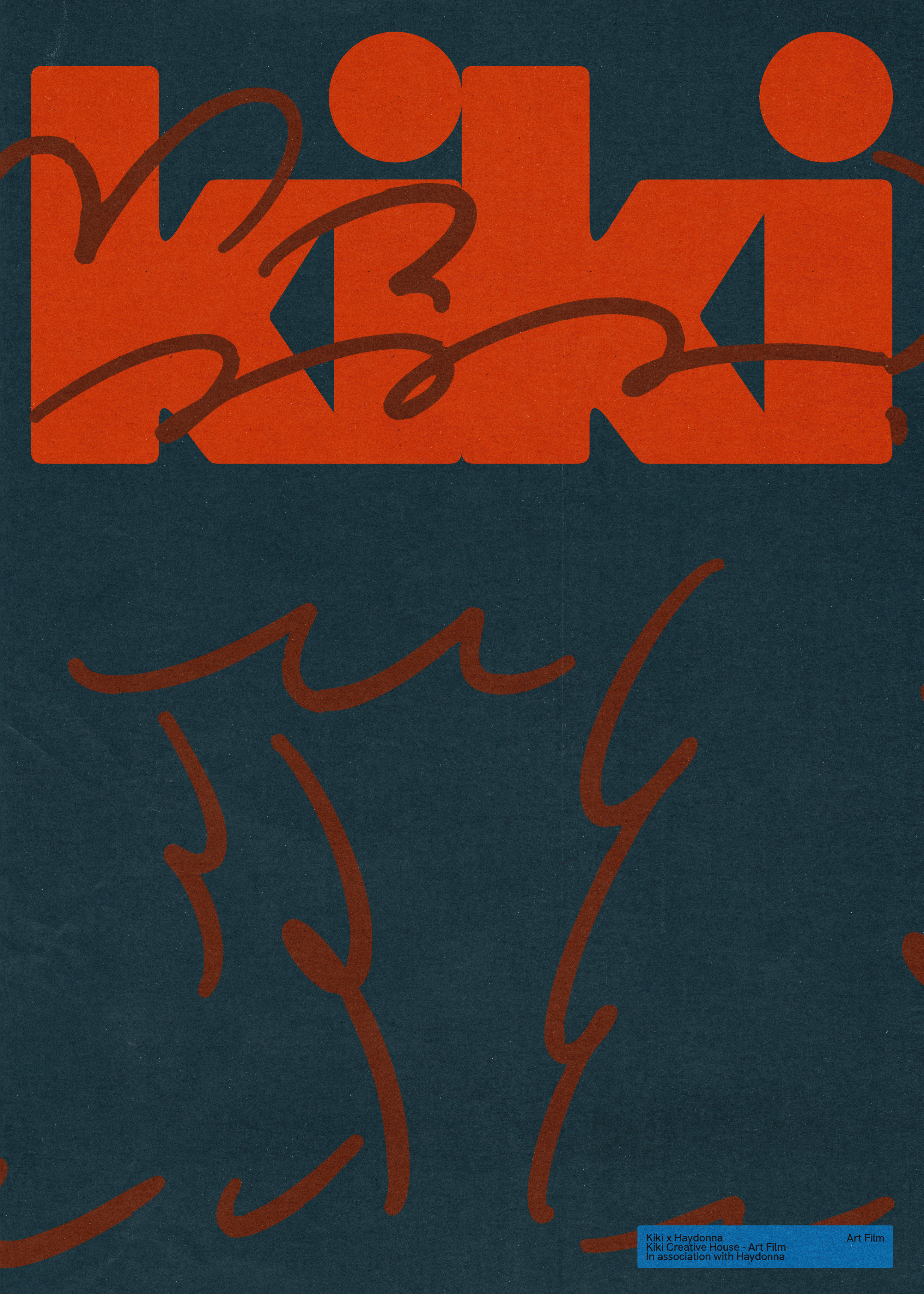
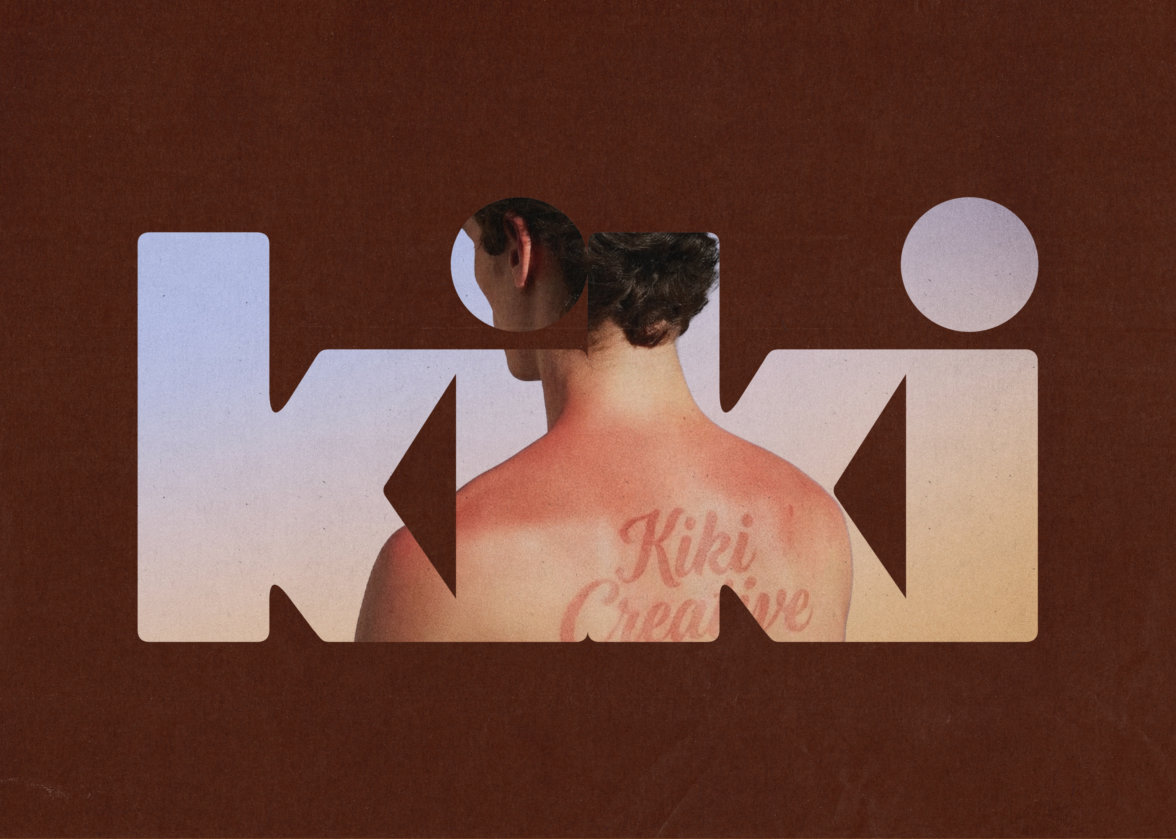
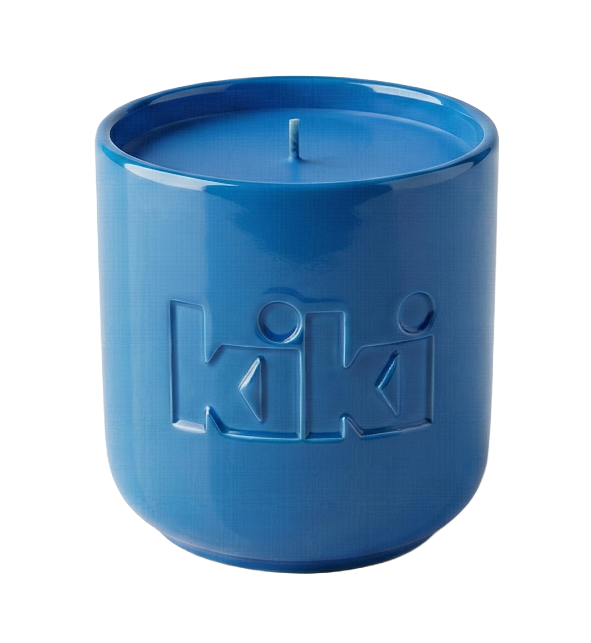
The Connected Letters structure, where each letterform flows naturally into the next, is a structural symbol of the ecosystem KIKI is building: one that links artists, creators, and film. The Bold Structure signals KIKI's intention to stand as a pillar in the independent arts and content industry. And the open space within each letter, Form as a Frame, becomes the canvas that holds the worlds of every production KIKI will create.
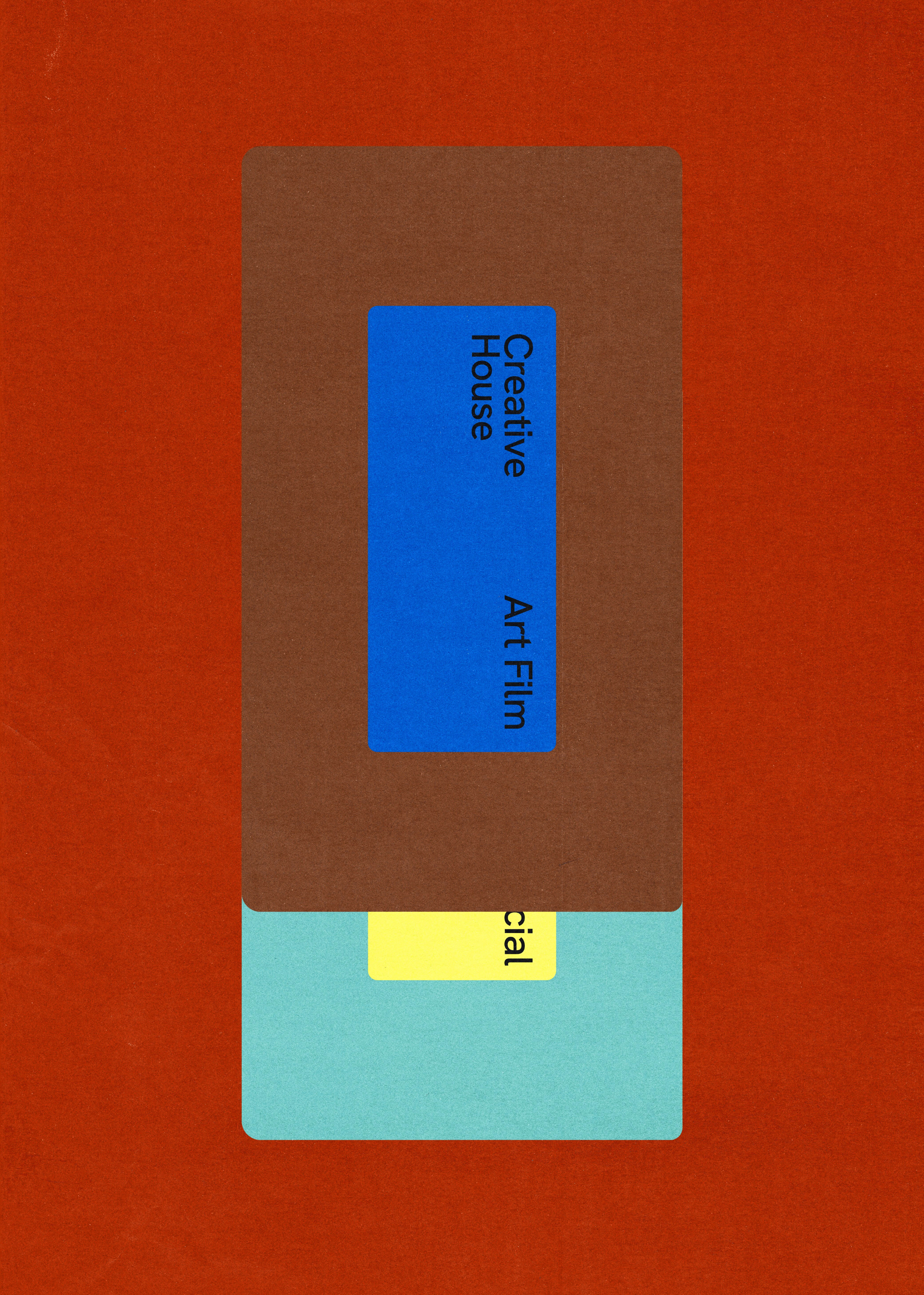
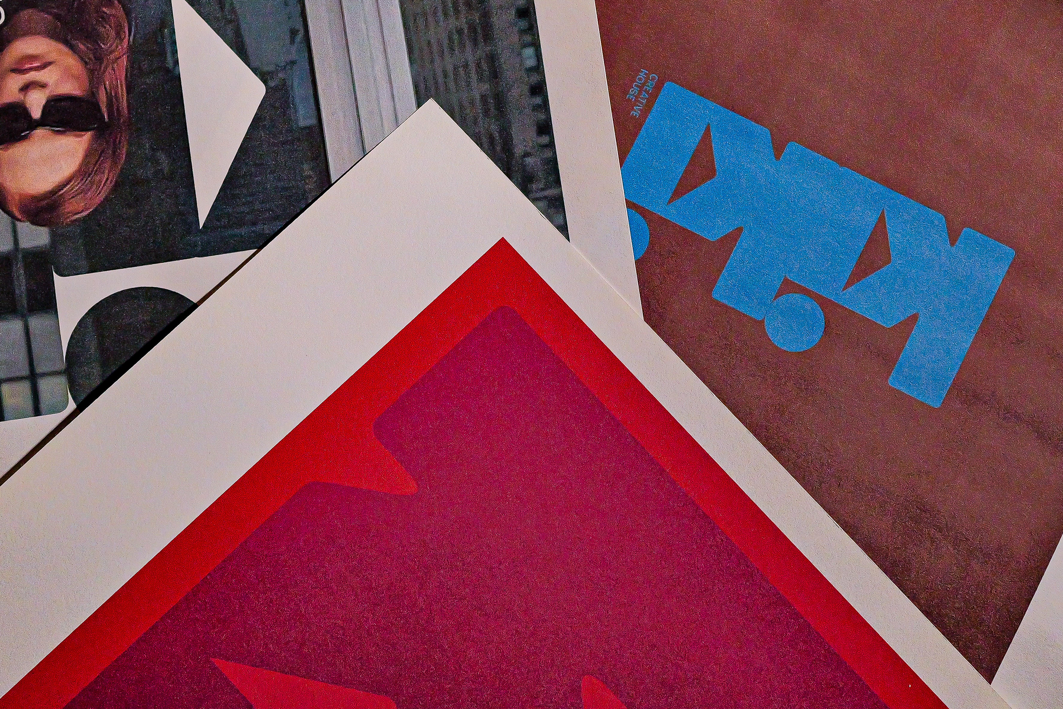
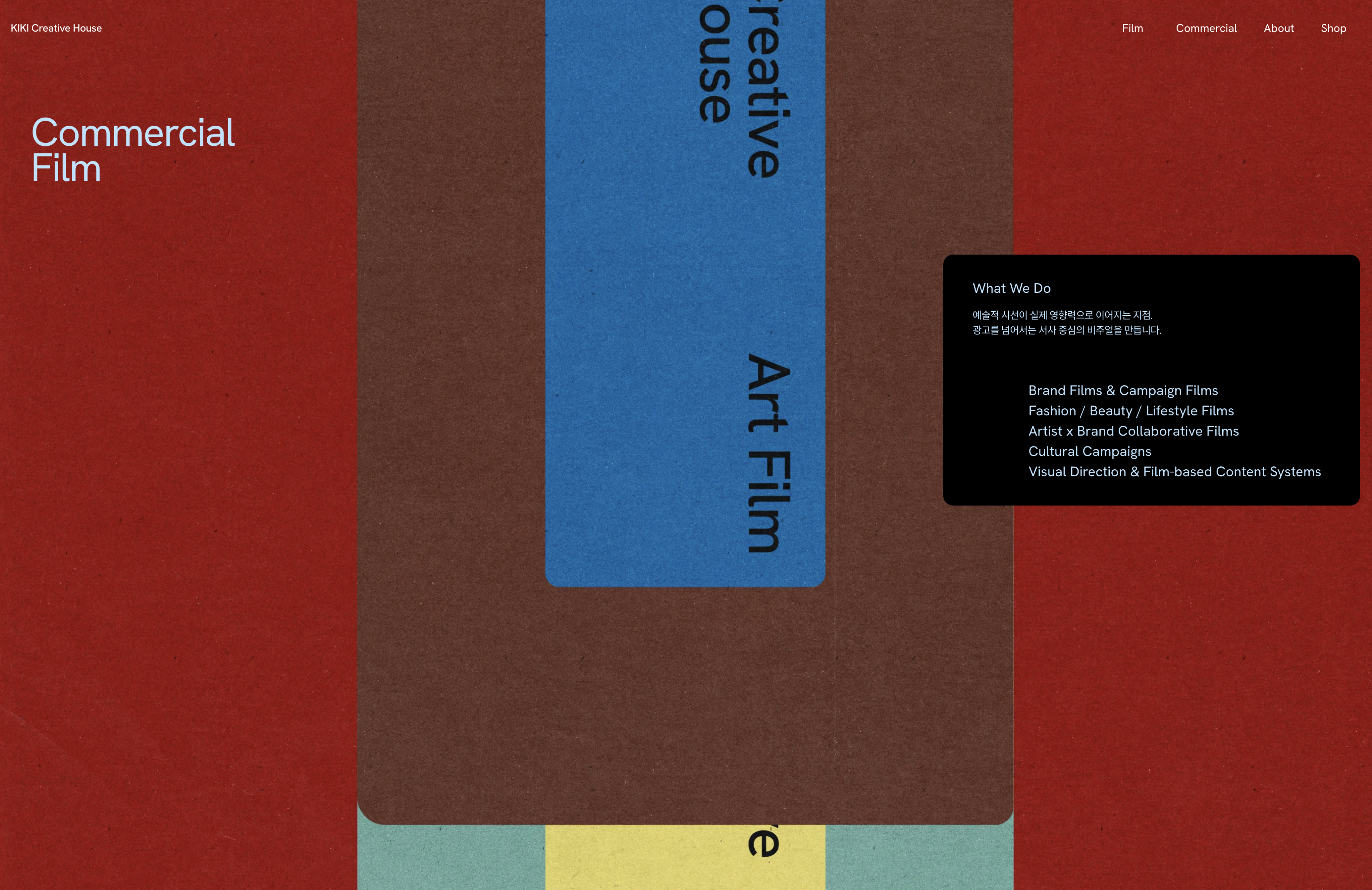
Blue speaks to expansion and possibility. Deep red carries the warmth and force of art. Dark brown grounds the brand in authenticity and depth. The palette is not decorative, it is deliberate. Strong without being loud, present without ornament.
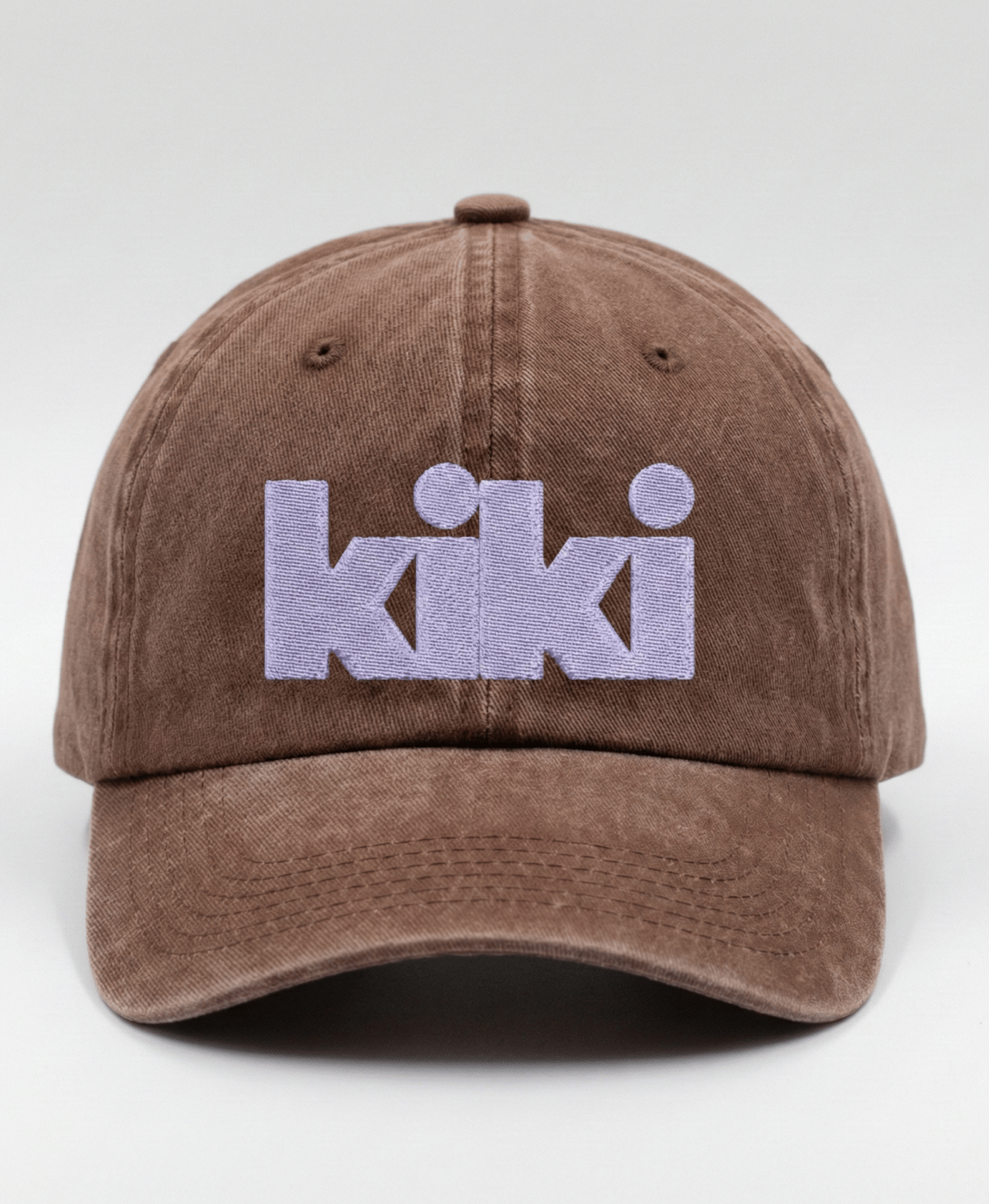
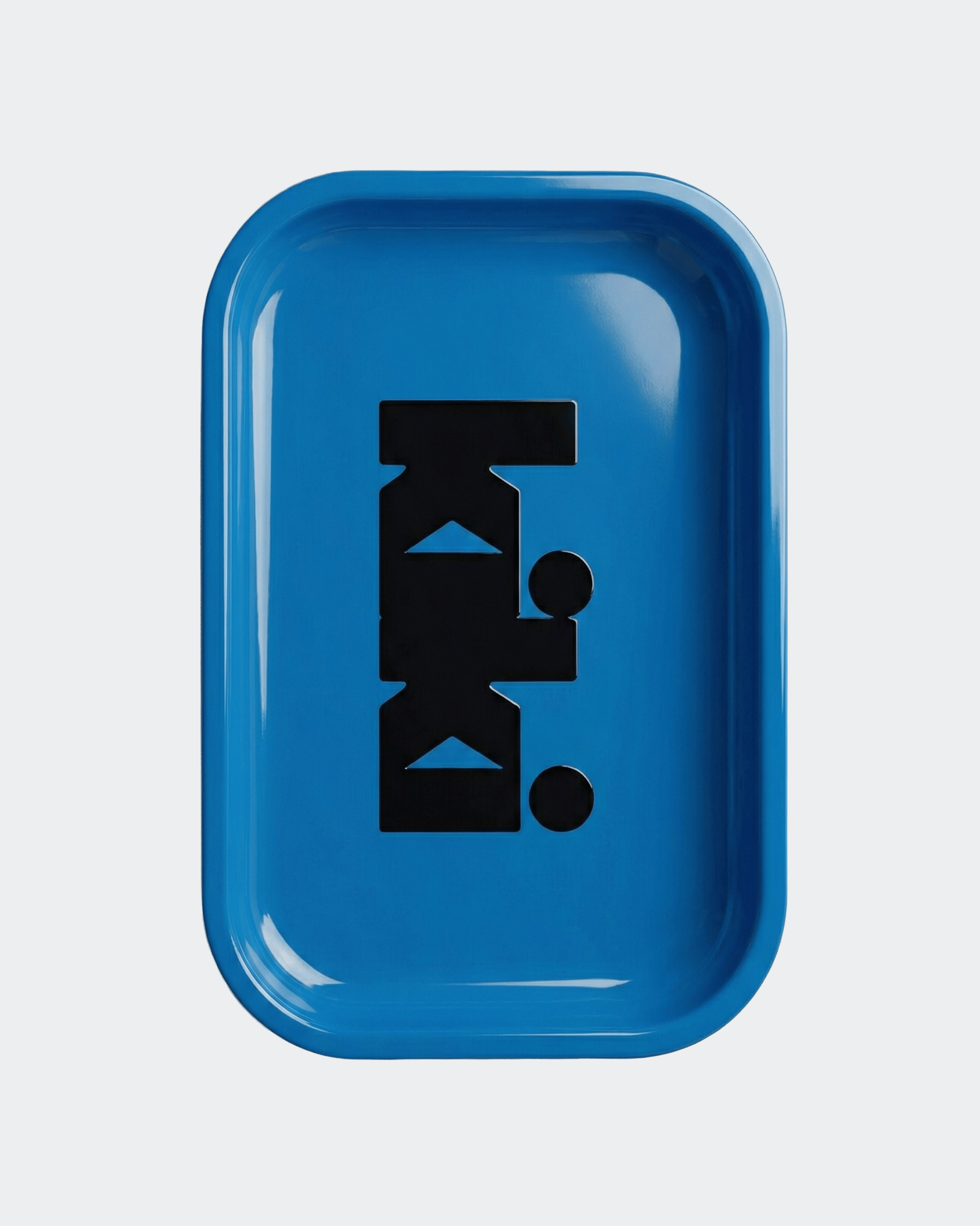
From brand merchandise and company introduction to website, every element was designed as a continuous and coherent system, so that every film and project KIKI creates going forward can grow within a clear and defined identity.
HAY TIN / Creative Base
A503-Sounds Hannam, 35 Daesagwan-ro,
Yongsan-gu, Seoul, 04401
Tel: +82-70-7778-5757
Email: hello@hay-tin.com
©HAYTIN. ALL RIGHTS RESERVED.
en
kr
/
hay TIN
works
about
KIKI Creative House Brand Identity & Positioning
request PRESS FILE
KIKI Creative House is an art film production built to expand artists' worlds through the medium of film.
HAY TIN joined KIKI from the very beginning, designing not just a visual identity, but the entire brand structure that allows this production to define a genre that has never existed before.
Our work went beyond aesthetics. We built the language, positioning, and system that answers the fundamental questions: what KIKI is, why it exists, and how it connects artists, creators, and film.
The Connected Letters structure, where each letterform flows naturally into the next, is a structural symbol of the ecosystem KIKI is building: one that links artists, creators, and film. The Bold Structure signals KIKI's intention to stand as a pillar in the independent arts and content industry. And the open space within each letter, Form as a Frame, becomes the canvas that holds the worlds of every production KIKI will create.
Blue speaks to expansion and possibility. Deep red carries the warmth and force of art. Dark brown grounds the brand in authenticity and depth. The palette is not decorative, it is deliberate. Strong without being loud, present without ornament.
From brand merchandise and company introduction to website, every element was designed as a continuous and coherent system, so that every film and project KIKI creates going forward can grow within a clear and defined identity.
HAY TIN / Creative Base
A503-Sounds Hannam, 35 Daesagwan-ro,
Yongsan-gu, Seoul, 04401
Tel: +82-70-7778-5757
Email: hello@hay-tin.com
©HAYTIN. ALL RIGHTS RESERVED.
← Last Project
next project →
en
kr
/
hay TIN
works
about
KIKI Creative House Brand Identity & Positioning
request PRESS FILE
KIKI Creative House is an art film production built to expand artists' worlds through the medium of film.
HAY TIN joined KIKI from the very beginning, designing not just a visual identity, but the entire brand structure that allows this production to define a genre that has never existed before.
Our work went beyond aesthetics. We built the language, positioning, and system that answers the fundamental questions: what KIKI is, why it exists, and how it connects artists, creators, and film.
The Connected Letters structure, where each letterform flows naturally into the next, is a structural symbol of the ecosystem KIKI is building: one that links artists, creators, and film. The Bold Structure signals KIKI's intention to stand as a pillar in the independent arts and content industry. And the open space within each letter, Form as a Frame, becomes the canvas that holds the worlds of every production KIKI will create.
Blue speaks to expansion and possibility. Deep red carries the warmth and force of art. Dark brown grounds the brand in authenticity and depth. The palette is not decorative, it is deliberate. Strong without being loud, present without ornament.
From brand merchandise and company introduction to website, every element was designed as a continuous and coherent system, so that every film and project KIKI creates going forward can grow within a clear and defined identity.