hay TIN
works
about
en
kr
/
Kriv skincare brand
Brand Identity, Package & graphic system
request PRESS FILE
Apigena™, KRIV's proprietary ingredient technology, begins with plants such as celery and chamomile. We chose not to put those plants on the page. The moment a raw material is shown as itself, the only thing a brand can talk about is where it came from.
What KRIV works with is not the plant, but the structure that ingredient builds inside the skin. So the first question of this project was not the logo, it was the point of view. How does KRIV see the world, why does it design this way, and how does that work inside someone's daily life.
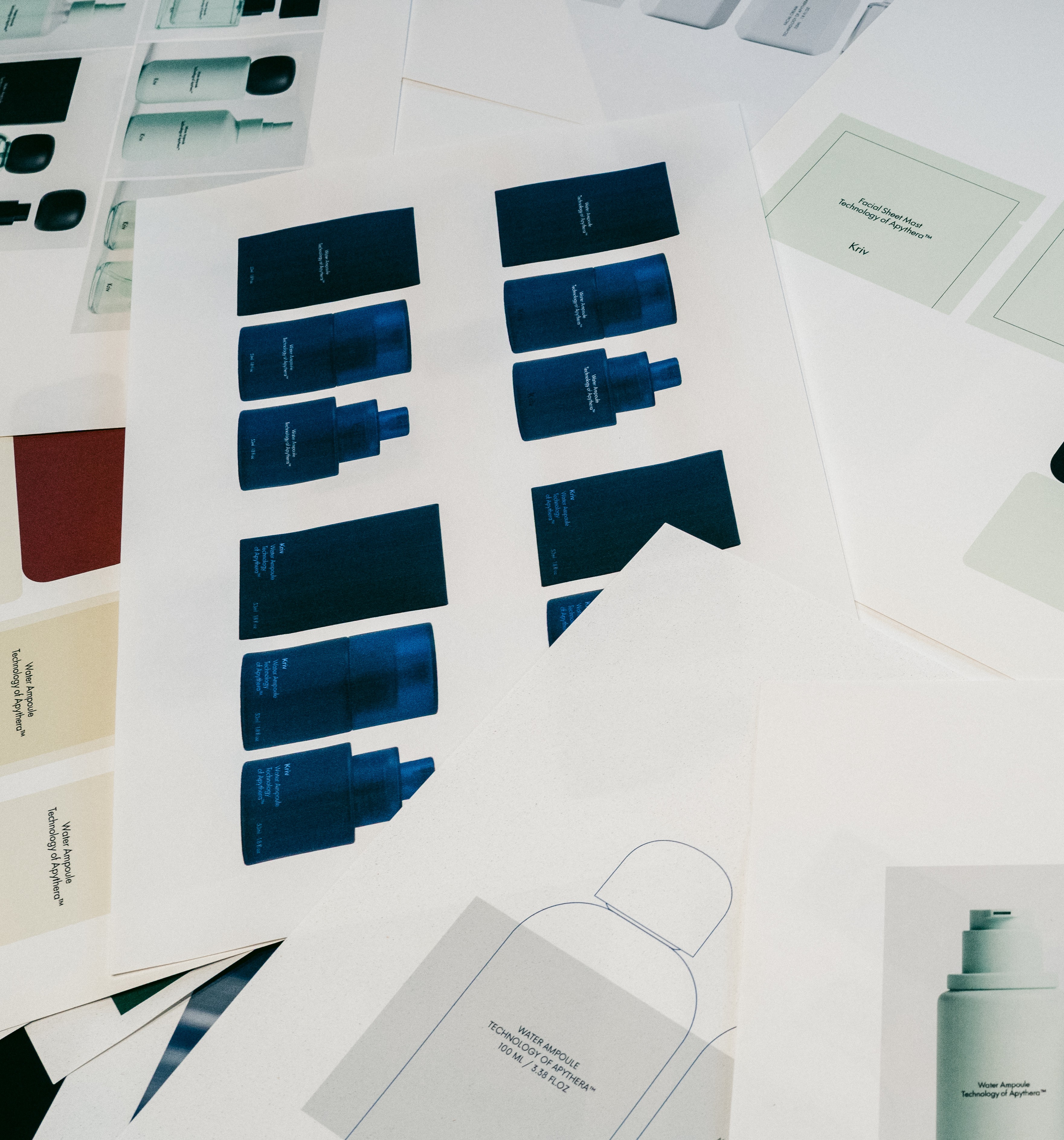
We built the answer on four axes: Technology, Design, Human, Everyday Life. Technology should sit inside as firm structure while remaining quiet at the surface. Design should support presence rather than announce it. When the two meet a person's day, skincare stops being a task and becomes a habit.
Skincare frames the beginning and the end of a day. In a place with no reason to perform, the work of design is not to interrupt the routine. This principle became the filter every later decision had to pass through.
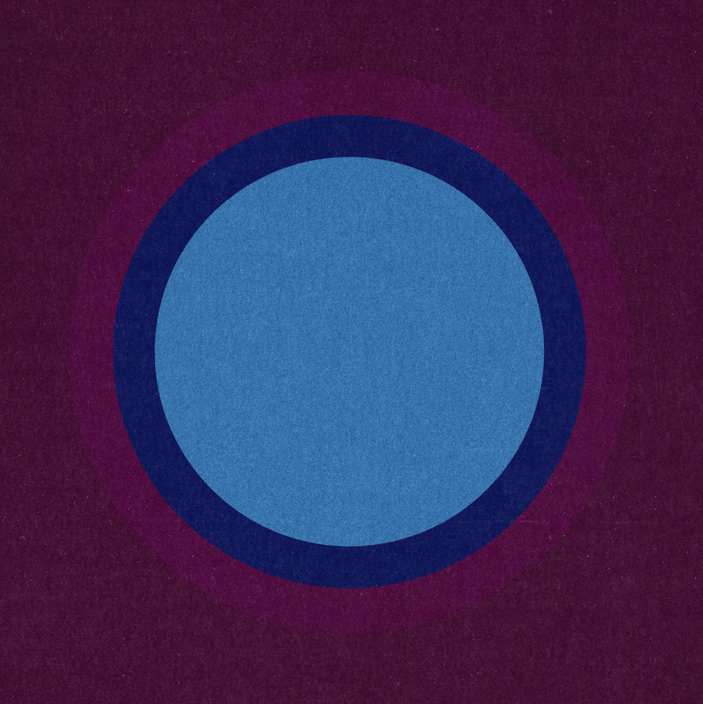
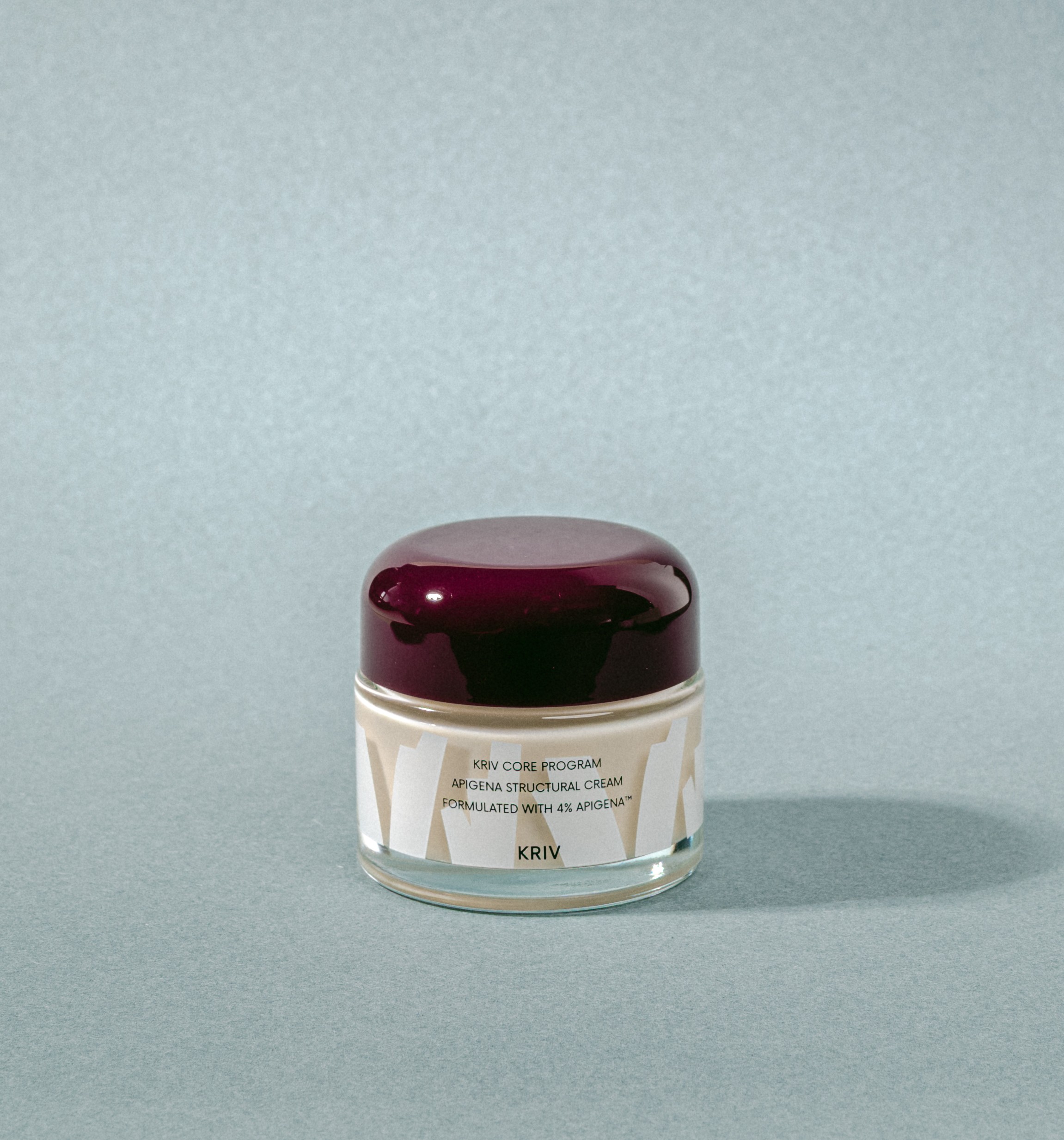

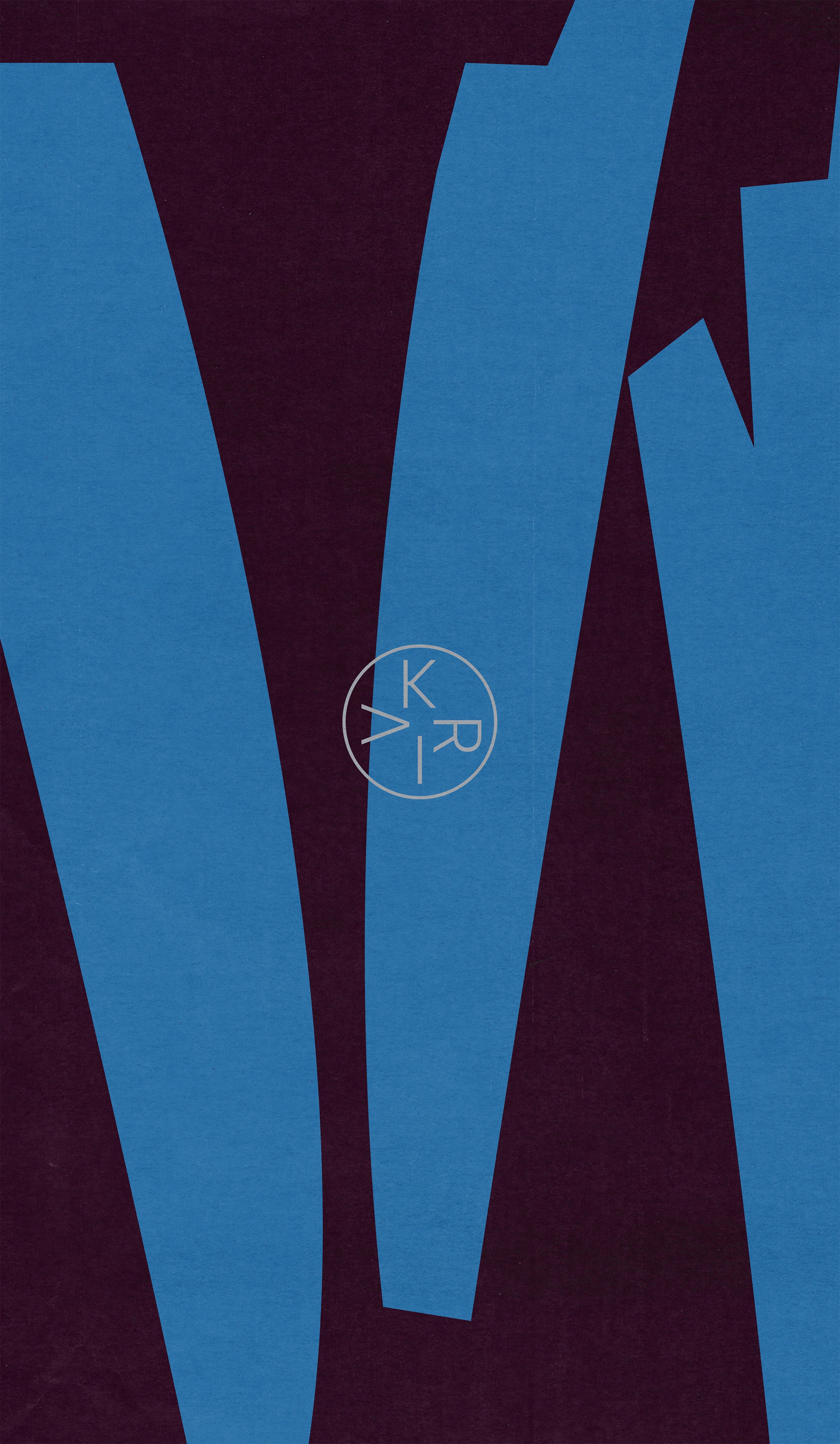
The graphic motif translates that point of view into visual language. The circle is the unit of the ingredient and the balance the skin is trying to return to. Overlap is the layering that runs from surface to depth. Repeated intervals make rhythm. Ingredient imagery is reduced to line, grain and layer, showing not what the material looks like but what it does.
The circular dot at the top of the bottle is where the system condenses into a single object. Standing for a particle of Apigena™, it is always used as a complete circle in a single colour, and never repeated as a pattern. It works as an anchor only when it stays rare.
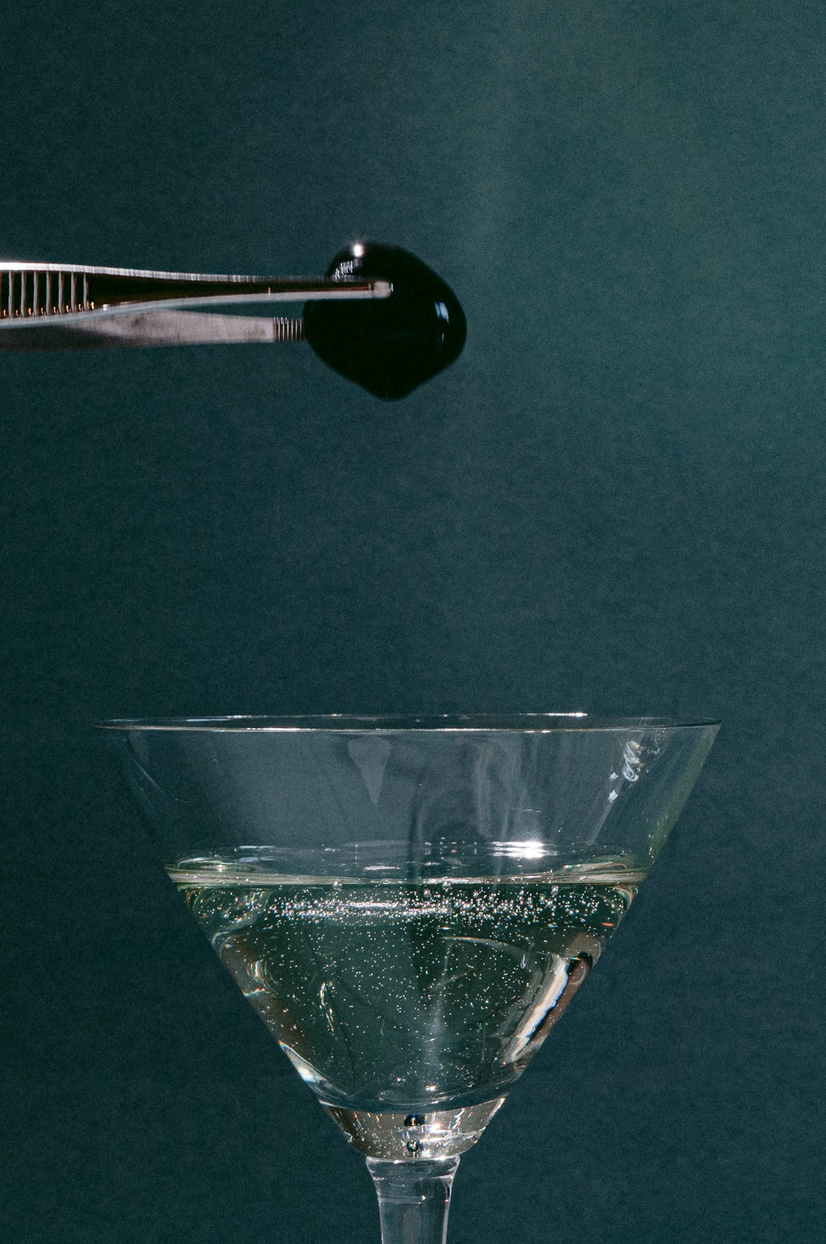
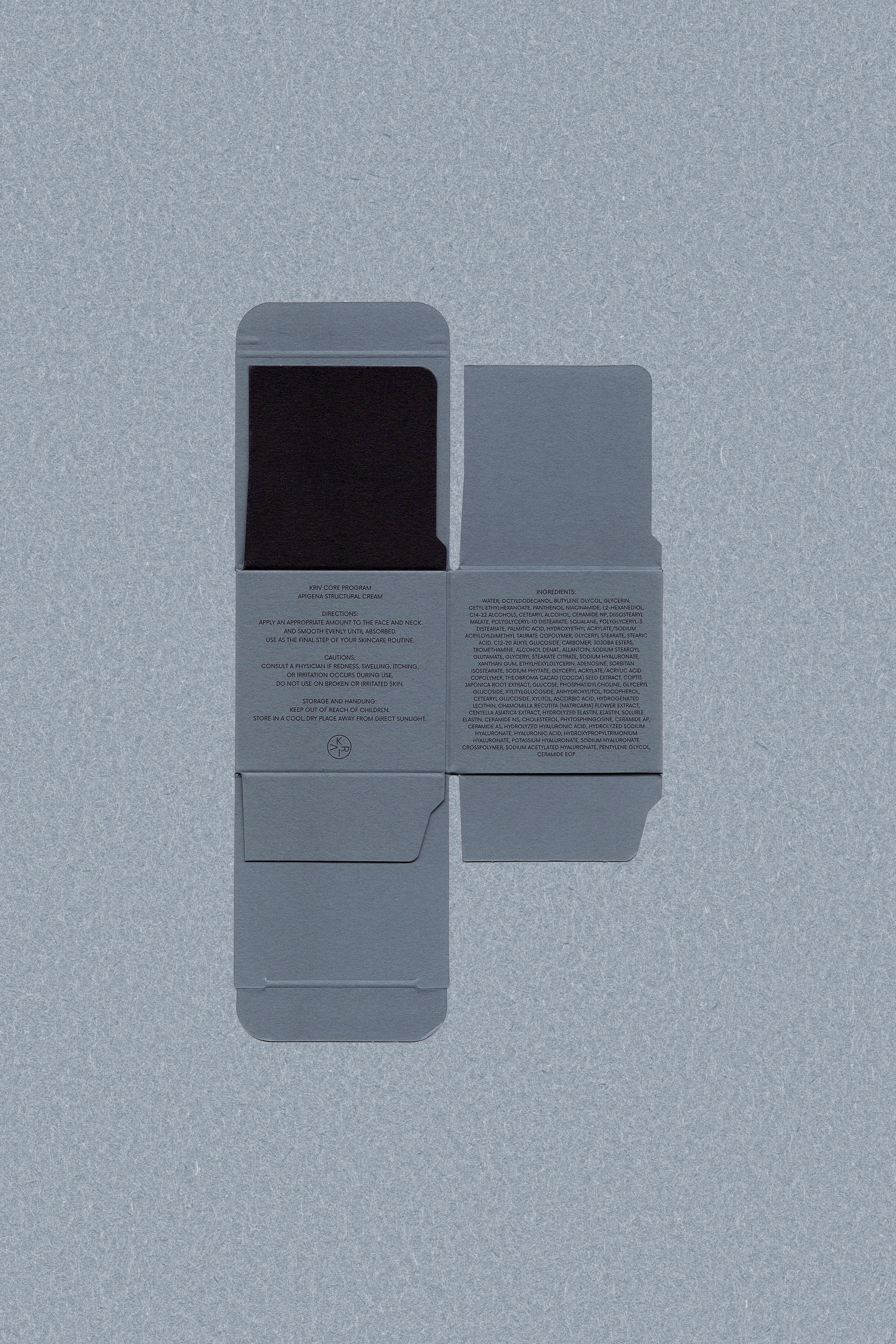
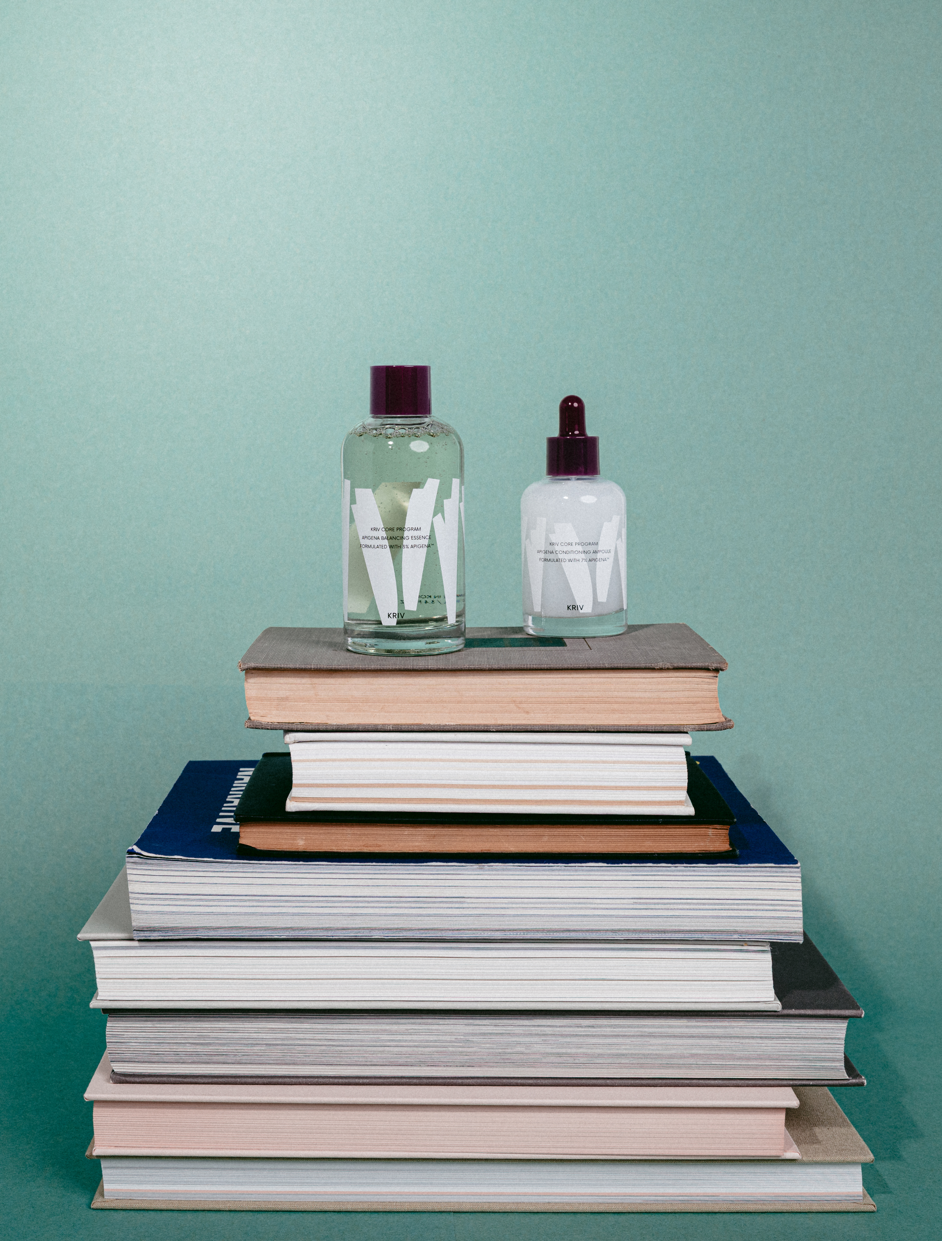
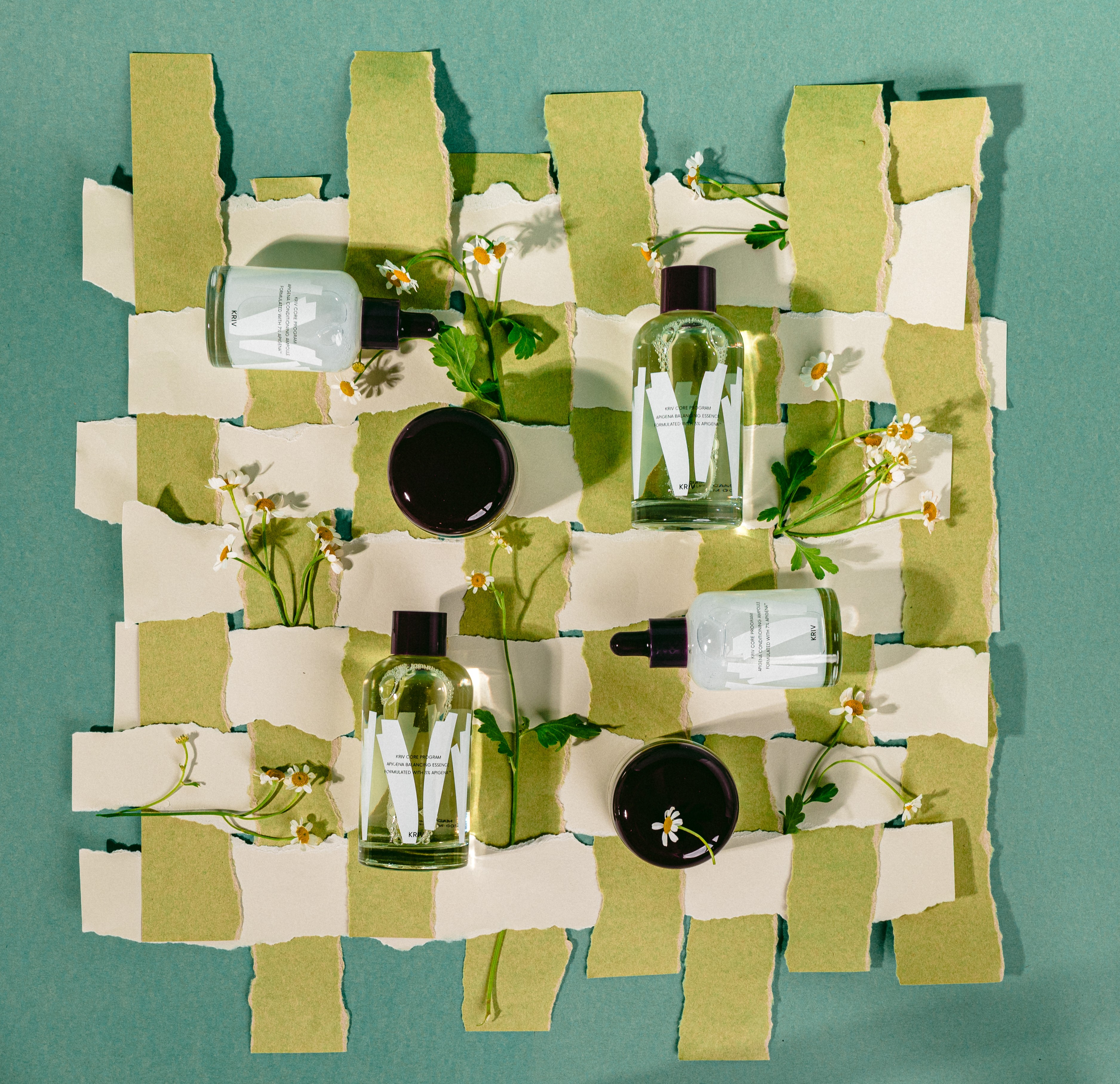
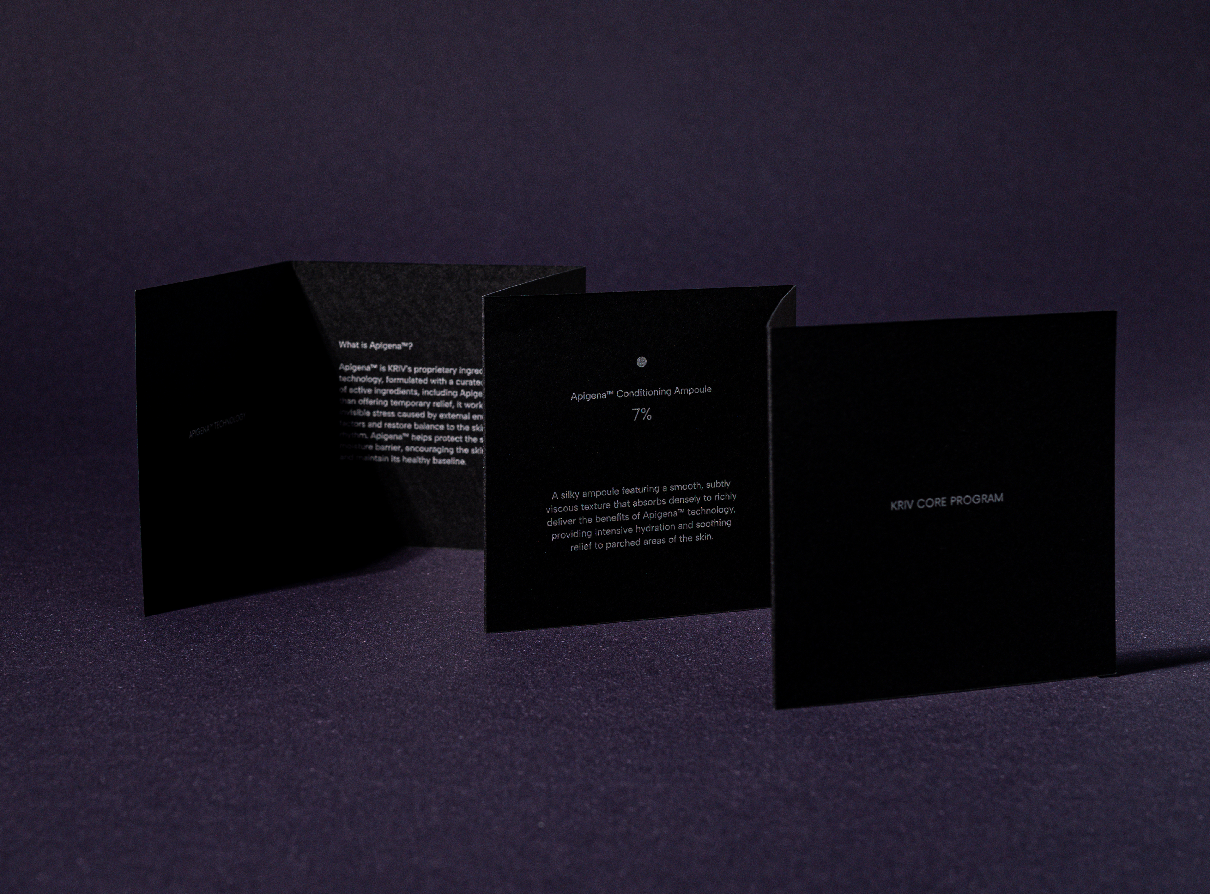
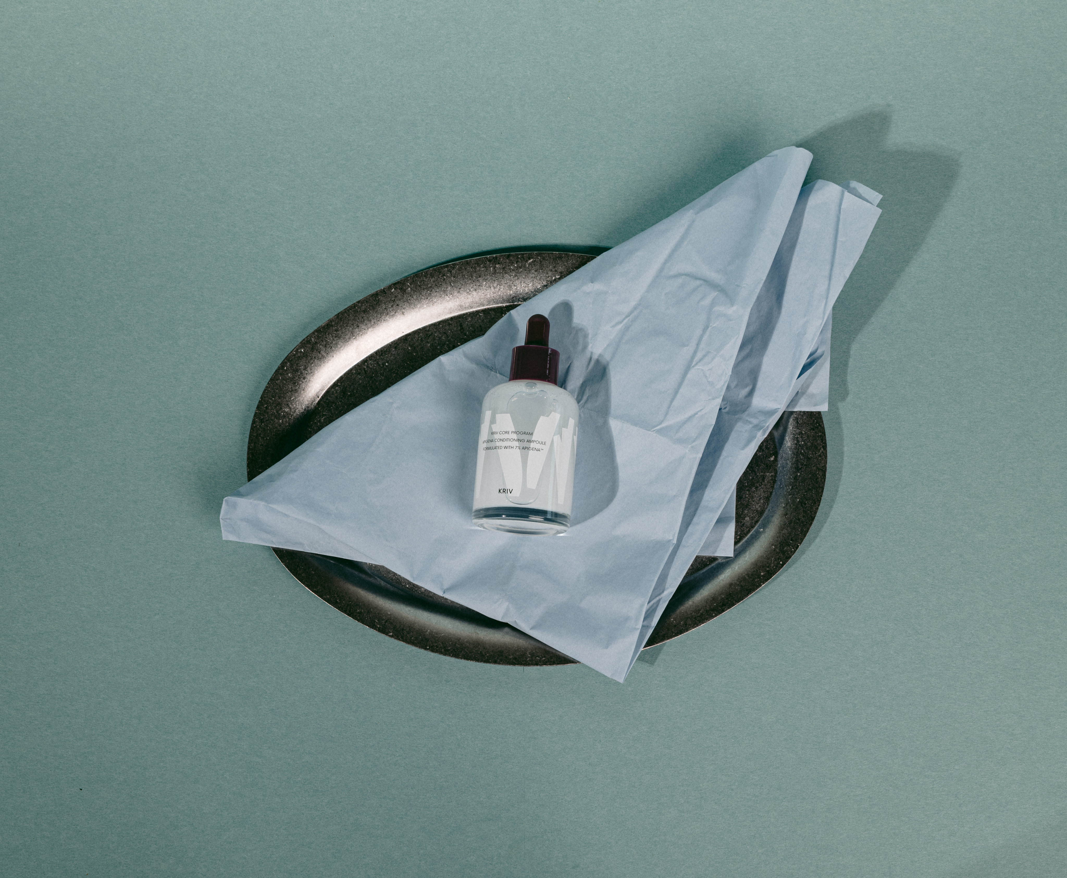
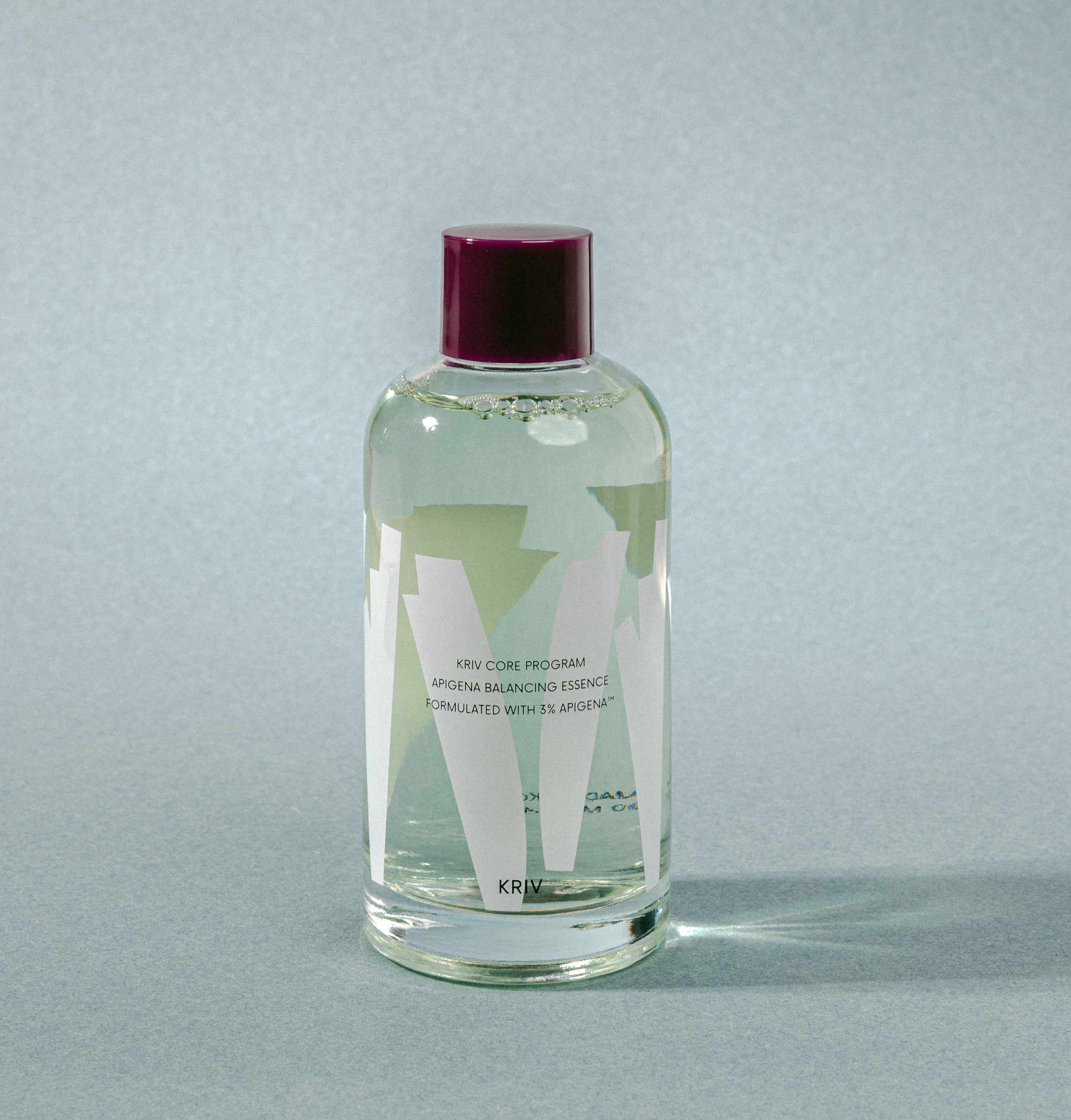
The final vessel is clear glass, carrying a two-colour silkscreen. The graphic motif is printed first, and typography is laid on top of it. The layered structure of skin we had been describing becomes the physical order of the printing process itself.
The bottle is therefore read by the fingertips before the eyes. Run a hand across the surface and the fine relief of the pattern comes through, with the layer of text registering one degree above it. It is a way of delivering through touch what had until then been explained as a concept, and the point we held as most important in the packaging.
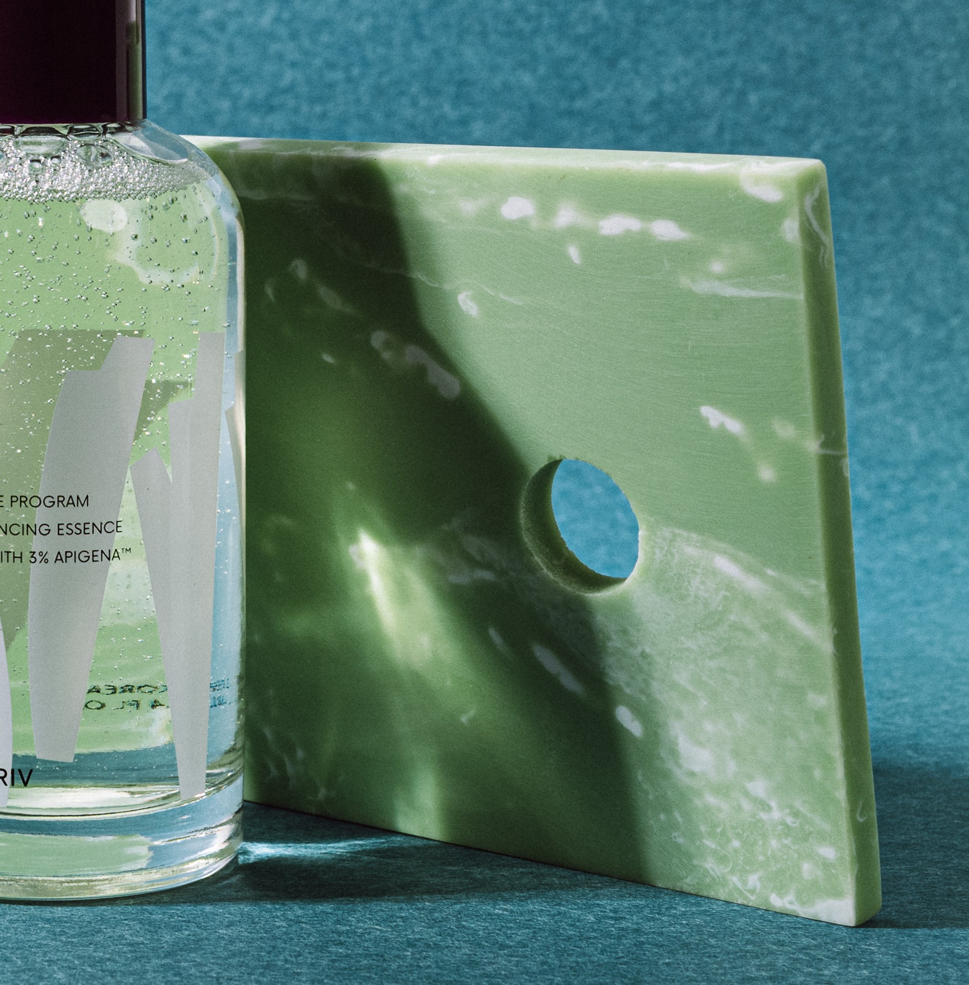
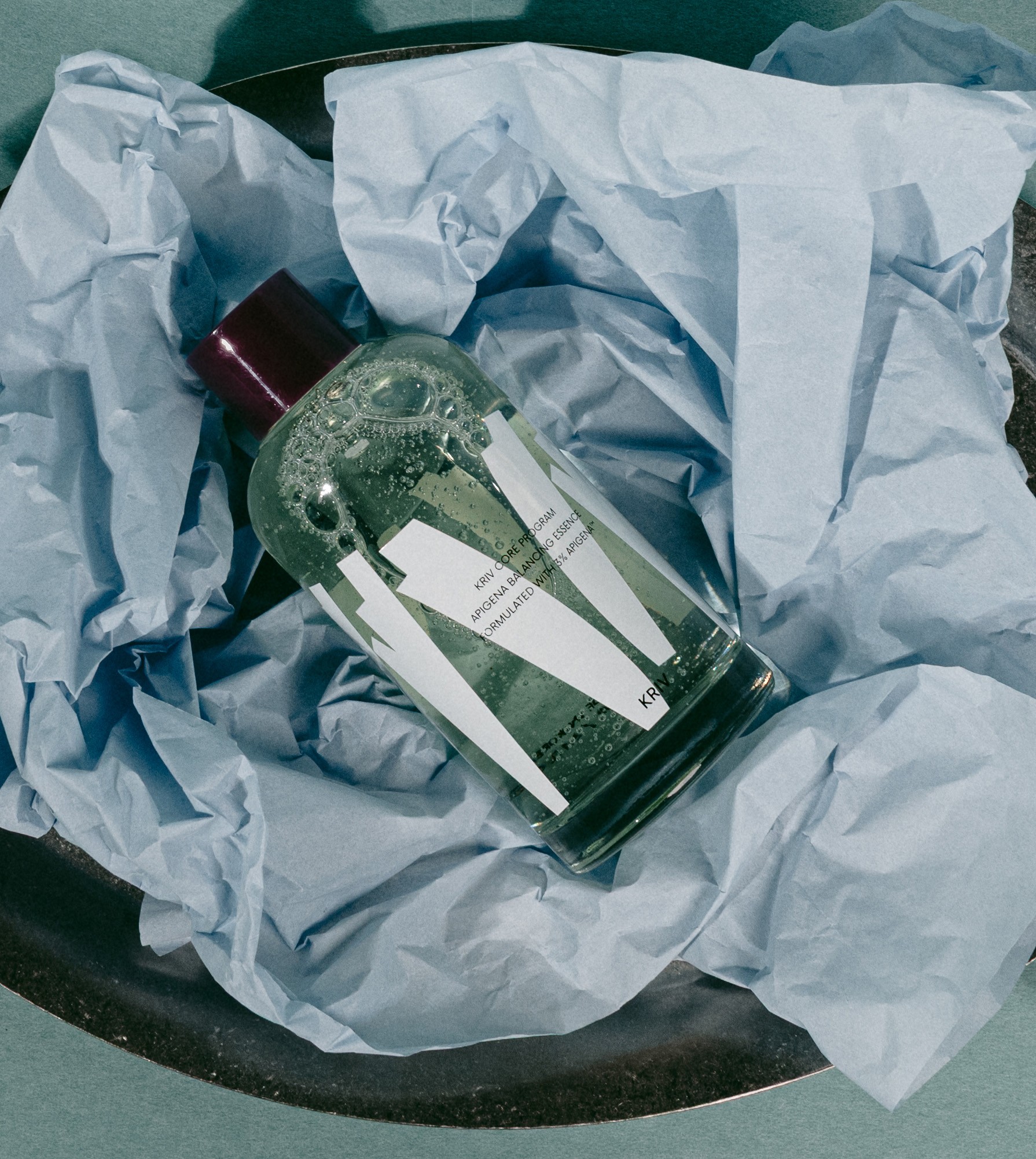
The colour of the formula was treated as part of the system. The faint green of the essence is a value calibrated to hold its place between clear glass and white graphics without breaking the brand's tone. Shake the bottle and pale green bubbles rise in layers, the moment a static graphic moves as actual rhythm.
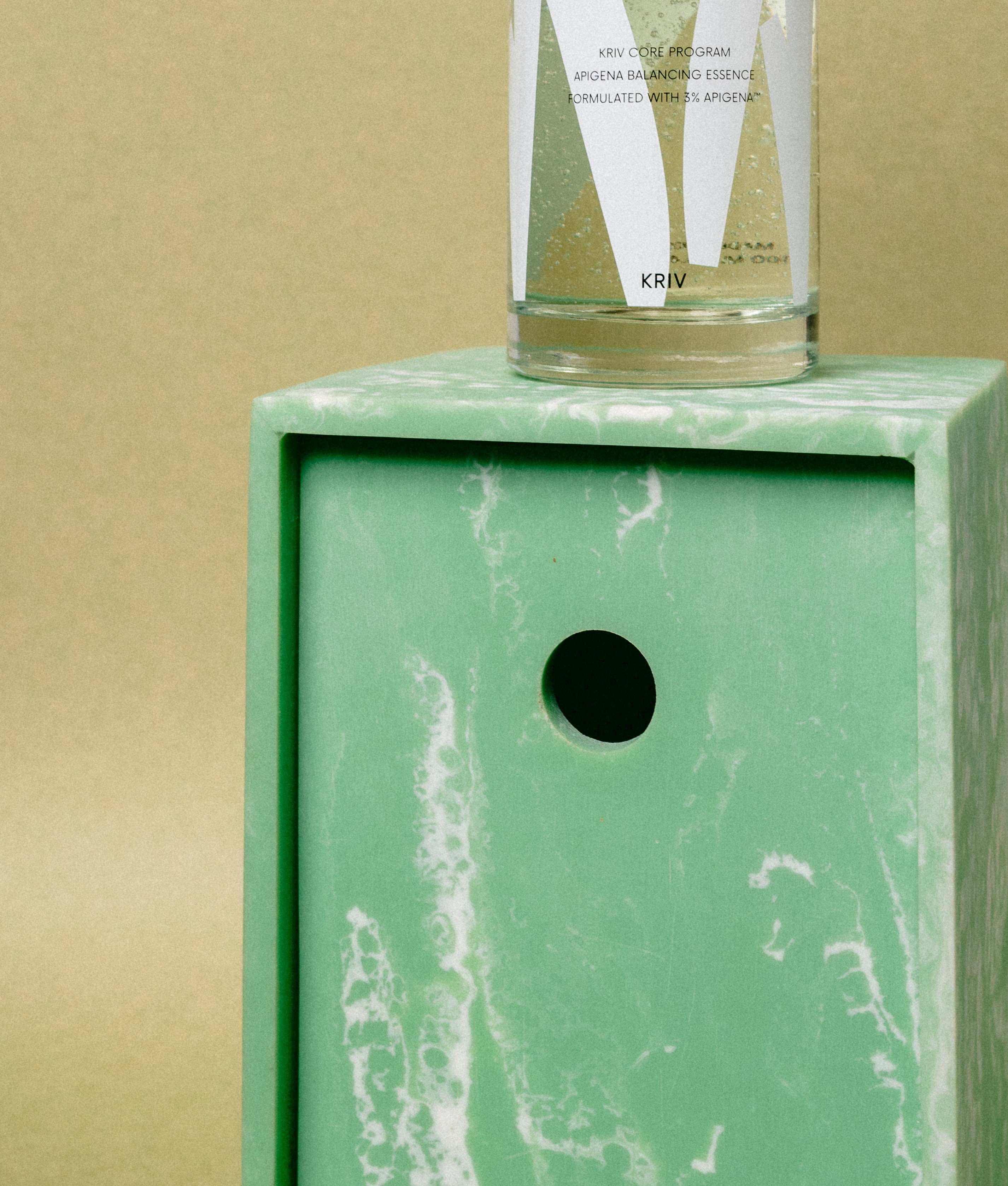
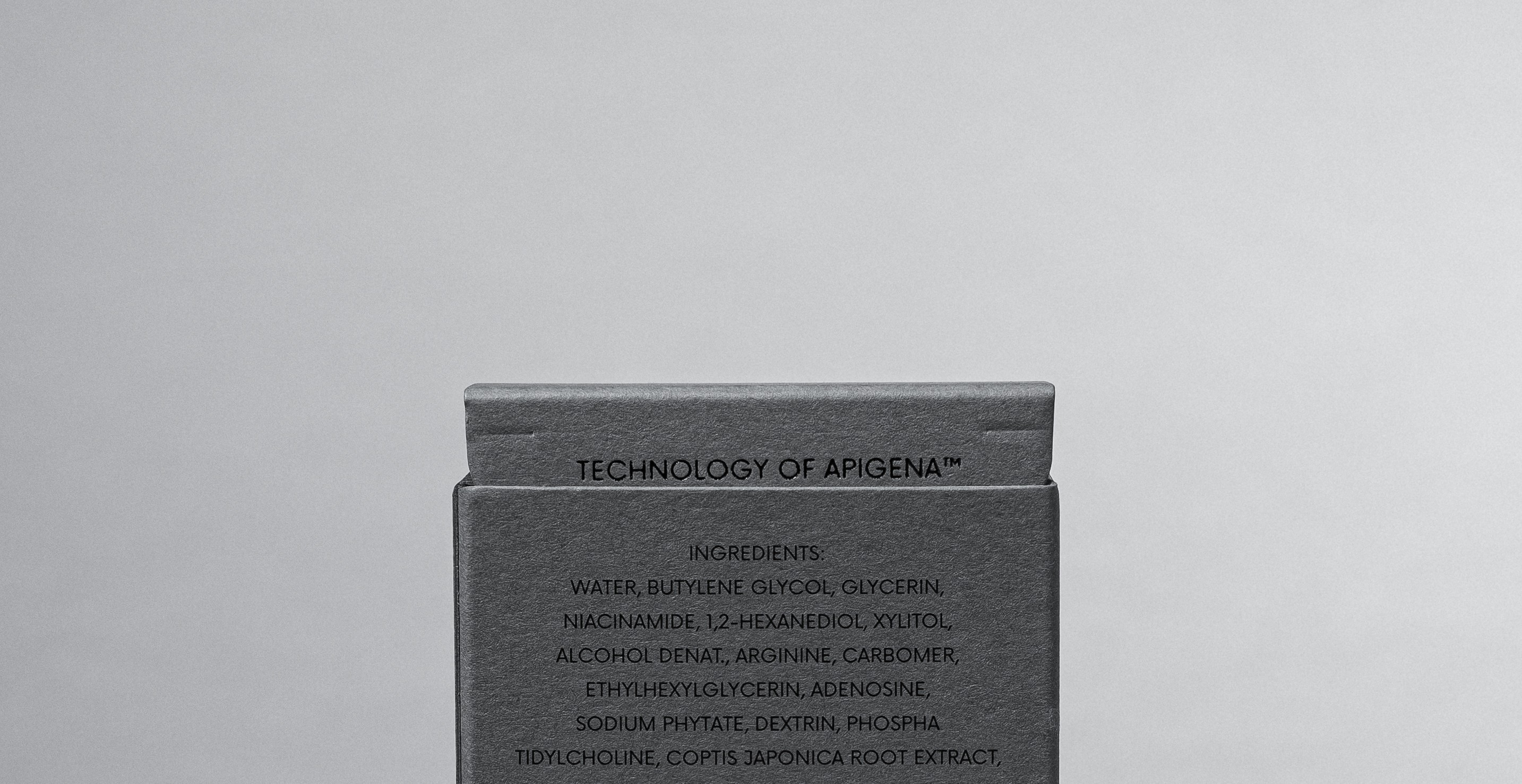
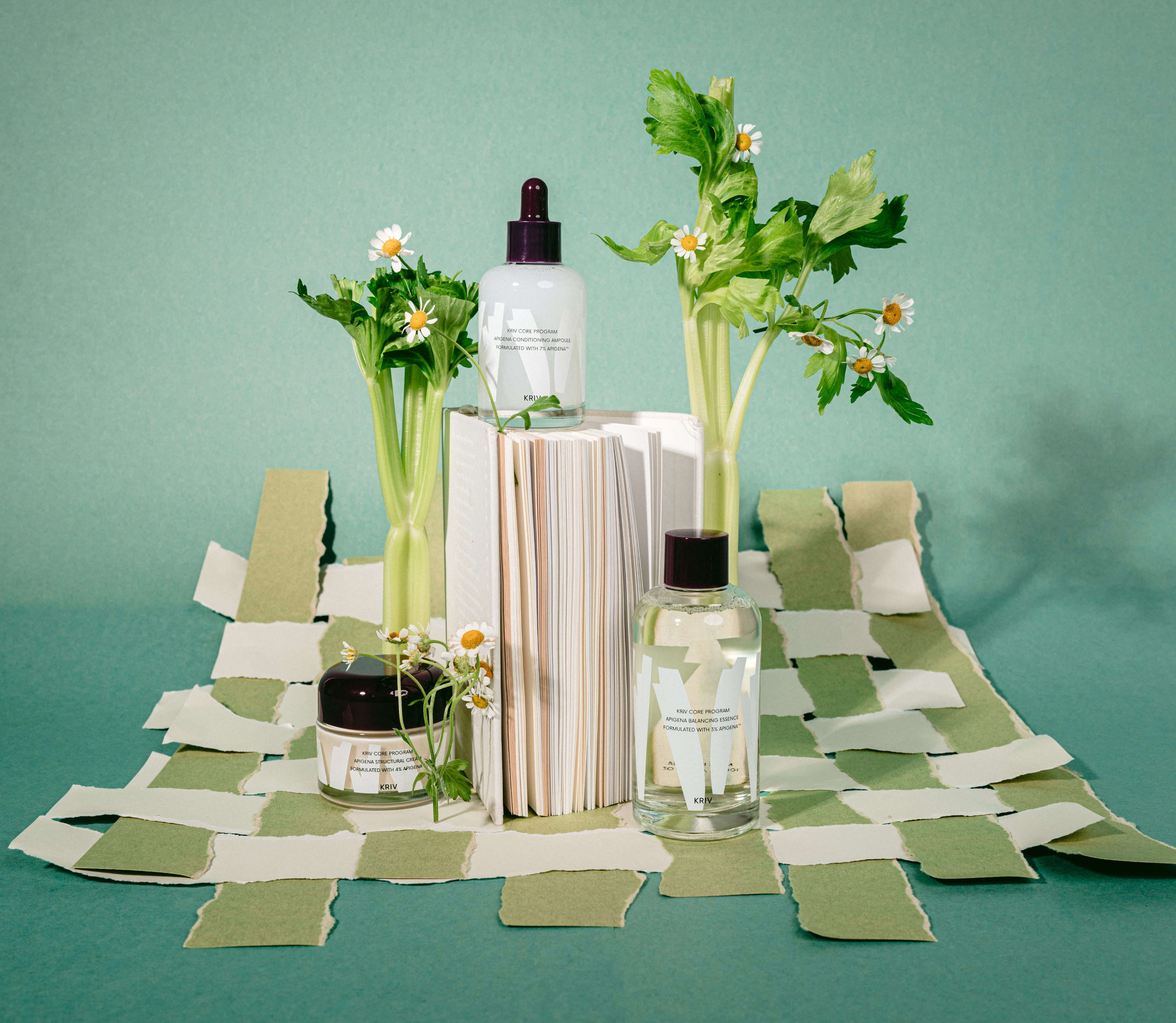
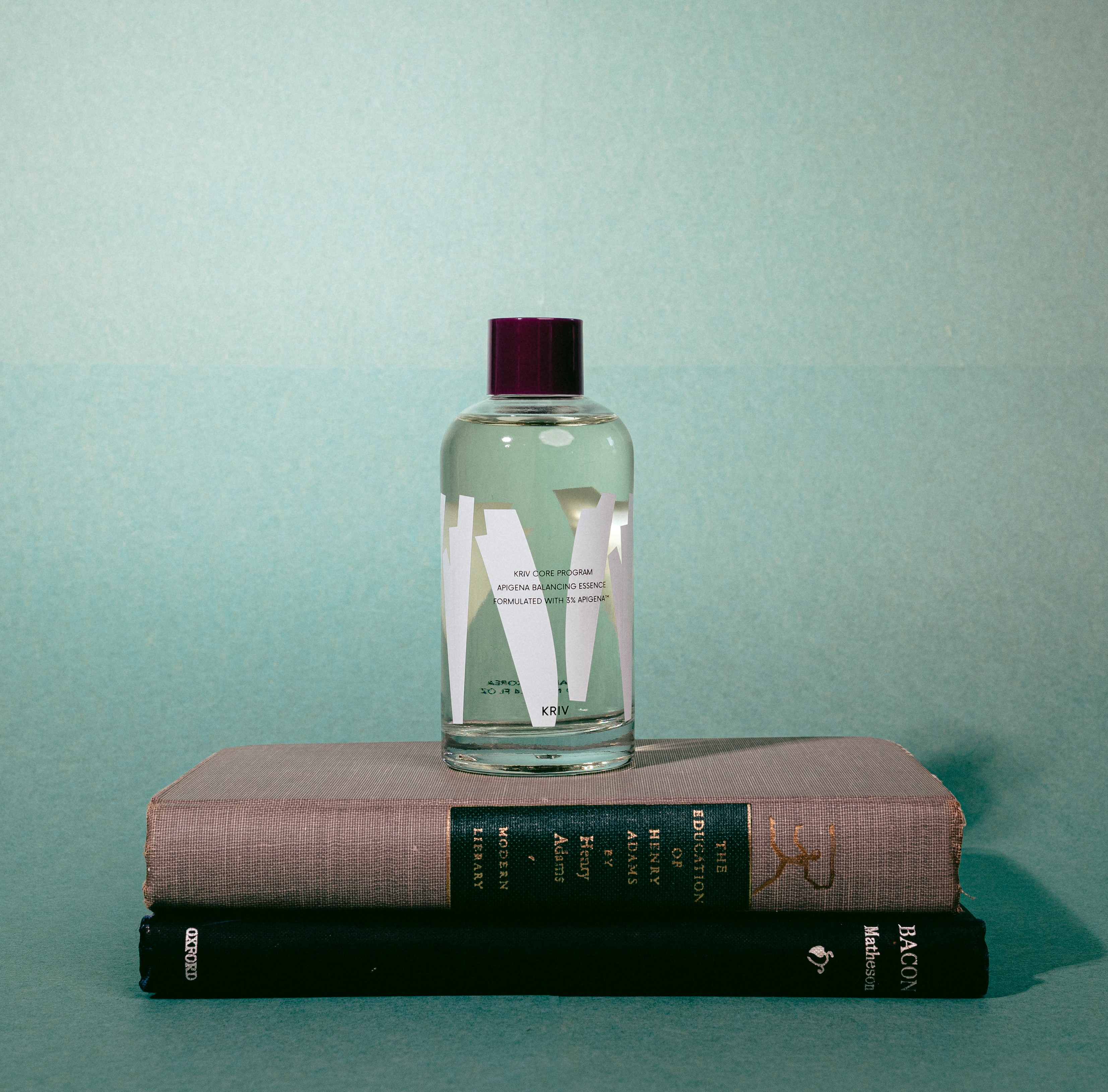
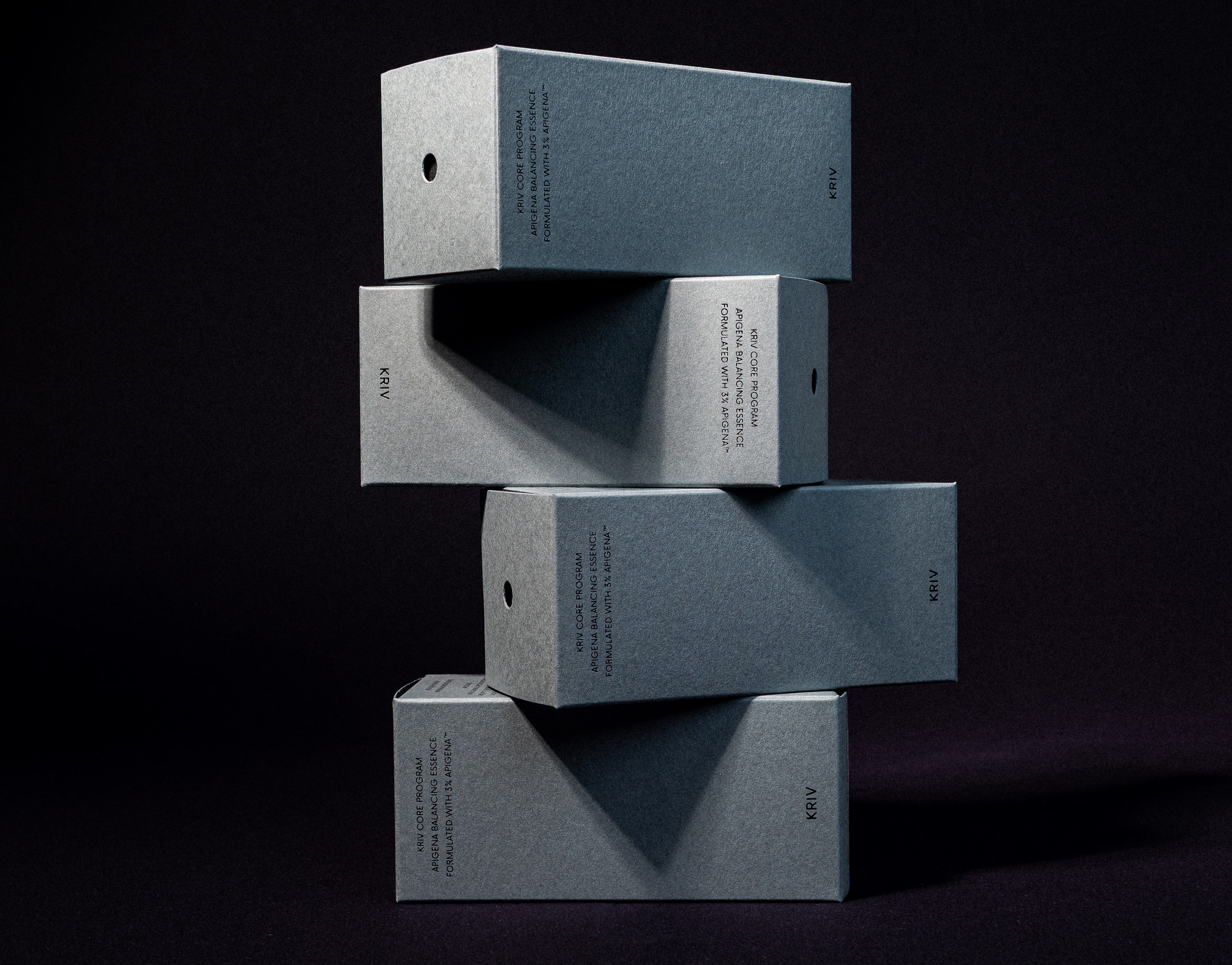
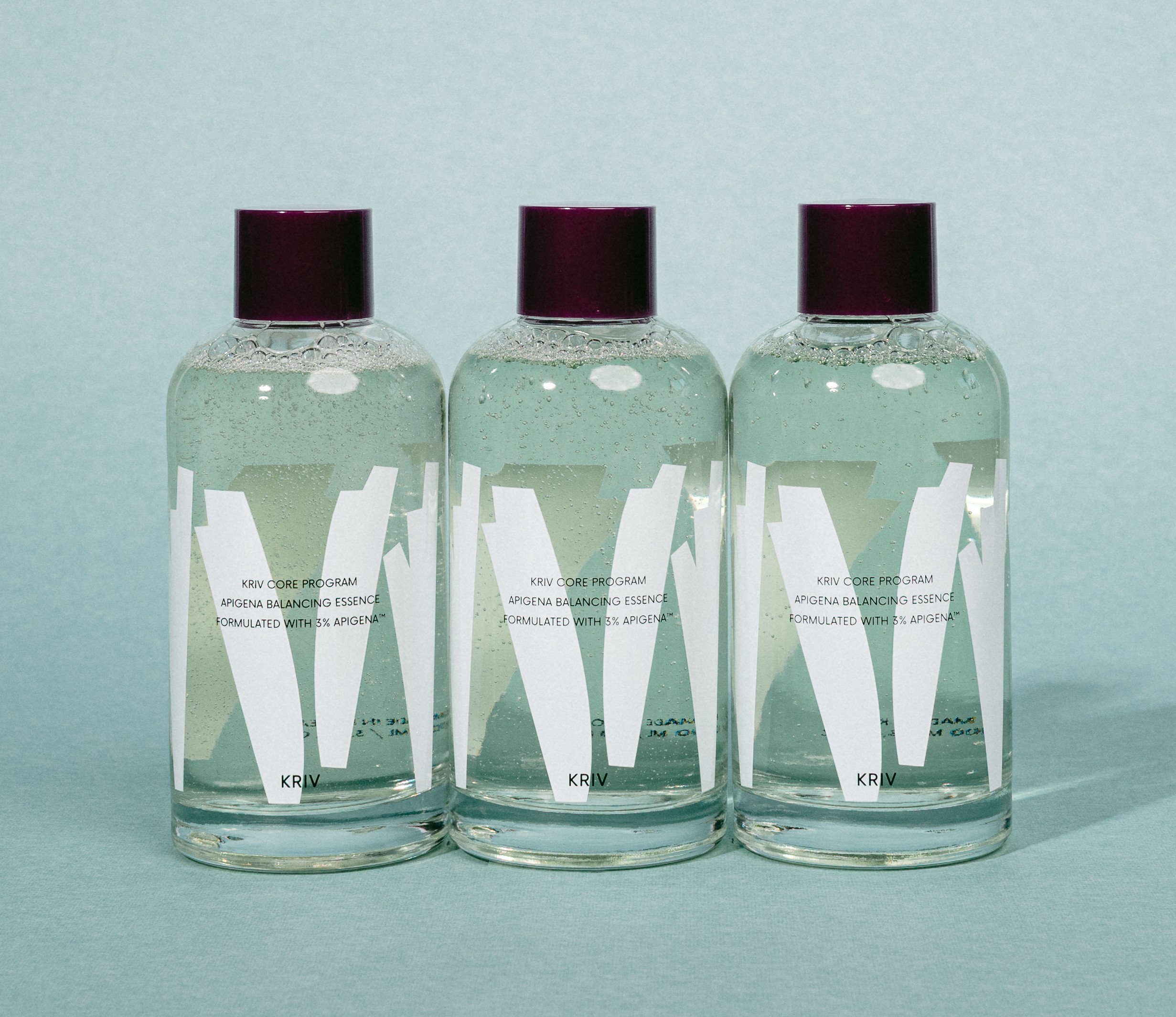
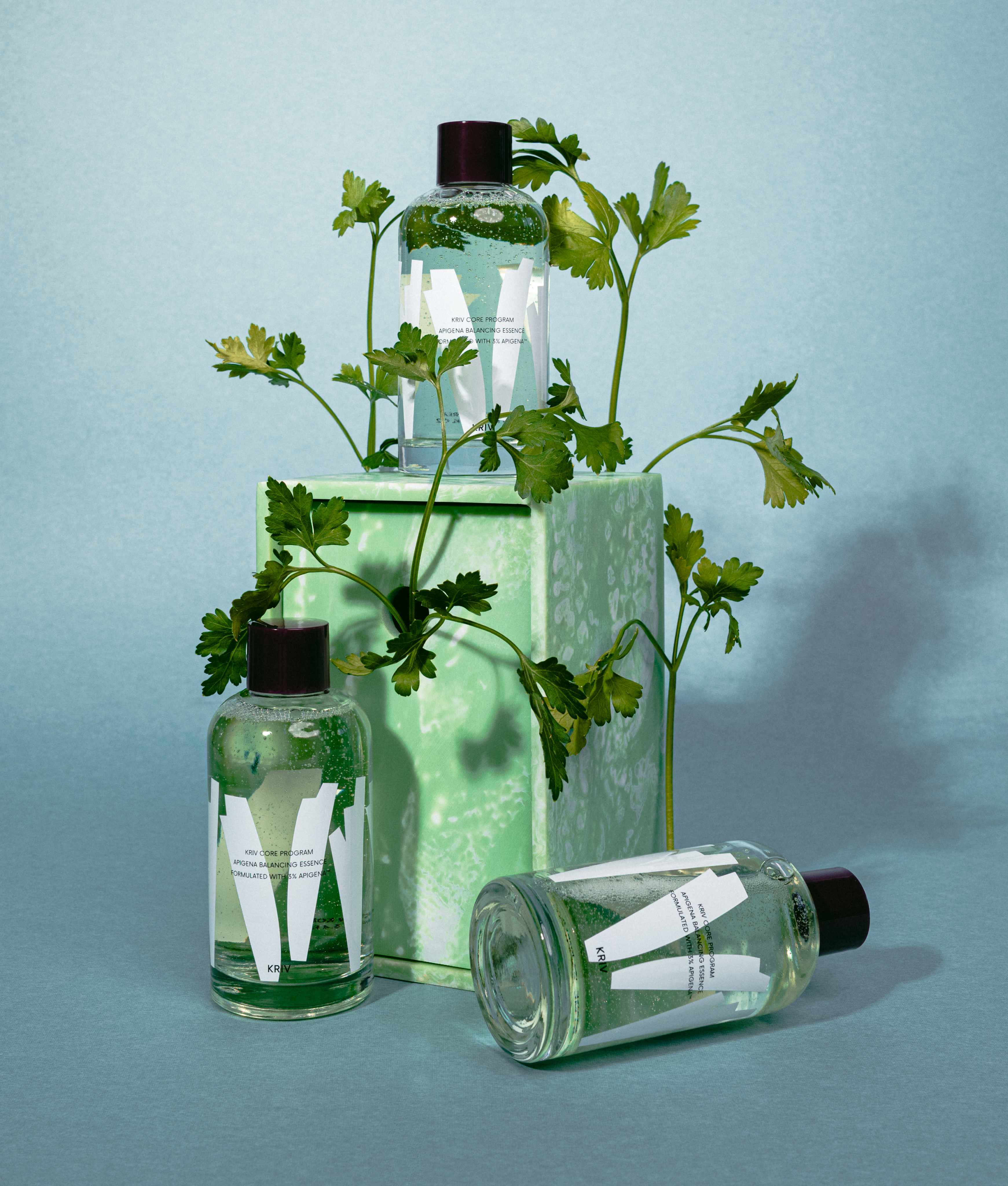
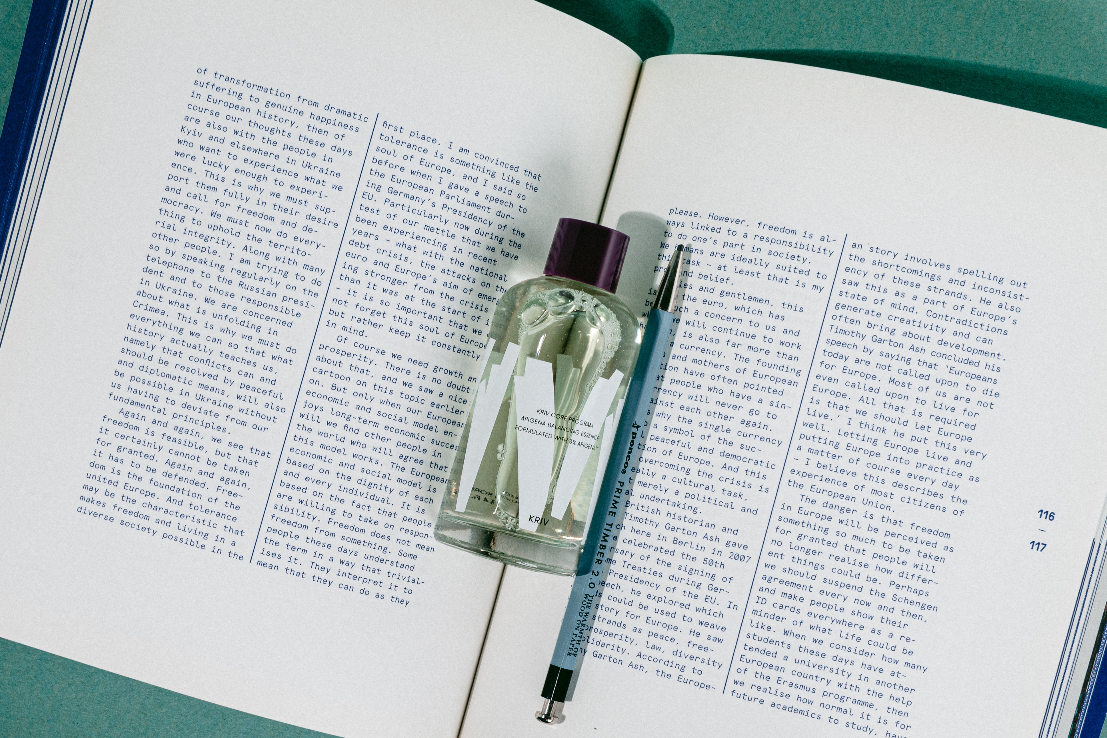
The images on this page were produced entirely by HAY TIN, from set design through art direction to photography. The work was made to see how the system we designed behaves on the actual object, and how it moves in someone's hands.
Skincare is a deeply private act. It is a ritual shown to no one, the opening and closing of a day, a process repeated daily yet registering a different state each time. We took that duality as the premise of the shoot.
The thickness of the glass, the relief of the printed layers, the bubbles the green essence forms. We chose to draw not the ingredient but what the ingredient does, and that decision is finally confirmed in these frames. Familiar because it repeats, new because it differs each time. rhythm is not a concept to be explained but a state to be sensed. We recorded, in our own view, the point where the concept completes itself as material.
HAY TIN / Creative Base
A503-Sounds Hannam, 35 Daesagwan-ro,
Yongsan-gu, Seoul, 04401
Tel: +82-70-7778-5757
Email: hello@hay-tin.com
©HAYTIN. ALL RIGHTS RESERVED.
en
kr
/
hay TIN
works
about
Kriv skincare brand
Brand Identity, Package & graphic system
request PRESS FILE
Apigena™, KRIV's proprietary ingredient technology, begins with plants such as celery and chamomile. We chose not to put those plants on the page. The moment a raw material is shown as itself, the only thing a brand can talk about is where it came from.
What KRIV works with is not the plant, but the structure that ingredient builds inside the skin. So the first question of this project was not the logo, it was the point of view. How does KRIV see the world, why does it design this way, and how does that work inside someone's daily life.
We built the answer on four axes: Technology, Design, Human, Everyday Life. Technology should sit inside as firm structure while remaining quiet at the surface. Design should support presence rather than announce it. When the two meet a person's day, skincare stops being a task and becomes a habit.
Skincare frames the beginning and the end of a day. In a place with no reason to perform, the work of design is not to interrupt the routine. This principle became the filter every later decision had to pass through.
The graphic motif translates that point of view into visual language. The circle is the unit of the ingredient and the balance the skin is trying to return to. Overlap is the layering that runs from surface to depth. Repeated intervals make rhythm. Ingredient imagery is reduced to line, grain and layer, showing not what the material looks like but what it does.
The circular dot at the top of the bottle is where the system condenses into a single object. Standing for a particle of Apigena™, it is always used as a complete circle in a single colour, and never repeated as a pattern. It works as an anchor only when it stays rare.
The final vessel is clear glass, carrying a two-colour silkscreen. The graphic motif is printed first, and typography is laid on top of it. The layered structure of skin we had been describing becomes the physical order of the printing process itself.
The bottle is therefore read by the fingertips before the eyes. Run a hand across the surface and the fine relief of the pattern comes through, with the layer of text registering one degree above it. It is a way of delivering through touch what had until then been explained as a concept, and the point we held as most important in the packaging.
The colour of the formula was treated as part of the system. The faint green of the essence is a value calibrated to hold its place between clear glass and white graphics without breaking the brand's tone. Shake the bottle and pale green bubbles rise in layers, the moment a static graphic moves as actual rhythm.
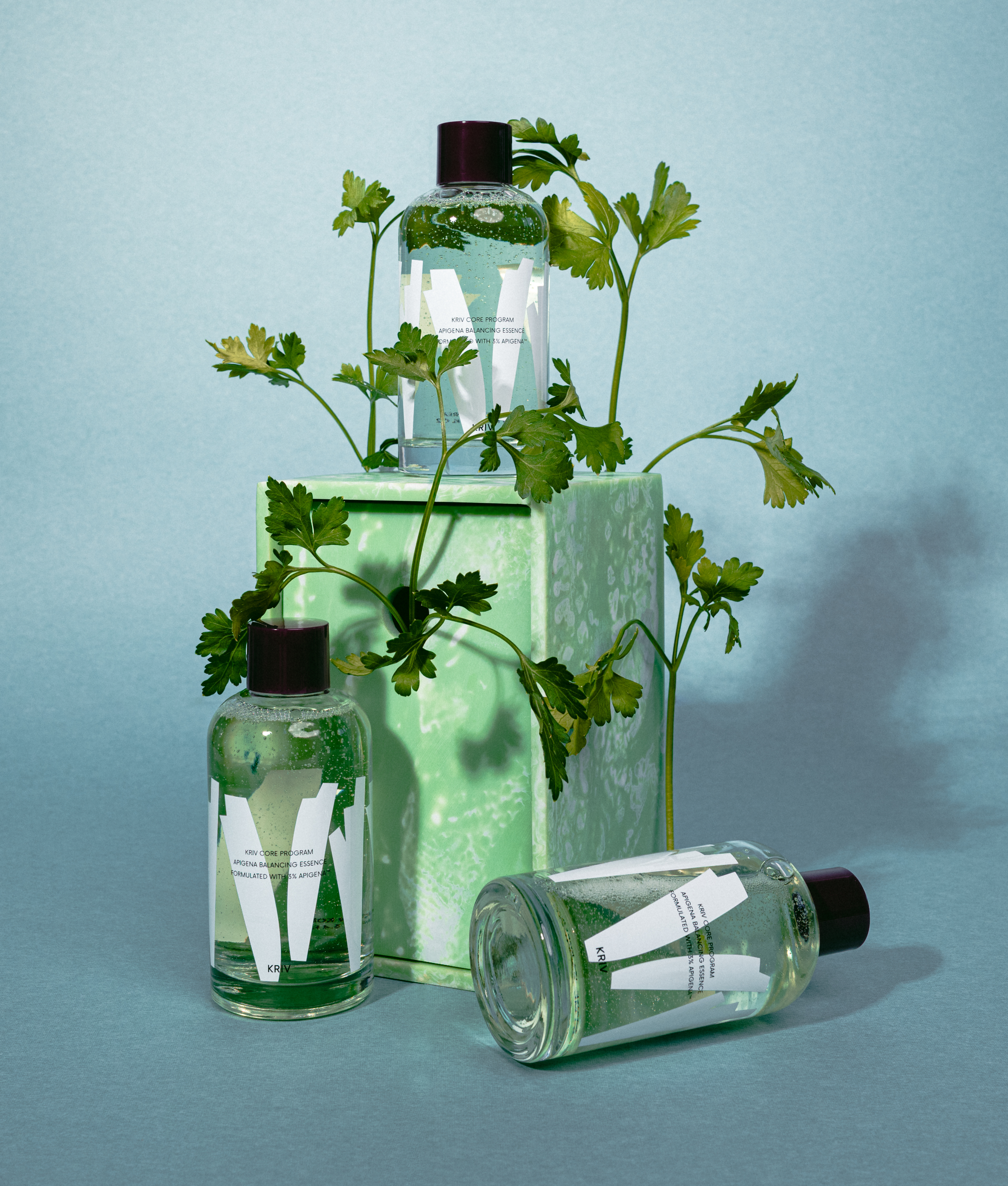
The images on this page were produced entirely by HAY TIN, from set design through art direction to photography. The work was made to see how the system we designed behaves on the actual object, and how it moves in someone's hands.
Skincare is a deeply private act. It is a ritual shown to no one, the opening and closing of a day, a process repeated daily yet registering a different state each time. We took that duality as the premise of the shoot.
The thickness of the glass, the relief of the printed layers, the bubbles the green essence forms. We chose to draw not the ingredient but what the ingredient does, and that decision is finally confirmed in these frames. Familiar because it repeats, new because it differs each time. rhythm is not a concept to be explained but a state to be sensed. We recorded, in our own view, the point where the concept completes itself as material.
HAY TIN / Creative Base
A503-Sounds Hannam, 35 Daesagwan-ro,
Yongsan-gu, Seoul, 04401
Tel: +82-70-7778-5757
Email: hello@hay-tin.com
©HAYTIN. ALL RIGHTS RESERVED.
en
kr
/
hay TIN
works
about
Kriv skincare brand
Brand Identity, Package & graphic system
request PRESS FILE
Apigena™, KRIV's proprietary ingredient technology, begins with plants such as celery and chamomile. We chose not to put those plants on the page. The moment a raw material is shown as itself, the only thing a brand can talk about is where it came from.
What KRIV works with is not the plant, but the structure that ingredient builds inside the skin. So the first question of this project was not the logo, it was the point of view. How does KRIV see the world, why does it design this way, and how does that work inside someone's daily life.
We built the answer on four axes: Technology, Design, Human, Everyday Life. Technology should sit inside as firm structure while remaining quiet at the surface. Design should support presence rather than announce it. When the two meet a person's day, skincare stops being a task and becomes a habit.
Skincare frames the beginning and the end of a day. In a place with no reason to perform, the work of design is not to interrupt the routine. This principle became the filter every later decision had to pass through.
The graphic motif translates that point of view into visual language. The circle is the unit of the ingredient and the balance the skin is trying to return to. Overlap is the layering that runs from surface to depth. Repeated intervals make rhythm. Ingredient imagery is reduced to line, grain and layer, showing not what the material looks like but what it does.
The circular dot at the top of the bottle is where the system condenses into a single object. Standing for a particle of Apigena™, it is always used as a complete circle in a single colour, and never repeated as a pattern. It works as an anchor only when it stays rare.
The final vessel is clear glass, carrying a two-colour silkscreen. The graphic motif is printed first, and typography is laid on top of it. The layered structure of skin we had been describing becomes the physical order of the printing process itself.
The bottle is therefore read by the fingertips before the eyes. Run a hand across the surface and the fine relief of the pattern comes through, with the layer of text registering one degree above it. It is a way of delivering through touch what had until then been explained as a concept, and the point we held as most important in the packaging.
The colour of the formula was treated as part of the system. The faint green of the essence is a value calibrated to hold its place between clear glass and white graphics without breaking the brand's tone. Shake the bottle and pale green bubbles rise in layers, the moment a static graphic moves as actual rhythm.
The images on this page were produced entirely by HAY TIN, from set design through art direction to photography. The work was made to see how the system we designed behaves on the actual object, and how it moves in someone's hands.
Skincare is a deeply private act. It is a ritual shown to no one, the opening and closing of a day, a process repeated daily yet registering a different state each time. We took that duality as the premise of the shoot.
The thickness of the glass, the relief of the printed layers, the bubbles the green essence forms. We chose to draw not the ingredient but what the ingredient does, and that decision is finally confirmed in these frames. Familiar because it repeats, new because it differs each time. rhythm is not a concept to be explained but a state to be sensed. We recorded, in our own view, the point where the concept completes itself as material.