hay TIN
works
about
en
kr
/
monday surf
BRAND IDENTITY REDEFINING MONDAY AS A SYMBOL OF ENERGY AND NEW BEGINNINGS
request PRESS FILE
In this project, HAY TIN approached branding through subtraction rather than addition. The focus was not on amplifying messages, but on defining how the brand could exist with clarity and composure.
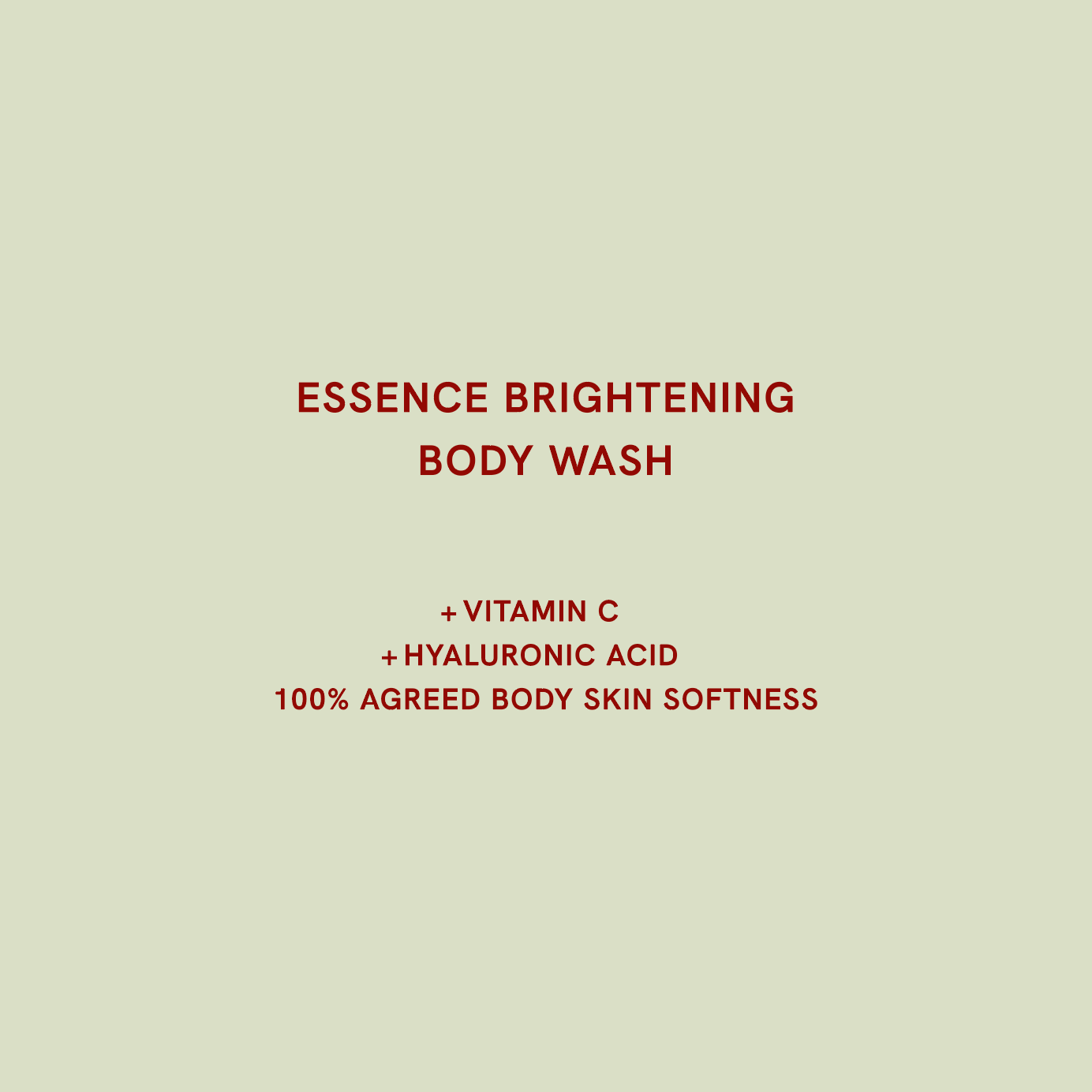
Beginning in Korea and expanding worldwide through Amazon, the brand asked HAY TIN to translate a functional formula of Vitamin C and Hyaluronic Acid into the free, affirmative rhythm of surf culture.
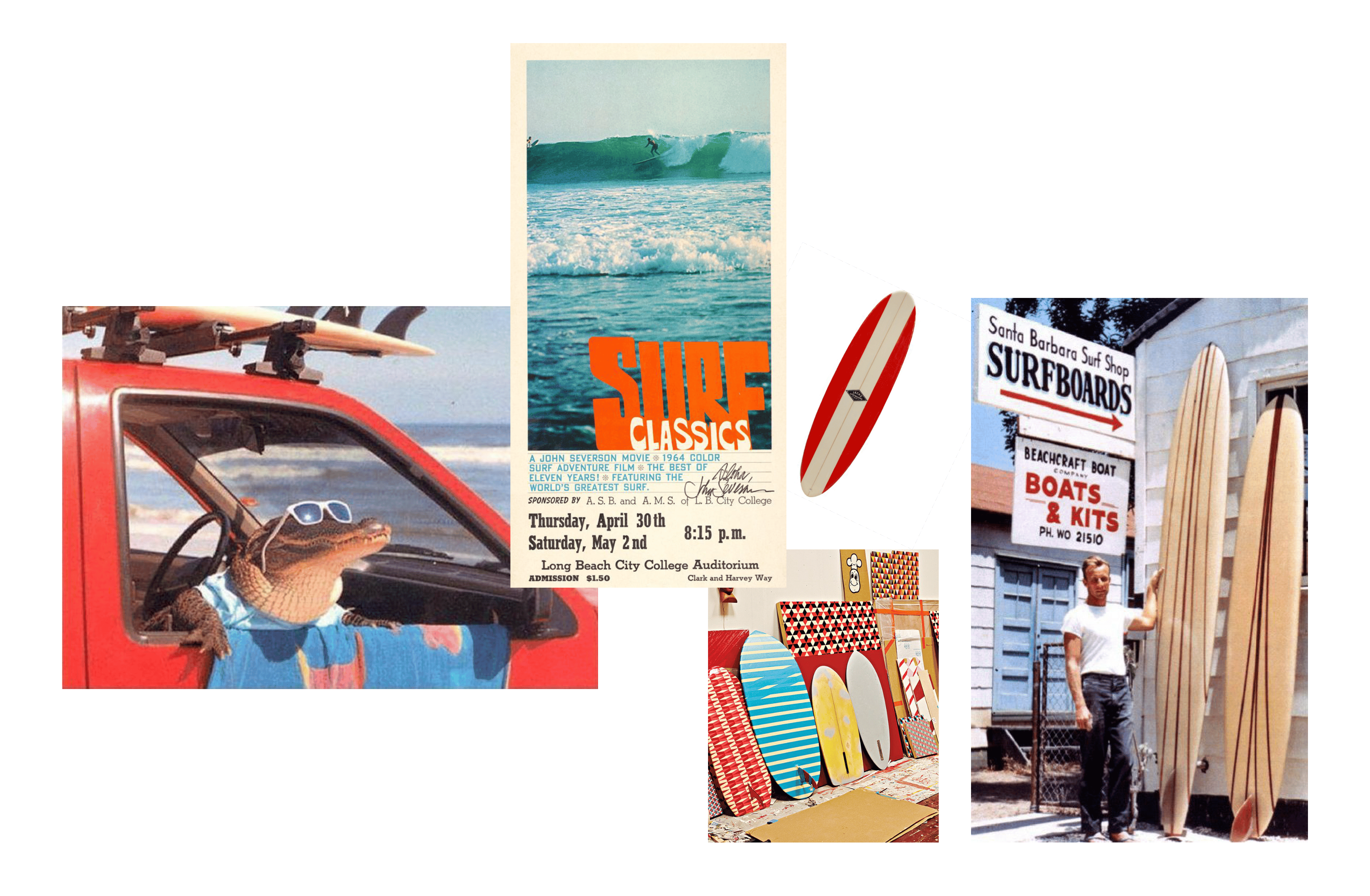

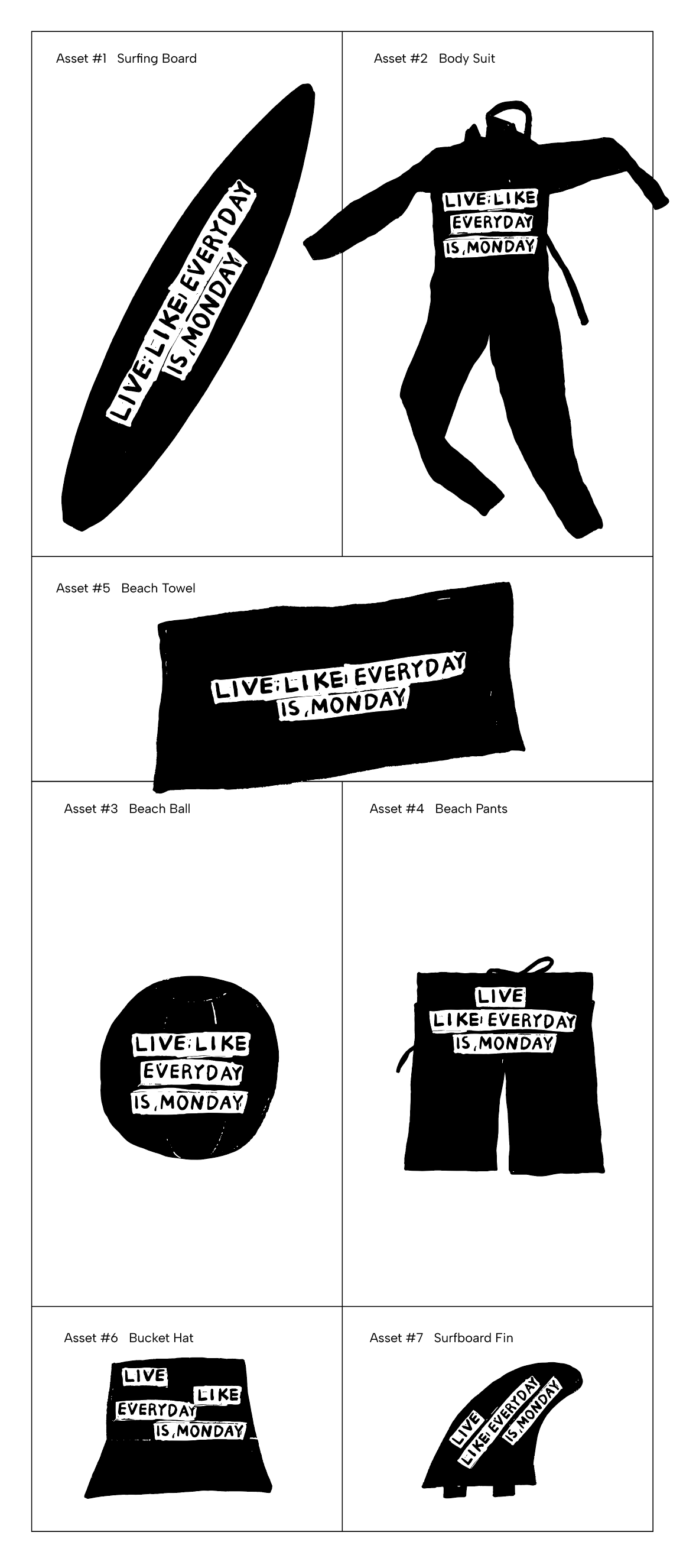
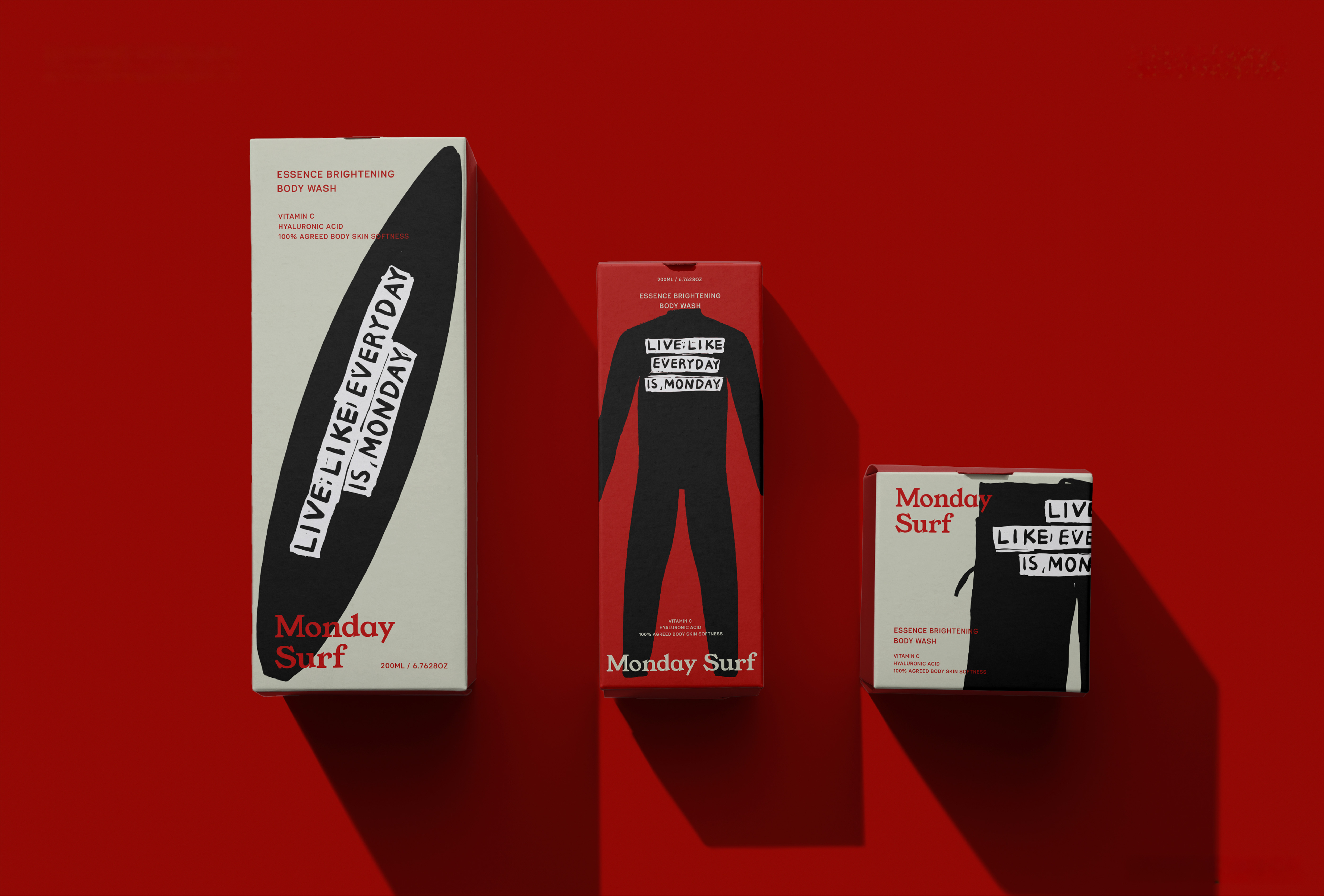
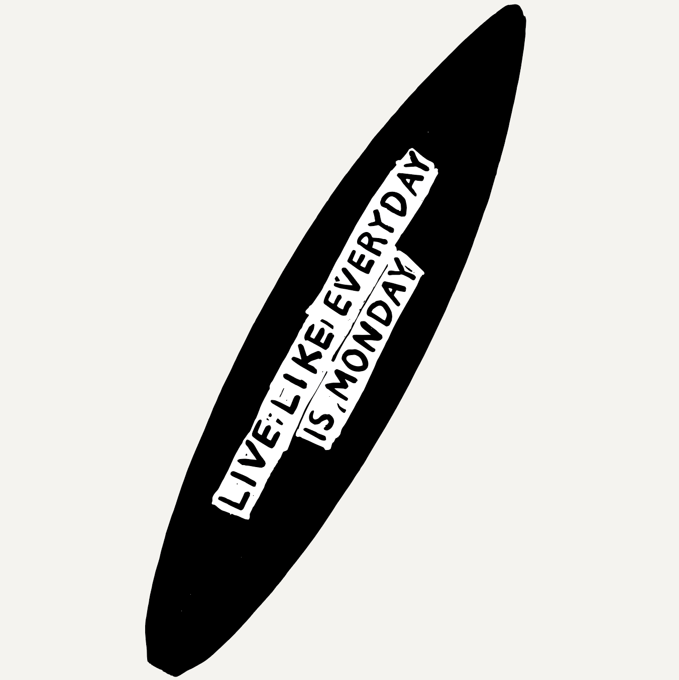
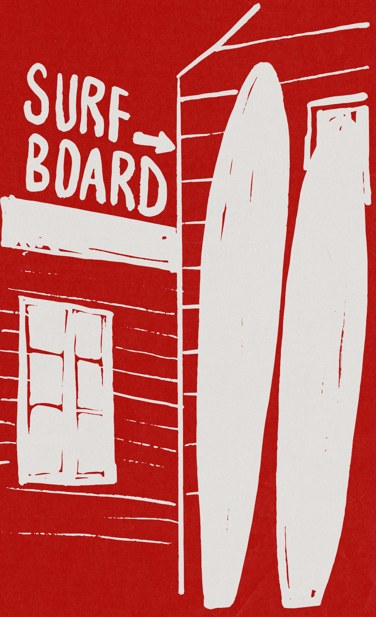
Rooted in Haydonna's drawing language, HAY TIN placed a bold red at the center of the brand and built a visual system around hand-carved illustration. The raw, tactile texture, like a woodcut pressed from carved timber, reveals the freedom and authenticity the brand stands for through an imperfect, unpolished rhythm.
This texture is not decoration. Repeating and slipping like the motion of a wave, the trace of the hand becomes a language that carries Monday Surf's attitude by touch.
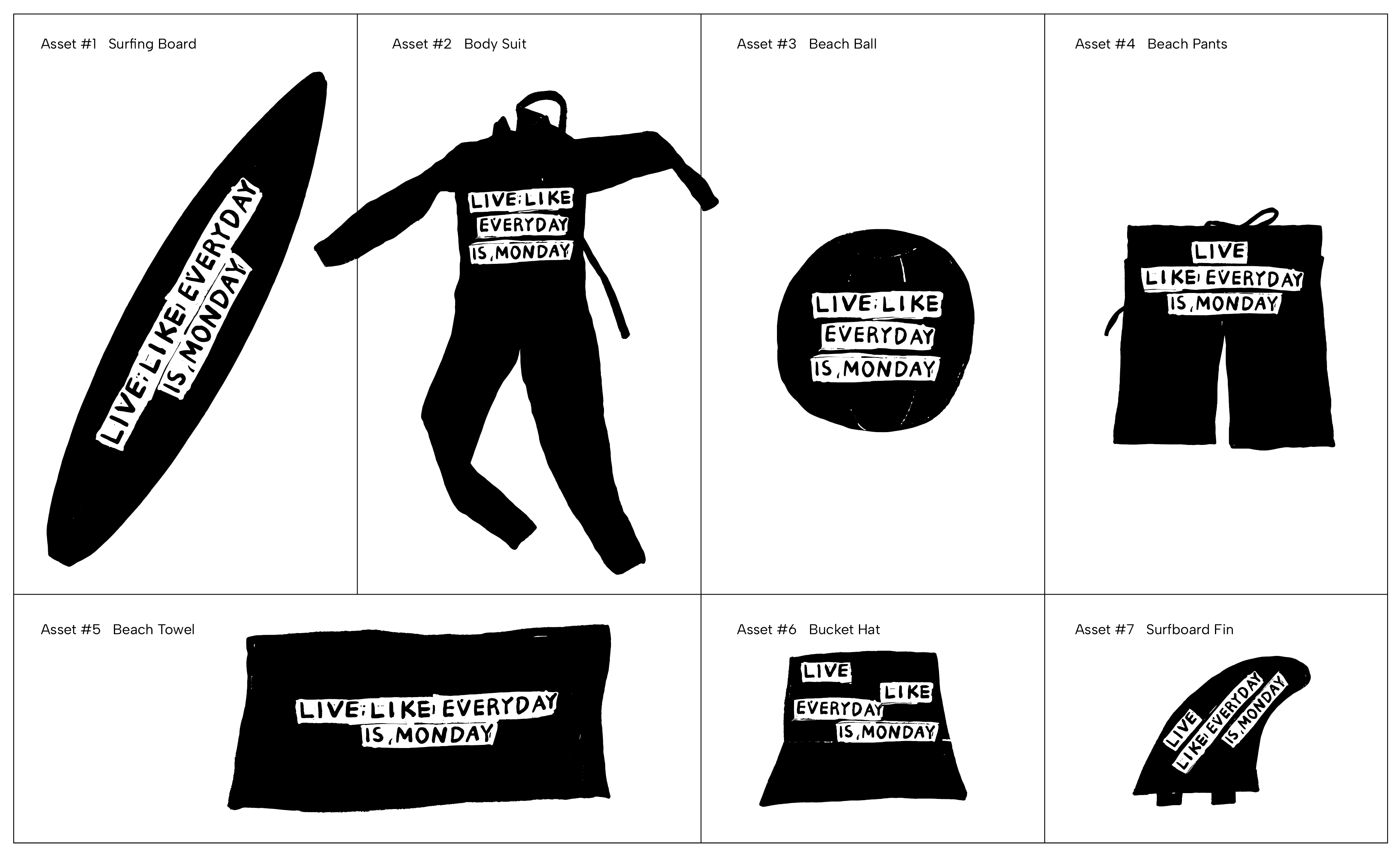
Within this visual system, the product range connects into a single world. The artwork does not dress up a surface, it defines how the brand operates emotionally.
Through Monday Surf, HAY TIN proposes a way for brand, product, and feeling to connect organically as one artwork. Beyond skincare, it becomes a lifestyle attitude that invites people to live boldly and confidently, as if every day were Monday.



HAY TIN / Creative Base
A503-Sounds Hannam, 35 Daesagwan-ro,
Yongsan-gu, Seoul, 04401
Tel: +82-70-7778-5757
Email: hello@hay-tin.com
©HAYTIN. ALL RIGHTS RESERVED.
en
kr
/
hay TIN
works
about
monday surf
BRAND IDENTITY REDEFINING MONDAY AS A SYMBOL OF ENERGY AND NEW BEGINNINGS
request PRESS FILE
In this project, HAY TIN approached branding through subtraction rather than addition. The focus was not on amplifying messages, but on defining how the brand could exist with clarity and composure.
Beginning in Korea and expanding worldwide through Amazon, the brand asked HAY TIN to translate a functional formula of Vitamin C and Hyaluronic Acid into the free, affirmative rhythm of surf culture.
Rooted in Haydonna's drawing language, HAY TIN placed a bold red at the center of the brand and built a visual system around hand-carved illustration. The raw, tactile texture, like a woodcut pressed from carved timber, reveals the freedom and authenticity the brand stands for through an imperfect, unpolished rhythm.
This texture is not decoration. Repeating and slipping like the motion of a wave, the trace of the hand becomes a language that carries Monday Surf's attitude by touch.
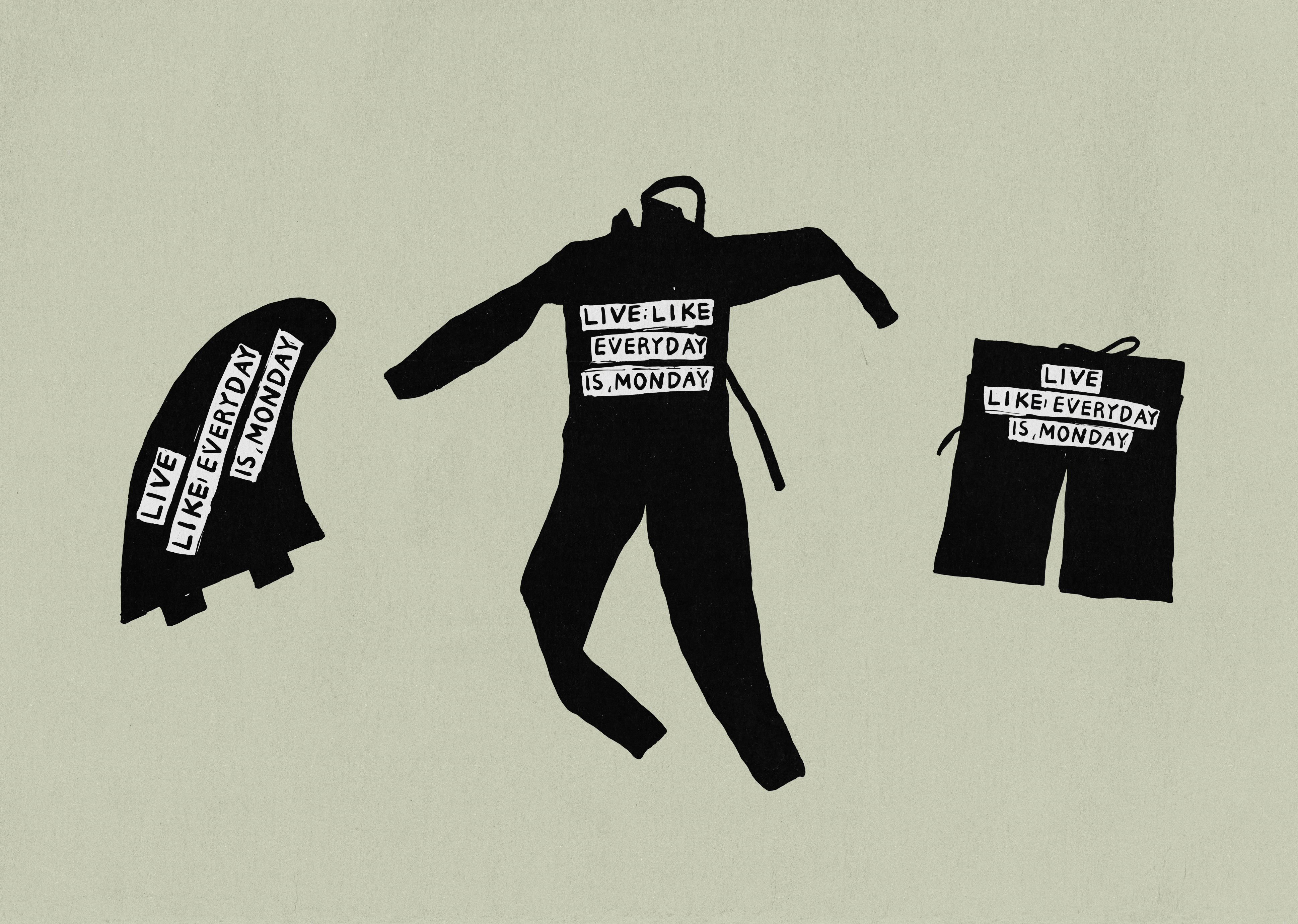
Within this visual system, the product range connects into a single world. The artwork does not dress up a surface, it defines how the brand operates emotionally.
Through Monday Surf, HAY TIN proposes a way for brand, product, and feeling to connect organically as one artwork. Beyond skincare, it becomes a lifestyle attitude that invites people to live boldly and confidently, as if every day were Monday.
HAY TIN / Creative Base
A503-Sounds Hannam, 35 Daesagwan-ro,
Yongsan-gu, Seoul, 04401
Tel: +82-70-7778-5757
Email: hello@hay-tin.com
©HAYTIN. ALL RIGHTS RESERVED.
en
kr
/
hay TIN
works
about
Monday Surf
BRAND IDENTITY REDEFINING MONDAY AS A SYMBOL OF ENERGY AND NEW BEGINNINGS
request PRESS FILE
HAY TIN designed the brand identity and brand artwork for Monday Surf, a skincare brand born from surf culture. Built on the line "Live Like Everyday Is Monday," Monday Surf reframes Monday not as the start of stress, but as a sense of new beginnings and vibrant energy.
Beginning in Korea and expanding worldwide through Amazon, the brand asked HAY TIN to translate a functional formula of Vitamin C and Hyaluronic Acid into the free, affirmative rhythm of surf culture.
Rooted in Haydonna's drawing language, HAY TIN placed a bold red at the center of the brand and built a visual system around hand-carved illustration. The raw, tactile texture, like a woodcut pressed from carved timber, reveals the freedom and authenticity the brand stands for through an imperfect, unpolished rhythm.
This texture is not decoration. Repeating and slipping like the motion of a wave, the trace of the hand becomes a language that carries Monday Surf's attitude by touch.
Within this visual system, the product range connects into a single world. The artwork does not dress up a surface, it defines how the brand operates emotionally.
Through Monday Surf, HAY TIN proposes a way for brand, product, and feeling to connect organically as one artwork. Beyond skincare, it becomes a lifestyle attitude that invites people to live boldly and confidently, as if every day were Monday.