hay TIN
works
about
en
kr
/
SUMMER WELLNESS STOP A SEASONAL BRAND ARTWORK CAMPAIGN FOR CJ OLIVE BETTER
request PRESS FILE
Yellow, black line drawing, and white remain the framework, now scaled to a temporary structure that appears and disappears with the season.
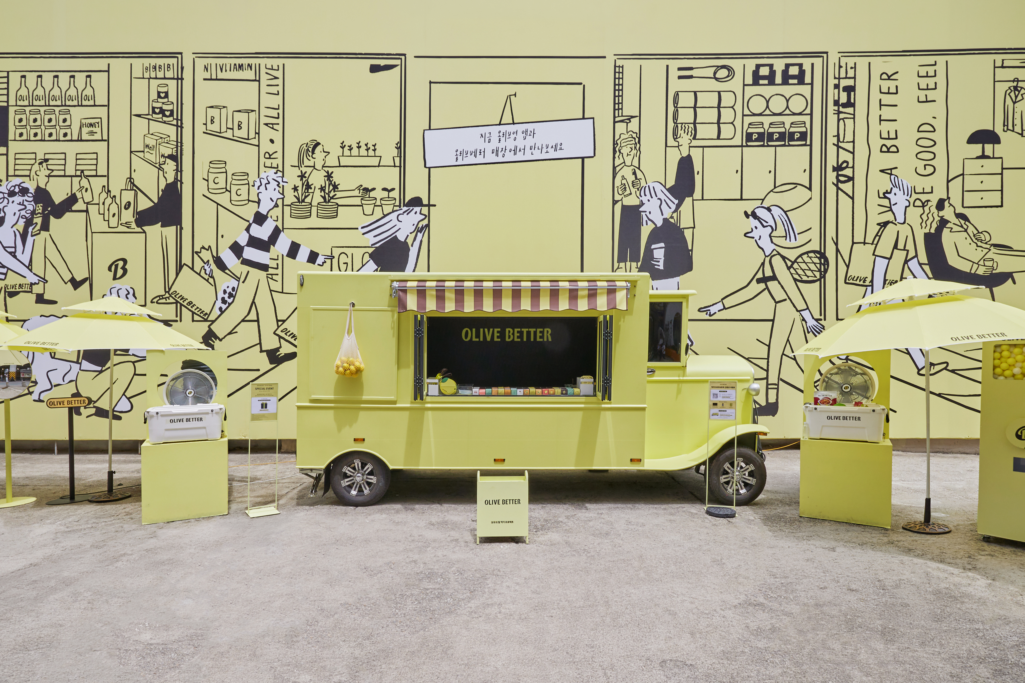
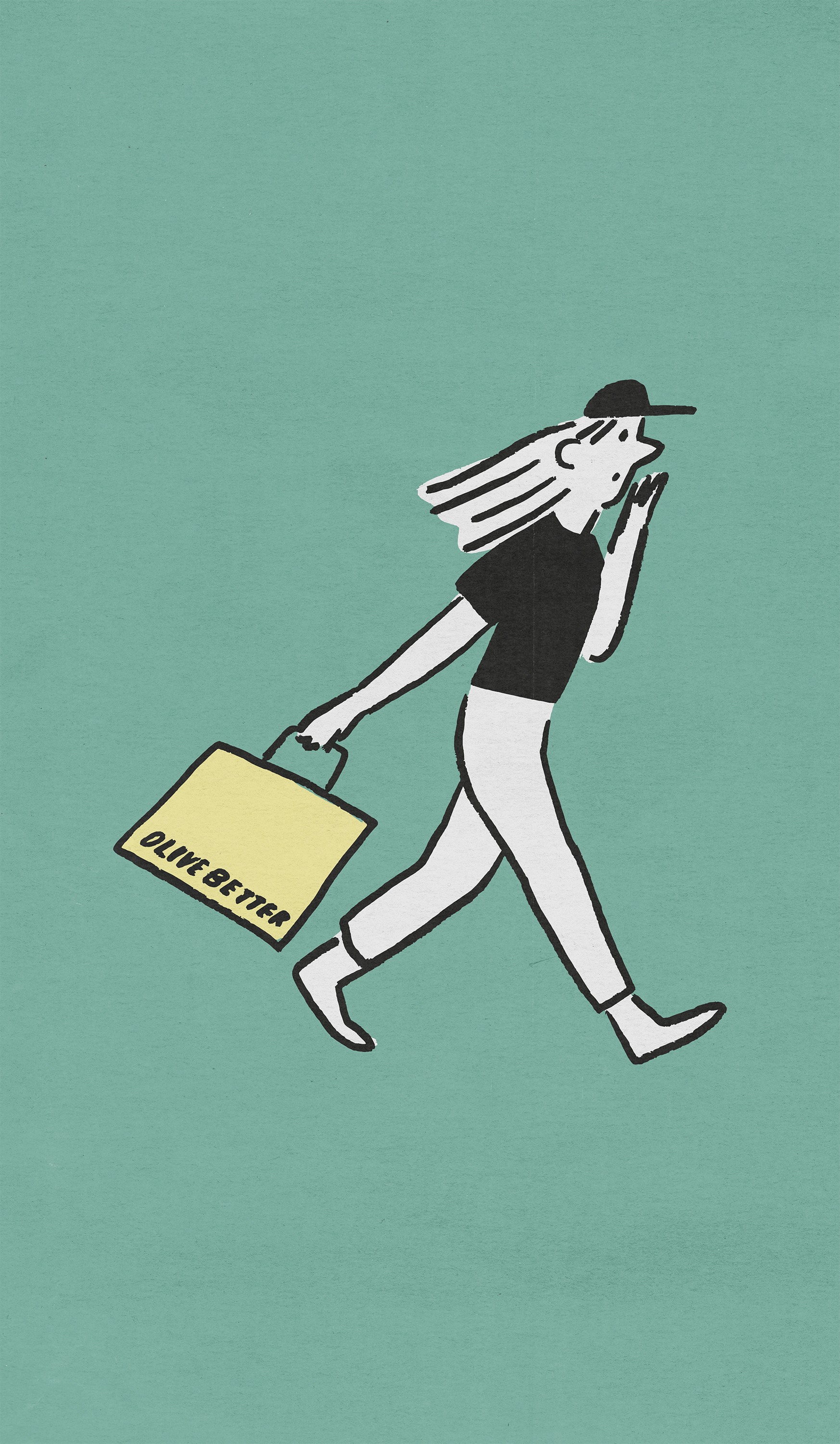
The backdrop artwork forms the campaign's spatial ground. A large-scale line drawing wraps the site with shelves, products, and figures in motion, reconstructing the store as a single continuous scene.
Grounded in Haydonna’s drawing language, TIN centered the visual system around the brand’s signature yellow, combining yellow, black line drawings, and white into a restrained yet expressive framework.
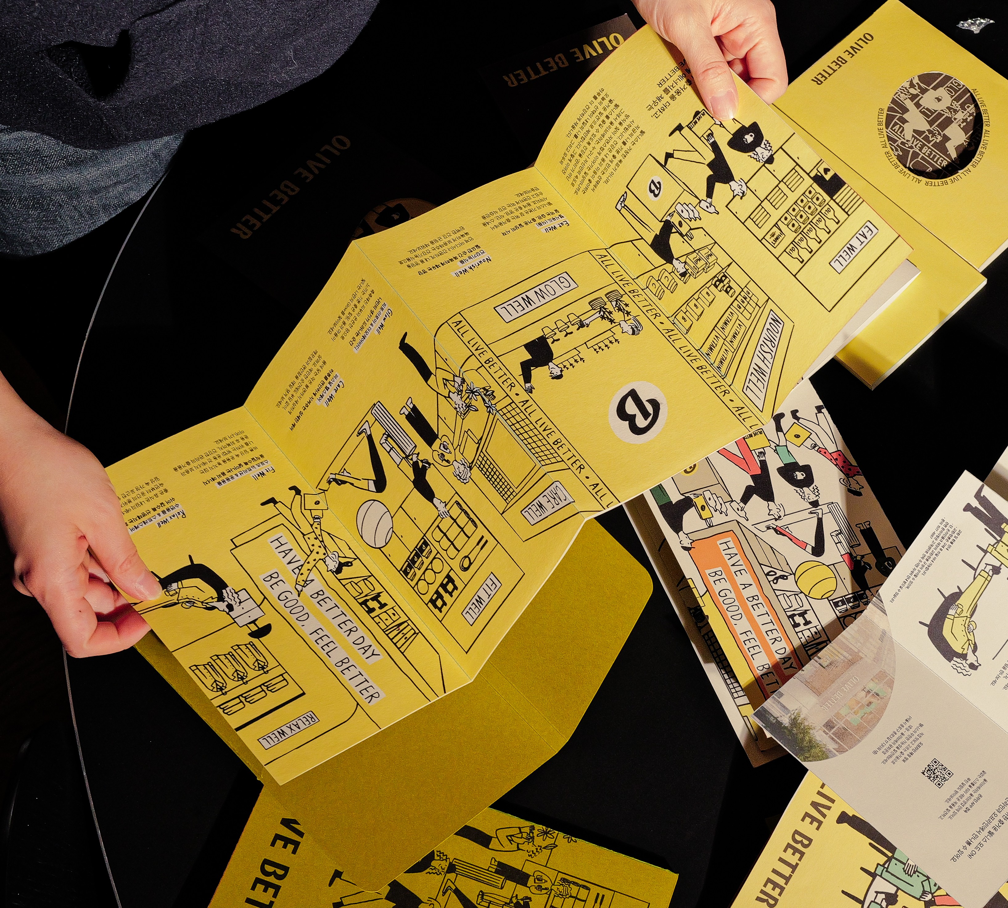
The resulting artwork functions beyond decoration. Integrated throughout the store, it operates as signage, information, and spatial attitude, activating the brand within the environment.
Behind the truck it operates less as decoration than as architecture — backdrop, signage, and attitude at once.
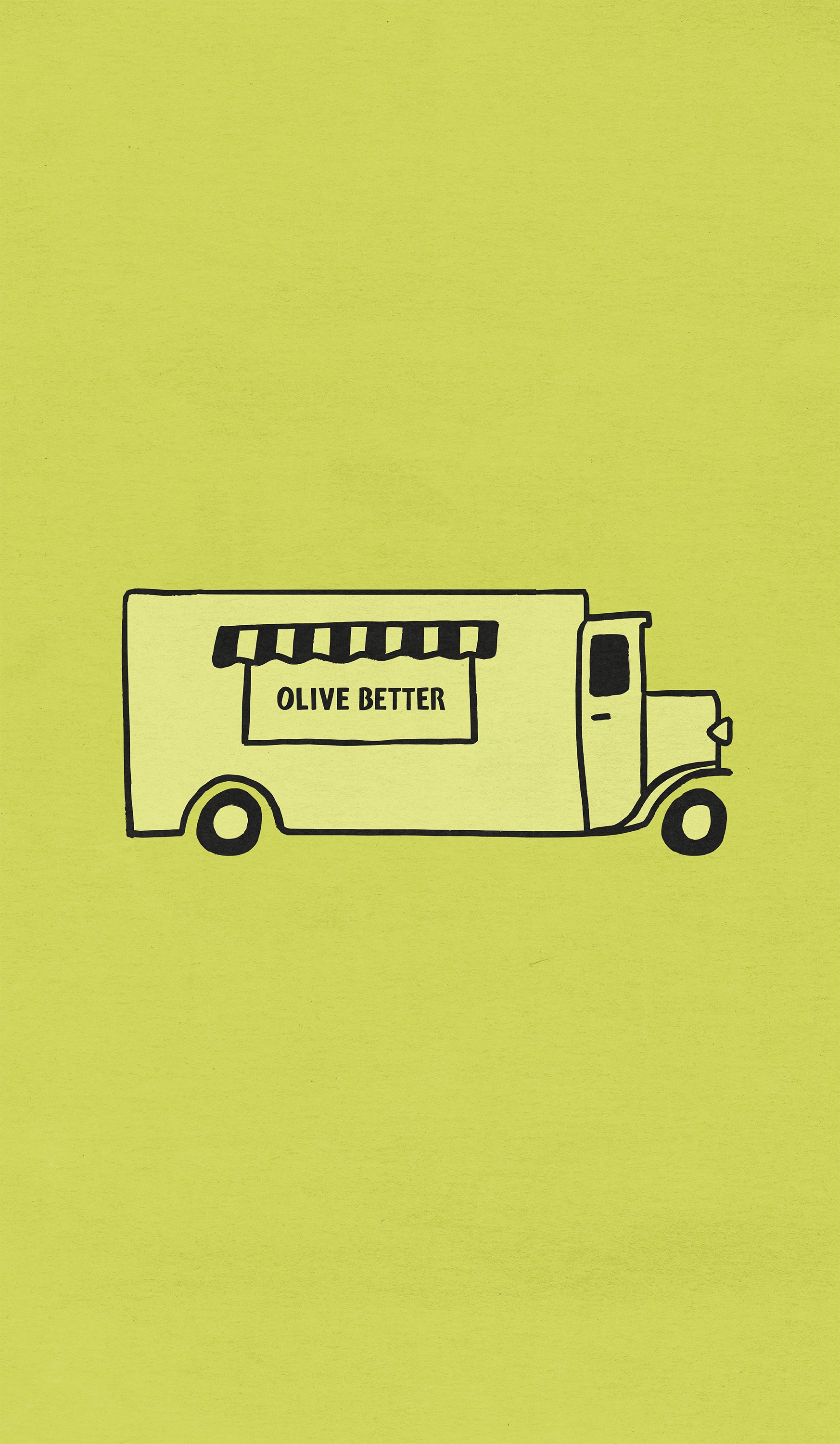
The sticker artwork reduces the campaign to its smallest carriable form. The truck is drawn as a single icon and released as an object visitors take with them, allowing the campaign to travel beyond its site.
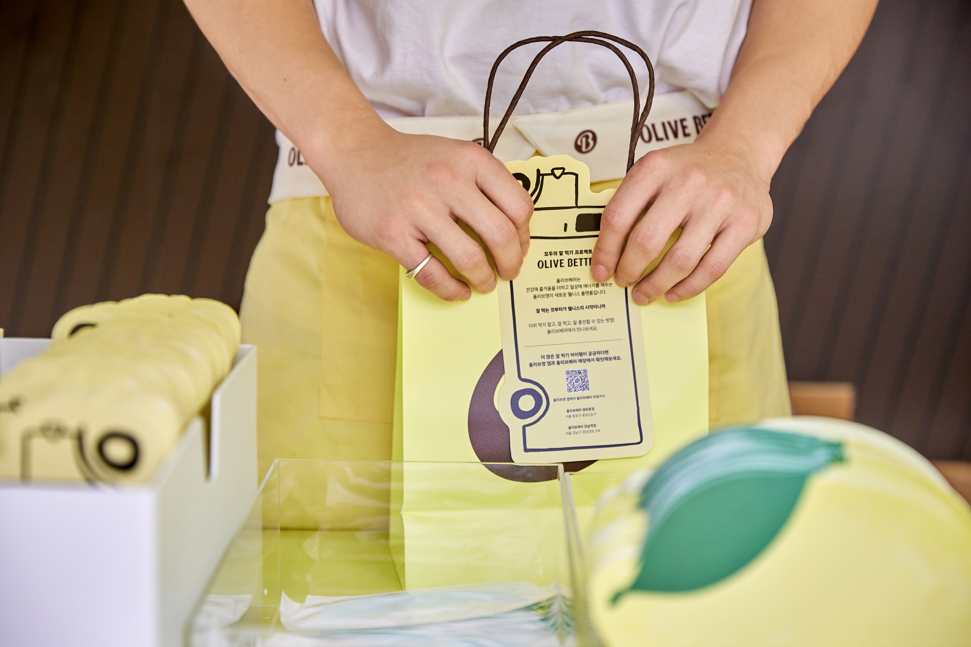
Handwriting enters the system as its most human register. Written by hand and printed across colored cards, the messages hold a warmth that typography cannot carry, placing a personal voice inside an otherwise structured graphic language.
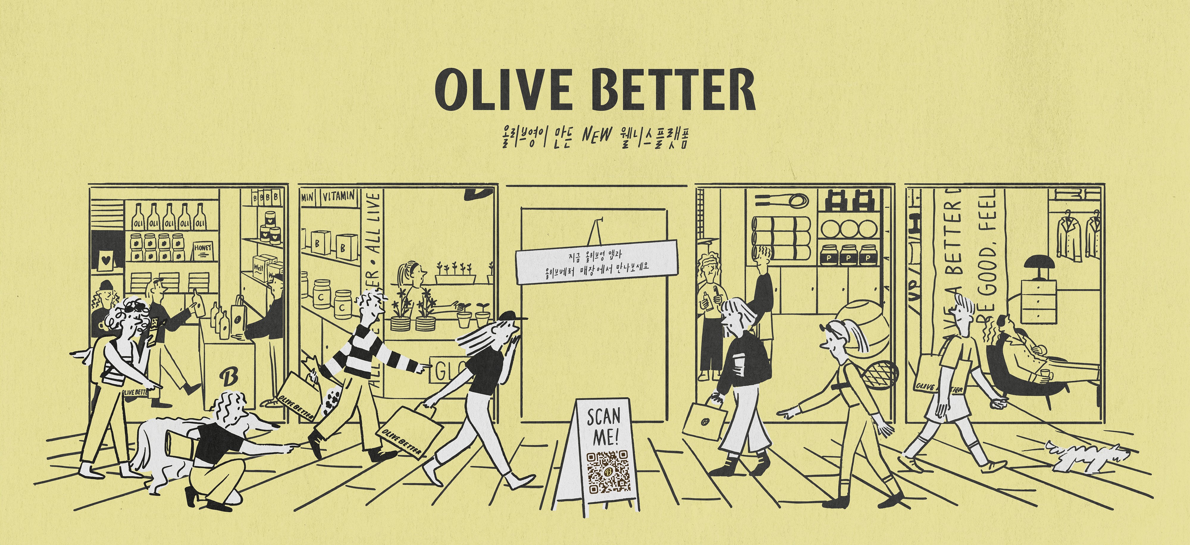
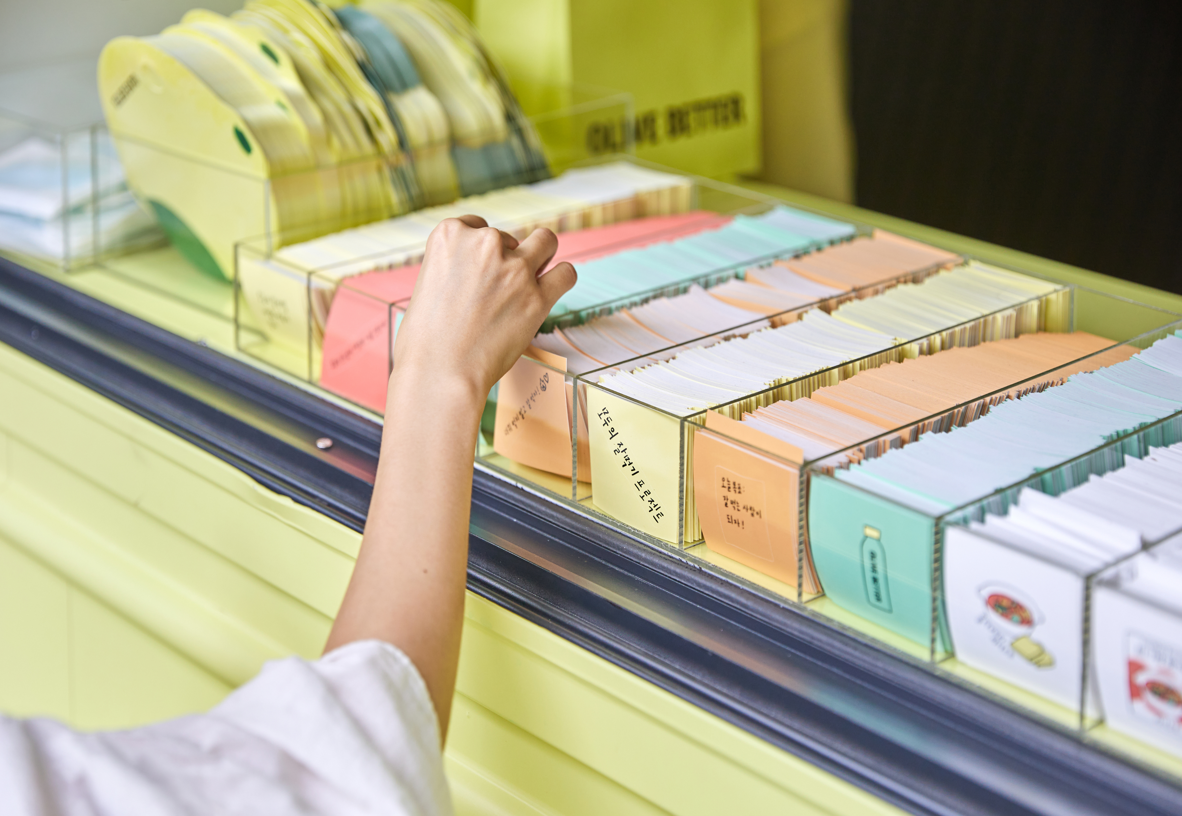
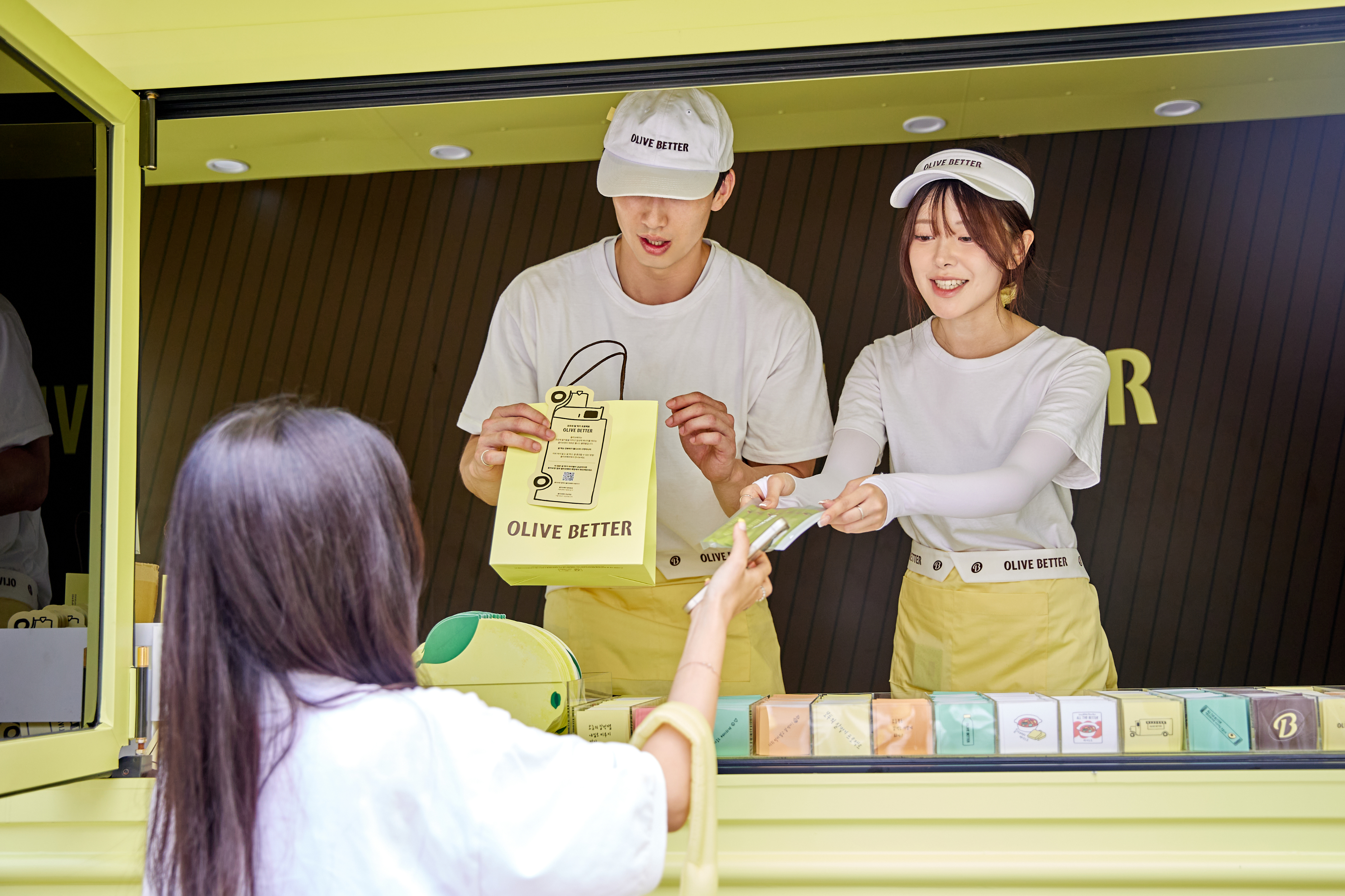
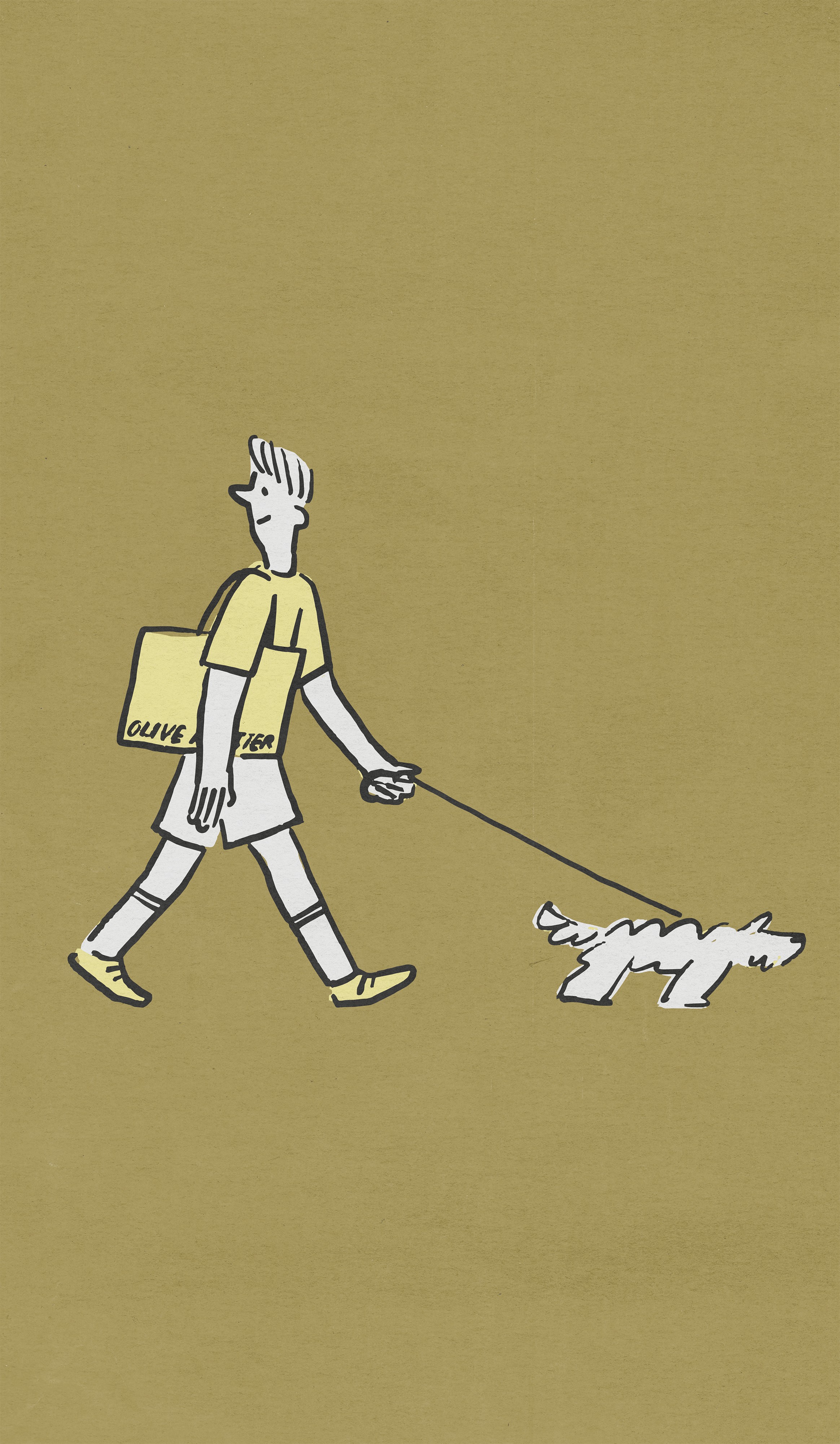
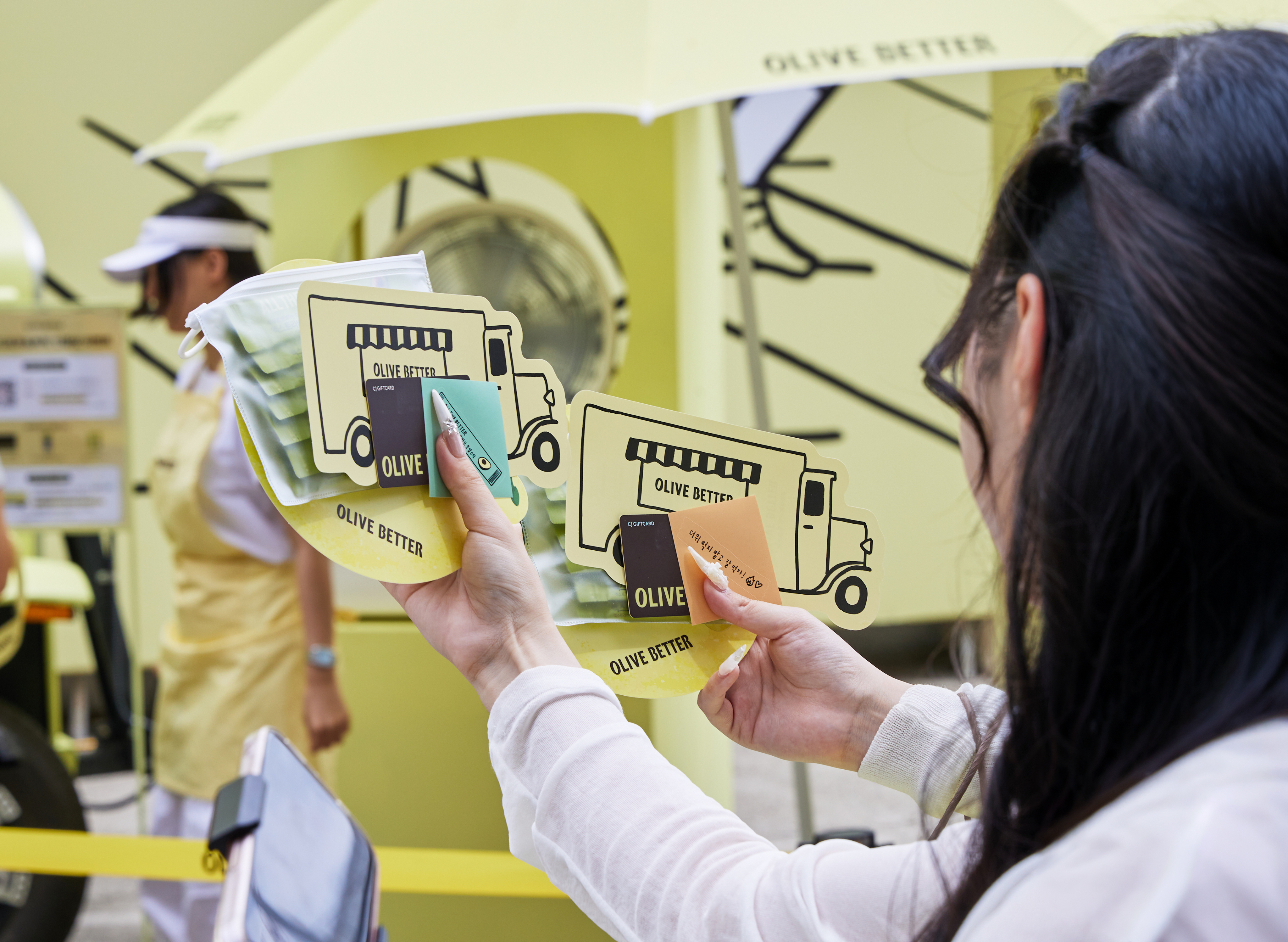
Photo by : 더에스엠씨
HAY TIN / Creative Base
A503-Sounds Hannam, 35 Daesagwan-ro,
Yongsan-gu, Seoul, 04401
Tel: +82-70-7778-5757
Email: hello@hay-tin.com
©HAYTIN. ALL RIGHTS RESERVED.
Behind the truck it operates less as decoration than as architecture — backdrop, signage, and attitude at once.
The sticker artwork reduces the campaign to its smallest carriable form. The truck is drawn as a single icon and released as an object visitors take with them, allowing the campaign to travel beyond its site.
Handwriting enters the system as its most human register. Written by hand and printed across colored cards, the messages hold a warmth that typography cannot carry, placing a personal voice inside an otherwise structured graphic language.
en
kr
/
hay TIN
works
about
SUMMER WELLNESS STOP A SEASONAL BRAND ARTWORK CAMPAIGN FOR CJ OLIVE BETTER
request PRESS FILE
HAY TIN developed the brand artwork for Summer Wellness Stop, a seasonal campaign by Olive Better, the wellness platform brand of CJ Olive Young.
Extending the visual system established at the brand's launch, the campaign moves Olive Better out of the store and into open air.
Yellow, black line drawing, and white remain the framework, now scaled to a temporary structure that appears and disappears with the season.
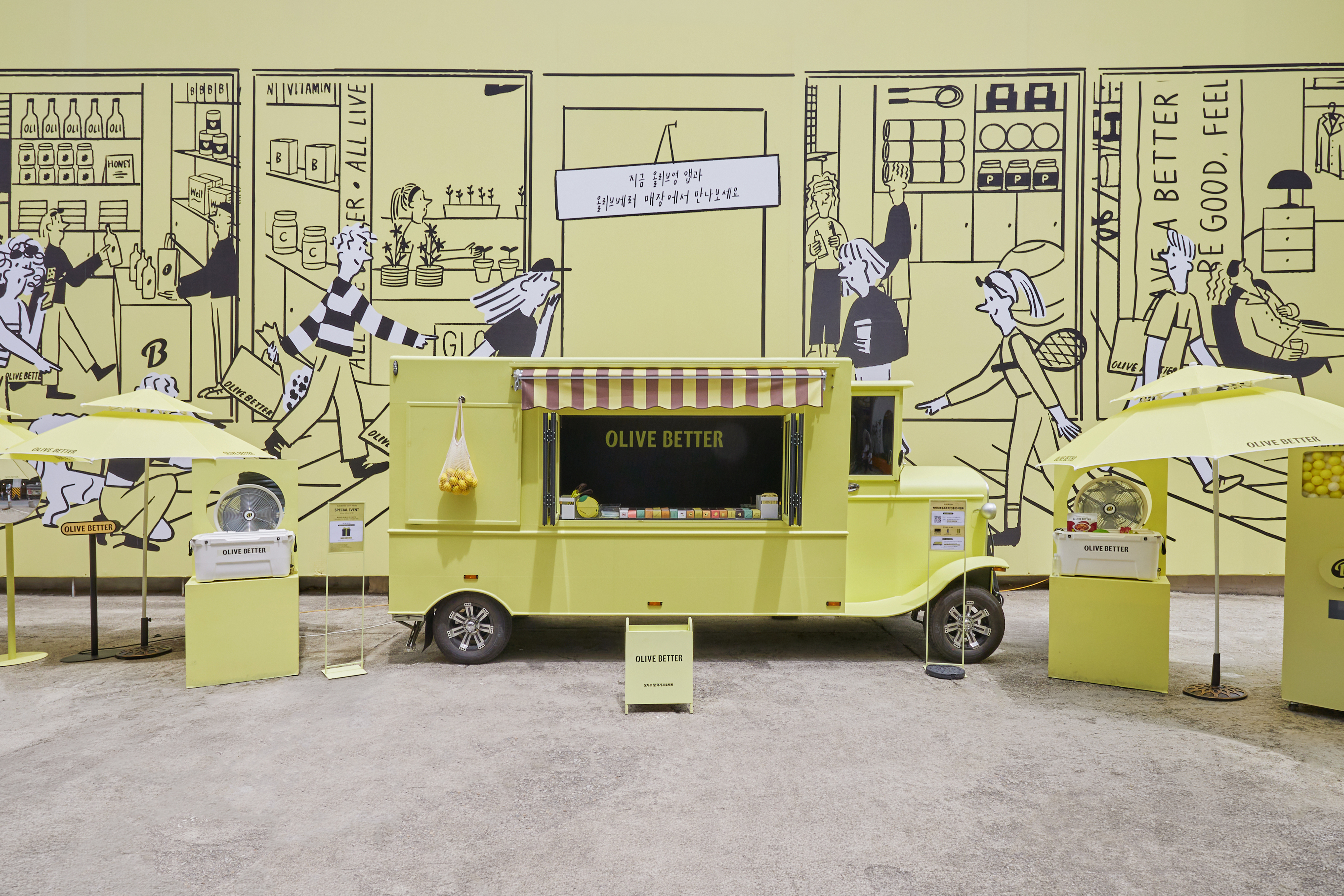
The backdrop artwork forms the campaign's spatial ground. A large-scale line drawing wraps the site with shelves, products, and figures in motion, reconstructing the store as a single continuous scene.
Behind the truck it operates less as decoration than as architecture — backdrop, signage, and attitude at once.
The sticker artwork reduces the campaign to its smallest carriable form. The truck is drawn as a single icon and released as an object visitors take with them, allowing the campaign to travel beyond its site.
Handwriting enters the system as its most human register. Written by hand and printed across colored cards, the messages hold a warmth that typography cannot carry, placing a personal voice inside an otherwise structured graphic language.
Photo by : 더에스엠씨
HAY TIN / Creative Base
A503-Sounds Hannam, 35 Daesagwan-ro,
Yongsan-gu, Seoul, 04401
Tel: +82-70-7778-5757
Email: hello@hay-tin.com
©HAYTIN. ALL RIGHTS RESERVED.
en
kr
/
hay TIN
works
about
SUMMER WELLNESS STOP A SEASONAL BRAND ARTWORK CAMPAIGN FOR CJ OLIVE BETTER
request PRESS FILE
HAY TIN developed the brand artwork for Summer Wellness Stop, a seasonal campaign by Olive Better, the wellness platform brand of CJ Olive Young.
Extending the visual system established at the brand's launch, the campaign moves Olive Better out of the store and into open air.
Yellow, black line drawing, and white remain the framework, now scaled to a temporary structure that appears and disappears with the season.
The backdrop artwork forms the campaign's spatial ground. A large-scale line drawing wraps the site with shelves, products, and figures in motion, reconstructing the store as a single continuous scene.
Behind the truck it operates less as decoration than as architecture — backdrop, signage, and attitude at once.
The sticker artwork reduces the campaign to its smallest carriable form. The truck is drawn as a single icon and released as an object visitors take with them, allowing the campaign to travel beyond its site.
Handwriting enters the system as its most human register. Written by hand and printed across colored cards, the messages hold a warmth that typography cannot carry, placing a personal voice inside an otherwise structured graphic language.
Photo by : 더에스엠씨
Behind the truck it operates less as decoration than as architecture — backdrop, signage, and attitude at once.
The sticker artwork reduces the campaign to its smallest carriable form. The truck is drawn as a single icon and released as an object visitors take with them, allowing the campaign to travel beyond its site.
Handwriting enters the system as its most human register. Written by hand and printed across colored cards, the messages hold a warmth that typography cannot carry, placing a personal voice inside an otherwise structured graphic language.