← Last Project
next project →
hay TIN
works
about
en
kr
/
Olive Better A Wellness Platform Launch for CJ Olive Young Brand Artwork & Printed Experience
request PRESS FILE
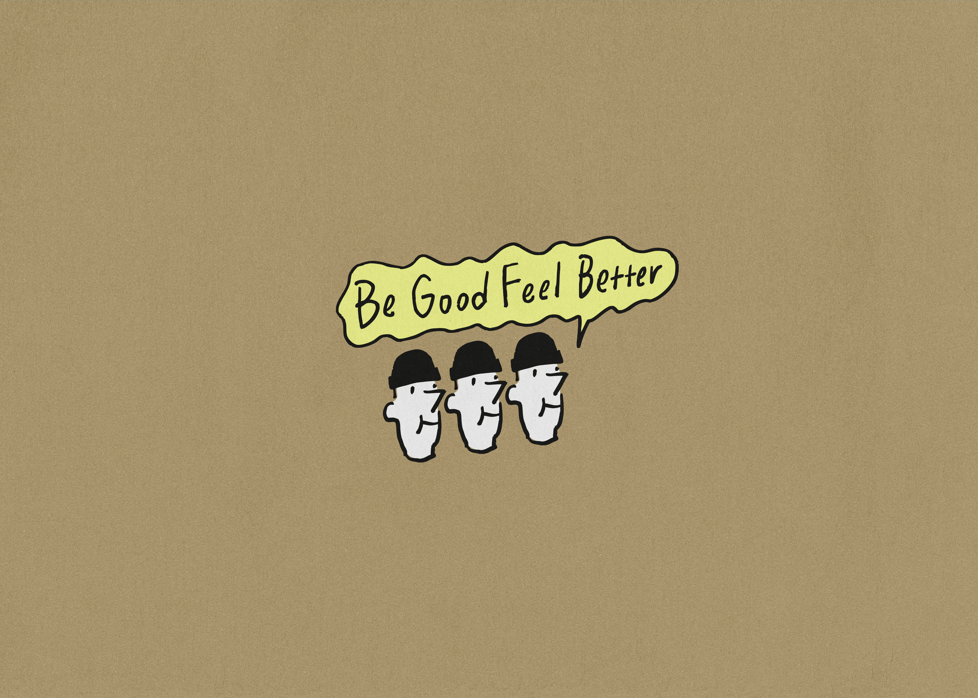
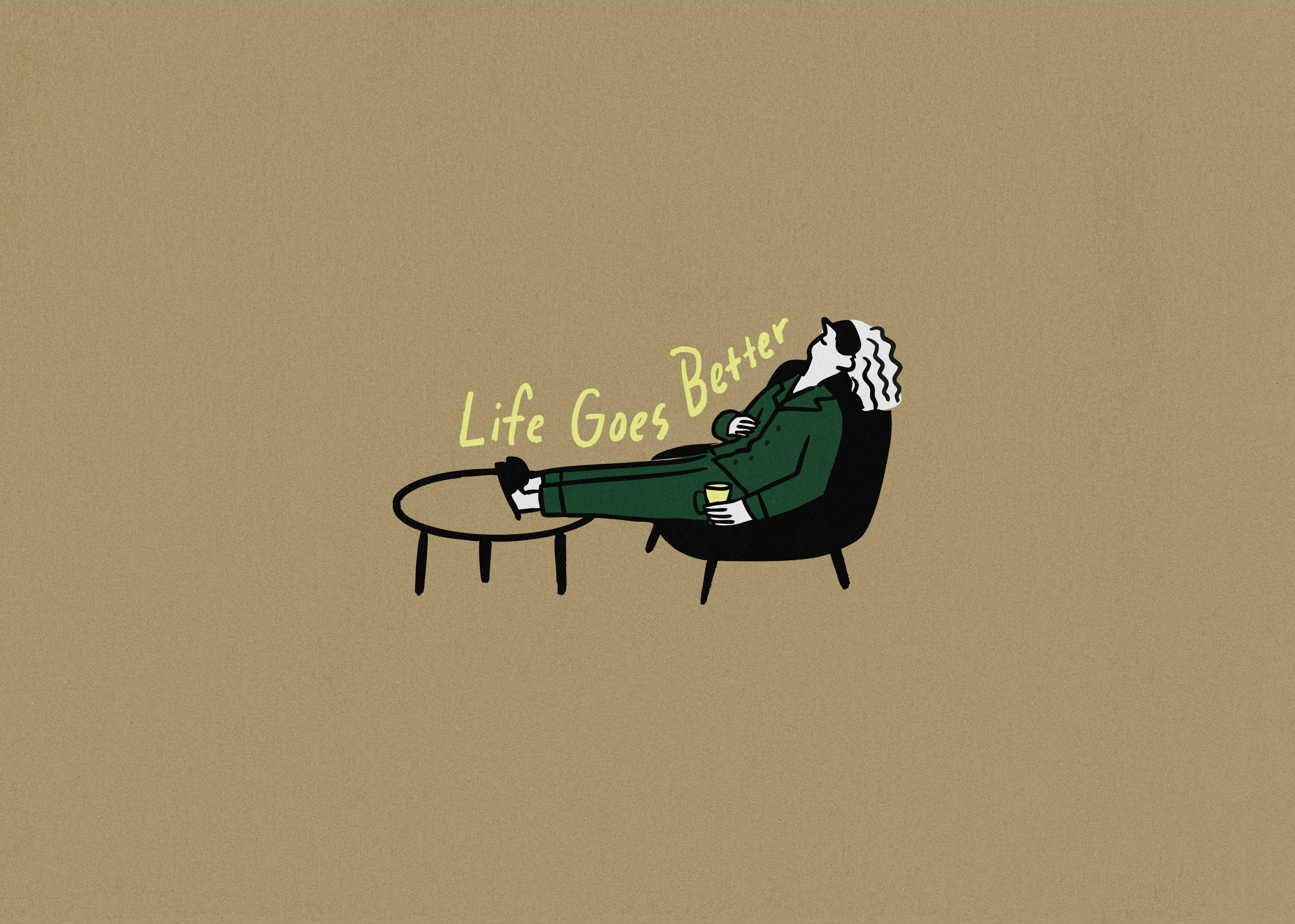
Grounded in Haydonna’s drawing language, TIN centered the visual system around the brand’s signature yellow, combining yellow, black line drawings, and white into a restrained yet expressive framework.
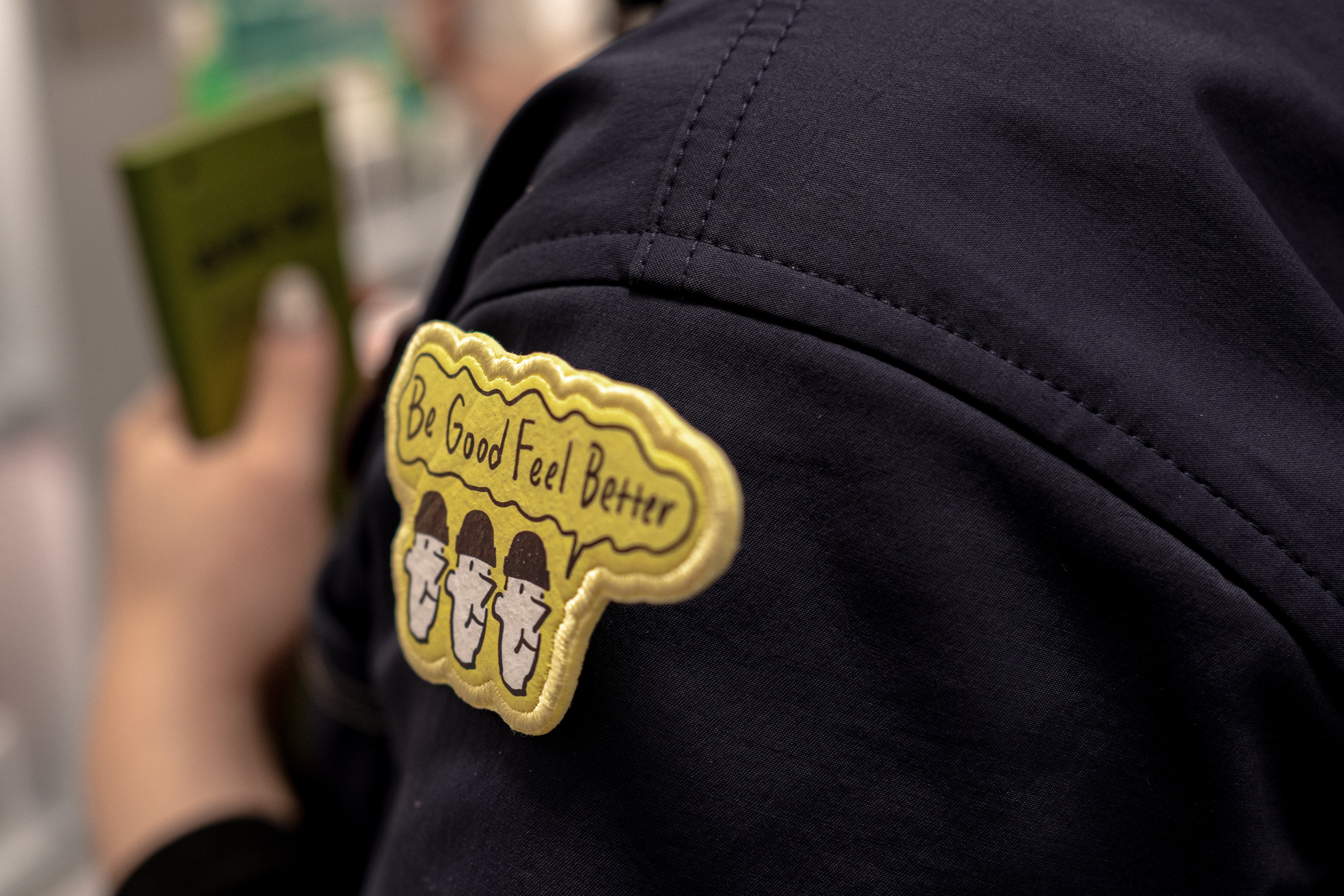
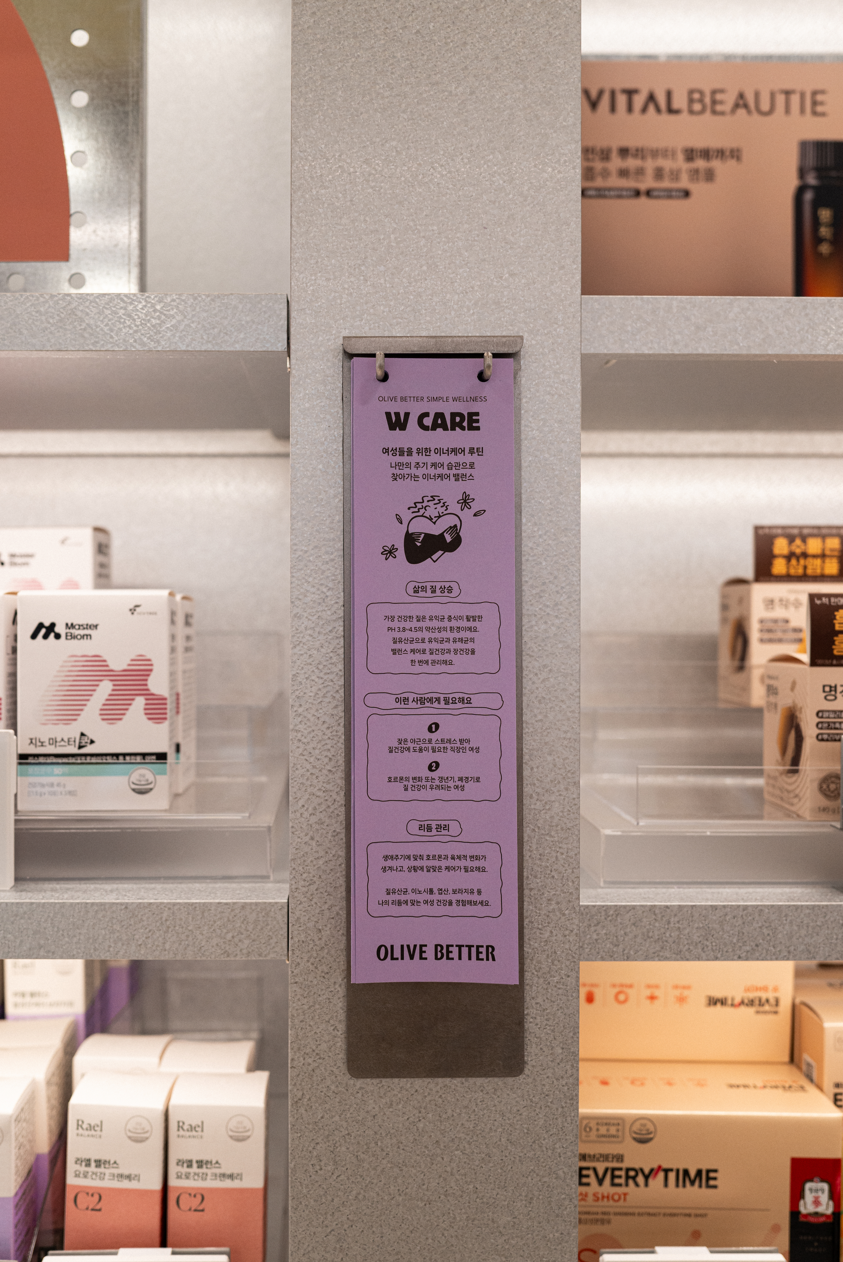
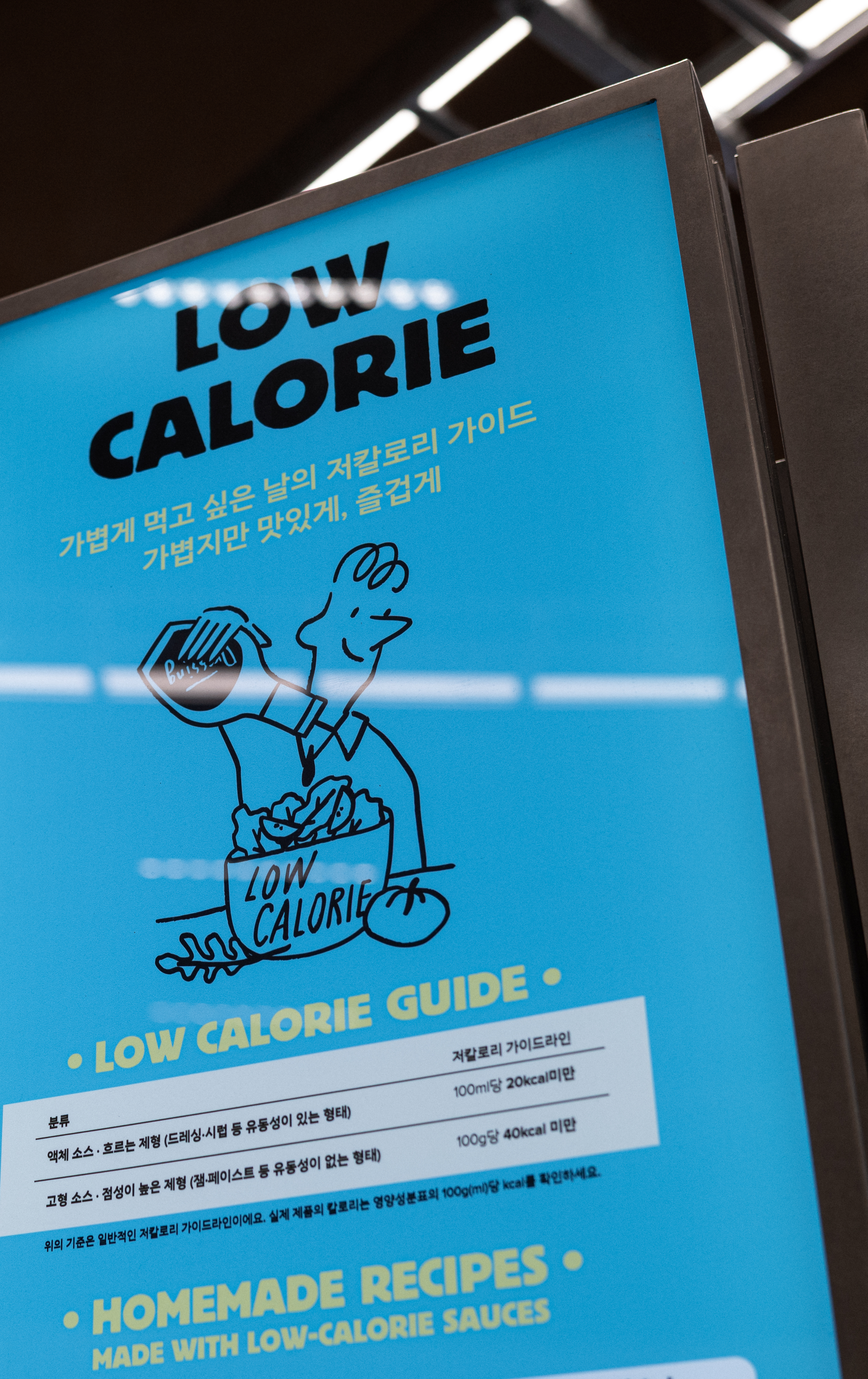
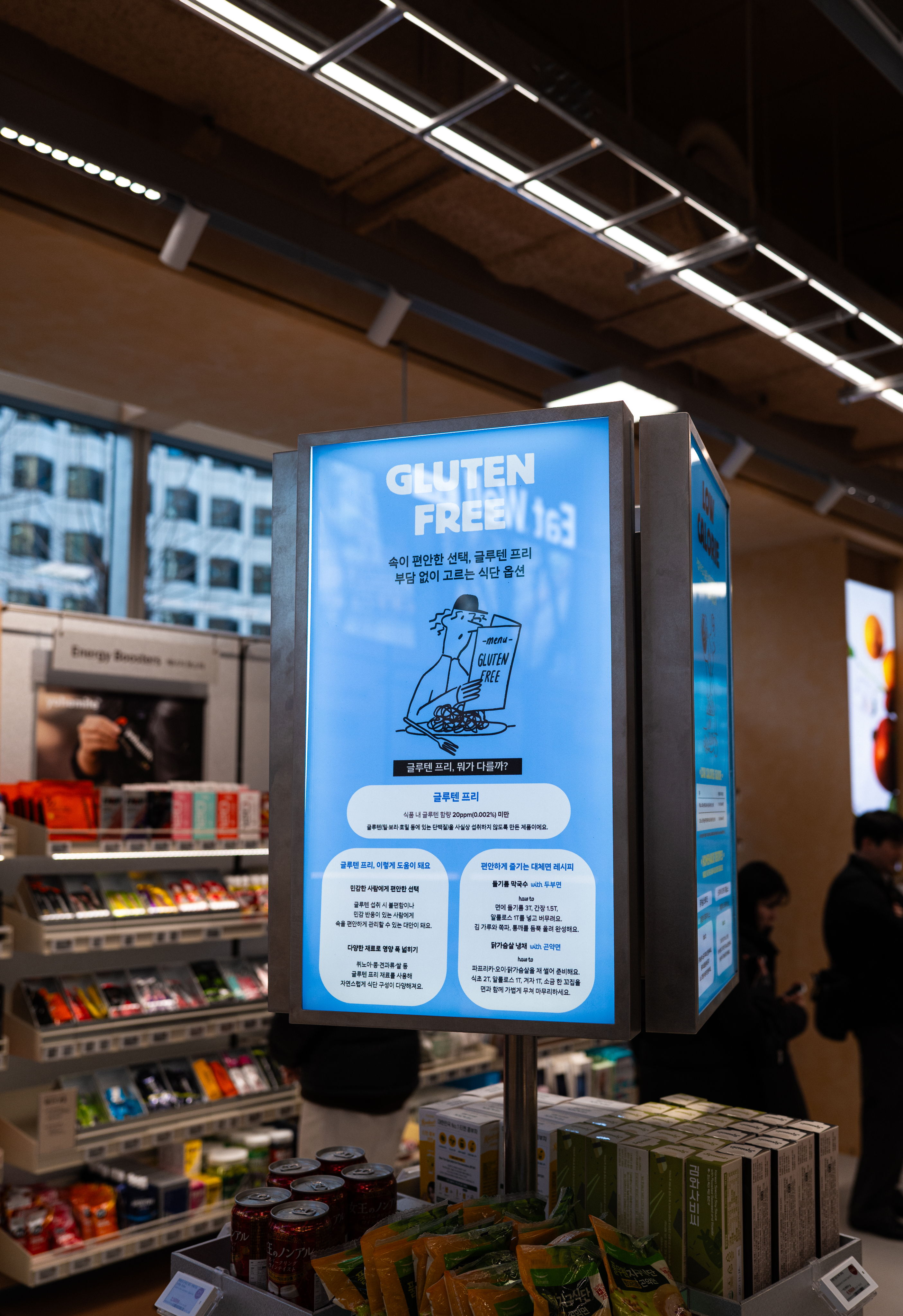
The resulting artwork functions beyond decoration. Integrated throughout the store, it operates as signage, information, and spatial attitude, activating the brand within the environment.
Grounded in Haydonna’s drawing language, TIN centered the visual system around the brand’s signature yellow, combining yellow, black line drawings, and white into a restrained yet expressive framework.
The resulting artwork functions beyond decoration. Integrated throughout the store, it operates as signage, information, and spatial attitude, activating the brand within the environment.
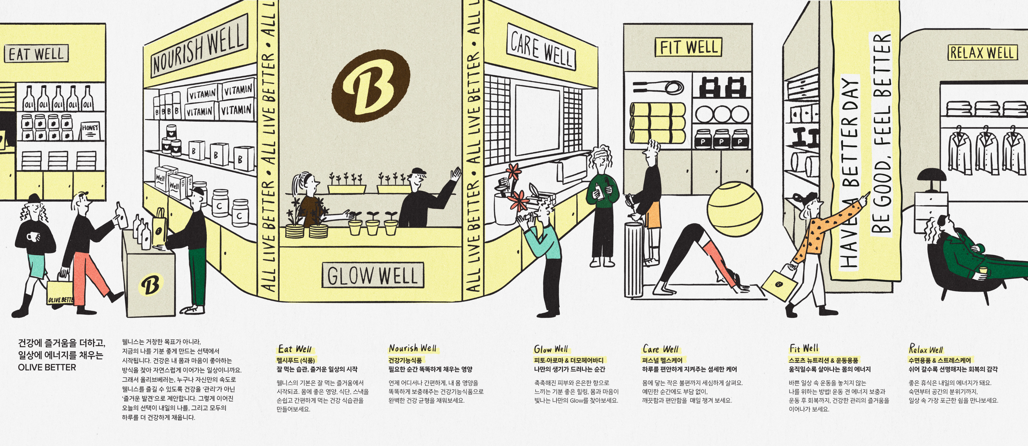
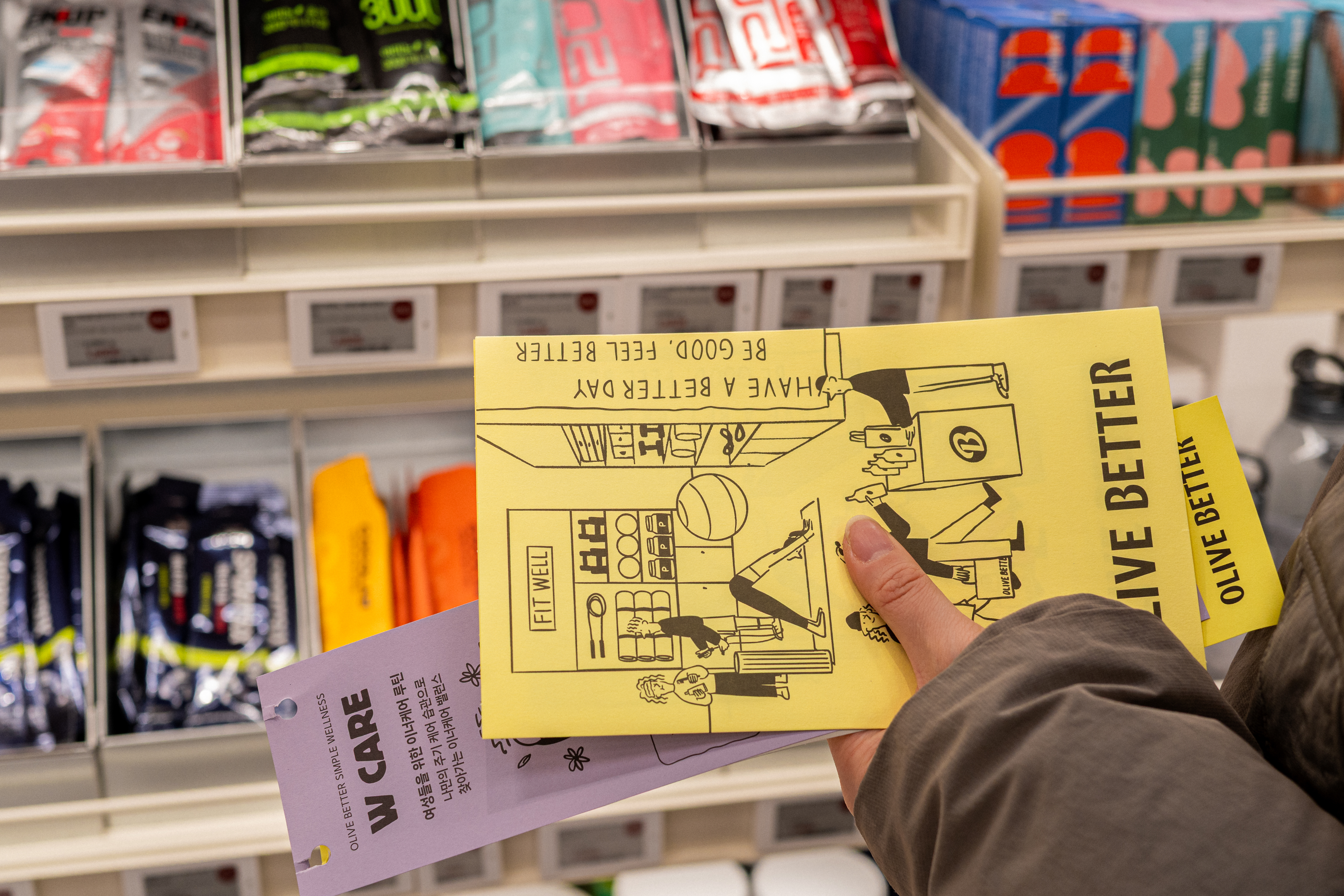
The leaflet serves as the project’s core interface. Though compact in scale, it condenses the brand’s philosophy and store journey into a dense, tactile object.
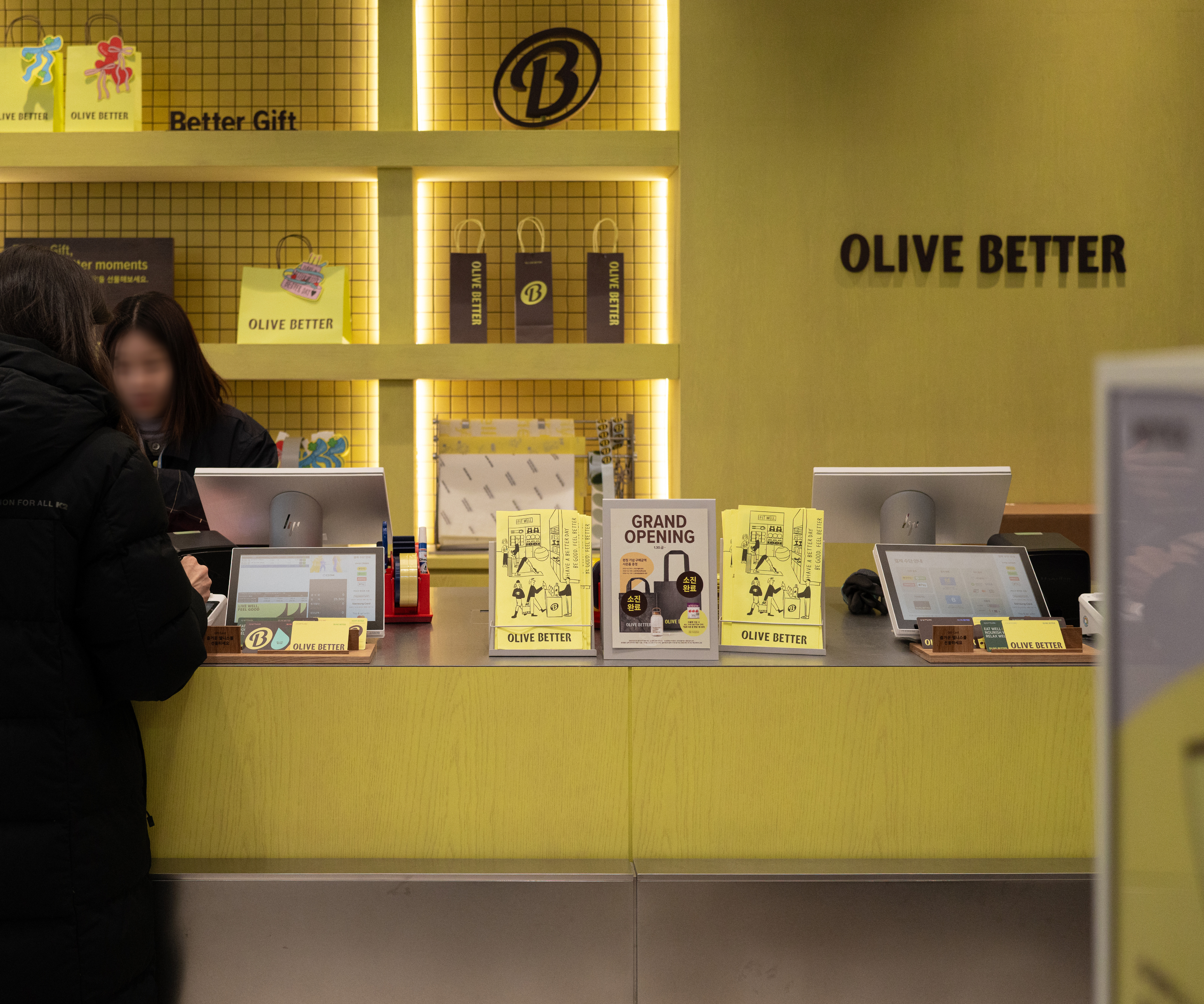
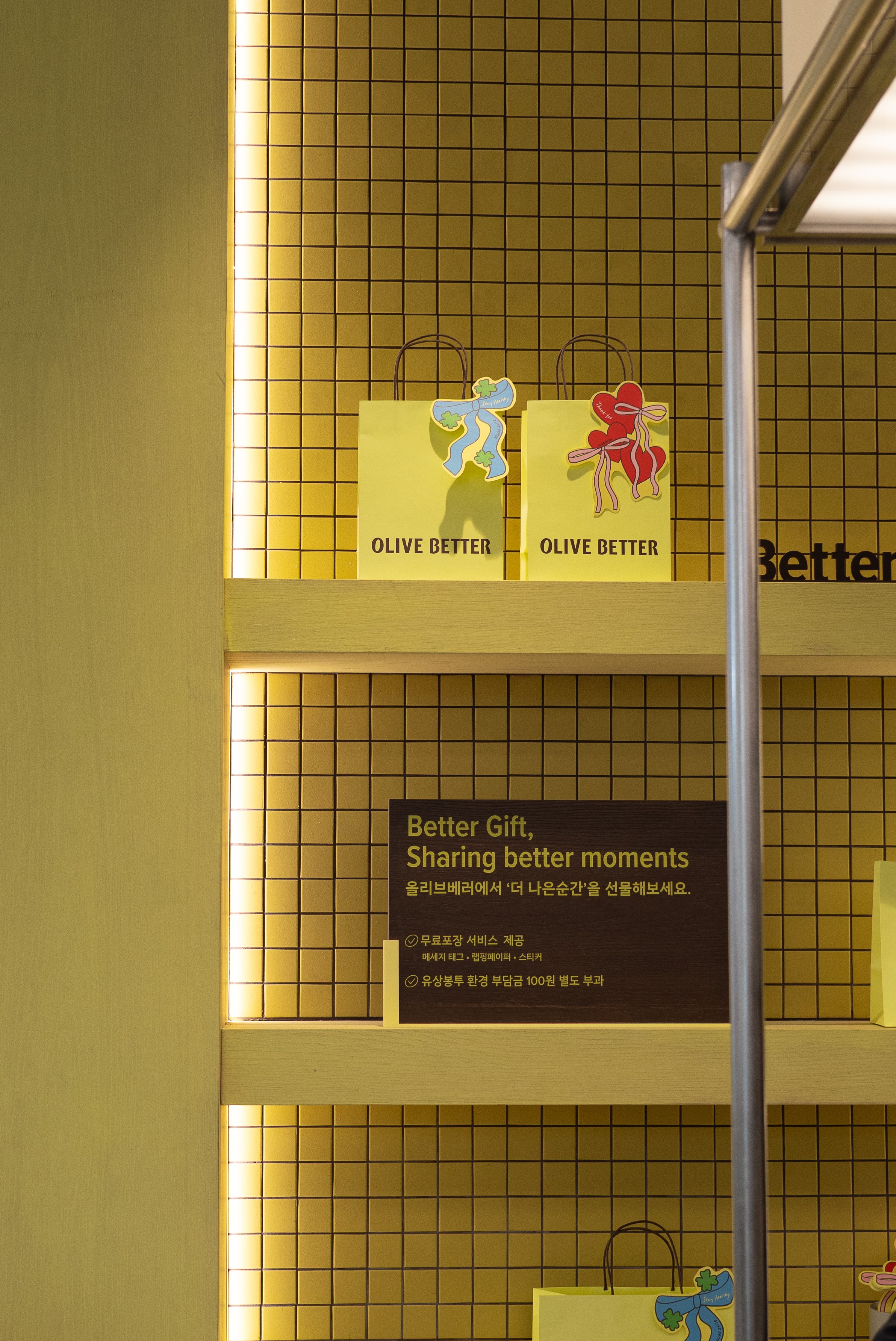
Graphics extend beyond flat surfaces. Distributed across walls, structures, and circulation paths, they visually translate the brand’s philosophy while shaping the rhythm of the space.
Through Olive Better, TIN proposes a way in which brand, space, and emotion converge into a unified artwork.
HAY TIN / Creative Base
A503-Sounds Hannam, 35 Daesagwan-ro,
Yongsan-gu, Seoul, 04401
Tel: +82-70-7778-5757
Email: hello@hay-tin.com
©HAYTIN. ALL RIGHTS RESERVED.
← Last Project
next project →
en
kr
/
hay TIN
works
about
Olive Better A Wellness Platform Launch for CJ Olive Young Brand Artwork & Printed Experience
request PRESS FILE
TIN developed the brand artwork and printed experience for the January 2026 launch of Olive Better, a new wellness platform brand by CJ Olive Young.
Olive Better was conceived as a wellness journey unfolding through movement and perception within the store environment.
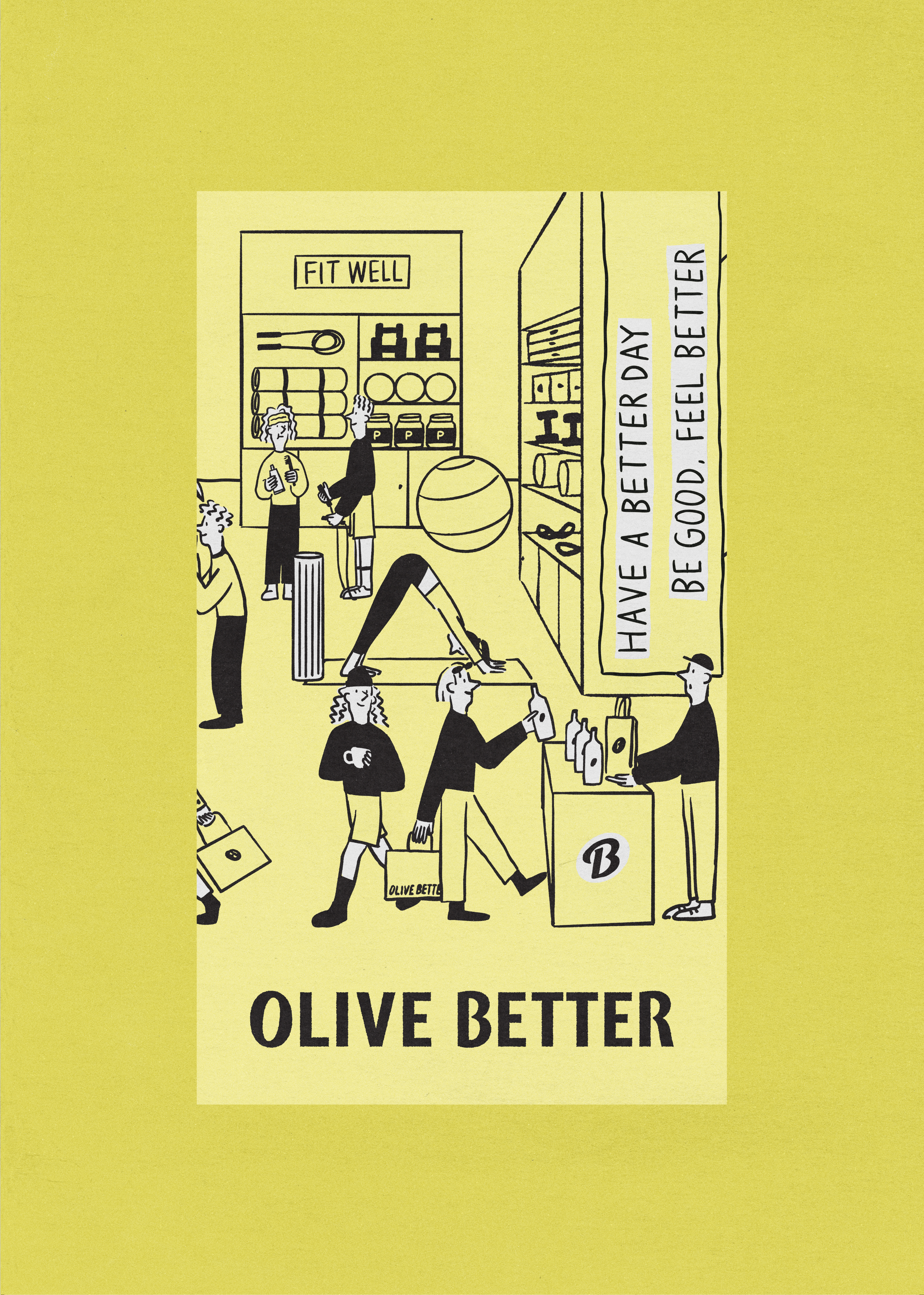
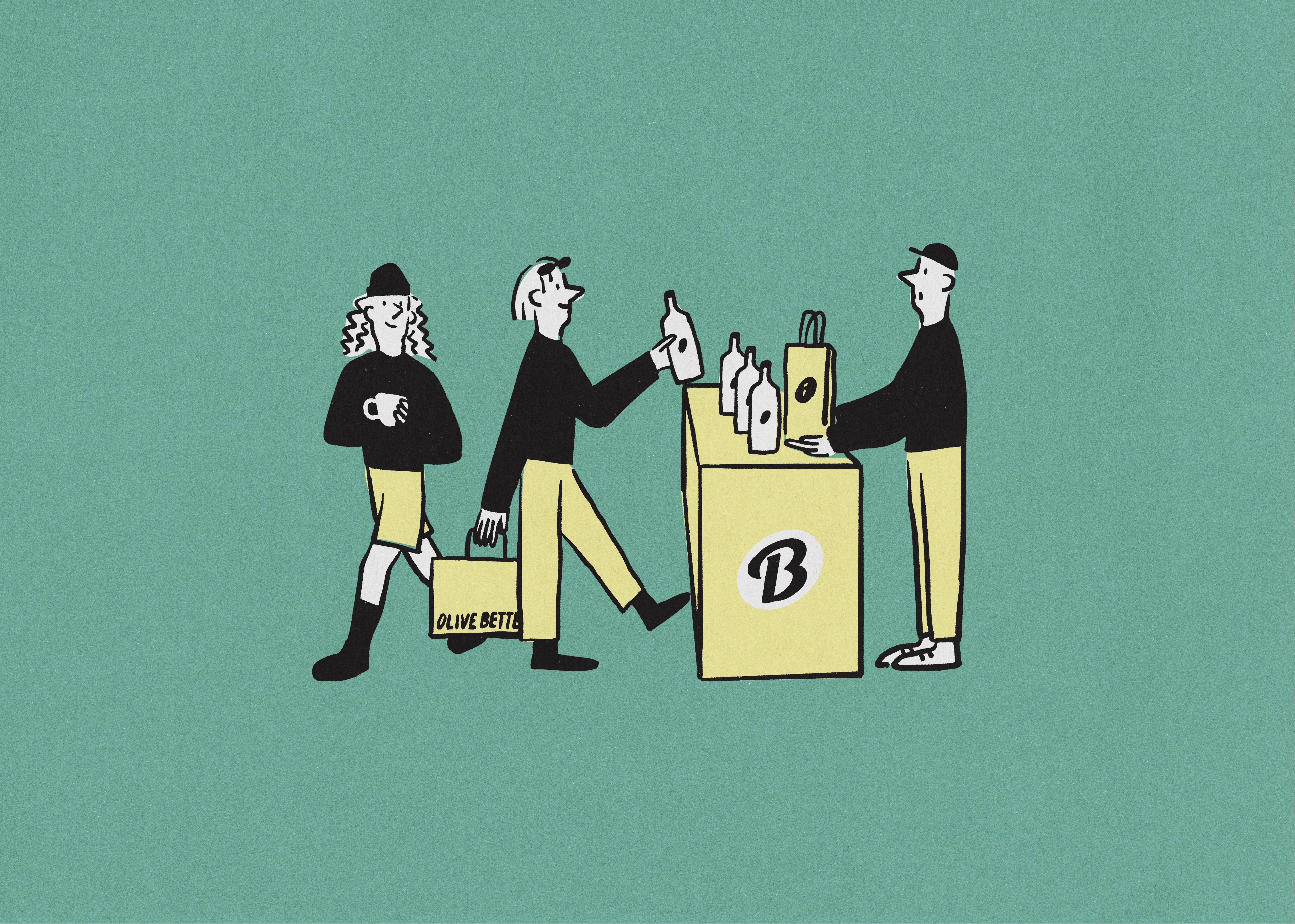
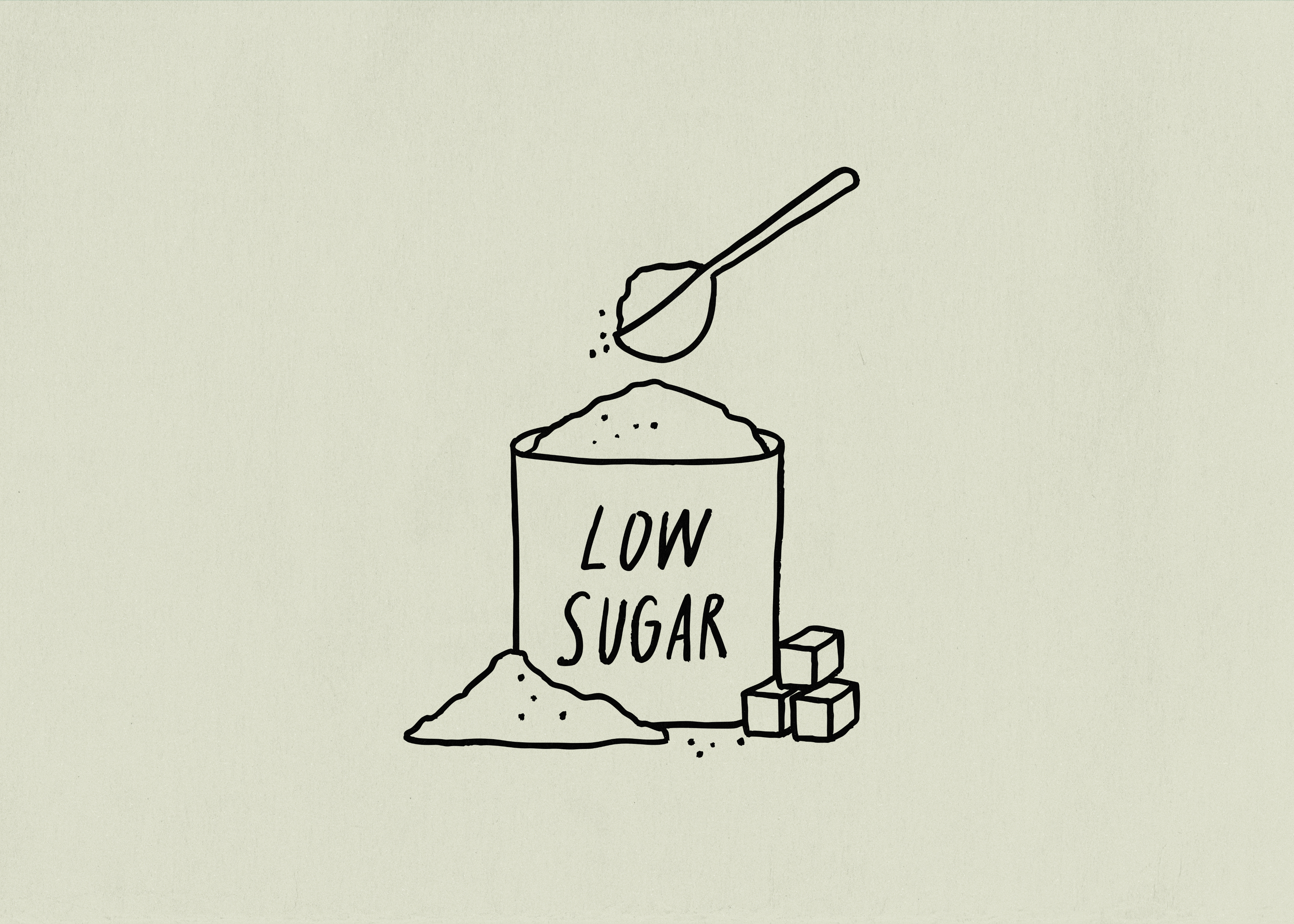
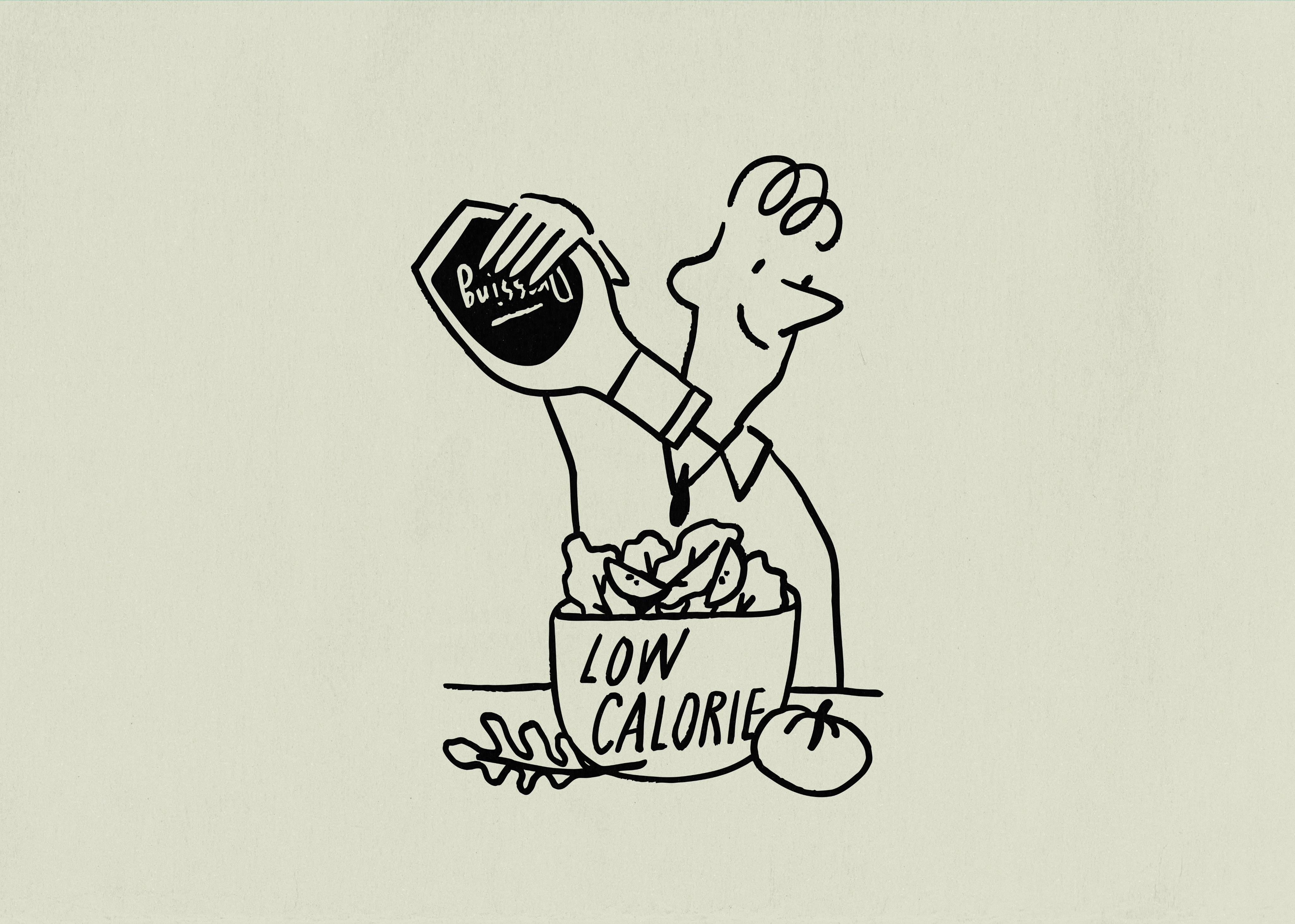
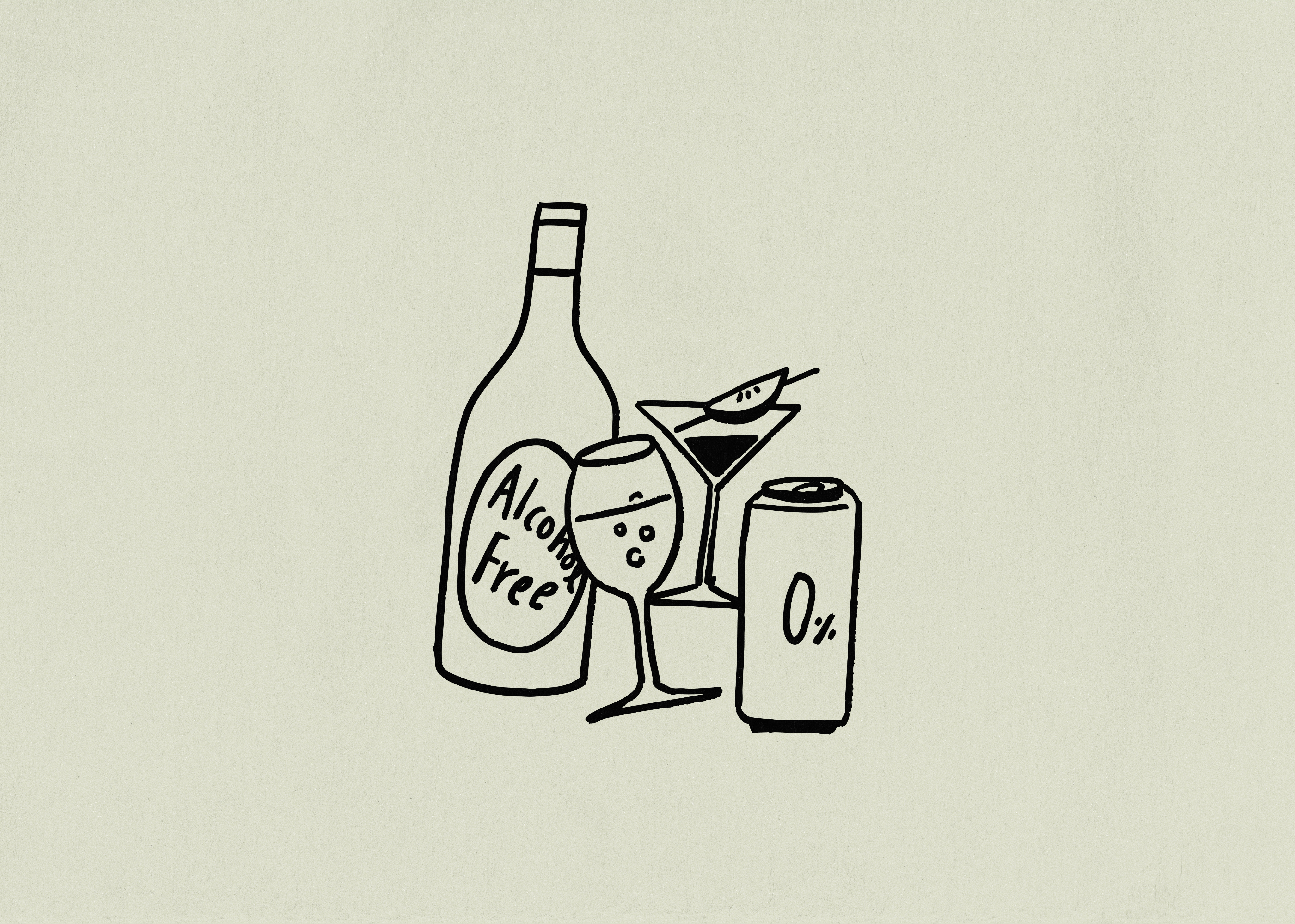
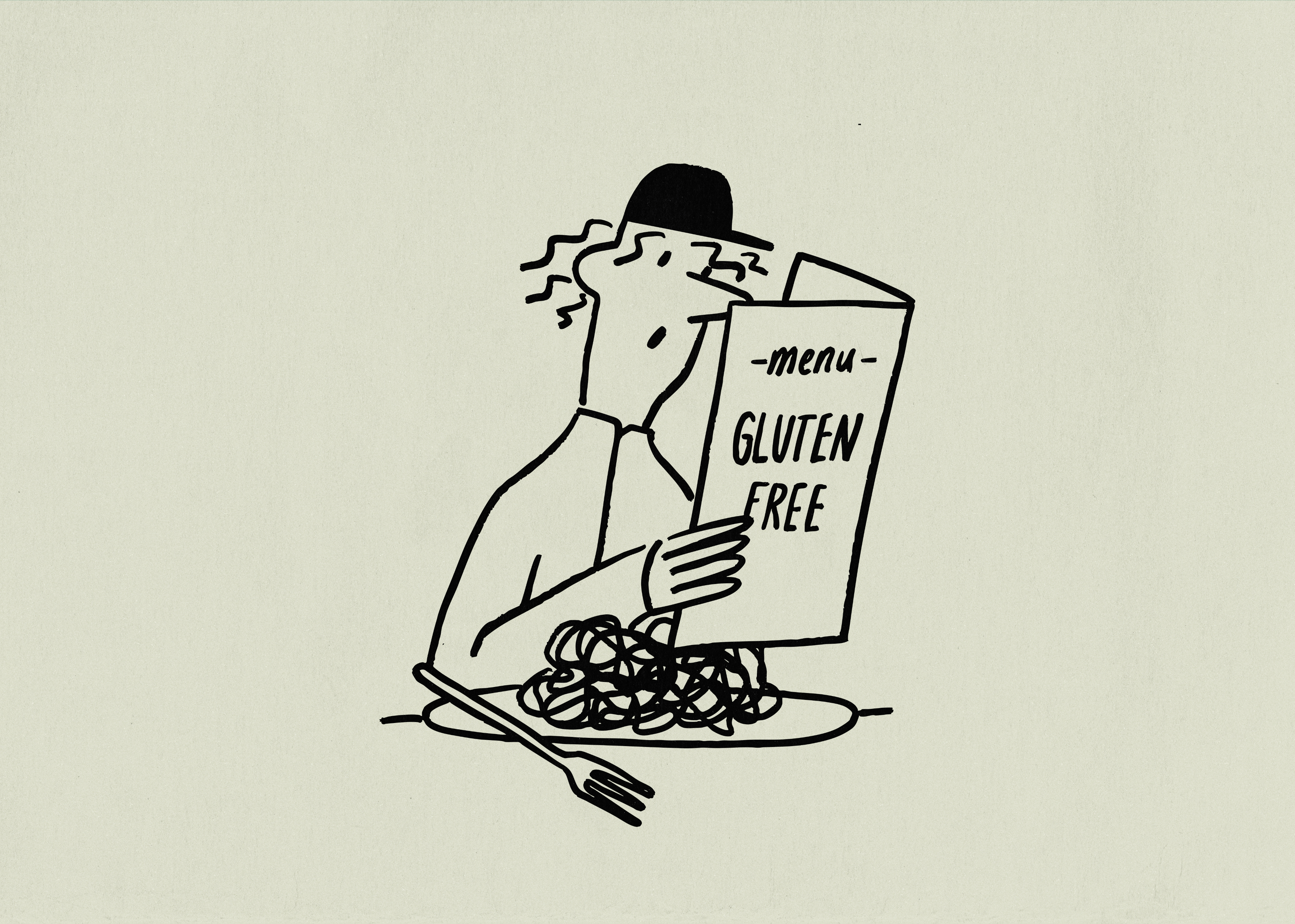
Grounded in Haydonna’s drawing language, TIN centered the visual system around the brand’s signature yellow, combining yellow, black line drawings, and white into a restrained yet expressive framework.
The resulting artwork functions beyond decoration. Integrated throughout the store, it operates as signage, information, and spatial attitude, activating the brand within the environment.
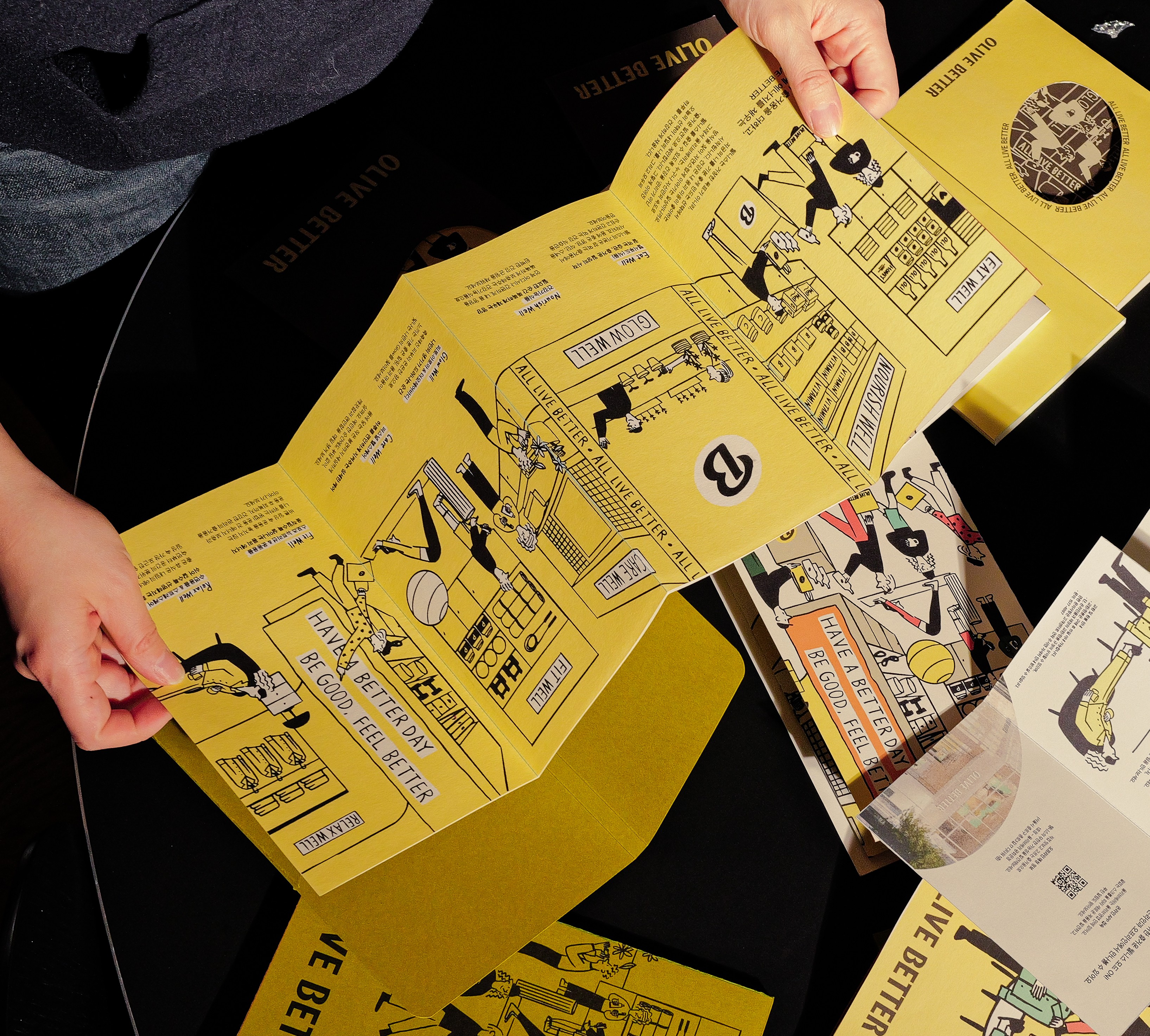
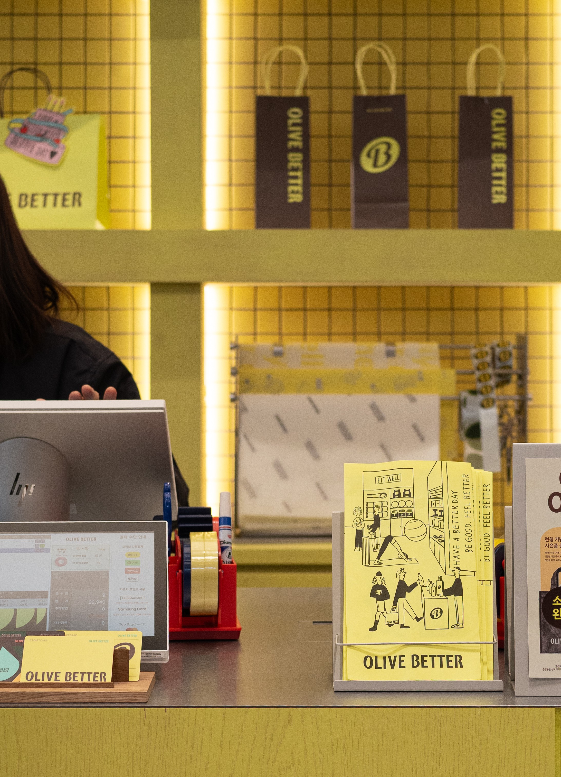
The leaflet serves as the project’s core interface. Though compact in scale, it condenses the brand’s philosophy and store journey into a dense, tactile object.
Graphics extend beyond flat surfaces. Distributed across walls, structures, and circulation paths, they visually translate the brand’s philosophy while shaping the rhythm of the space.
Through Olive Better, TIN proposes a way in which brand, space, and emotion converge into a unified artwork.
HAY TIN / Creative Base
A503-Sounds Hannam, 35 Daesagwan-ro,
Yongsan-gu, Seoul, 04401
Tel: +82-70-7778-5757
Email: hello@hay-tin.com
©HAYTIN. ALL RIGHTS RESERVED.
← Last Project
next project →
en
kr
/
hay TIN
works
about
Olive Better A Wellness Platform Launch for CJ Olive Young Brand Artwork & Printed Experience
request PRESS FILE
TIN developed the brand artwork and printed experience for the January 2026 launch of Olive Better, a new wellness platform brand by CJ Olive Young.
Olive Better was conceived as a wellness journey unfolding through movement and perception within the store environment.
Grounded in Haydonna’s drawing language, TIN centered the visual system around the brand’s signature yellow, combining yellow, black line drawings, and white into a restrained yet expressive framework.
The resulting artwork functions beyond decoration. Integrated throughout the store, it operates as signage, information, and spatial attitude, activating the brand within the environment.
The leaflet serves as the project’s core interface. Though compact in scale, it condenses the brand’s philosophy and store journey into a dense, tactile object.
Graphics extend beyond flat surfaces. Distributed across walls, structures, and circulation paths, they visually translate the brand’s philosophy while shaping the rhythm of the space.
Through Olive Better, TIN proposes a way in which brand, space, and emotion converge into a unified artwork.