hay TIN
works
about
en
kr
/
raymond
request PRESS FILE
Through Bo, TIN redefined the act of drawing as a process of visual storytelling. Each of the many illustrations captures a fragment of Bo’s feelings, thoughts, and the inner world of modern people, all forming one cohesive universe. His ironic humor, sensitivity, and love for art resonate deeply with the emotions of contemporary life.
This project takes a different path from conventional commercial IPs. TIN did not create a simple visual icon, but designed a world where artistic identity and emotion coexist. It reflects the studio’s artistic sensibility and its ability to translate emotional depth into a distinctive brand language.
HAY TIN / Creative Base
A503-Sounds Hannam, 35 Daesagwan-ro,
Yongsan-gu, Seoul, 04401
Tel: +82-70-7778-5757
Email: hello@hay-tin.com
©HAYTIN. ALL RIGHTS RESERVED.
raymond
request PRESS FILE
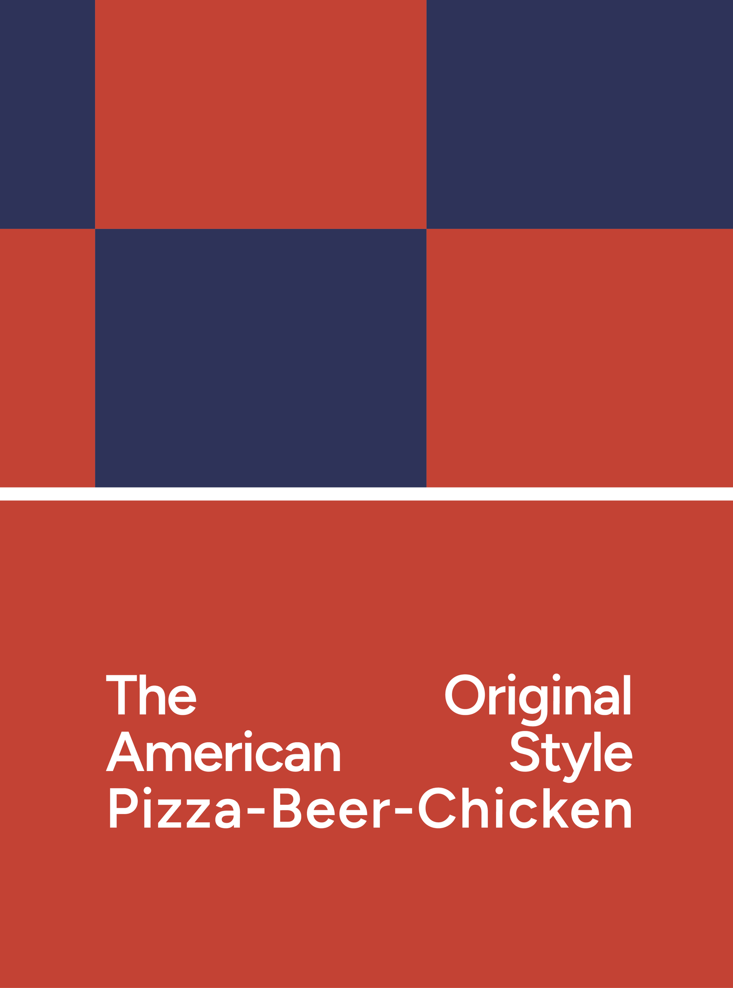
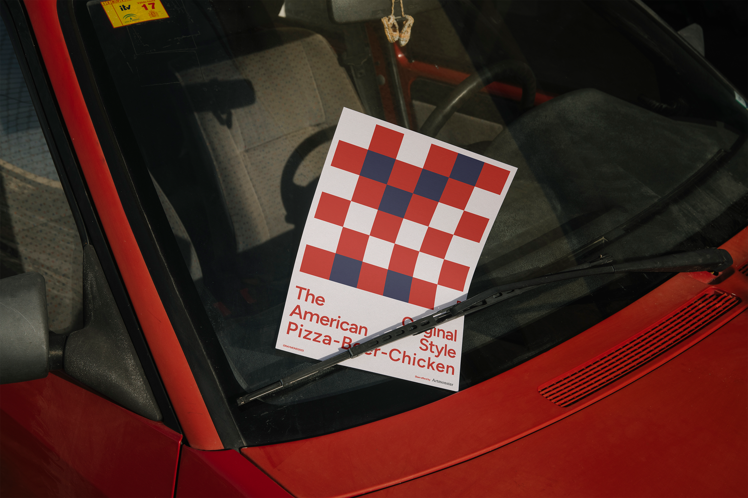
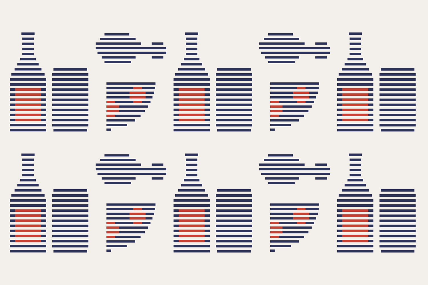
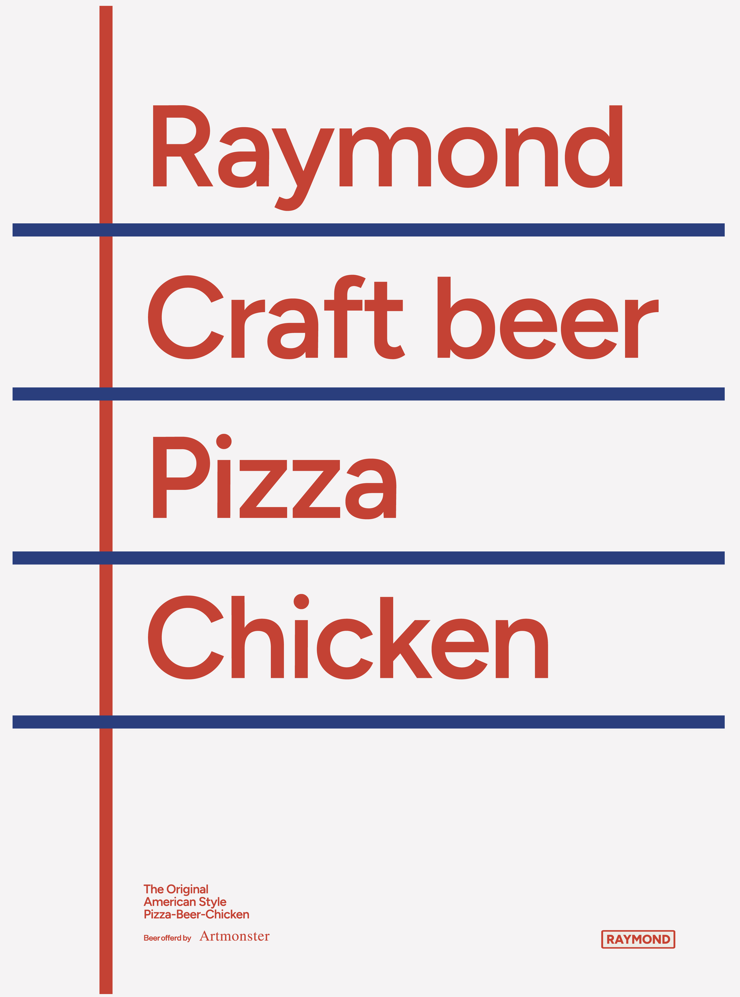
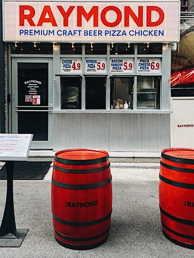
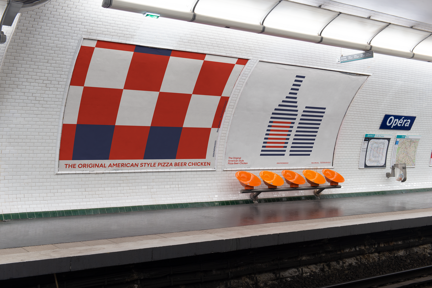
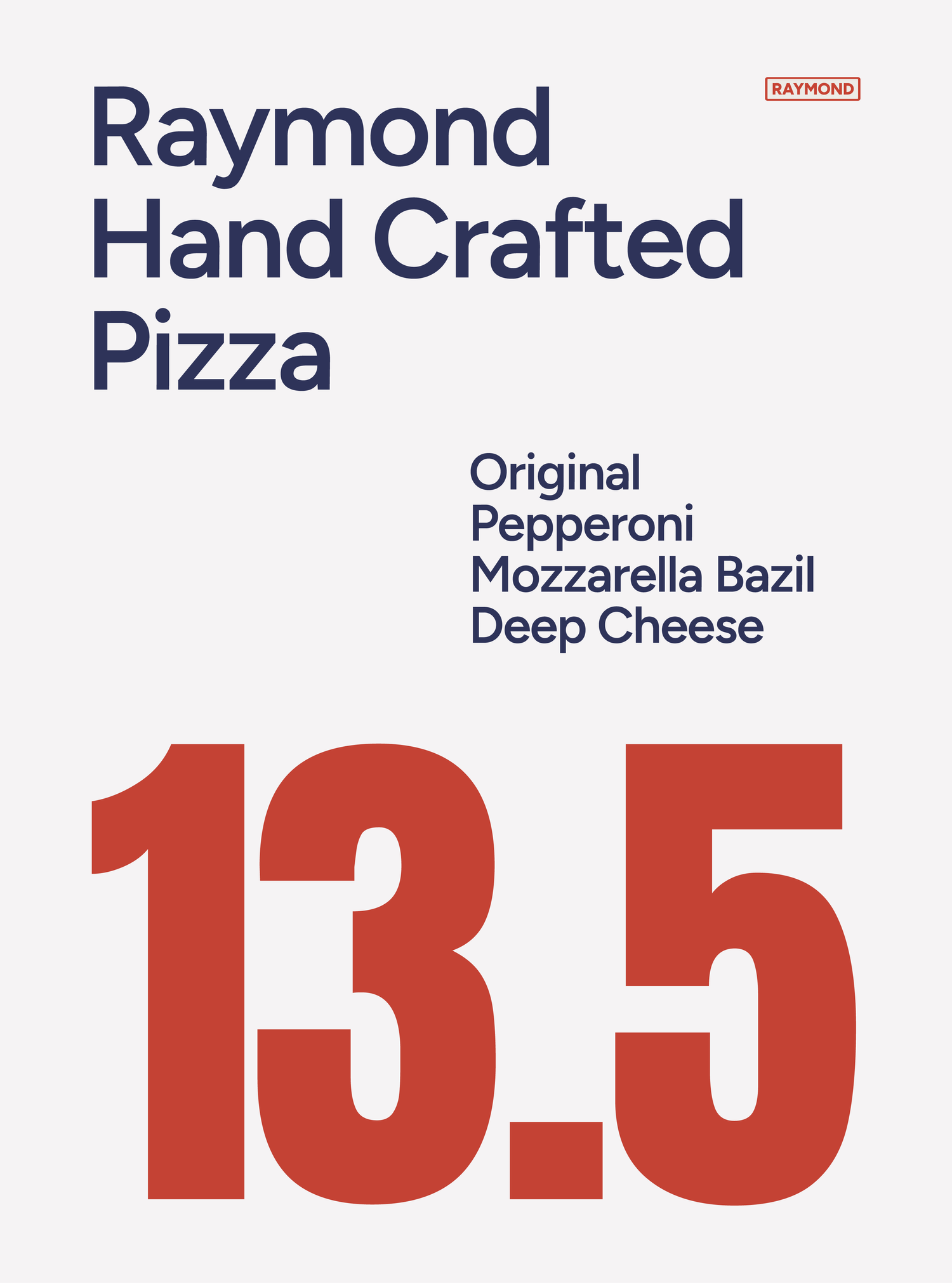
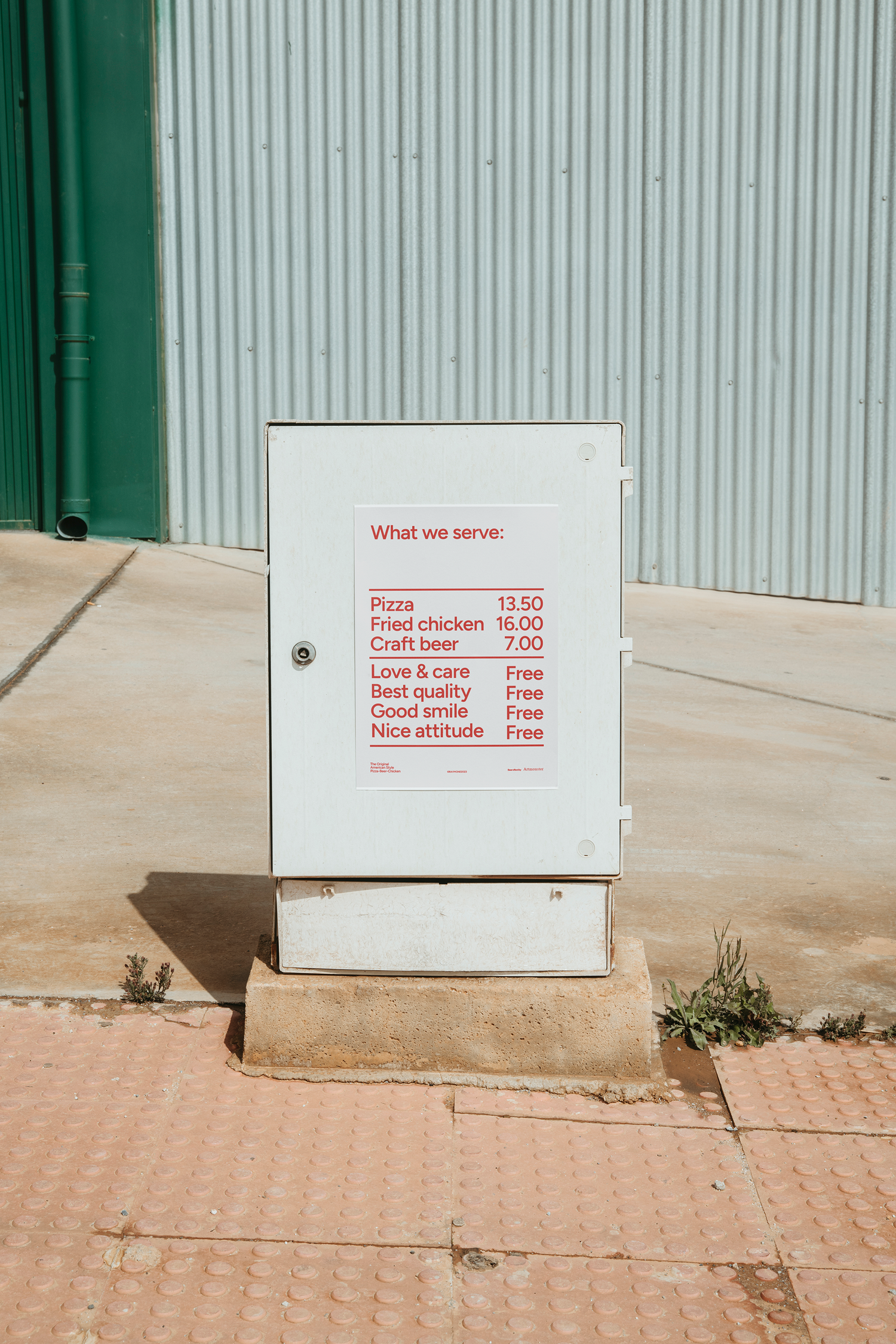
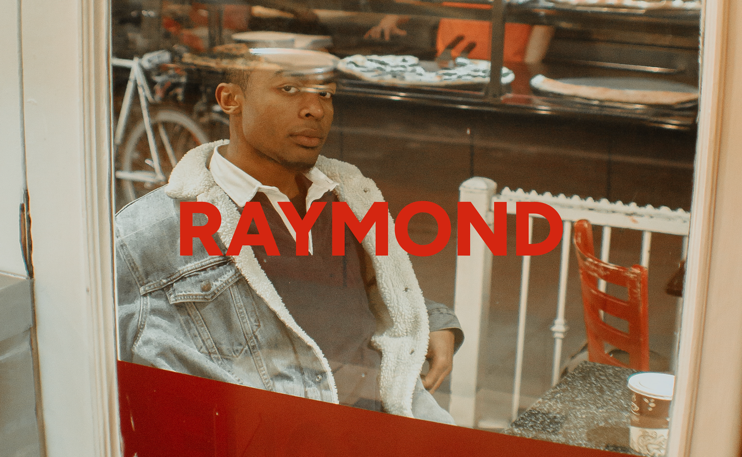
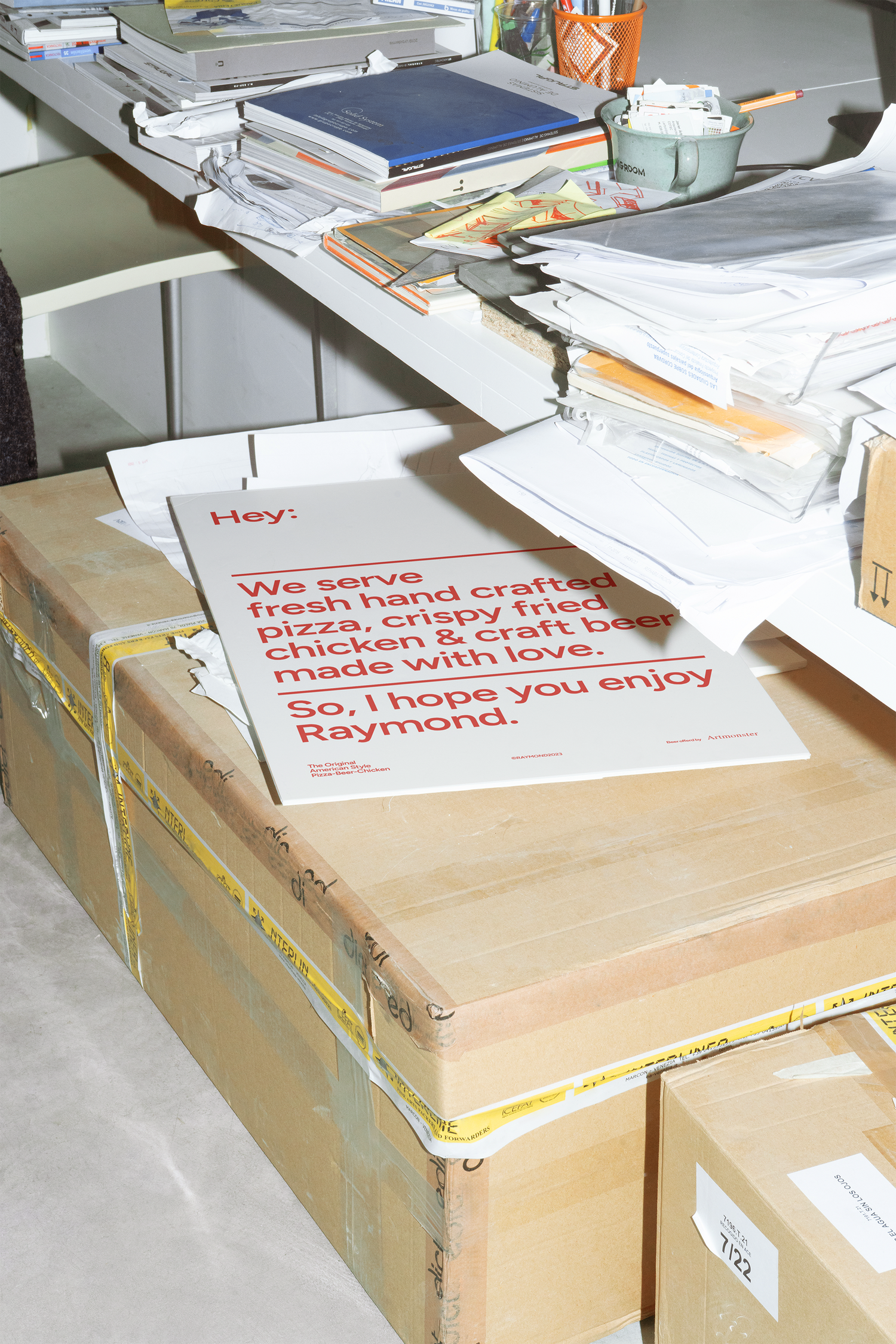
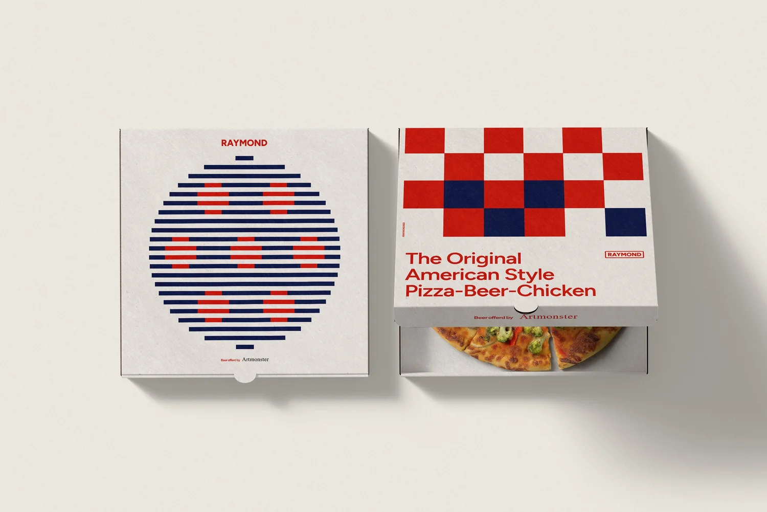
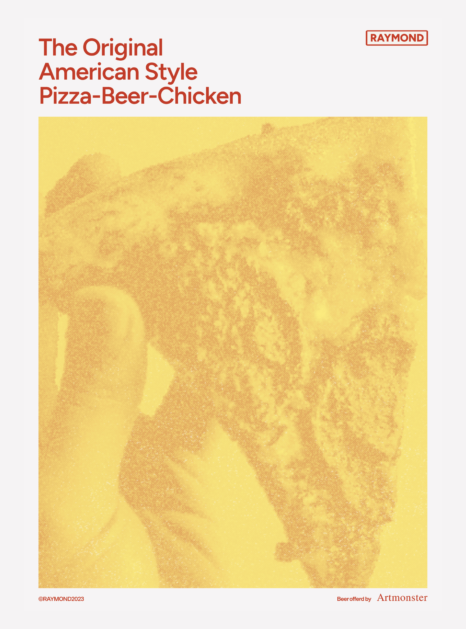
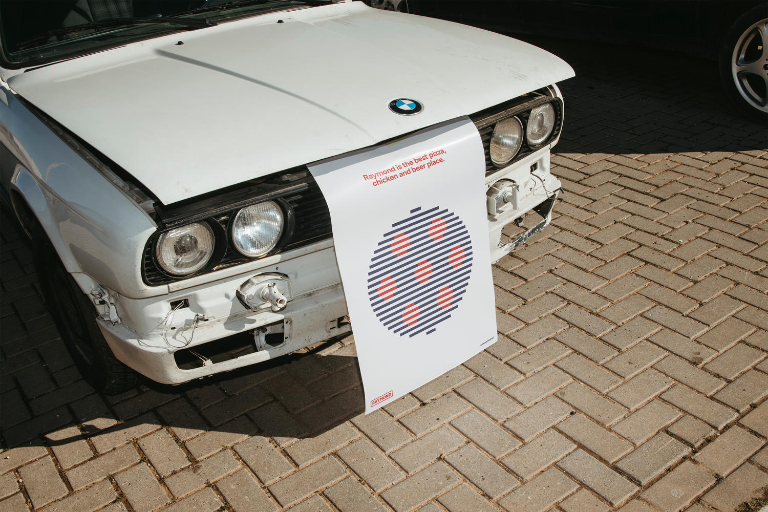
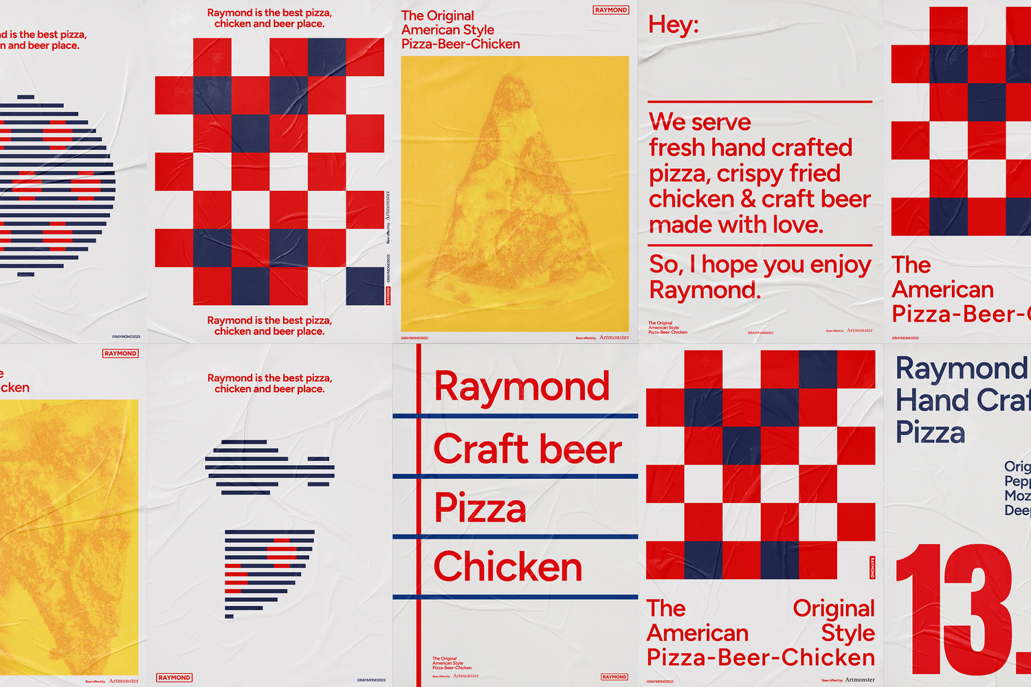
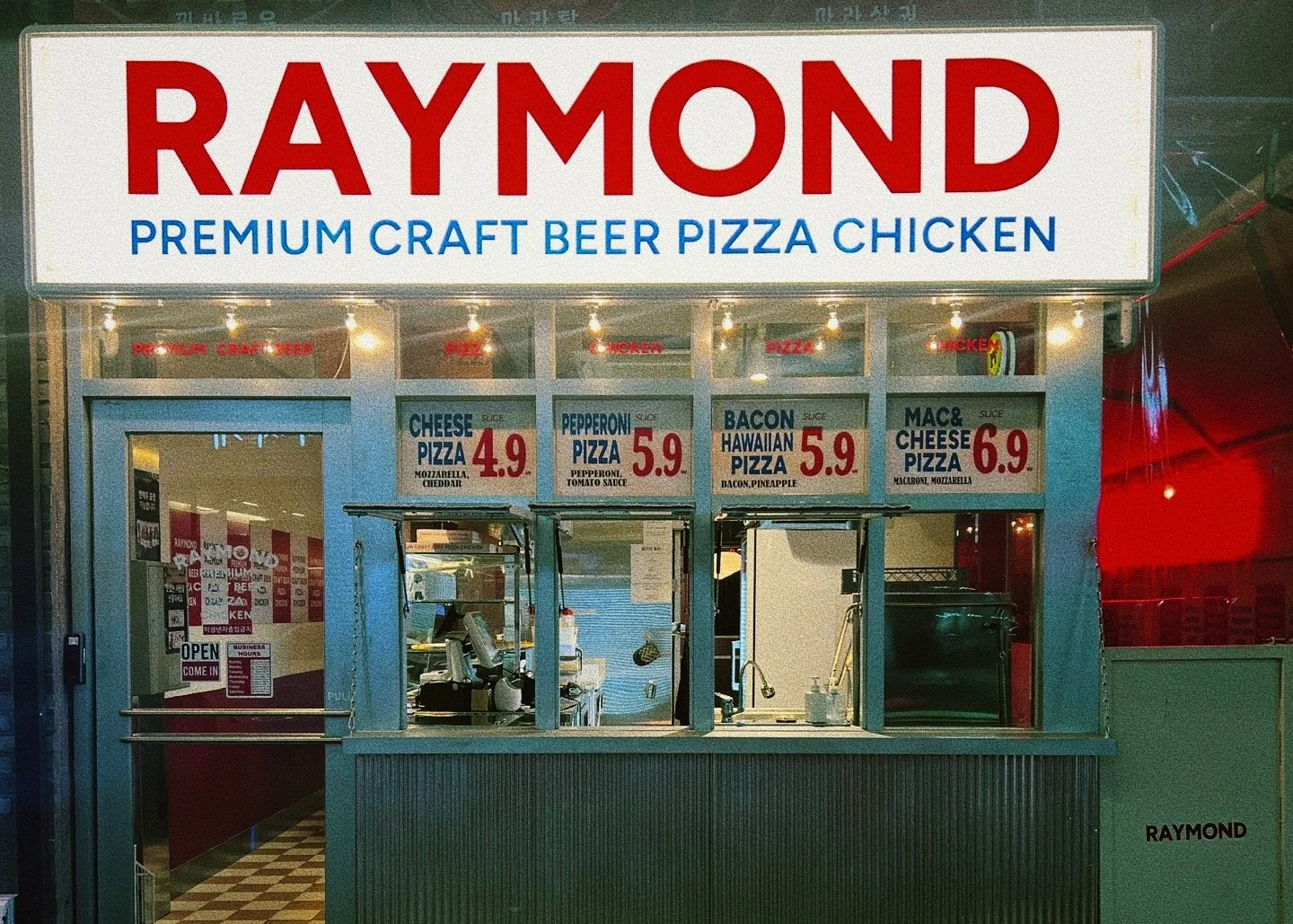
Raymond is a new American-style restaurant brand launched by Artmonster, created to deliver both culinary excellence and an enjoyable dining experience. TIN developed the brand identity to position Raymond not just as a restaurant, but as a space where American nostalgia meets modern sensibility.
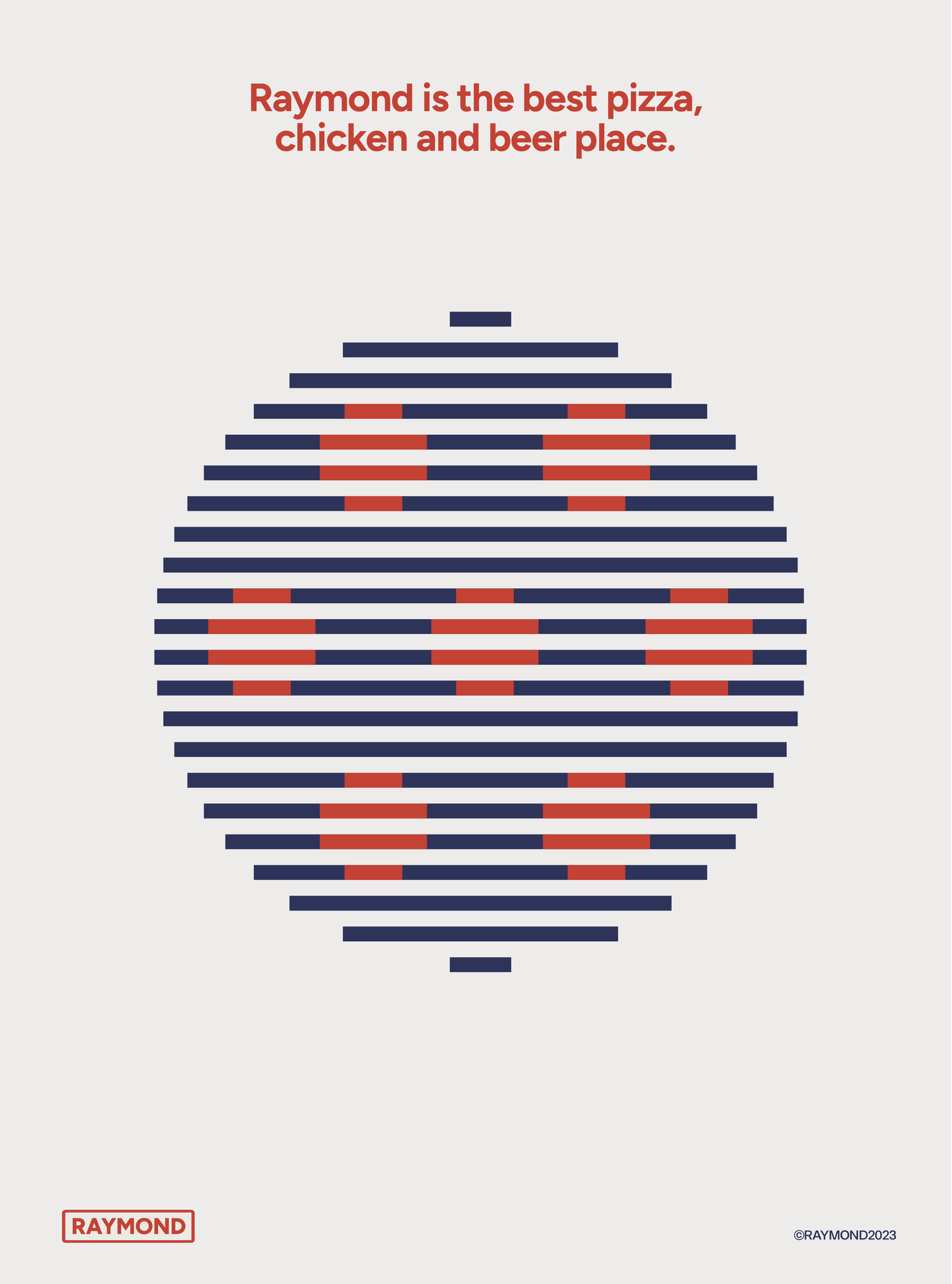
At the core of the branding lies the star motif, inspired by the American flag. Paired with a classic typeface, it recalls the charm of 1980s Americana while adding a clean, contemporary touch. The vintage-toned blue and red palette reinforces the American character of the brand, creating a warm and welcoming atmosphere that feels both authentic and familiar.
HAY TIN / Creative Base
A503-Sounds Hannam, 35 Daesagwan-ro,
Yongsan-gu, Seoul, 04401
Tel: +82-70-7778-5757
Email: hello@hay-tin.com
©HAYTIN. ALL RIGHTS RESERVED.
en
kr
/
hay TIN
works
about
raymond
request PRESS FILE
Raymond is a new American-style restaurant brand launched by Artmonster, created to deliver both culinary excellence and an enjoyable dining experience. TIN developed the brand identity to position Raymond not just as a restaurant, but as a space where American nostalgia meets modern sensibility.
At the core of the branding lies the star motif, inspired by the American flag. Paired with a classic typeface, it recalls the charm of 1980s Americana while adding a clean, contemporary touch. The vintage-toned blue and red palette reinforces the American character of the brand, creating a warm and welcoming atmosphere that feels both authentic and familiar.
en
kr
/
hay TIN
works
about