hay TIN
works
about
en
kr
/
seoul hannok week
Brand identity design for Seoul Hanok Week and the exhibition Resonance of Space
request PRESS FILE
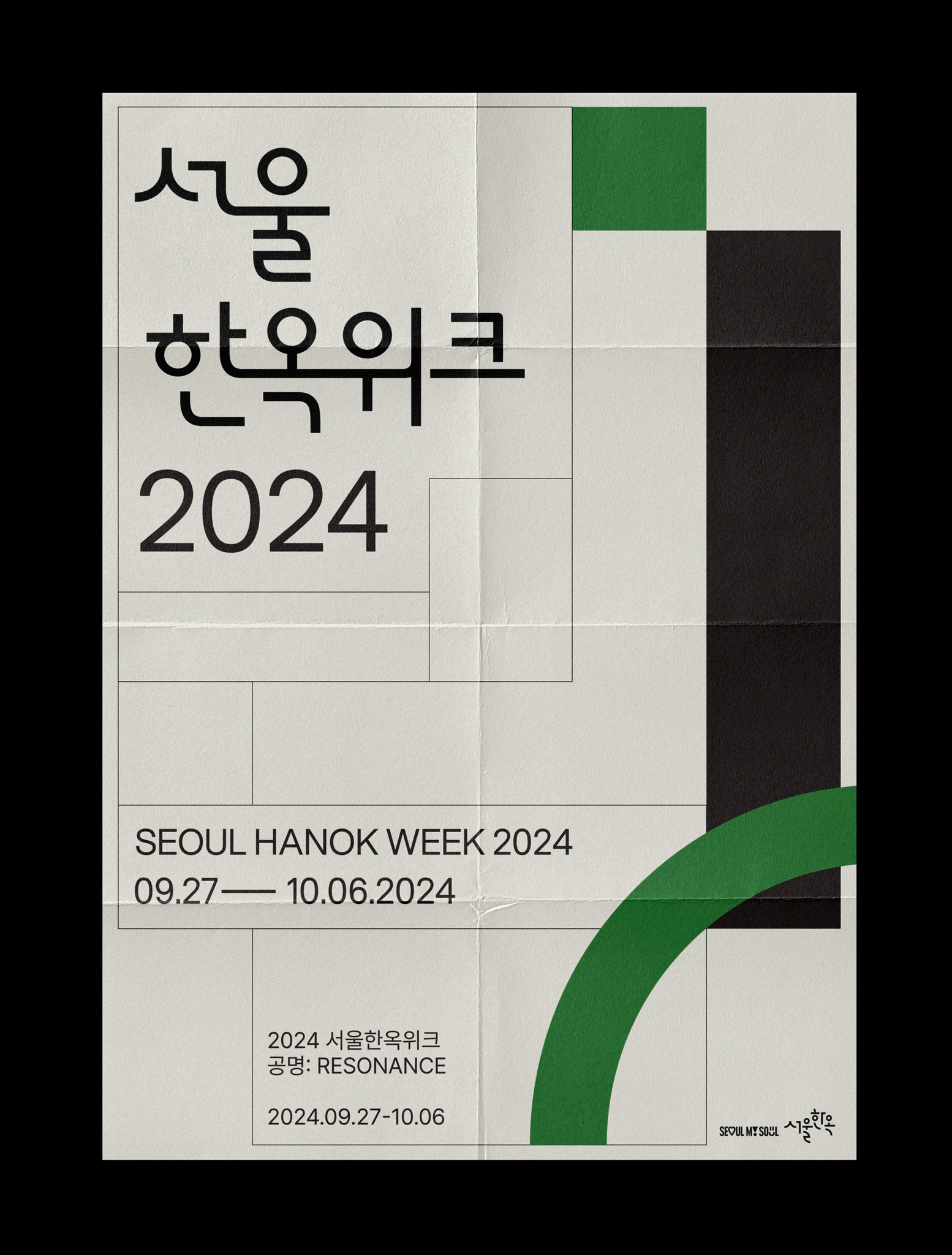
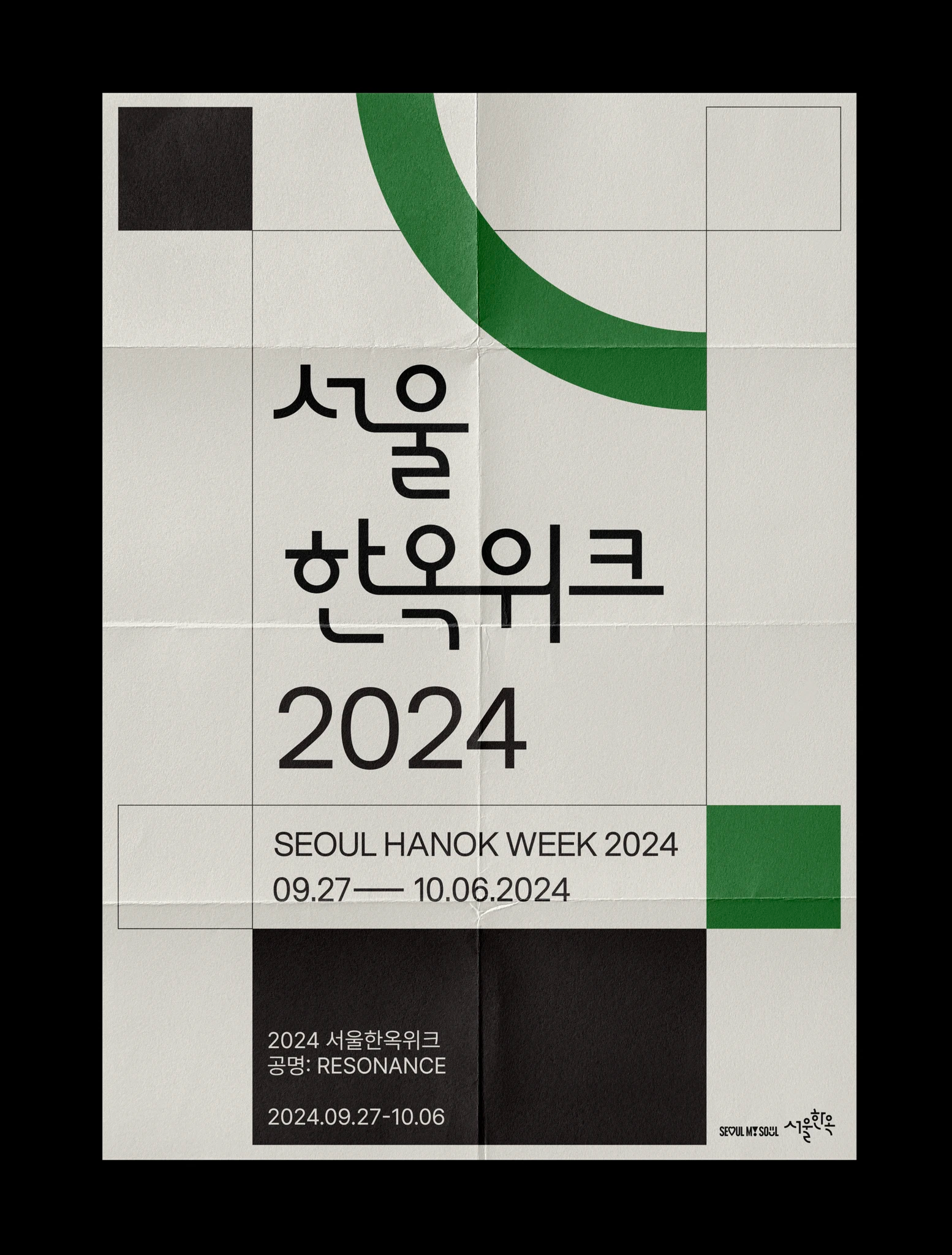
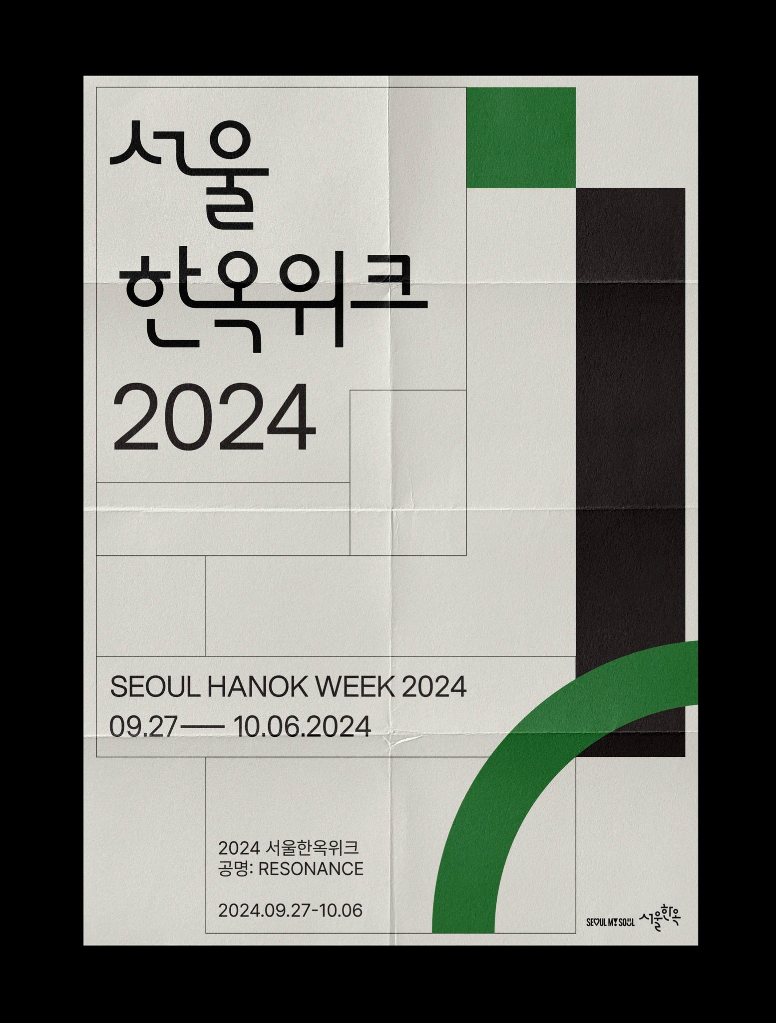
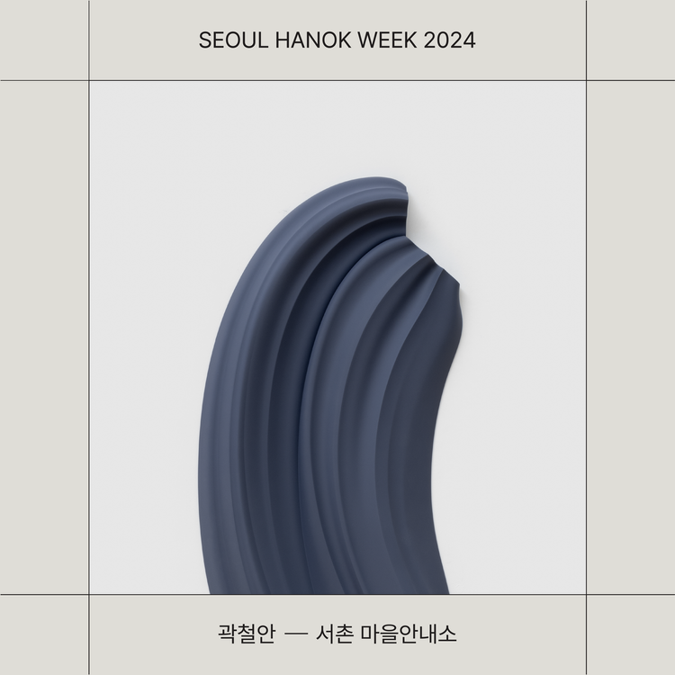
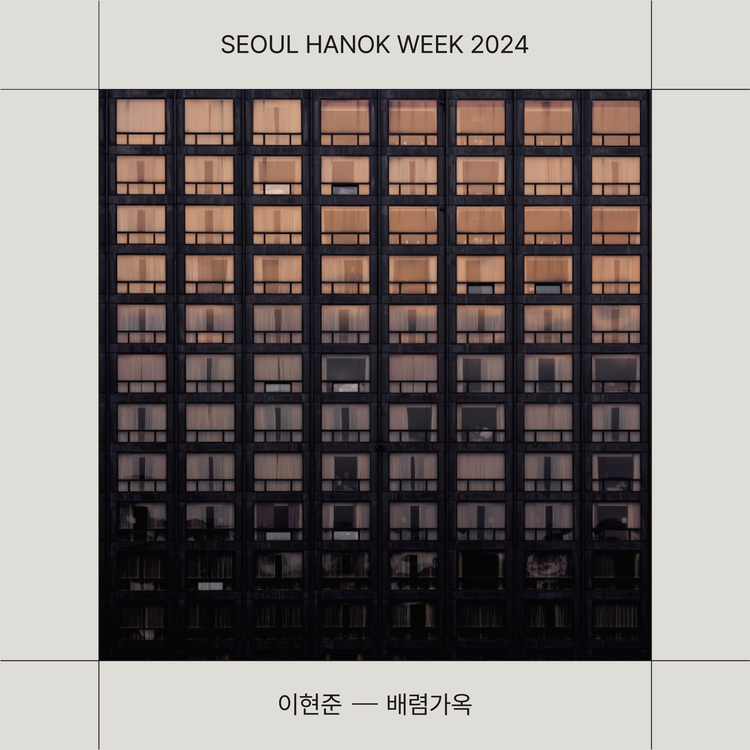
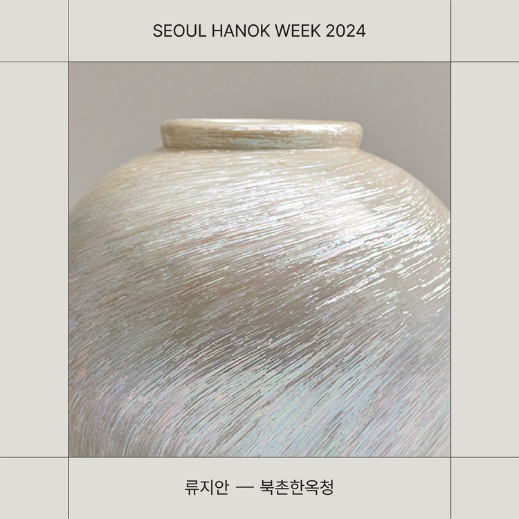
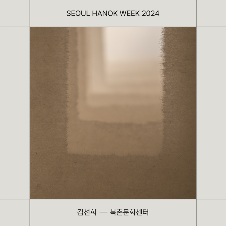
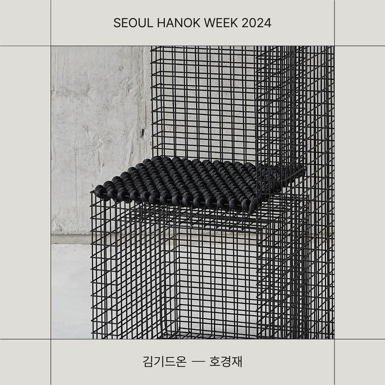
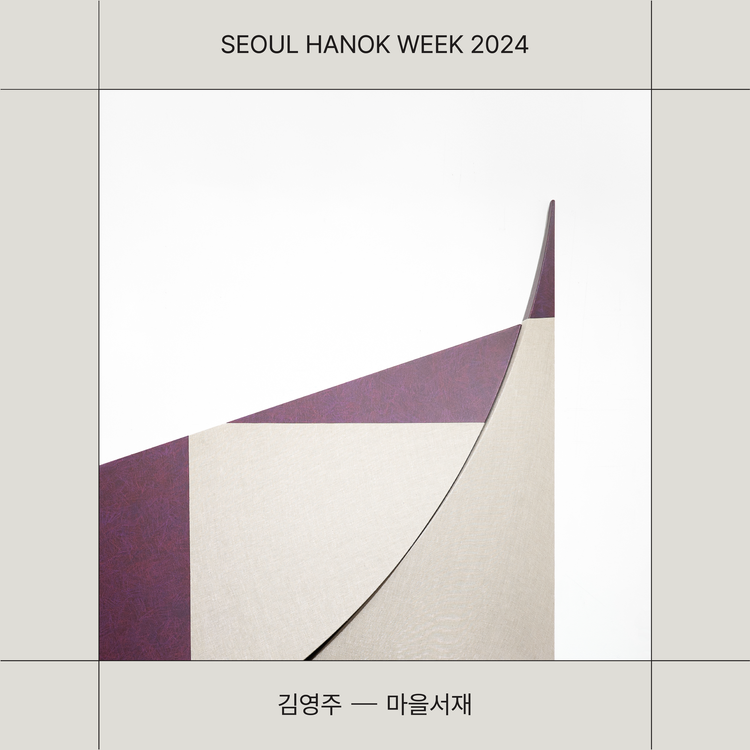
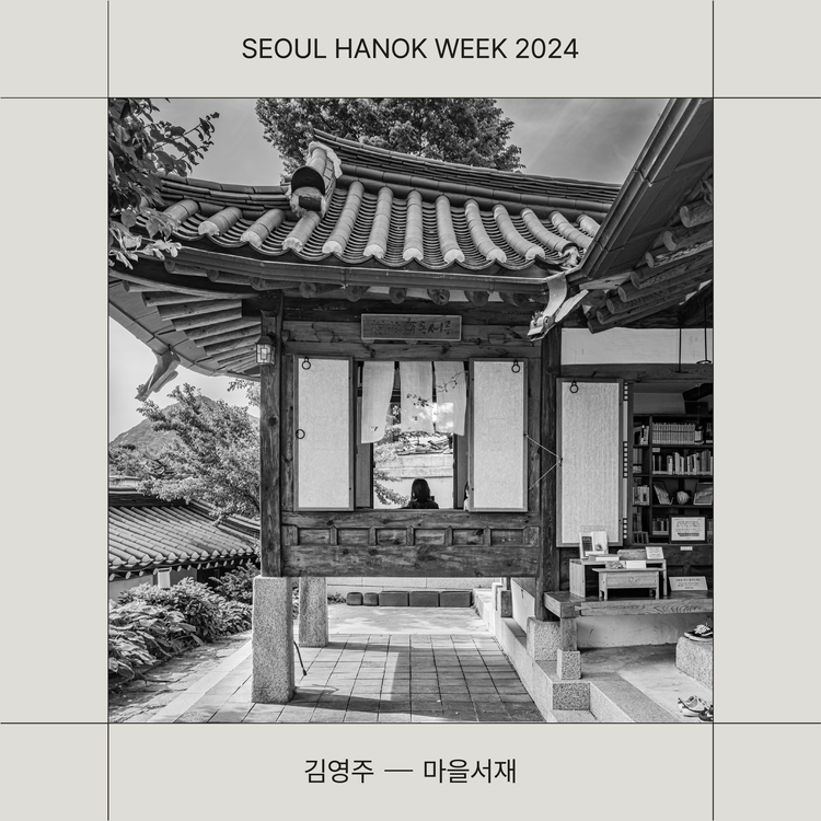
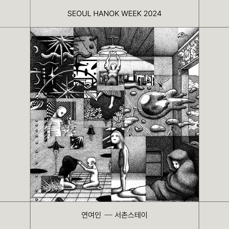
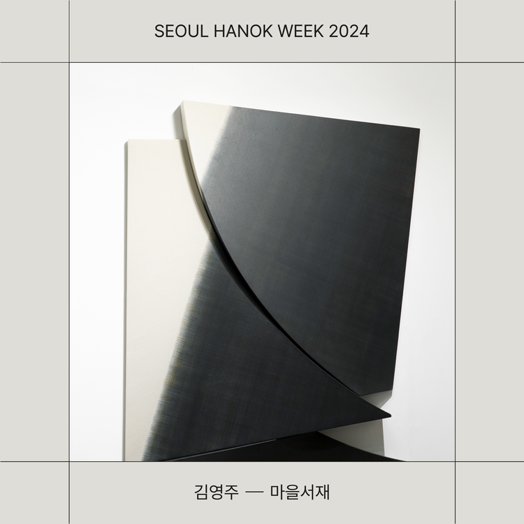
The branding for Seoul Hanok Week used the existing green color from the ‘Seoul Hanok’ identity as a point color, complemented by black and ivory tones to convey the natural and grounded image of Hanok. Korean typography was utilized to visually express the elegant curves and structure of Hanok architecture.
Grounded in Haydonna’s drawing language, TIN centered the visual system around the brand’s signature yellow, combining yellow, black line drawings, and white into a restrained yet expressive framework.
The resulting artwork functions beyond decoration. Integrated throughout the store, it operates as signage, information, and spatial attitude, activating the brand within the environment.
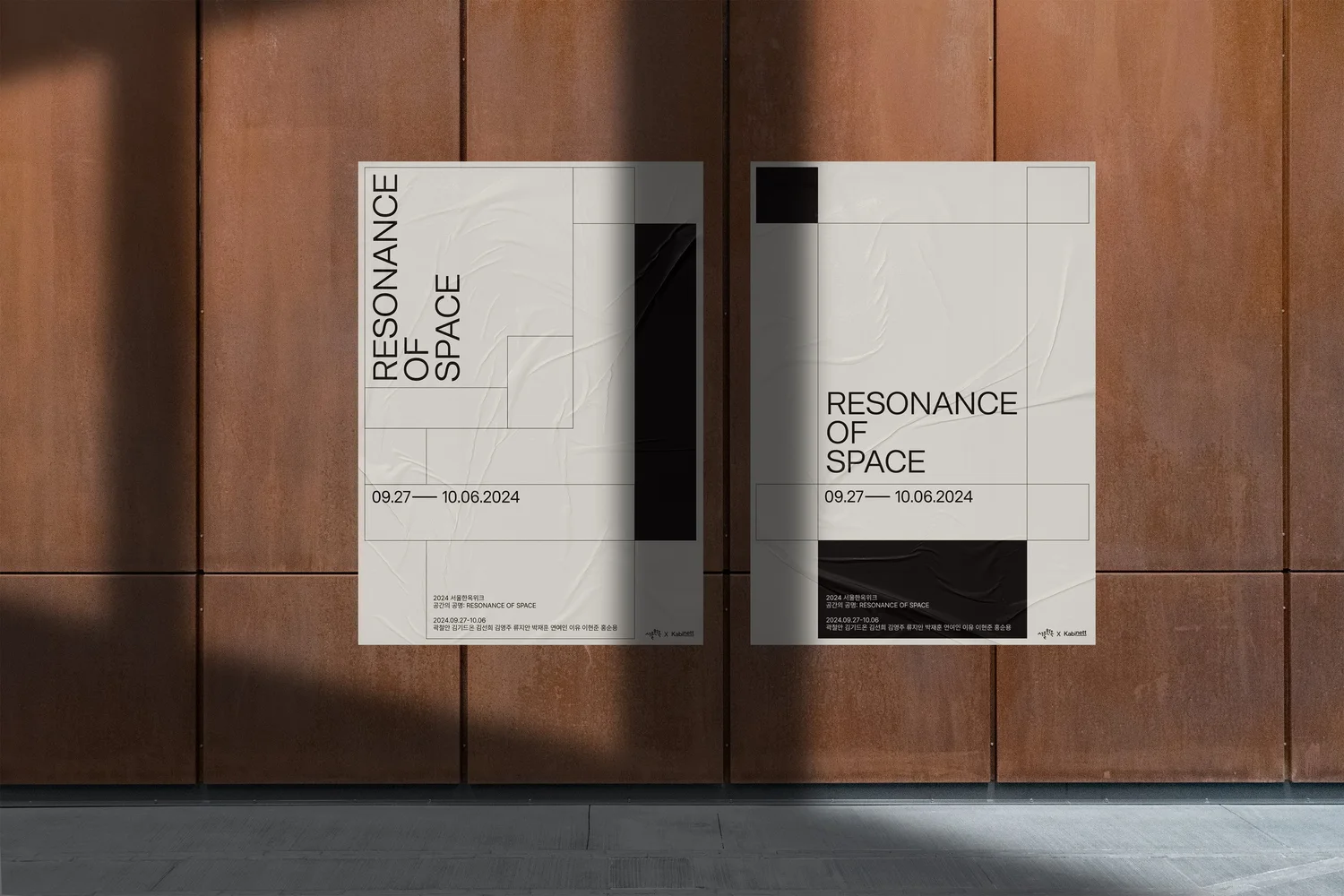
Excluding the green, a restrained palette of black and ivory emphasized the grandeur, calmness, and elegance of Hanok. Through the use of simple linear square structures, the design conveyed the sense of space and resonance that defines Hanok’s architectural philosophy.
Together, the two projects reinterpreted the timeless beauty of Hanok through a modern design language, creating a unified yet distinctive visual narrative where tradition and modernity coexist in harmony.
Grounded in Haydonna’s drawing language, TIN centered the visual system around the brand’s signature yellow, combining yellow, black line drawings, and white into a restrained yet expressive framework.
The resulting artwork functions beyond decoration. Integrated throughout the store, it operates as signage, information, and spatial attitude, activating the brand within the environment.
en
kr
/
hay TIN
works
about
seoul hannok week
Brand identity design for Seoul Hanok Week and the exhibition Resonance of Space
request PRESS FILE
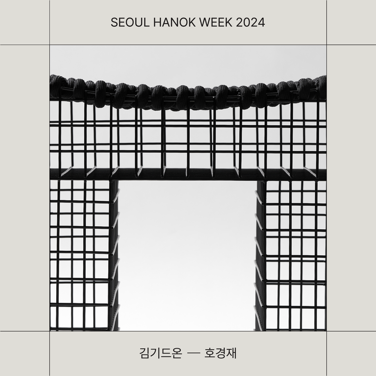
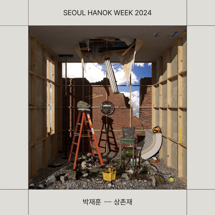
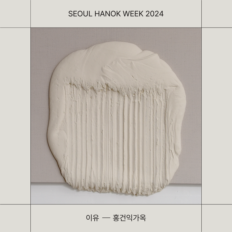
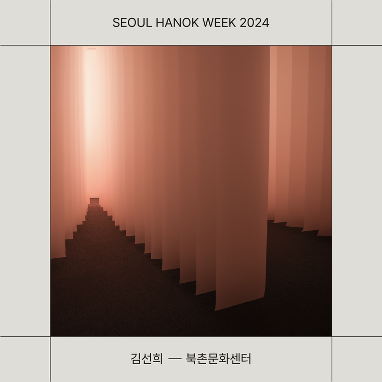
The branding and design for Seoul Hanok Week and its exhibition program, Resonance of Space, highlight the harmony between tradition and modernity and the aesthetics of space. Both projects share the same foundation yet hold distinct identities, each carefully crafted to align with its unique theme and atmosphere.
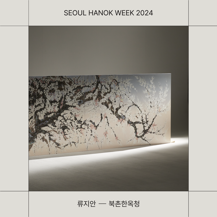
The branding for Seoul Hanok Week used the existing green color from the ‘Seoul Hanok’ identity as a point color, complemented by black and ivory tones to convey the natural and grounded image of Hanok. Korean typography was utilized to visually express the elegant curves and structure of Hanok architecture.
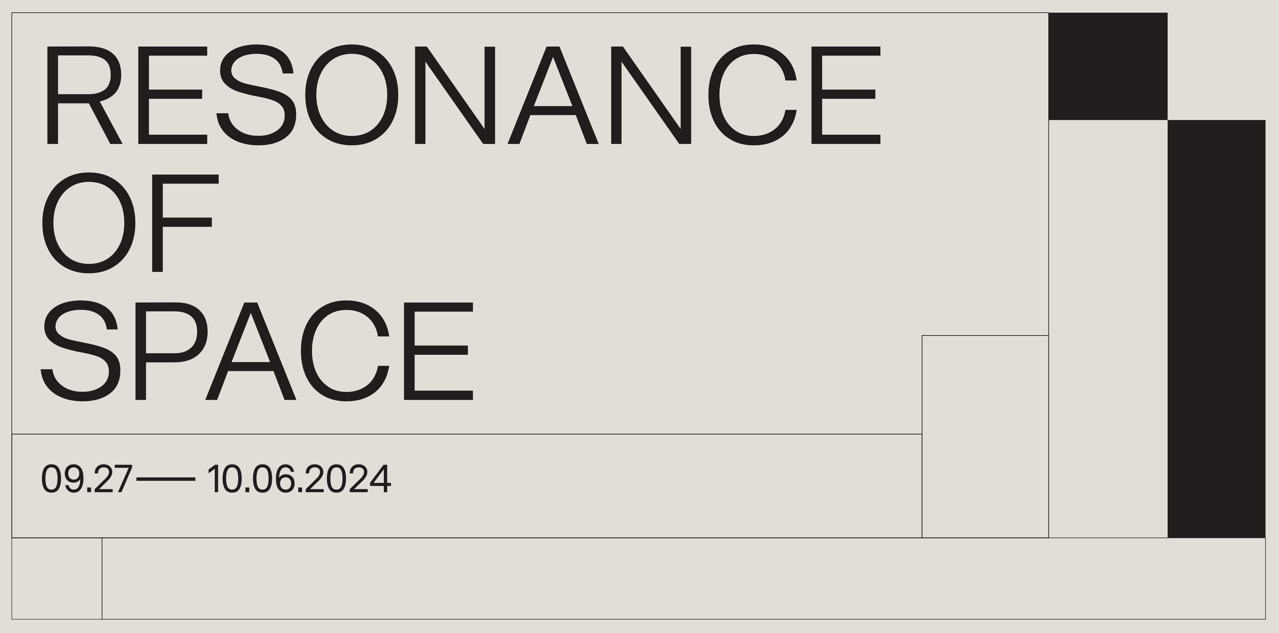
The main graphic motif consisted of various square compositions, symbolizing spatial balance and the geometric beauty of traditional architecture, reinterpreted in a modern, minimal way.
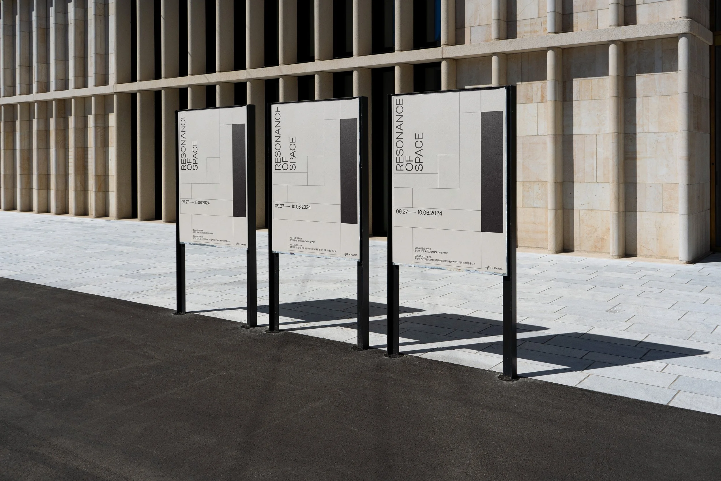
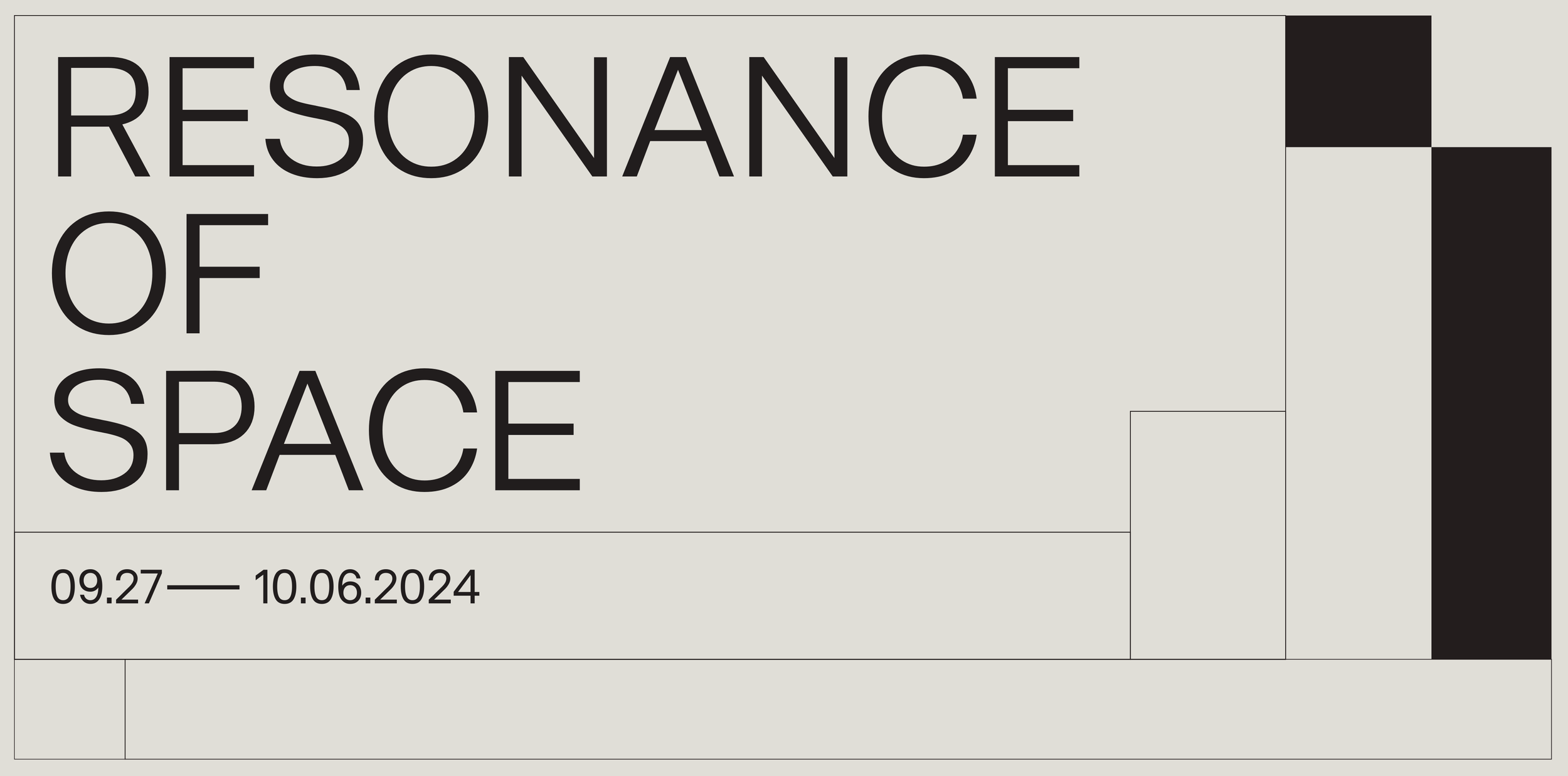
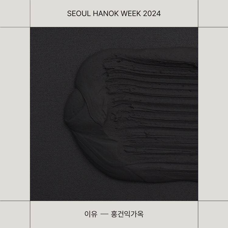
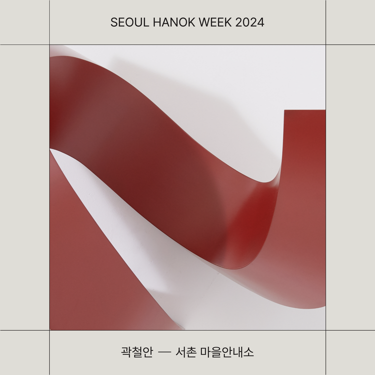
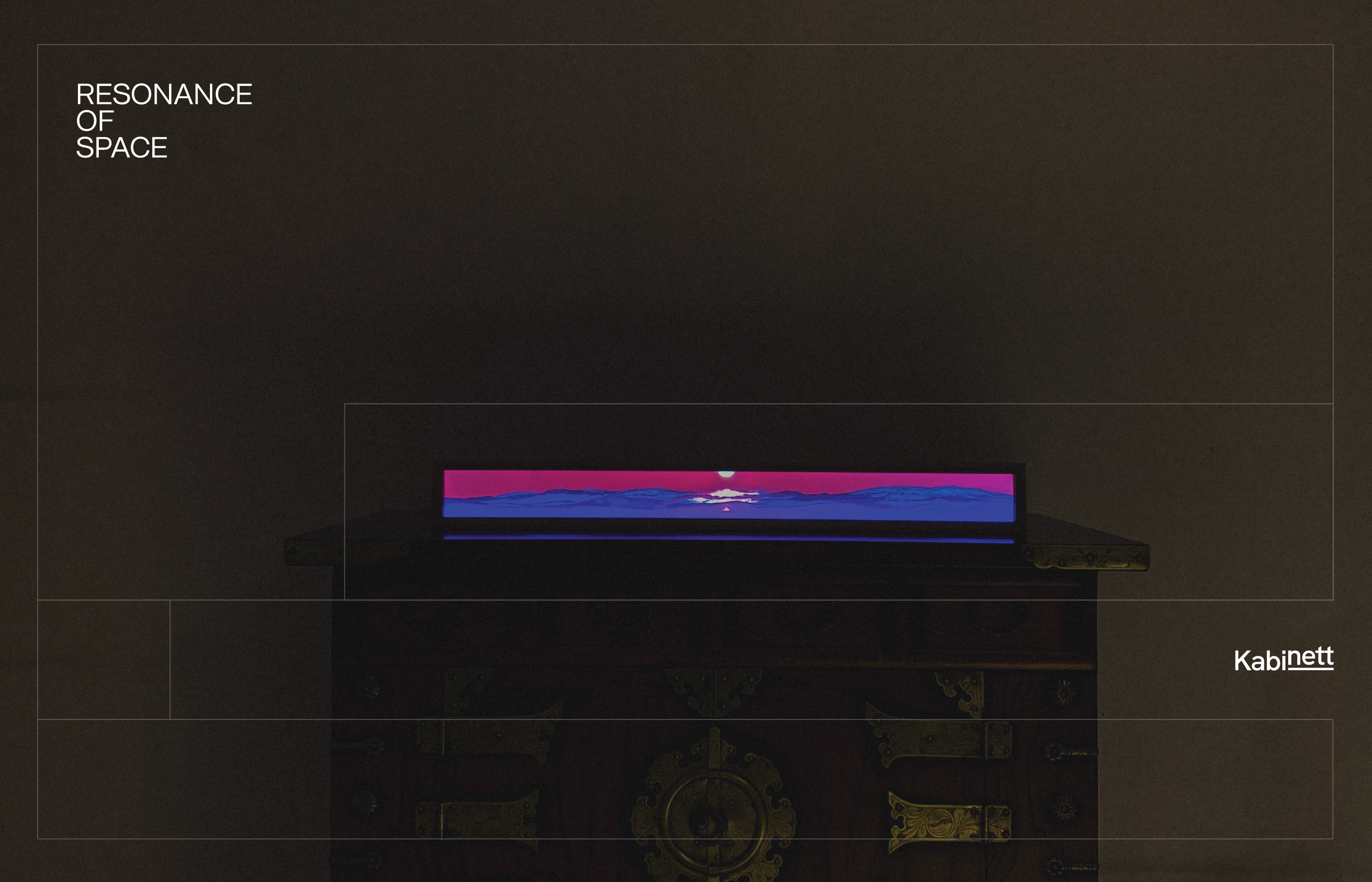
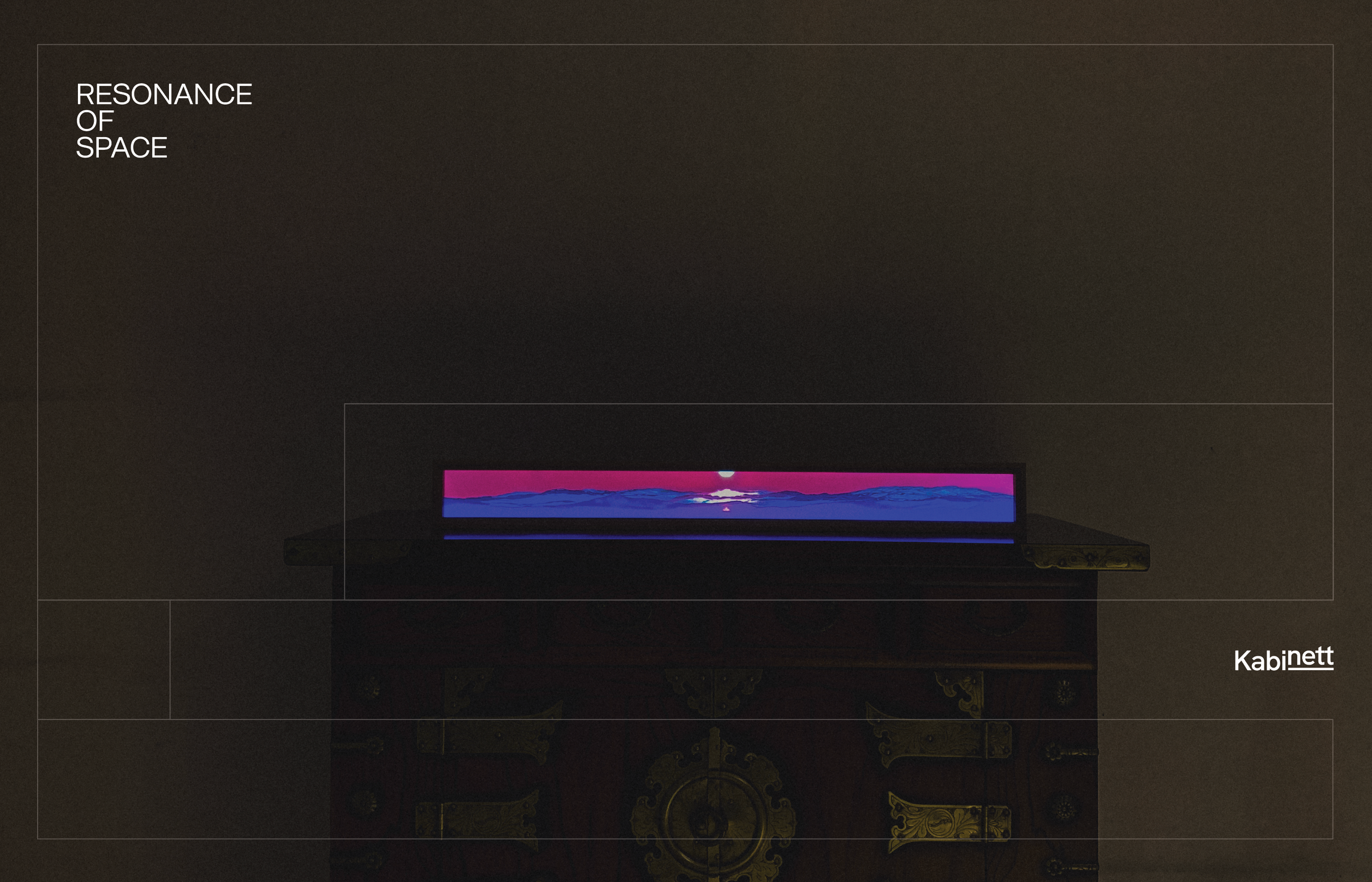
The exhibition branding maintained a visual connection with Seoul Hanok Week but introduced an independent aesthetic. Excluding the green, a restrained palette of black and ivory emphasized the grandeur, calmness, and elegance of Hanok. Through the use of simple linear square structures, the design conveyed the sense of space and resonance that defines Hanok’s architectural philosophy.
Excluding the green, a restrained palette of black and ivory emphasized the grandeur, calmness, and elegance of Hanok. Through the use of simple linear square structures, the design conveyed the sense of space and resonance that defines Hanok’s architectural philosophy.
Together, the two projects reinterpreted the timeless beauty of Hanok through a modern design language, creating a unified yet distinctive visual narrative where tradition and modernity coexist in harmony.
en
kr
/
hay TIN
works
about
seoul hannok week
Brand identity design for Seoul Hanok Week and the exhibition Resonance of Space
request PRESS FILE
The branding and design for Seoul Hanok Week and its exhibition program, Resonance of Space, highlight the harmony between tradition and modernity and the aesthetics of space. Both projects share the same foundation yet hold distinct identities, each carefully crafted to align with its unique theme and atmosphere.
The branding for Seoul Hanok Week used the existing green color from the ‘Seoul Hanok’ identity as a point color, complemented by black and ivory tones to convey the natural and grounded image of Hanok. Korean typography was utilized to visually express the elegant curves and structure of Hanok architecture.
The main graphic motif consisted of various square compositions, symbolizing spatial balance and the geometric beauty of traditional architecture, reinterpreted in a modern, minimal way.
The exhibition branding maintained a visual connection with Seoul Hanok Week but introduced an independent aesthetic. Excluding the green, a restrained palette of black and ivory emphasized the grandeur, calmness, and elegance of Hanok.
Through the use of simple linear square structures, the design conveyed the sense of space and resonance that defines Hanok’s architectural philosophy.
Together, the two projects reinterpreted the timeless beauty of Hanok through a modern design language, creating a unified yet distinctive visual narrative where tradition and modernity coexist in harmony.