hay TIN
works
about
en
kr
/
Tenné
An Exercise in Restraint
request PRESS FILE
In this project, HAY TIN approached branding through subtraction rather than addition. The focus was not on amplifying messages, but on defining how the brand could exist with clarity and composure.
Haydonna interpreted the brand through restraint. Instead of layering visual elements or reinforcing narrative through emphasis, she established a controlled visual framework built on proportion, material balance, muted color density, and spatial rhythm. The objective was to allow presence to emerge through calibration rather than volum
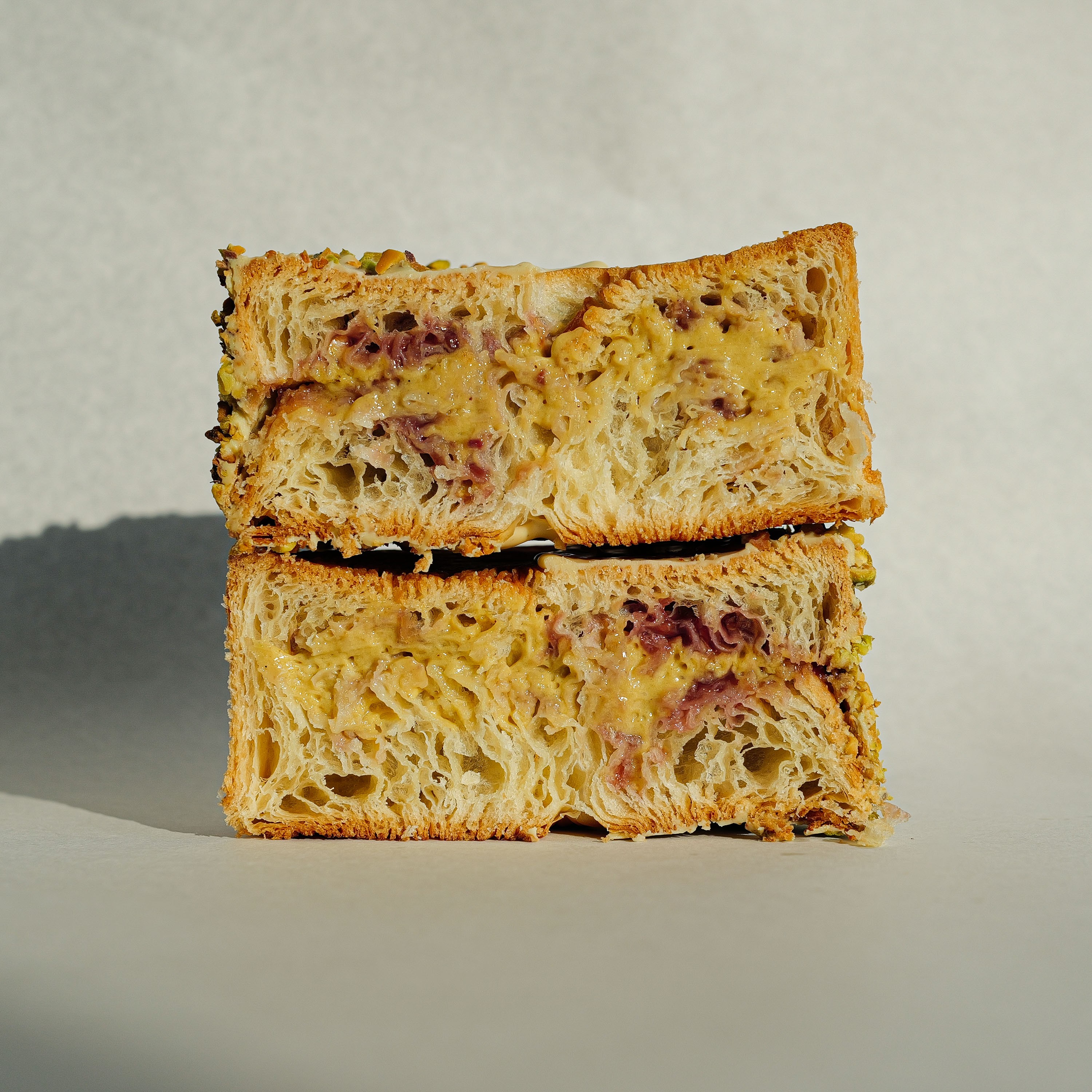
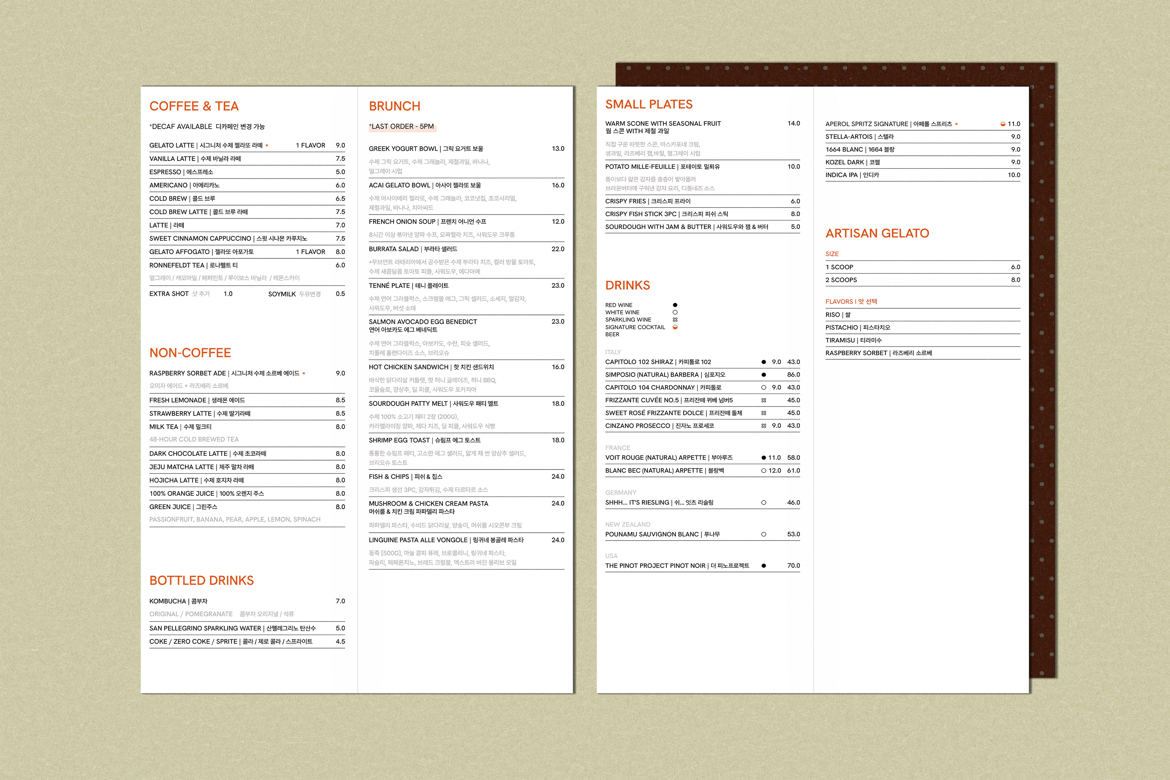
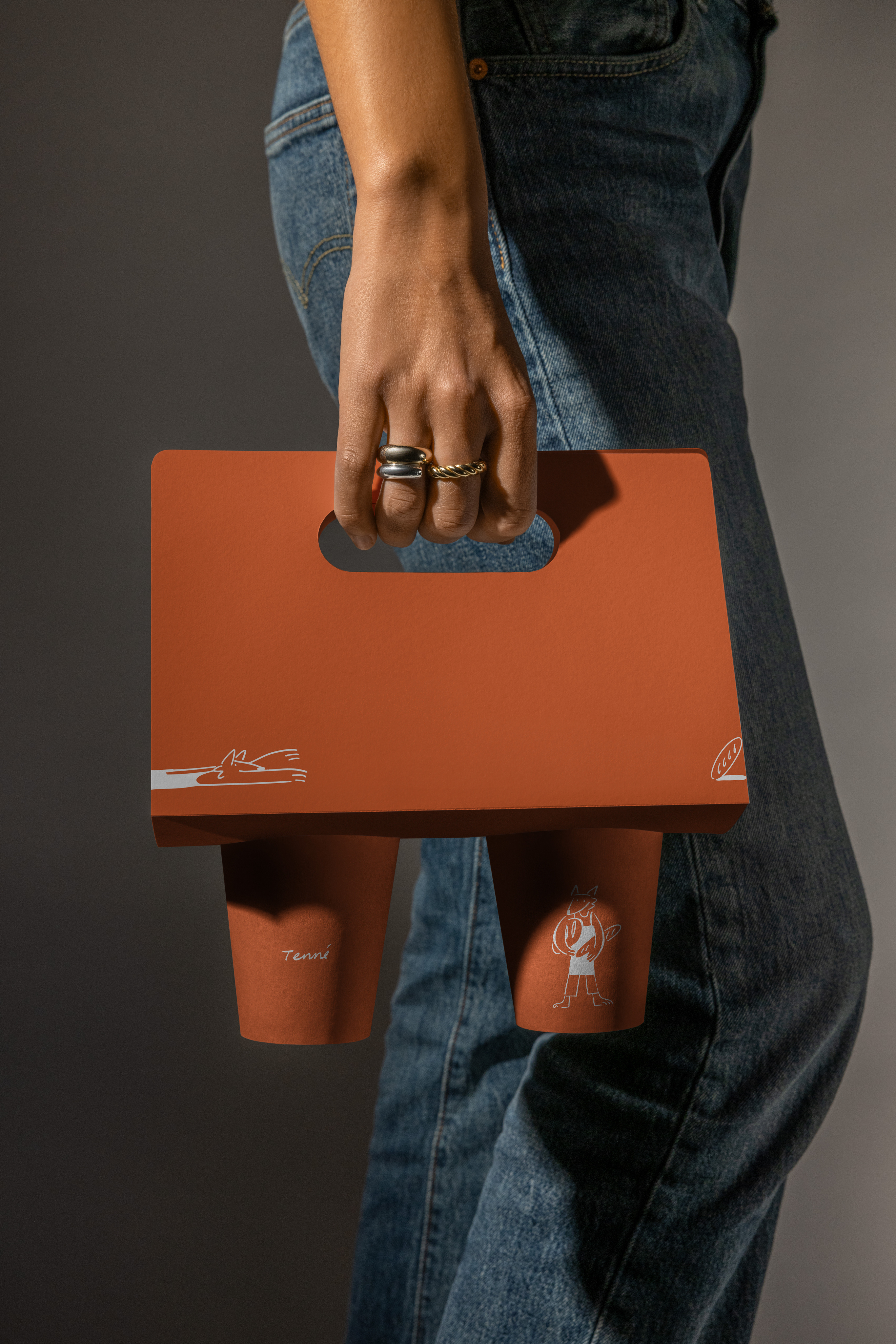

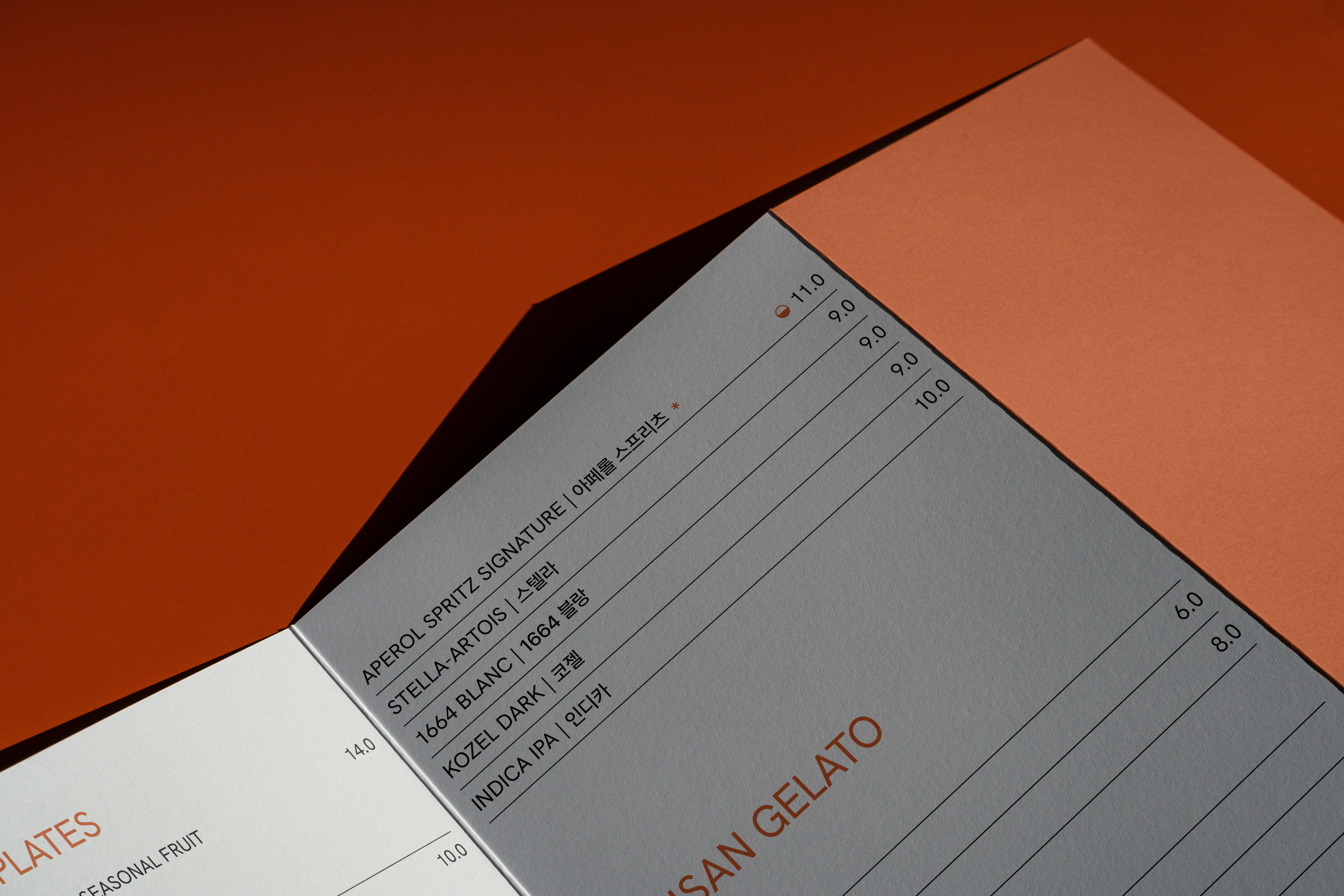
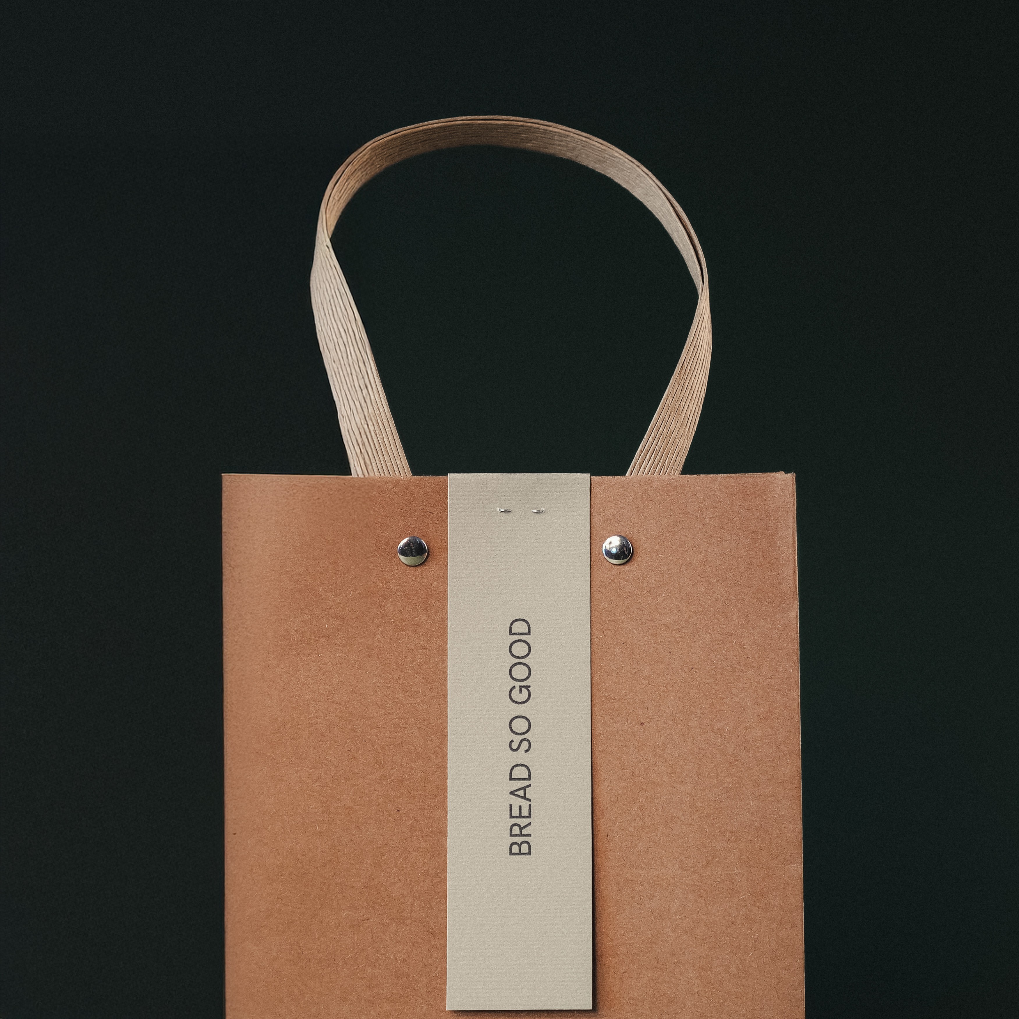
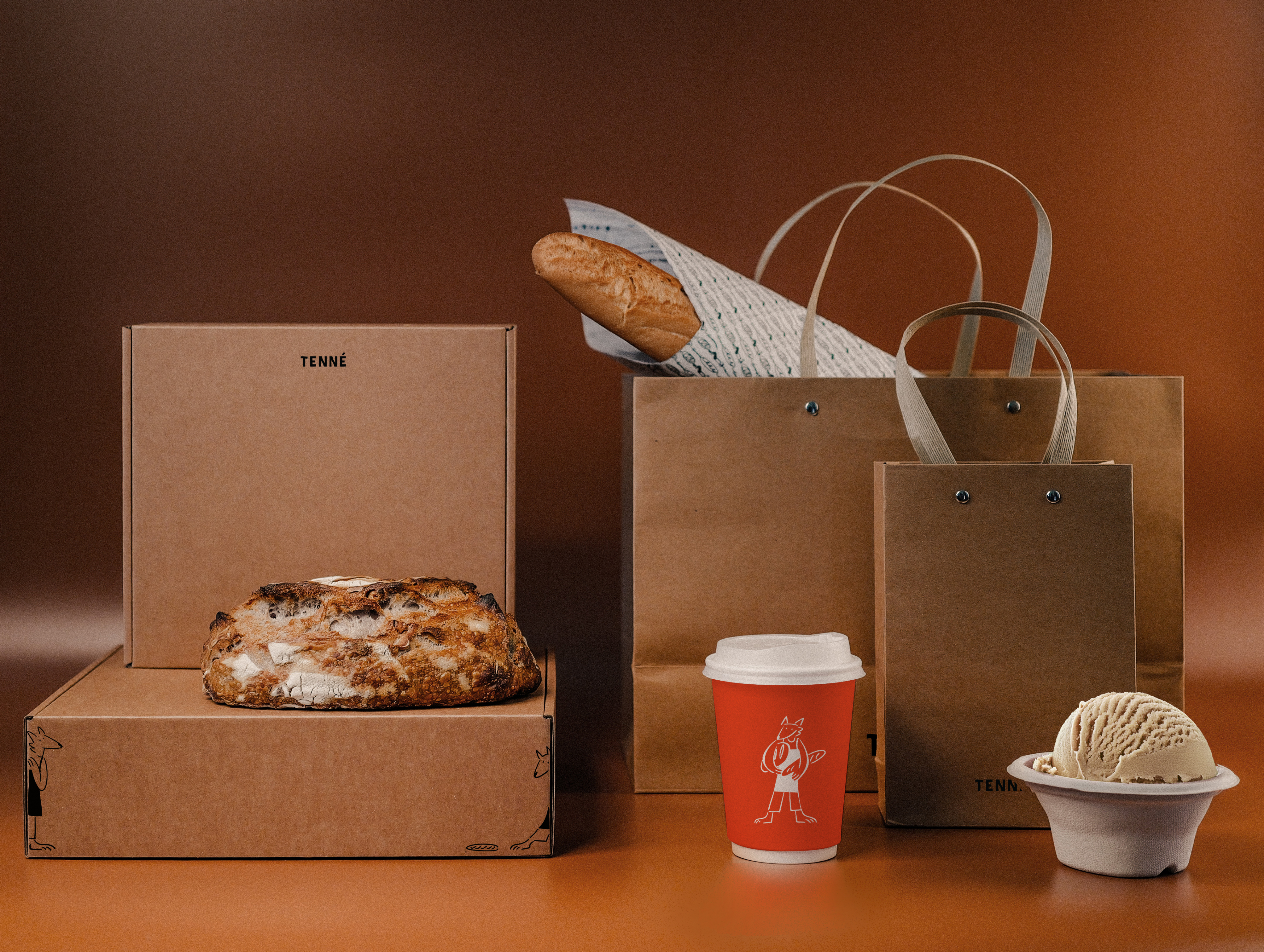
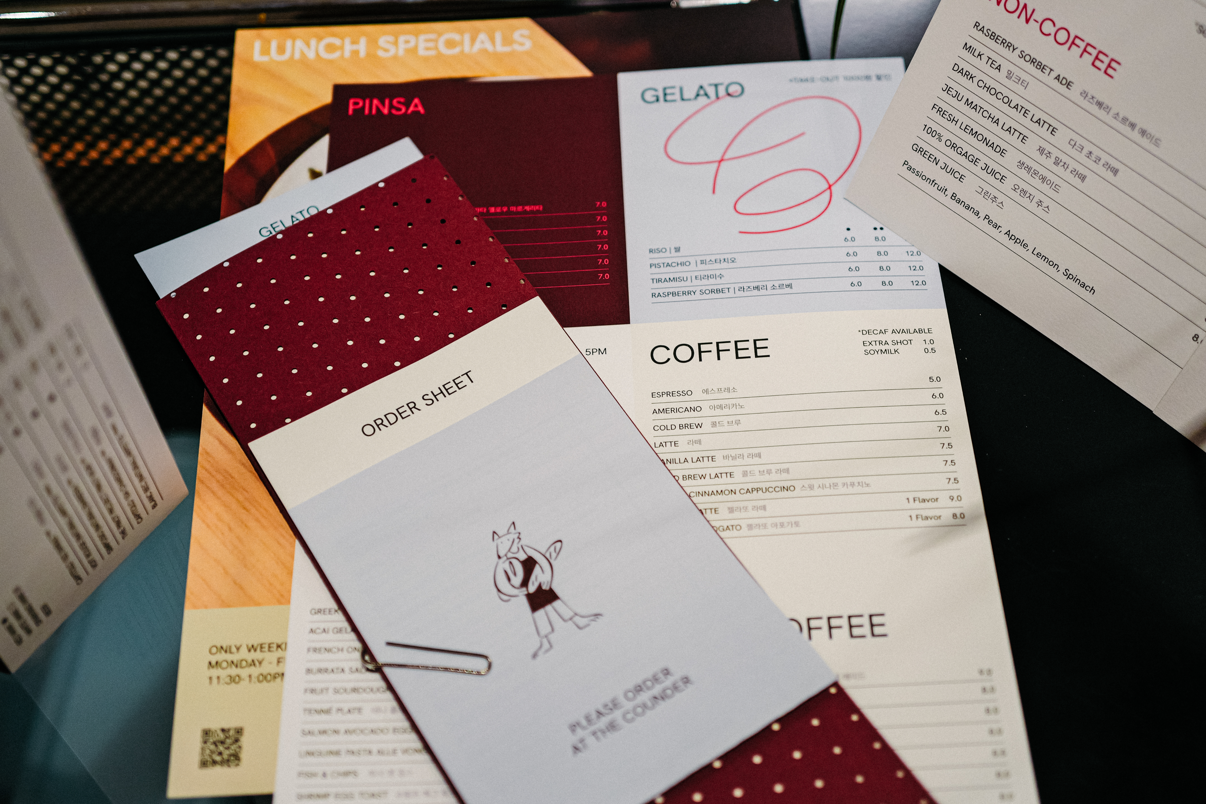
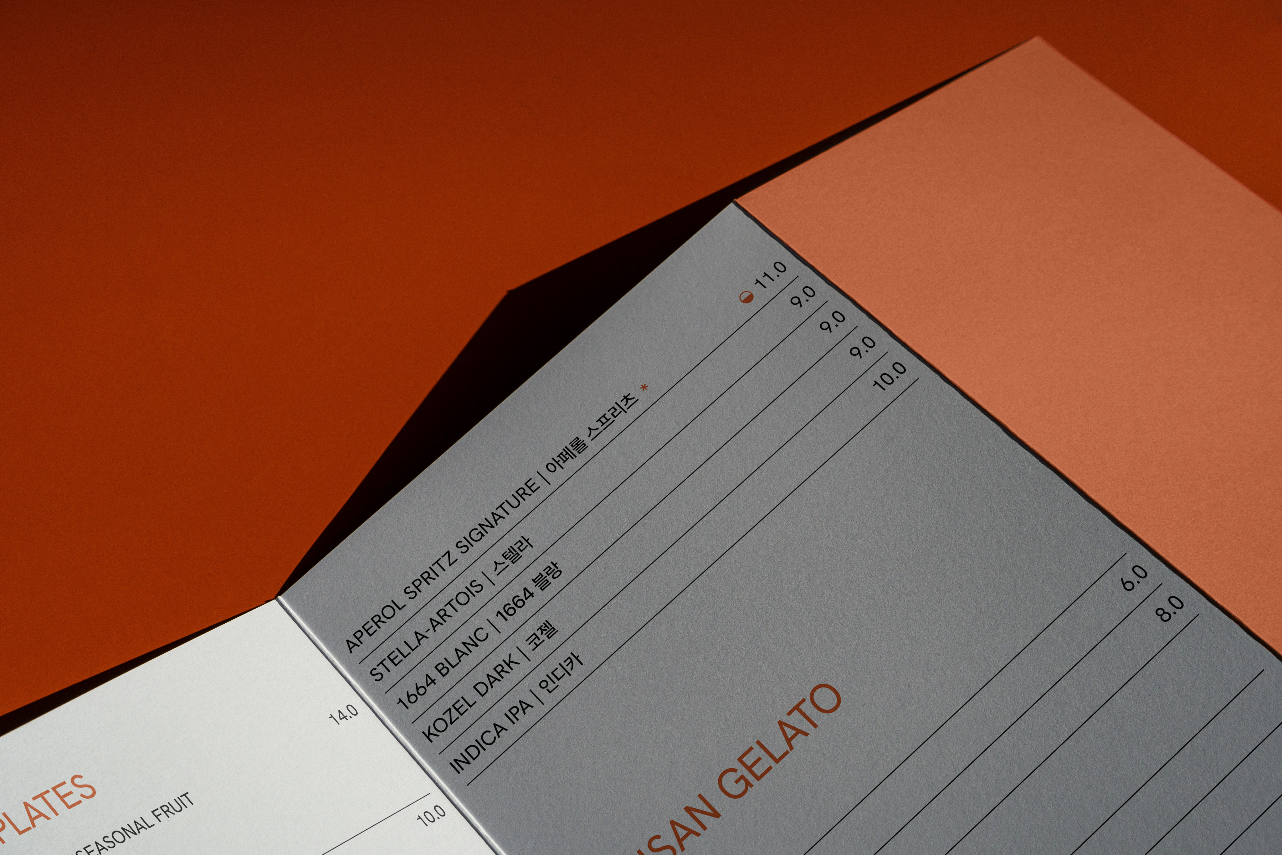
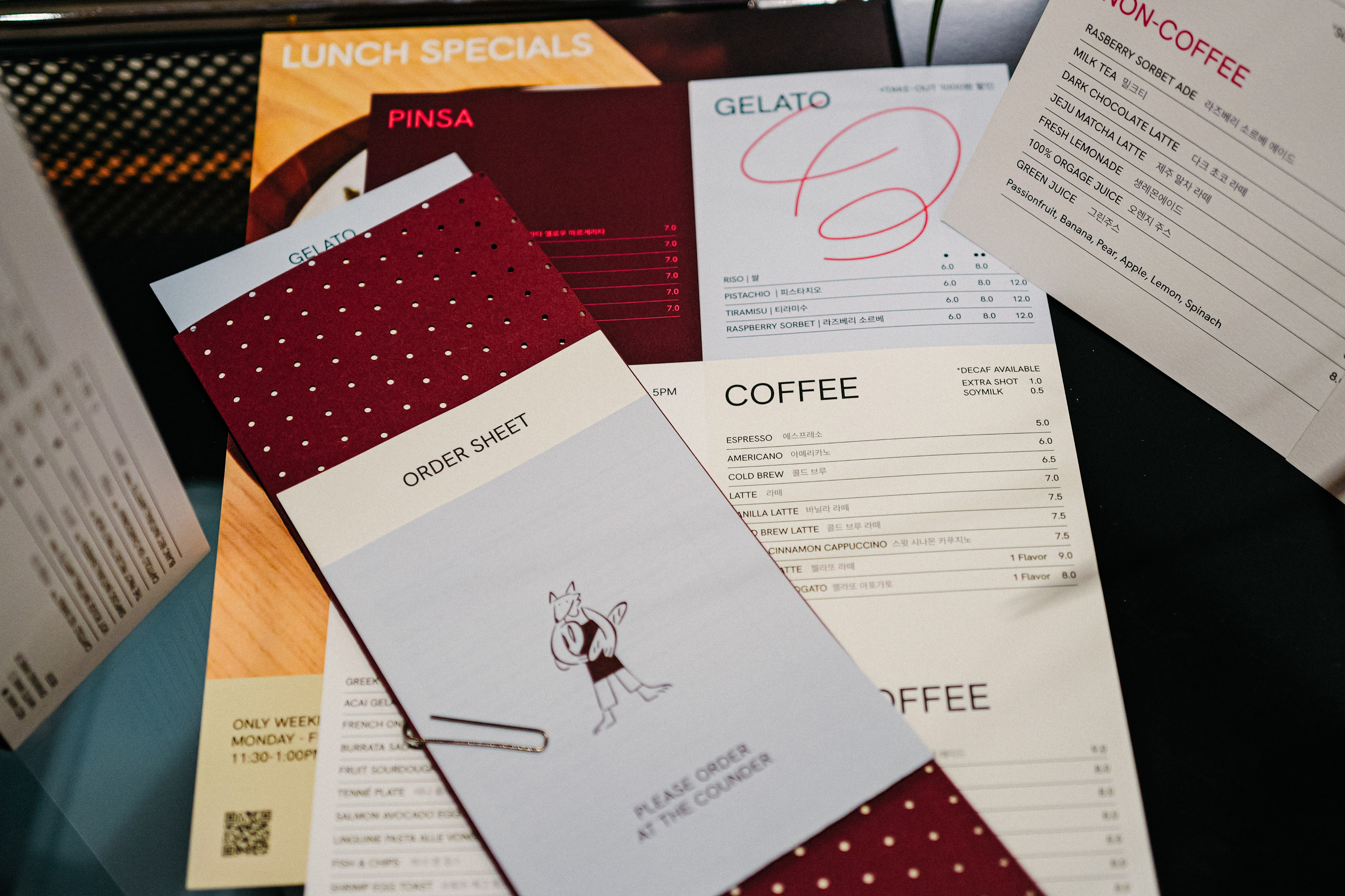
This interpretation was translated into form by the HAY TIN team. Graphic elements were reduced to essentials. Typography, layout, and material selections were aligned to maintain visual quietness. The space was treated as a composed environment rather than a stage for messaging.
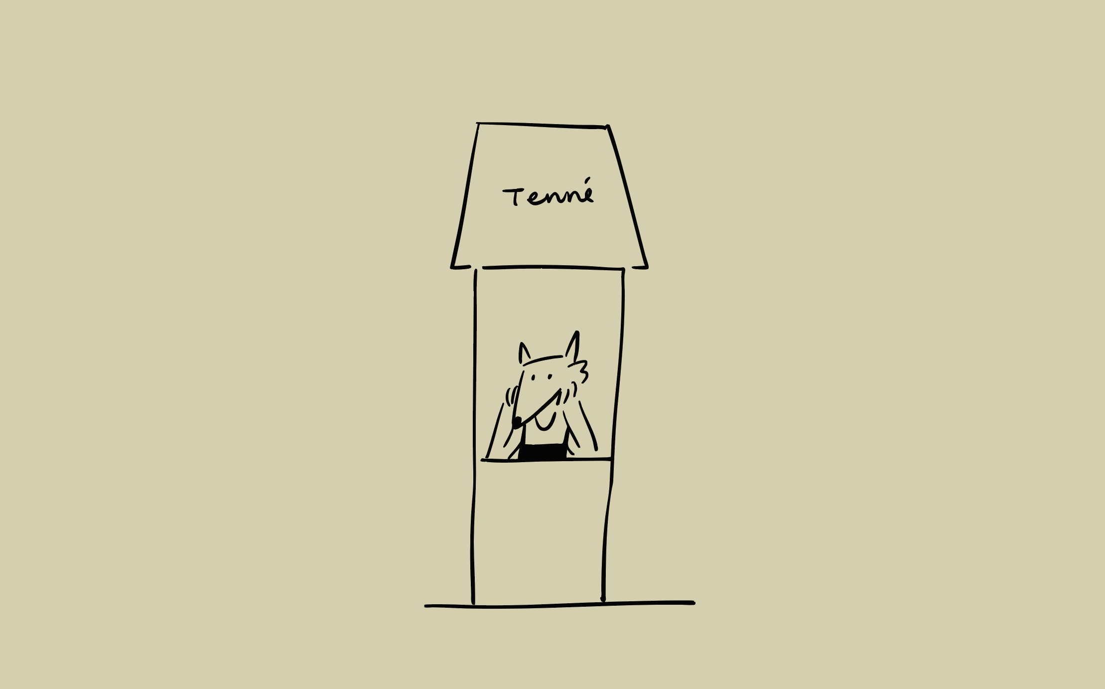
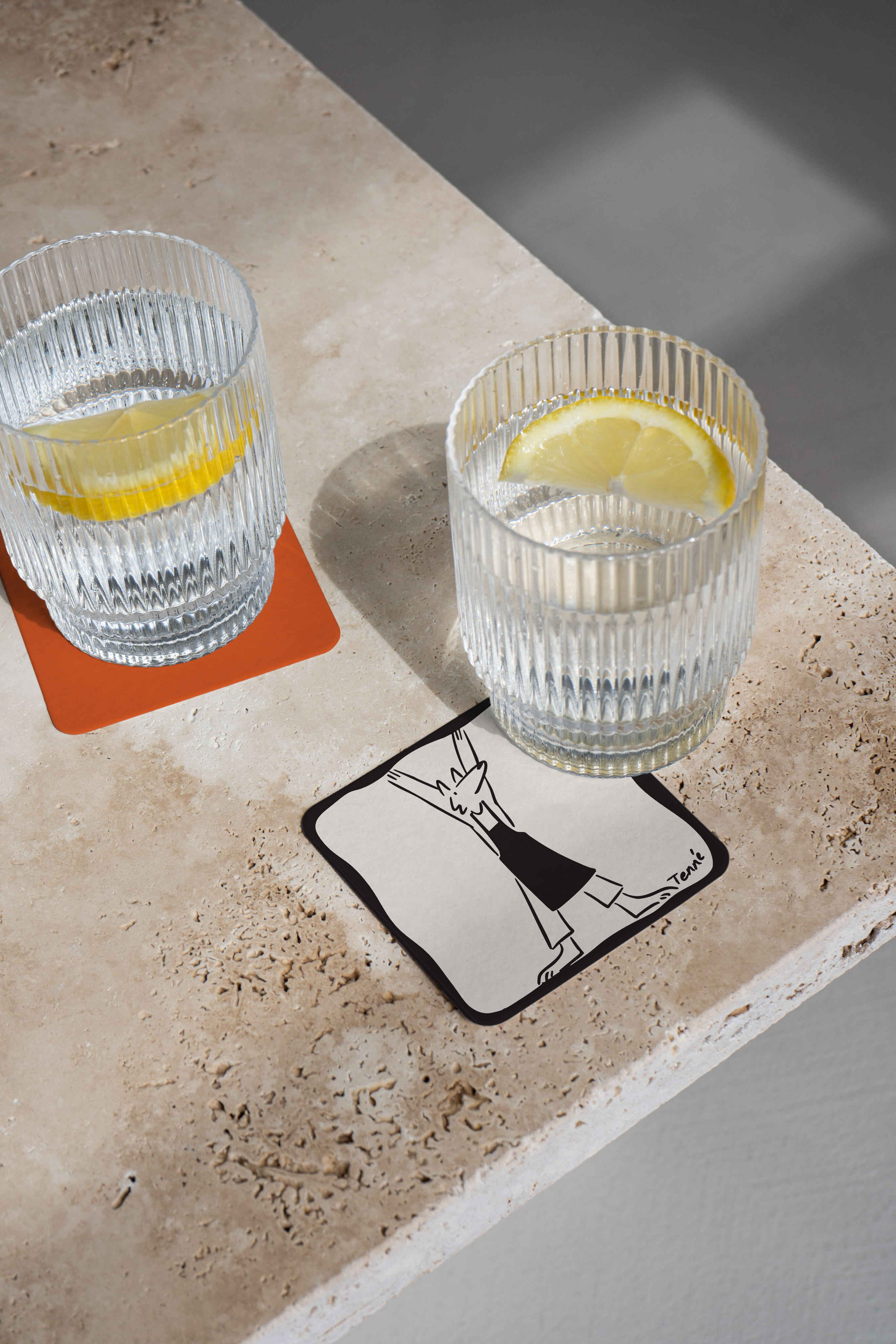
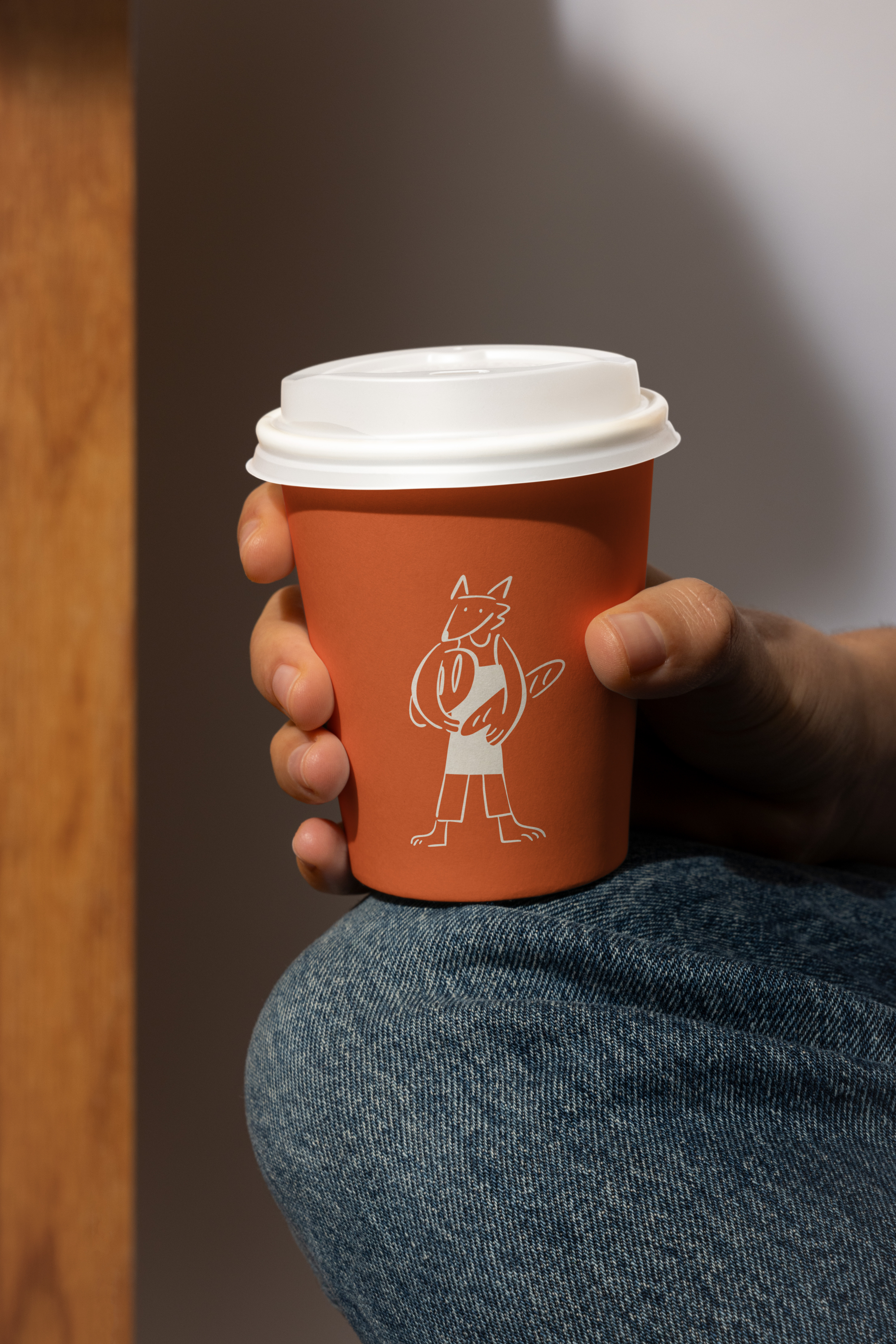
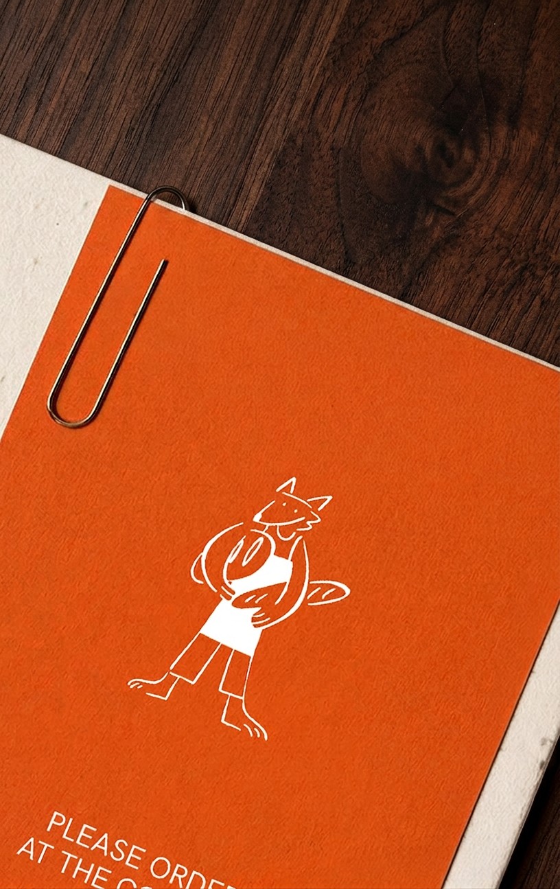
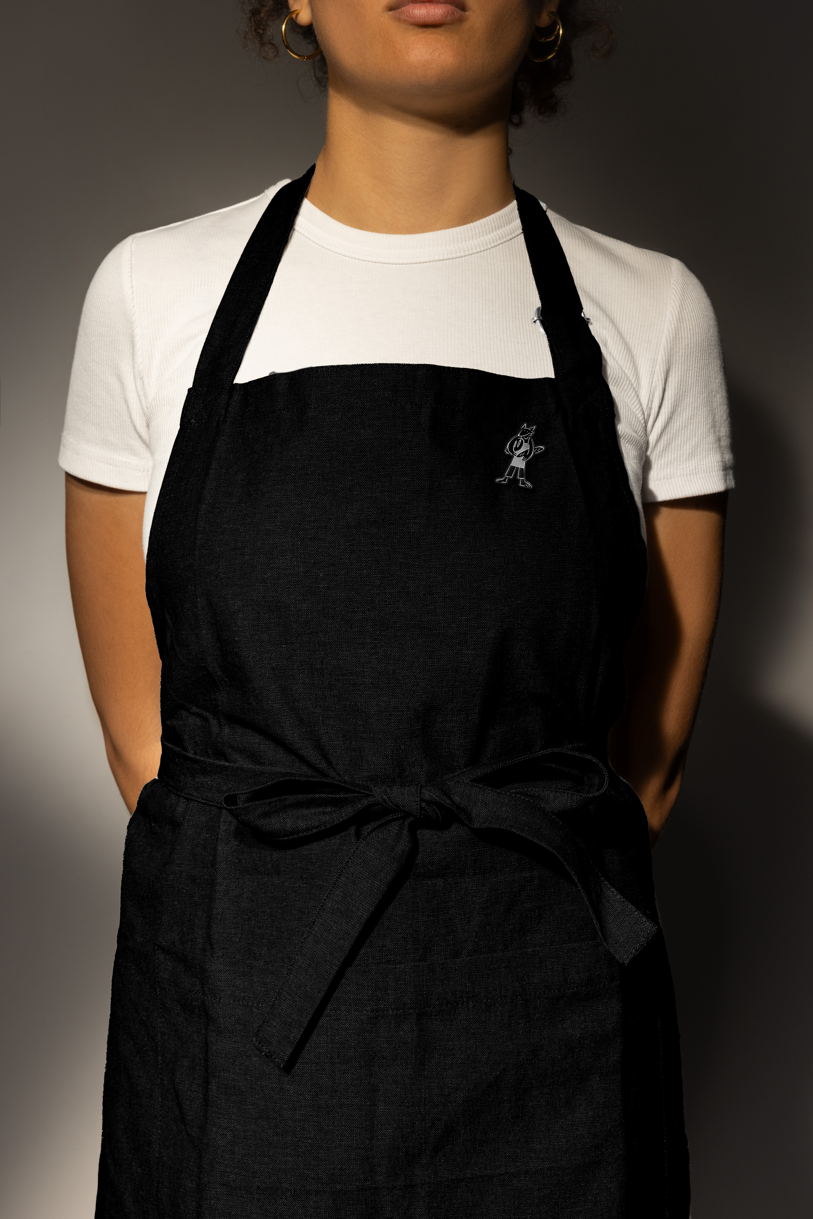
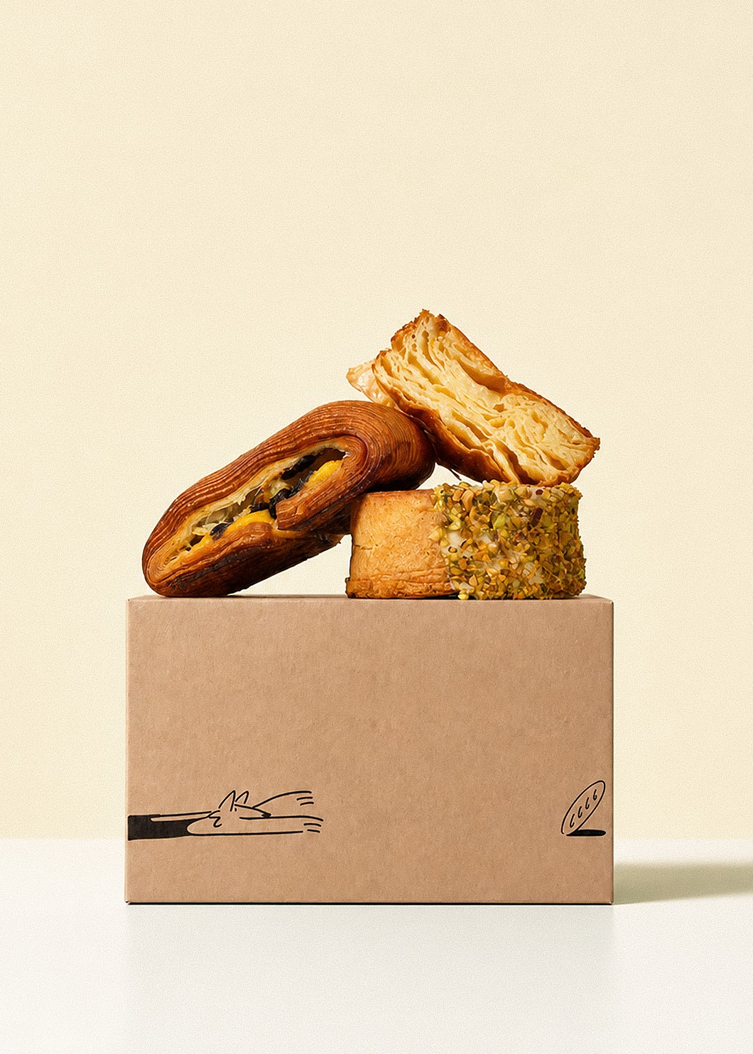
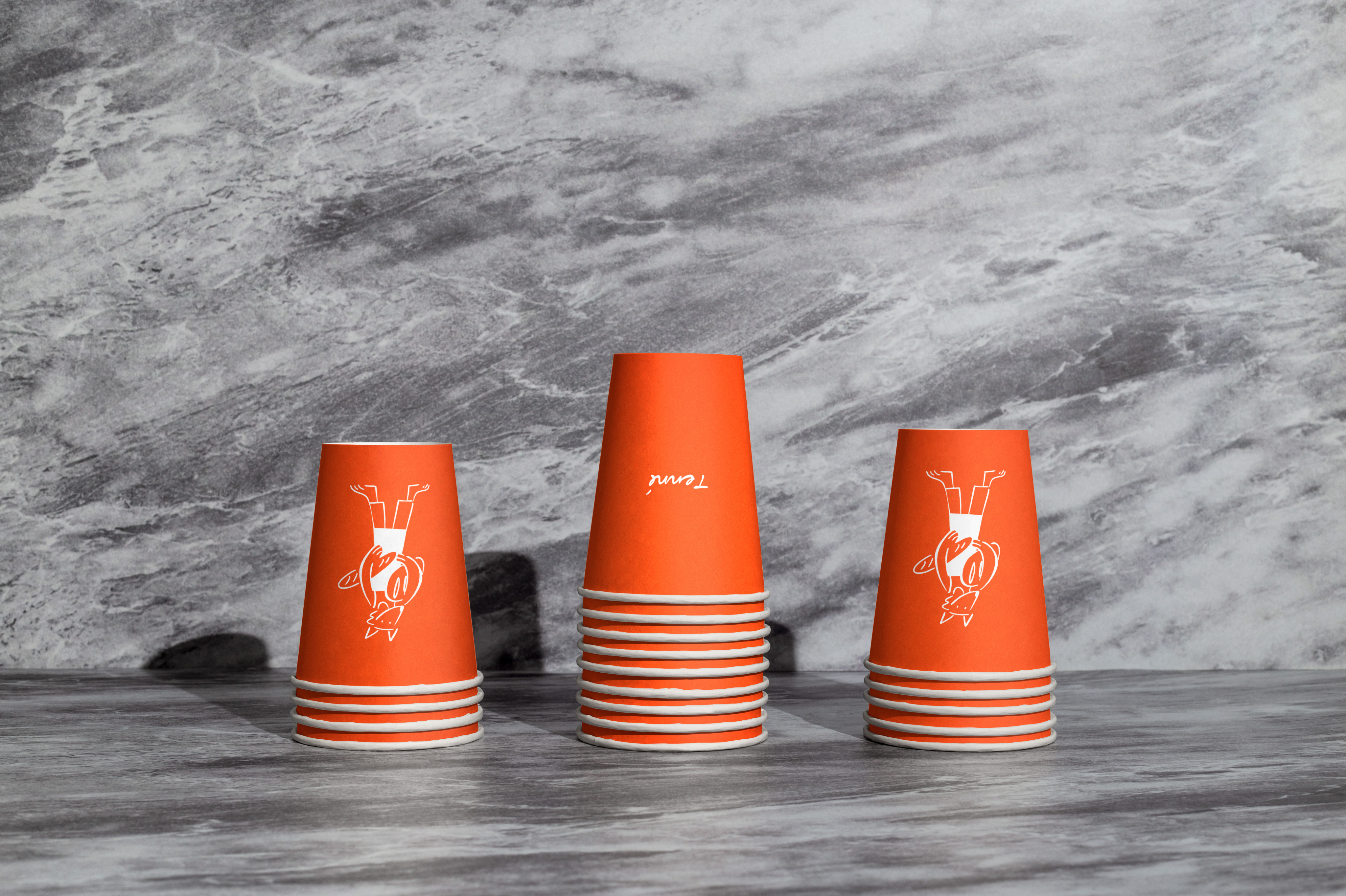
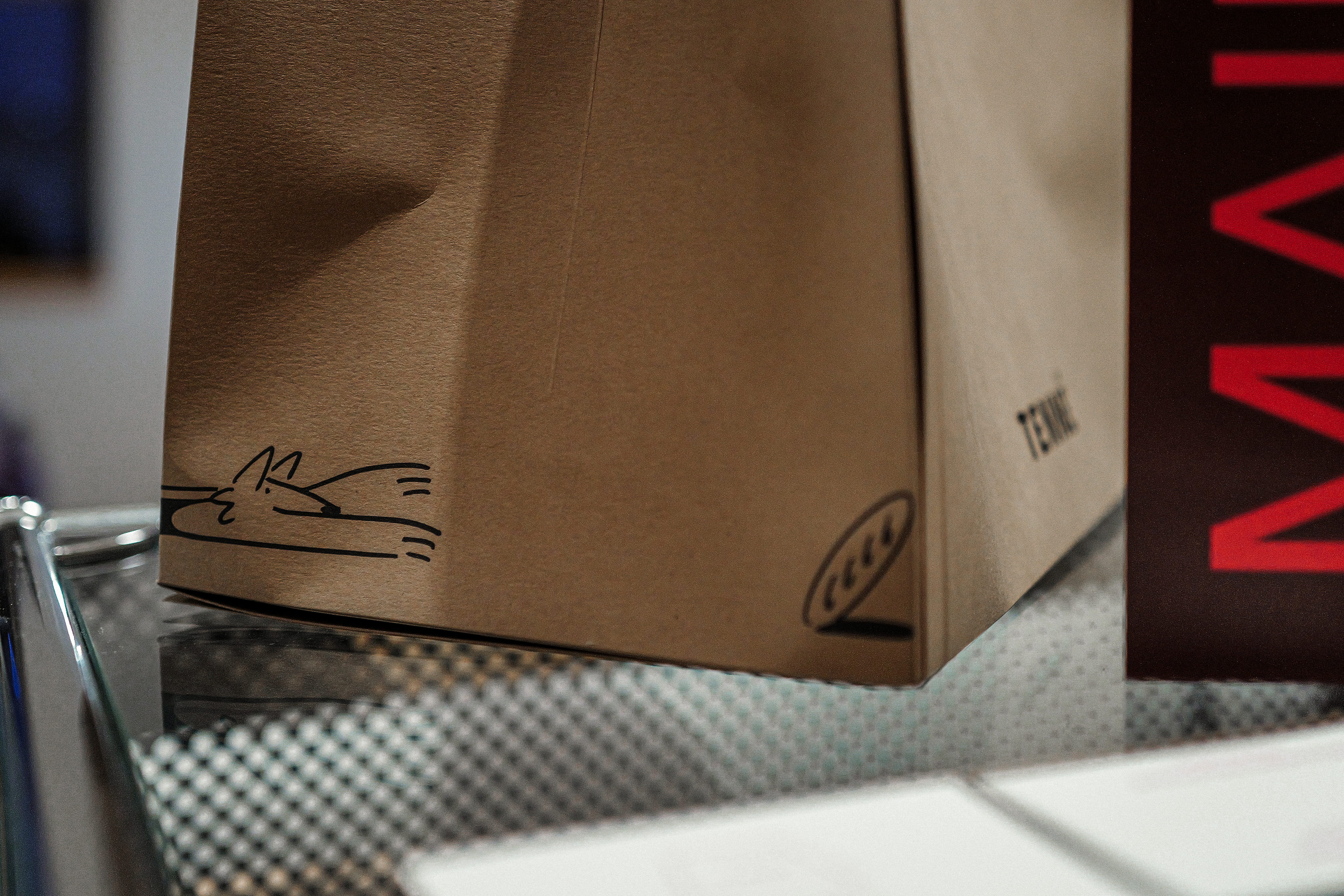
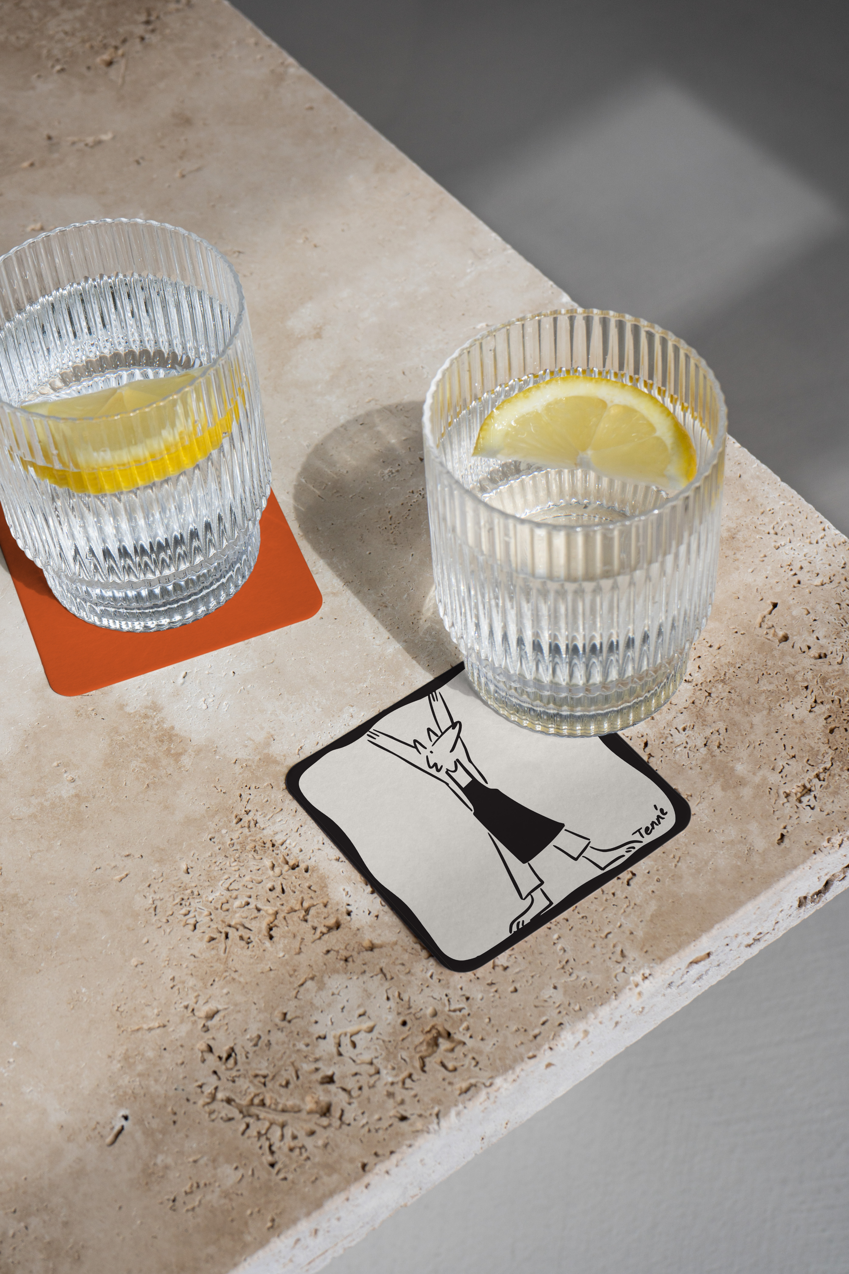
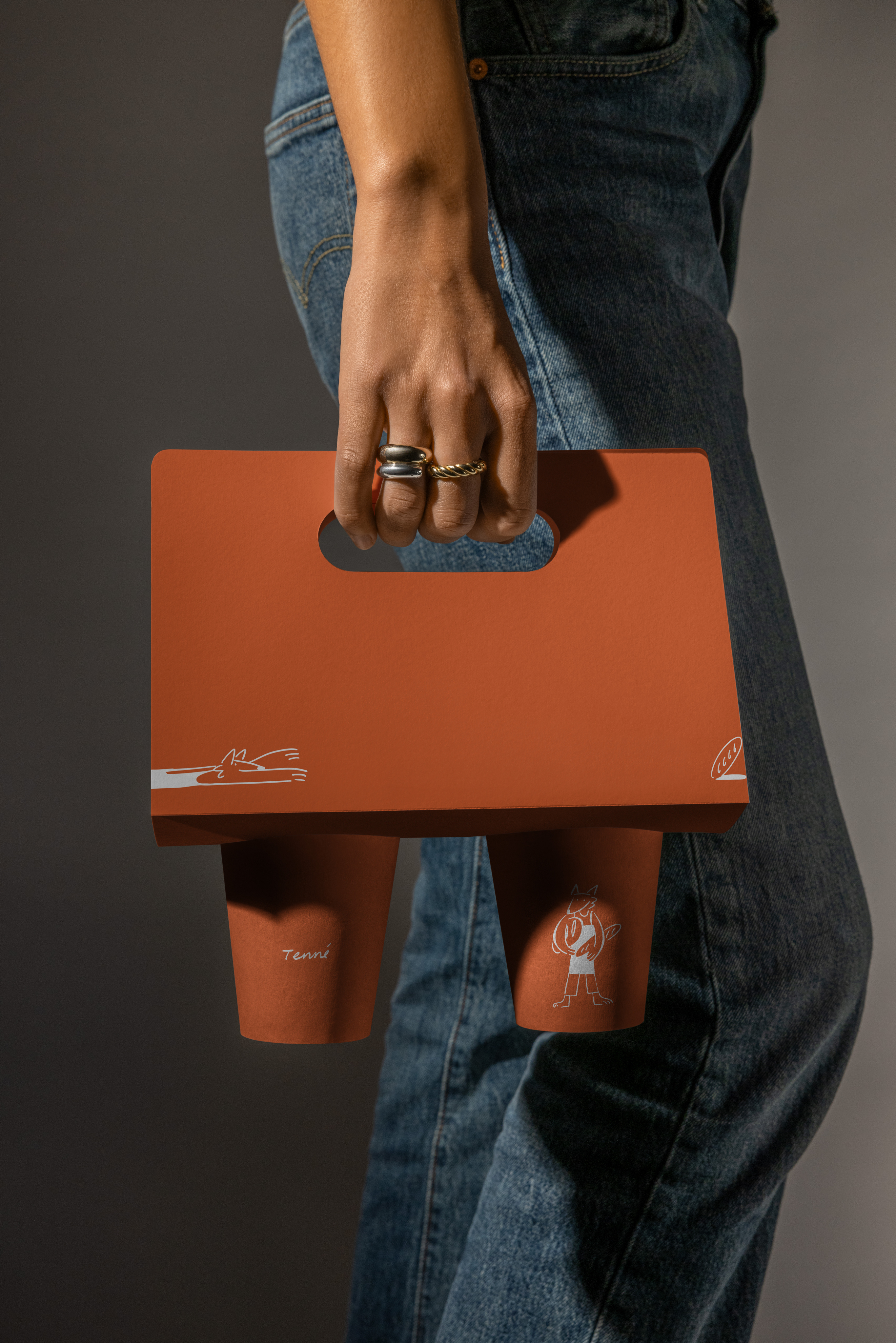
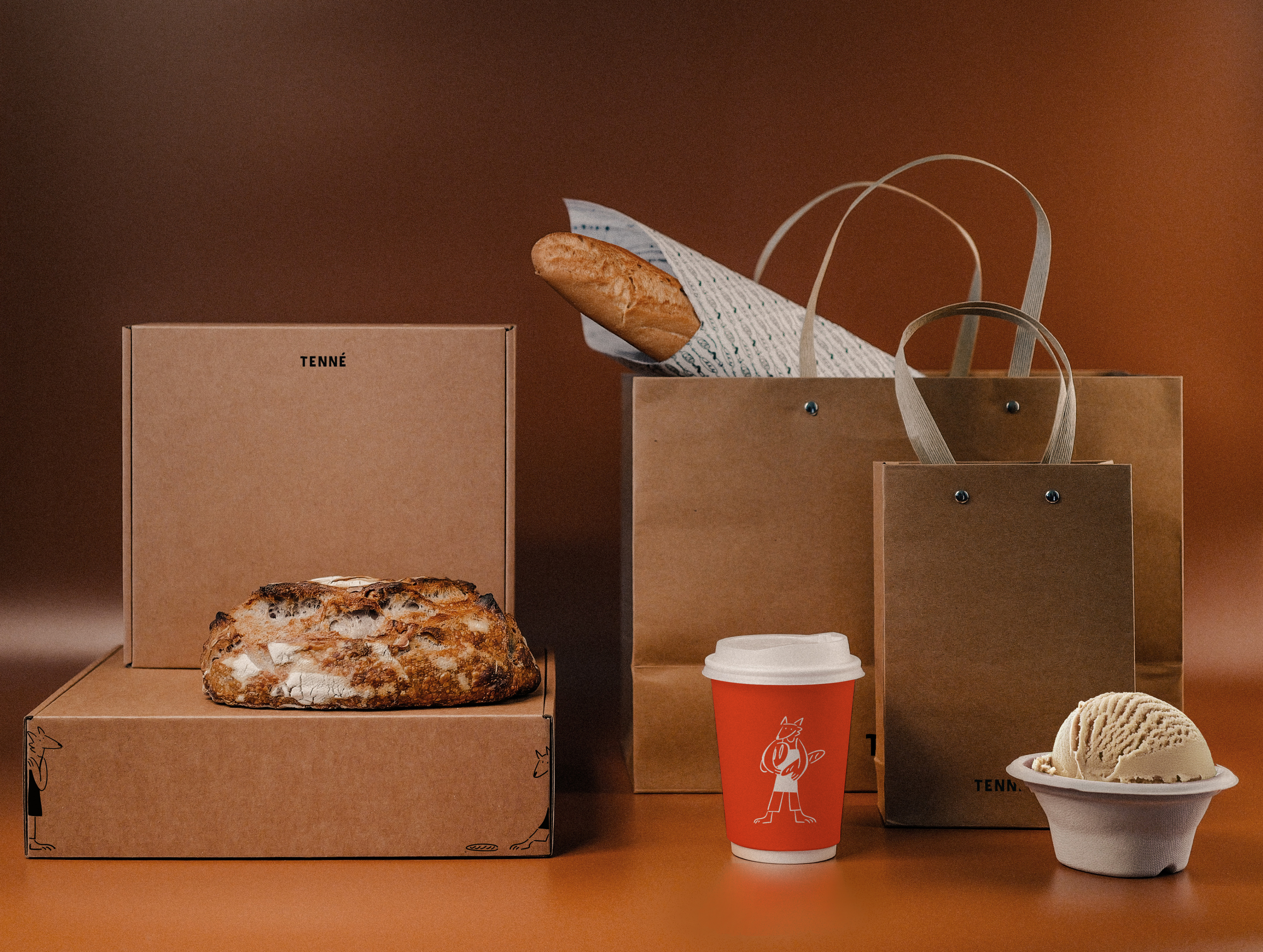
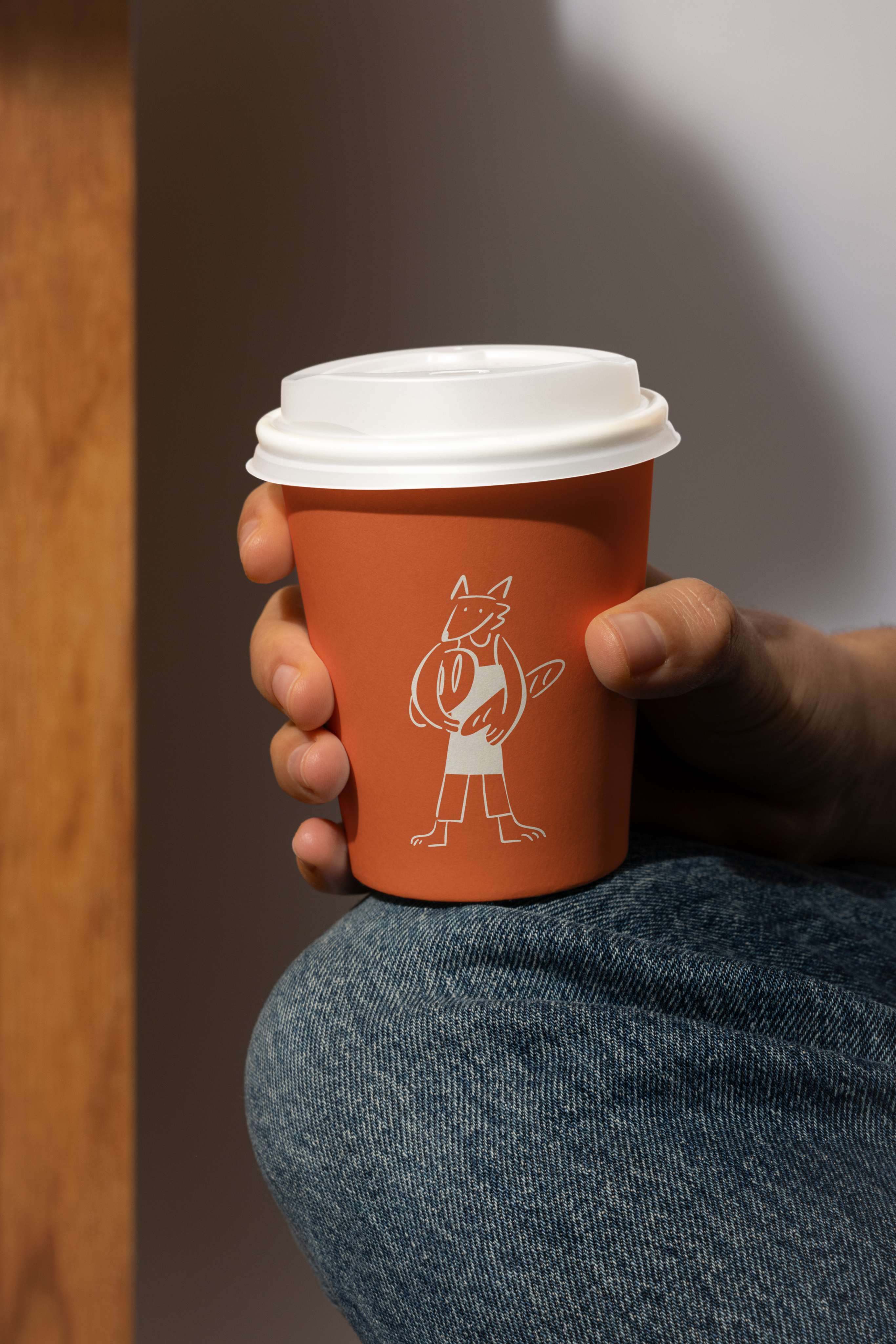
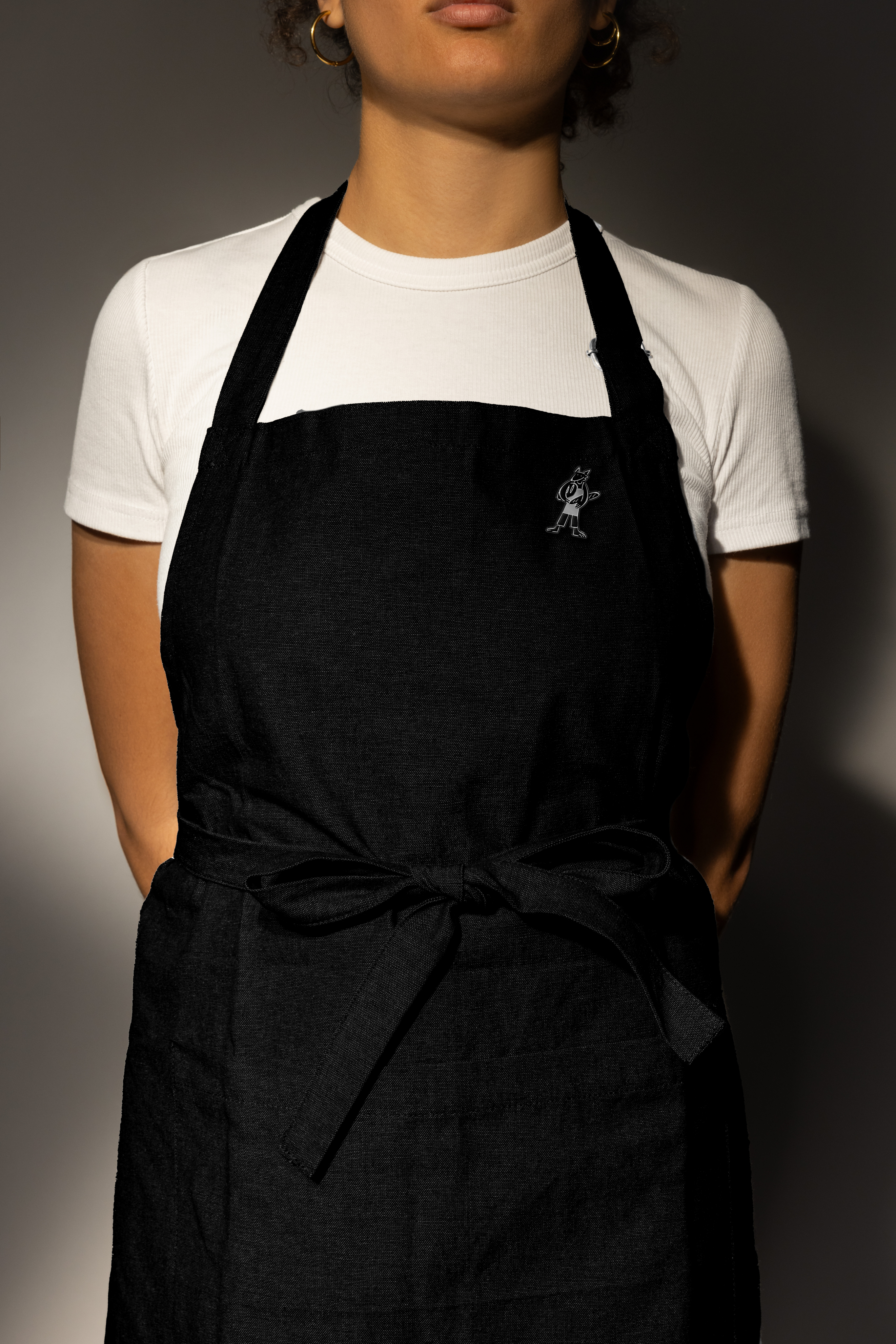
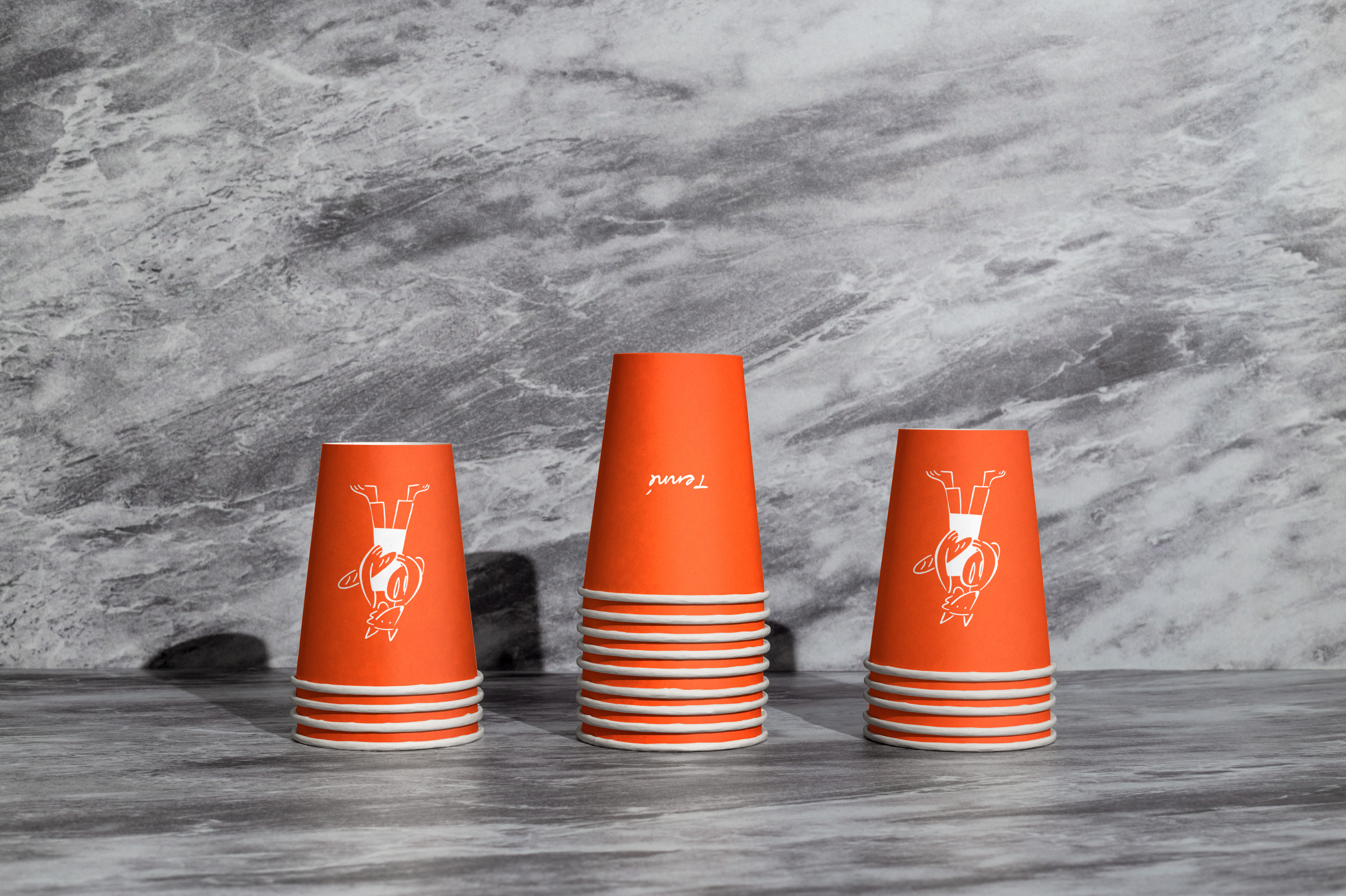
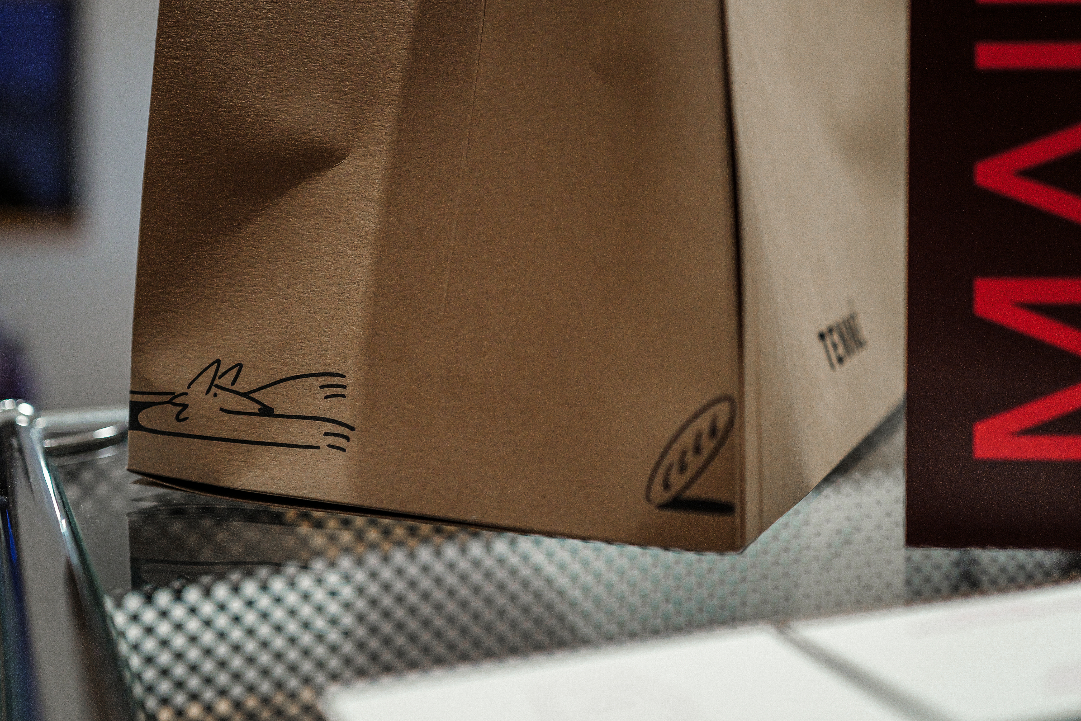
The mini “Tenné” fox artworks were integrated with similar intention. They were not positioned as focal illustrations, but placed discreetly within the space, almost request-like in their presence. Customers encounter them gradually. The scenes depict the act of baking without exaggerated emotion, unfolding as small, contained narratives. The illustrations function as tonal elements rather than storytelling devices.
Through this approach, illustration became part of the structural balance of the brand rather than an expressive overlay. The overall system operates without visual excess. Each component supports the whole.
This project reflects HAY TIN’s direction: art is not applied to decorate a brand, but used to define how it exists. The team works to translate an authored perspective into a coherent physical and visual structure that remains steady over time.
HAY TIN / Creative Base
A503-Sounds Hannam, 35 Daesagwan-ro,
Yongsan-gu, Seoul, 04401
Tel: +82-70-7778-5757
Email: hello@hay-tin.com
©HAYTIN. ALL RIGHTS RESERVED.
en
kr
/
hay TIN
works
about
Tenné
An Exercise in Restraint
request PRESS FILE
In this project, HAY TIN approached branding through subtraction rather than addition. The focus was not on amplifying messages, but on defining how the brand could exist with clarity and composure.
Haydonna interpreted the brand through restraint. Instead of layering visual elements or reinforcing narrative through emphasis, she established a controlled visual framework built on proportion, material balance, muted color density, and spatial rhythm. The objective was to allow presence to emerge through calibration rather than volum
This interpretation was translated into form by the HAY TIN team. Graphic elements were reduced to essentials. Typography, layout, and material selections were aligned to maintain visual quietness. The space was treated as a composed environment rather than a stage for messaging.
The mini “Tenné” fox artworks were integrated with similar intention. They were not positioned as focal illustrations, but placed discreetly within the space, almost request-like in their presence. Customers encounter them gradually. The scenes depict the act of baking without exaggerated emotion, unfolding as small, contained narratives. The illustrations function as tonal elements rather than storytelling devices.
Through this approach, illustration became part of the structural balance of the brand rather than an expressive overlay. The overall system operates without visual excess. Each component supports the whole.
This project reflects HAY TIN’s direction: art is not applied to decorate a brand, but used to define how it exists. The team works to translate an authored perspective into a coherent physical and visual structure that remains steady over time.
HAY TIN / Creative Base
A503-Sounds Hannam, 35 Daesagwan-ro,
Yongsan-gu, Seoul, 04401
Tel: +82-70-7778-5757
Email: hello@hay-tin.com
©HAYTIN. ALL RIGHTS RESERVED.
en
kr
/
hay TIN
works
about
Tenné
An Exercise in Restraint
request PRESS FILE
In this project, HAY TIN approached branding through subtraction rather than addition. The focus was not on amplifying messages, but on defining how the brand could exist with clarity and composure.e.
Haydonna interpreted the brand through restraint. Instead of layering visual elements or reinforcing narrative through emphasis, she established a controlled visual framework built on proportion, material balance, muted color density, and spatial rhythm. The objective was to allow presence to emerge through calibration rather than volum
This interpretation was translated into form by the HAY TIN team. Graphic elements were reduced to essentials. Typography, layout, and material selections were aligned to maintain visual quietness. The space was treated as a composed environment rather than a stage for messaging.
The mini “Tenné” fox artworks were integrated with similar intention. They were not positioned as focal illustrations, but placed discreetly within the space, almost request-like in their presence. Customers encounter them gradually. The scenes depict the act of baking without exaggerated emotion, unfolding as small, contained narratives. The illustrations function as tonal elements rather than storytelling devices.
Through this approach, illustration became part of the structural balance of the brand rather than an expressive overlay. The overall system operates without visual excess. Each component supports the whole.
This project reflects HAY TIN’s direction: art is not applied to decorate a brand, but used to define how it exists. The team works to translate an authored perspective into a coherent physical and visual structure that remains steady over time.