hay TIN
works
about
en
kr
/

Willu
Curating Connection
Brand Identity & Visual Narrative
request PRESS FILE
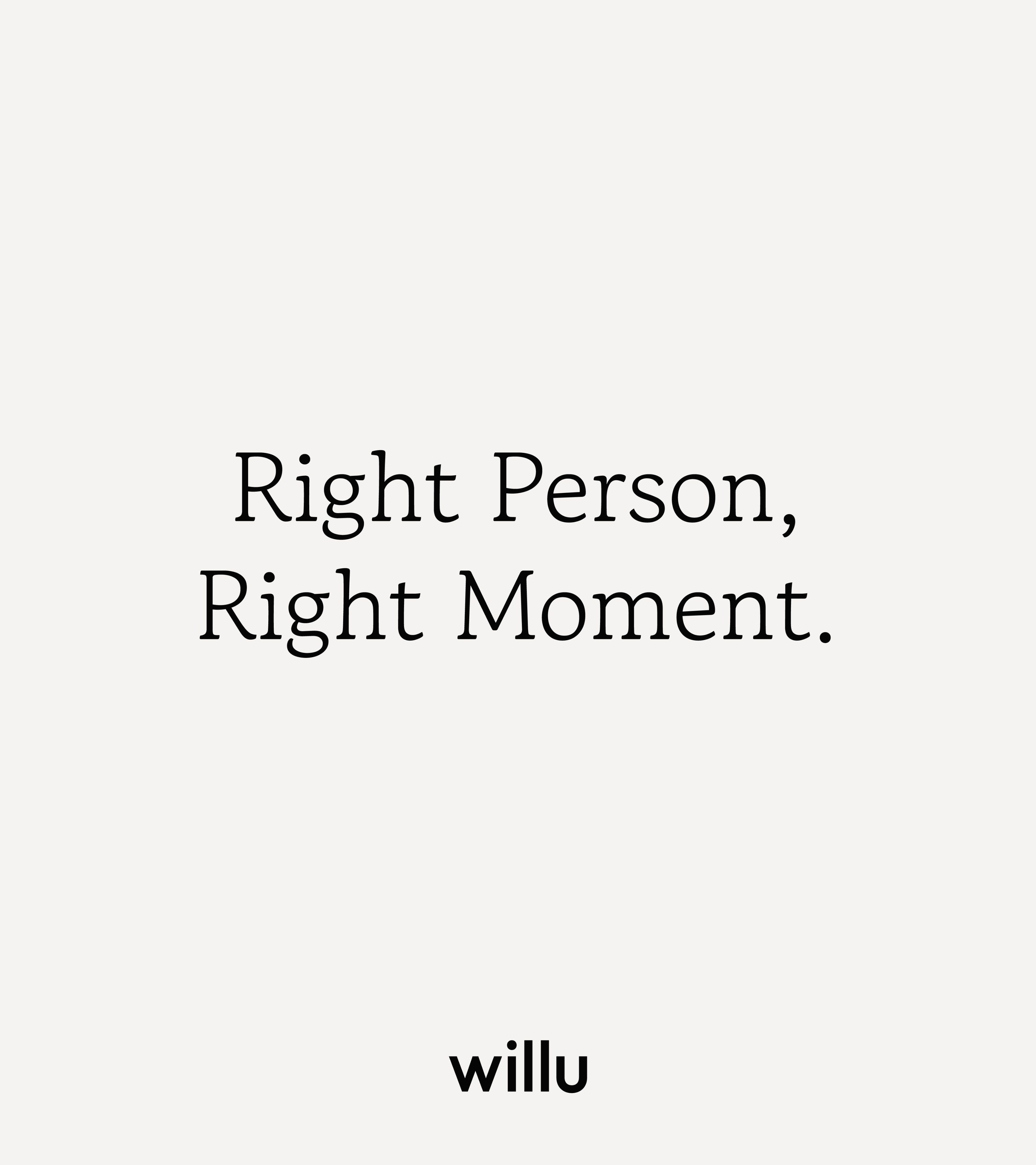
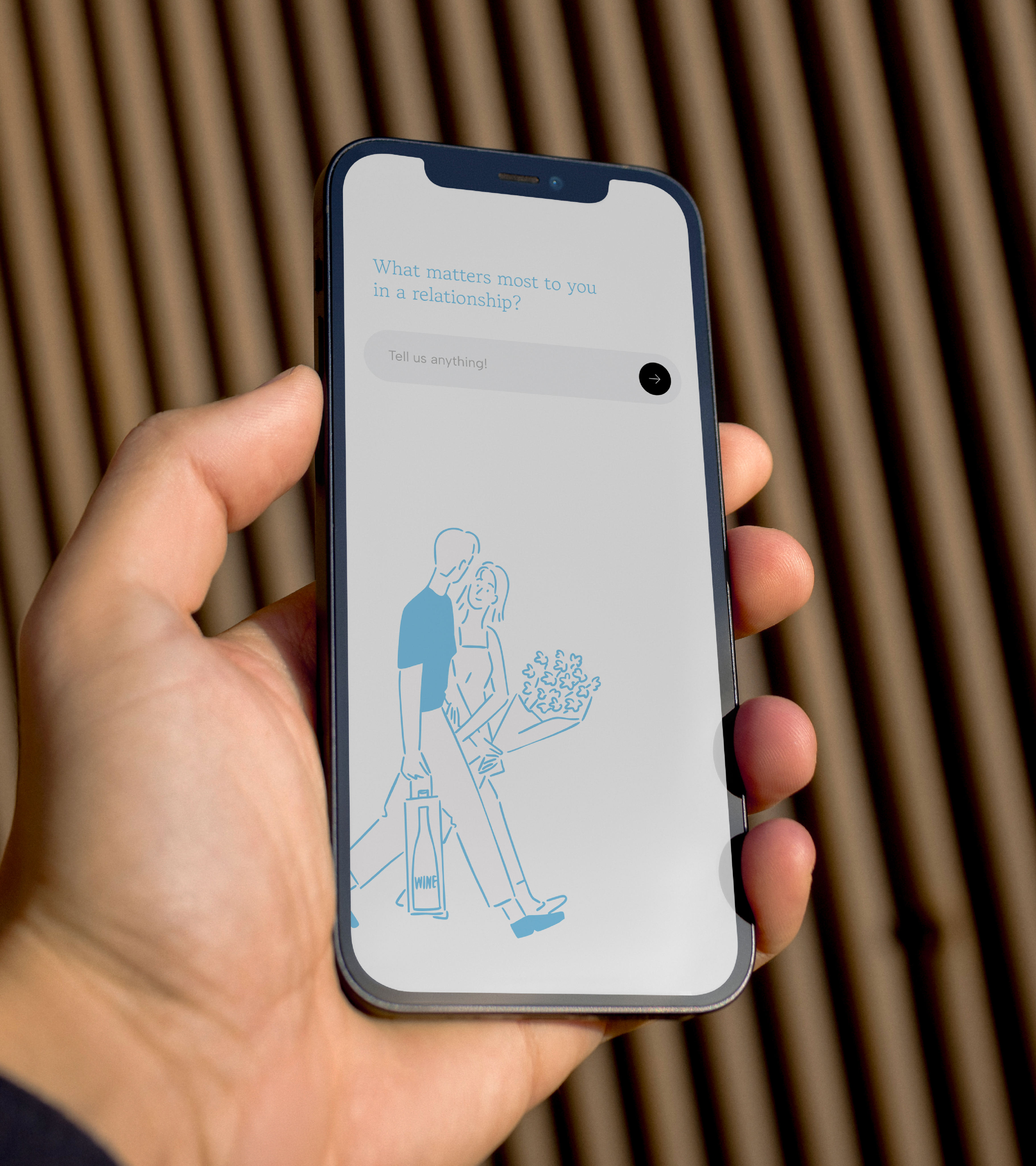
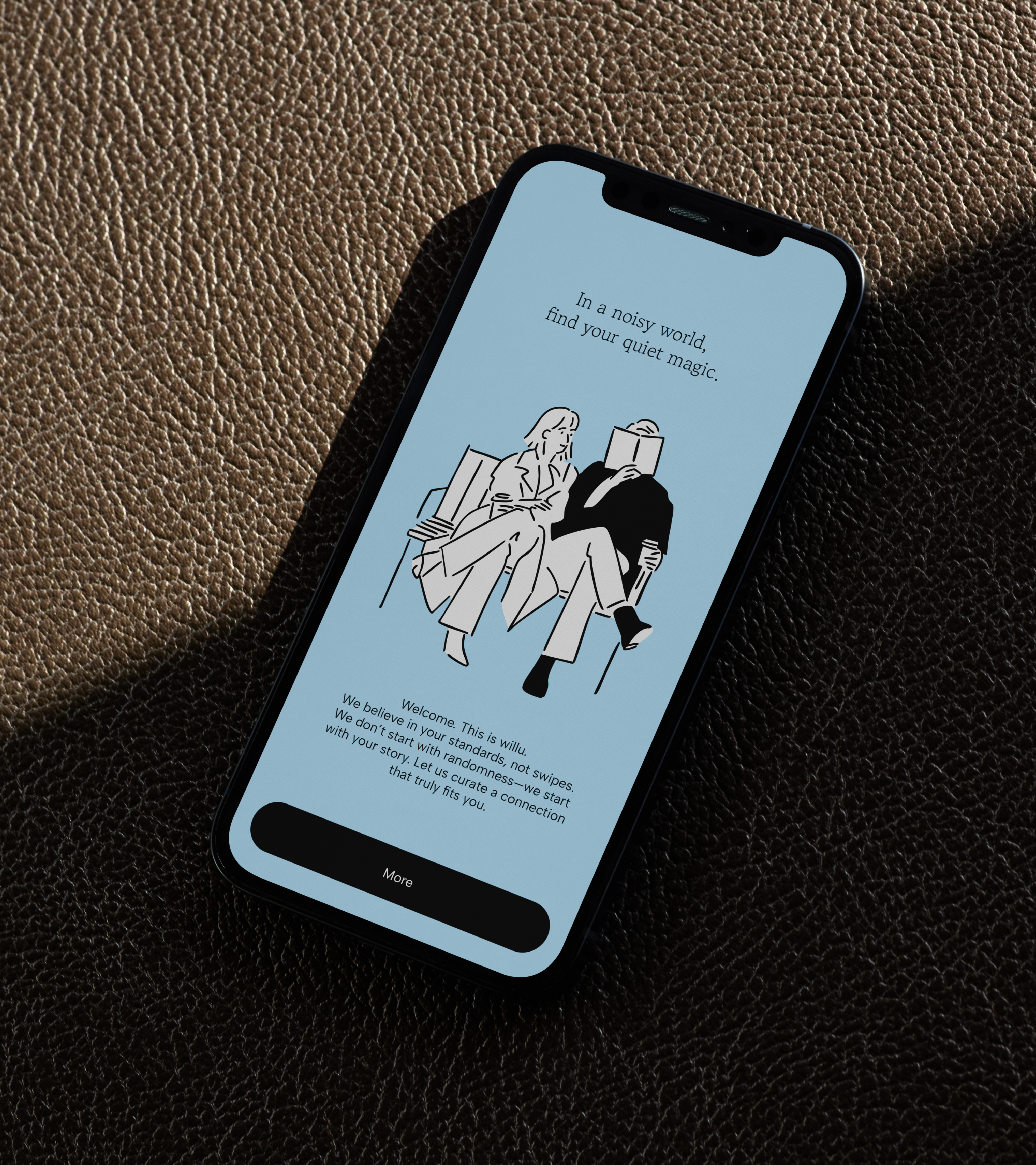
Willu is a platform built on the pursuit of genuine human connection. TIN approached the project through the concept of Curation of Connection, designing the entire framework through which the brand is first perceived.
From visual identity to color system and artwork, each element was shaped into a cohesive visual language that reflects the emotional threshold where relationships begin.
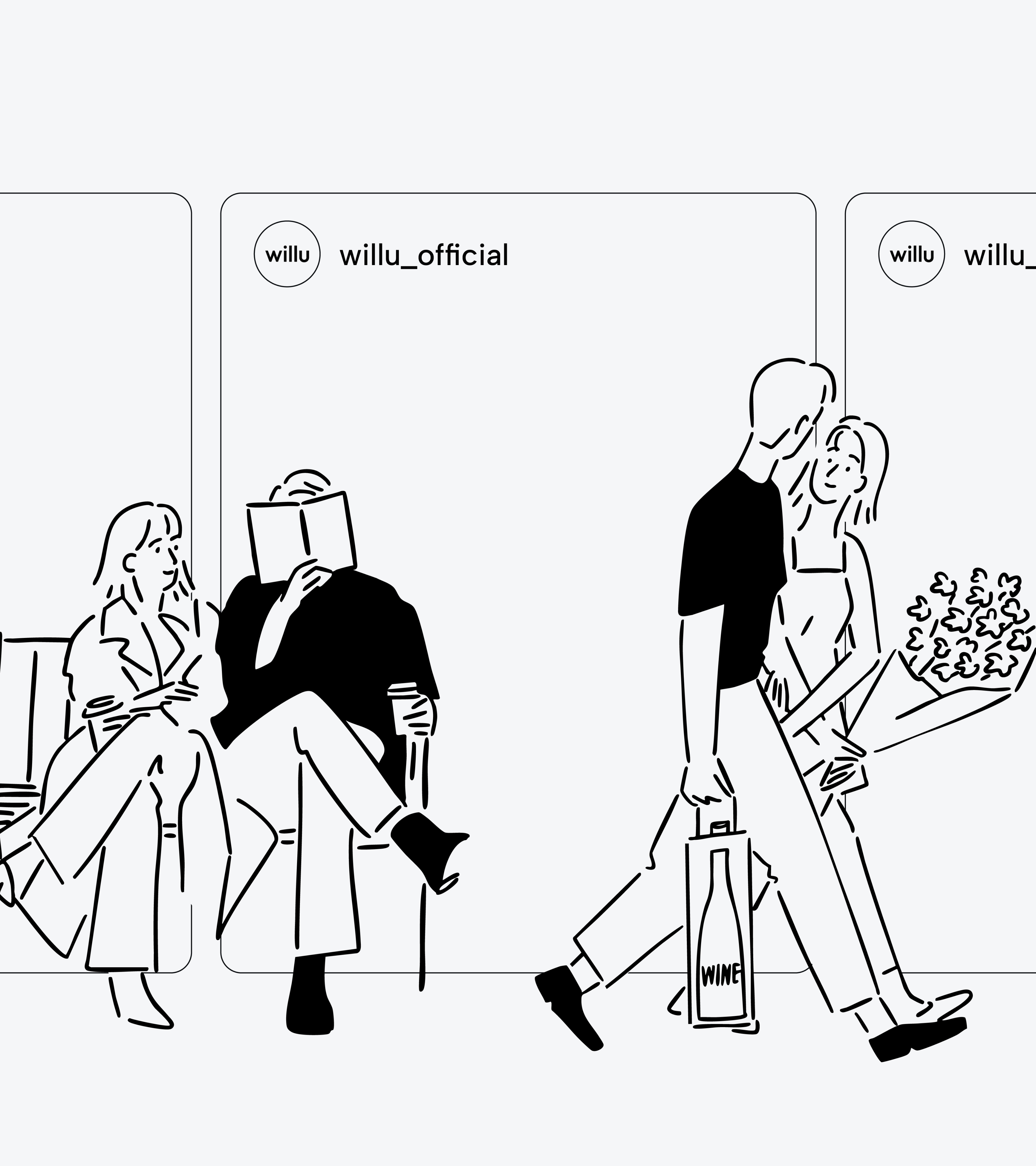
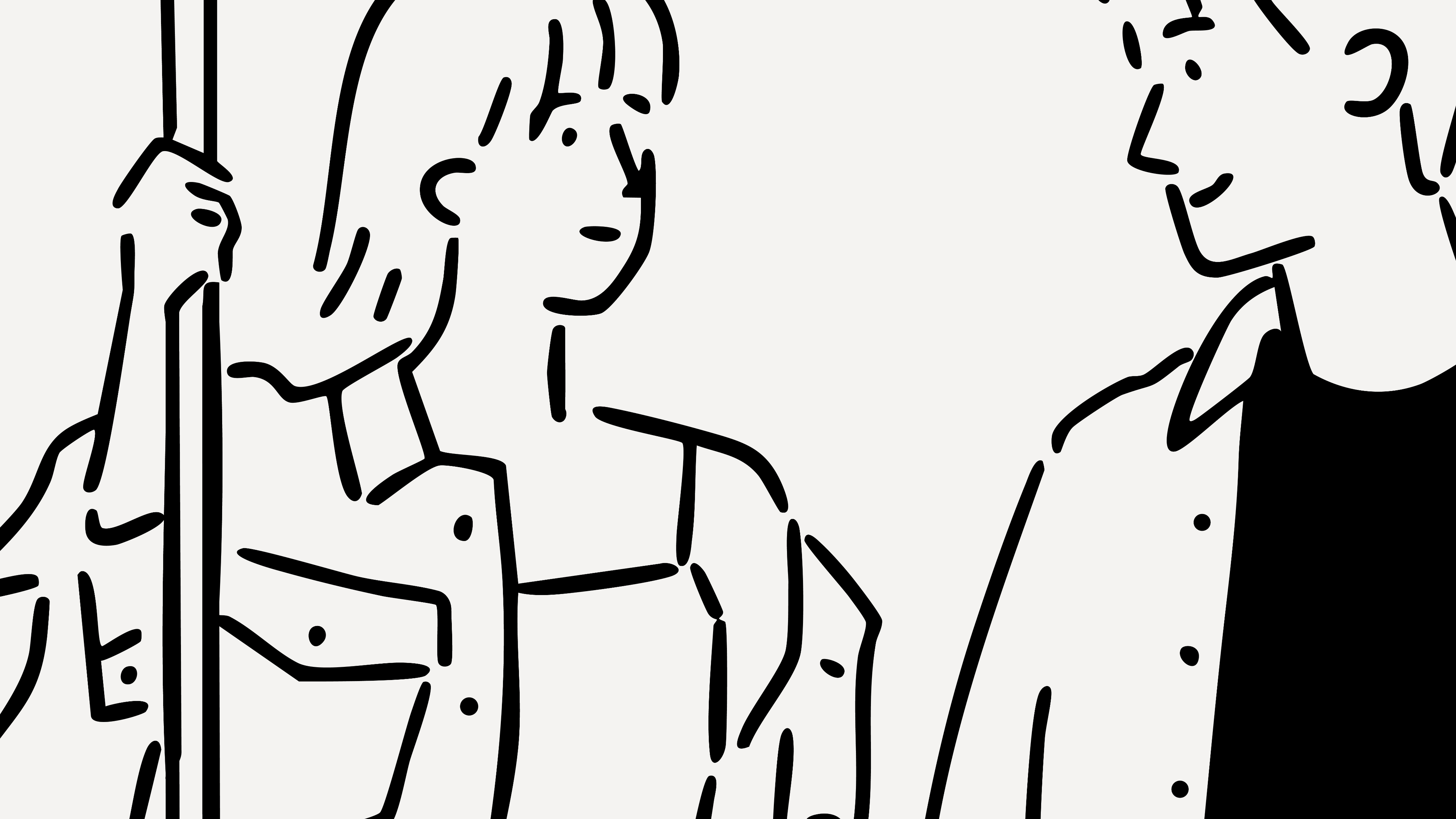
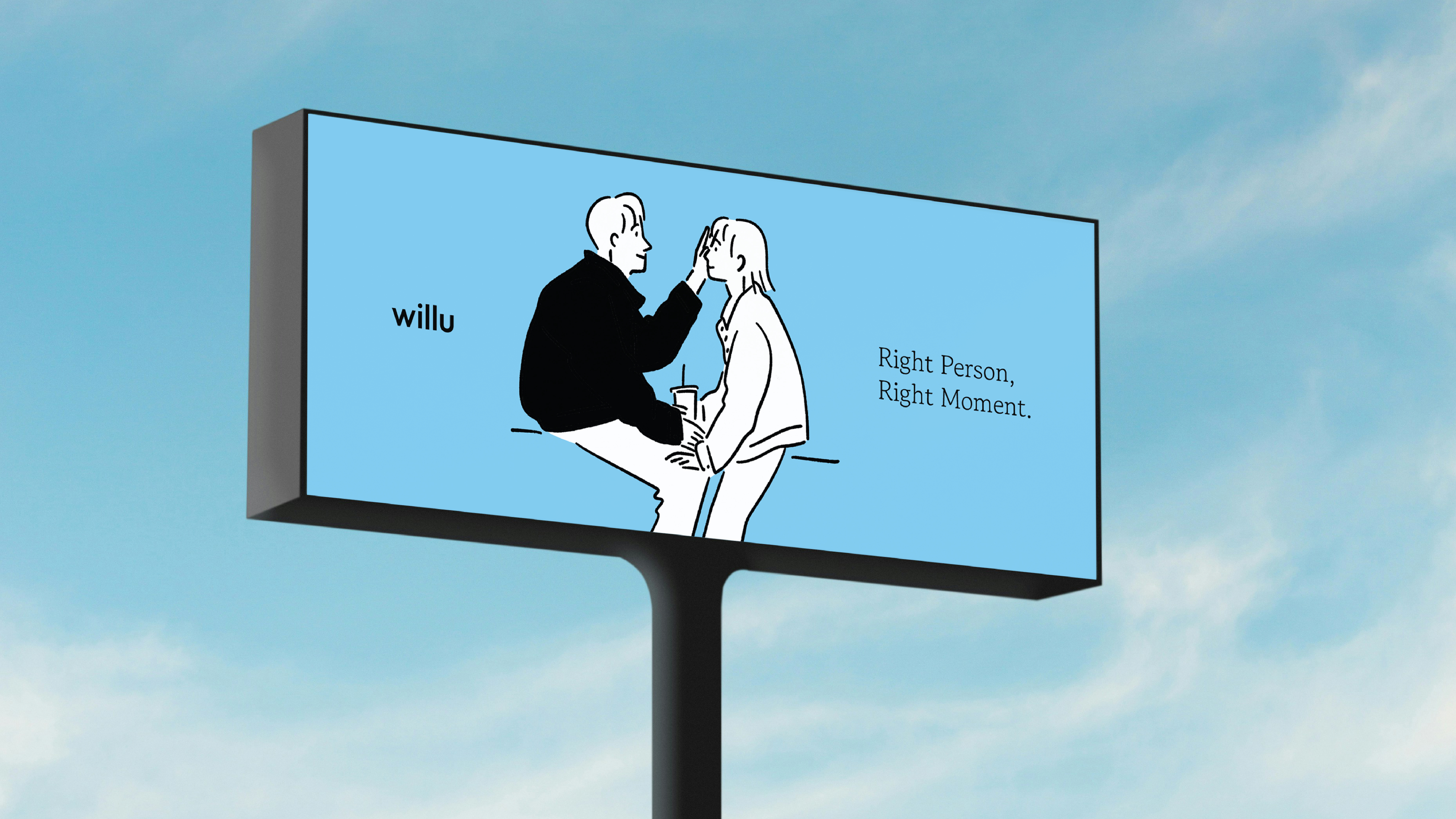
Artwork plays a structural role within the brand. Haydonna’s black line drawings express human presence and emotion through minimal gestures, free of unnecessary ornament.
The restrained lines and intentional space do not explain emotion directly, but instead allow viewers to project their own feelings and discover meaning. This approach visually reflects Willu’s philosophy of sincerity, respect, and emotional clarity.
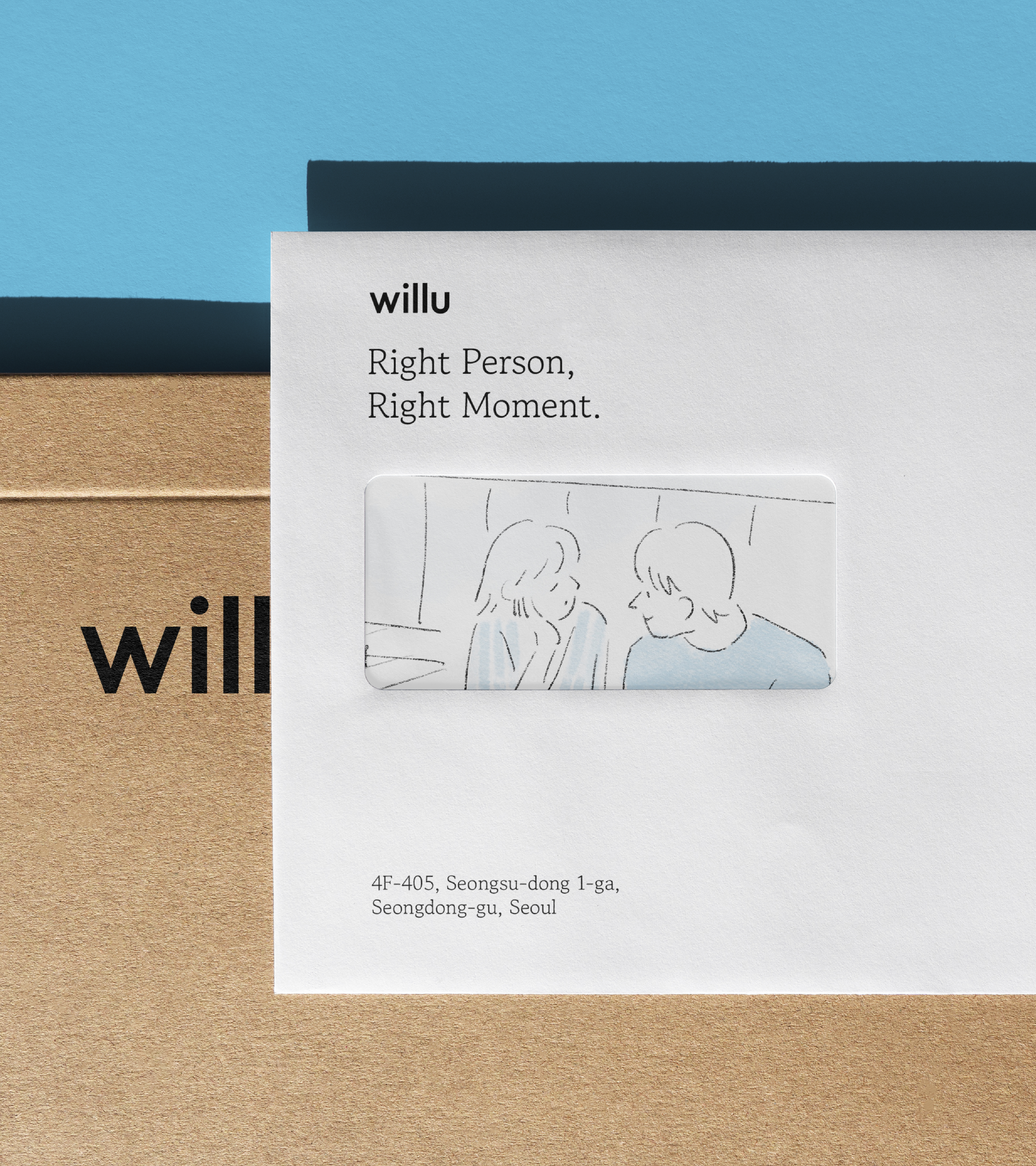
The primary color, Soft Cloud Blue, establishes the emotional atmosphere of the visual system. Clear and transparent in tone, it does not impose emotion but allows it to emerge through its relationship with form, structure, and artwork. Color, line, and space work together to regulate the emotional temperature of the brand.
Through Willu, TIN proposes a way in which artwork becomes the medium through which emotional connection is translated into visual language. Artwork is not ornament, but the structure through which the brand exists and operates. It allows the brand to be experienced not only visually, but emotionally.




HAY TIN / Creative Base
A503-Sounds Hannam, 35 Daesagwan-ro,
Yongsan-gu, Seoul, 04401
Tel: +82-70-7778-5757
Email: hello@hay-tin.com
©HAYTIN. ALL RIGHTS RESERVED.
en
kr
/
hay TIN
works
about
Willu
Curating Connection
Brand Identity & Visual Narrative
request PRESS FILE
Willu is a platform built on the pursuit of genuine human connection. TIN approached the project through the concept of Curation of Connection, designing the entire framework through which the brand is first perceived.
From visual identity to color system and artwork, each element was shaped into a cohesive visual language that reflects the emotional threshold where relationships begin.
Artwork plays a structural role within the brand. Haydonna’s black line drawings express human presence and emotion through minimal gestures, free of unnecessary ornament.
The restrained lines and intentional space do not explain emotion directly, but instead allow viewers to project their own feelings and discover meaning. This approach visually reflects Willu’s philosophy of sincerity, respect, and emotional clarity.
The primary color, Soft Cloud Blue, establishes the emotional atmosphere of the visual system. Clear and transparent in tone, it does not impose emotion but allows it to emerge through its relationship with form, structure, and artwork. Color, line, and space work together to regulate the emotional temperature of the brand.
Through Willu, TIN proposes a way in which artwork becomes the medium through which emotional connection is translated into visual language. Artwork is not ornament, but the structure through which the brand exists and operates. It allows the brand to be experienced not only visually, but emotionally.
HAY TIN / Creative Base
A503-Sounds Hannam, 35 Daesagwan-ro,
Yongsan-gu, Seoul, 04401
Tel: +82-70-7778-5757
Email: hello@hay-tin.com
©HAYTIN. ALL RIGHTS RESERVED.
en
kr
/
hay TIN
works
about
Willu
Curating Connection
Brand Identity & Visual Narrative
request PRESS FILE
Willu is a platform built on the pursuit of genuine human connection. TIN approached the project through the concept of Curation of Connection, designing the entire framework through which the brand is first perceived.
From visual identity to color system and artwork, each element was shaped into a cohesive visual language that reflects the emotional threshold where relationships begin.
Artwork plays a structural role within the brand. Haydonna’s black line drawings express human presence and emotion through minimal gestures, free of unnecessary ornament.
The restrained lines and intentional space do not explain emotion directly, but instead allow viewers to project their own feelings and discover meaning. This approach visually reflects Willu’s philosophy of sincerity, respect, and emotional clarity.
The primary color, Soft Cloud Blue, establishes the emotional atmosphere of the visual system. Clear and transparent in tone, it does not impose emotion but allows it to emerge through its relationship with form, structure, and artwork. Color, line, and space work together to regulate the emotional temperature of the brand.
Through Willu, TIN proposes a way in which artwork becomes the medium through which emotional connection is translated into visual language. Artwork is not ornament, but the structure through which the brand exists and operates. It allows the brand to be experienced not only visually, but emotionally.